Nostalgia Veteran Artisan Bakery Landing Page Template
Reveille is a Neo-Retro veteran bakery landing page built for click-through conversion. It uses a Dopamine Pop color system, a Pinterest-style masonry grid, and a sticky "Order the Next Batch" call to action to move visitors from craving to cart. The design feels like a warm diner booth brought to life with electric signage and fresh-from-the-oven energy.
by Rocket studio
Quick summary
Reveille is a single-page, click-through landing page template built for a veteran-owned bakery and café. The page uses a Neo-Retro Dopamine Pop color system, a masonry polaroid grid, and a persistent ordering call to action. Every scroll reveals another tray of something golden. Every card carries a direct link to the ordering flow. The design does the selling before the visitor even reaches a button.
Who this template is for
This template is built for founders and designers who need a landing page that earns trust and drives orders at the same time. It speaks directly to the veteran-owned food and beverage world, where authenticity matters as much as the product itself. The template is equally useful for anyone customizing a bakery or café experience where community, craft, and conversion all live on the same page.
- Veteran-owned bakery and café operators who want a landing page that reflects their culture and drives online orders
- Designers and no-code builders creating a production-ready page for a neighborhood food business without writing extensive code
- Office managers and catering coordinators who need a clear, direct path to bulk ordering from a local bakery
What problem this template solves
Most bakery landing pages make visitors work too hard. They bury the ordering link, show low-quality photos, and write copy that reads like a food magazine rather than a neighborhood sign. The consequence is a lost sale. Reveille solves this by collapsing the distance between craving and cart. The photography does the selling. The calls to action are always in reach. The page never asks visitors to fill out a form before they can place an order.
- Visitors arrive hungry and leave without ordering because the path to the cart is unclear or buried under irrelevant content
- Small bakeries lose catering business because their landing page has no dedicated section for office or bulk orders
- Veteran-owned businesses struggle to communicate their story and their menu on the same page without one undermining the other
What you get with this template
You get a fully designed, section-rich landing page that handles discovery, storytelling, product display, social proof, and ordering in a single scroll. The template is built around a masonry grid system that groups bakes and moments into three visual clusters. Each cluster has its own identity and its own purpose. Together they create a browsing experience that feels personal rather than transactional.
- A complete masonry landing page layout with five named sections, a sticky call to action, per-card micro-calls to action, and a footer
- A Dopamine Pop color system using diner-booth cherry, soft buttercream yellow, deep espresso brown, and neon mint applied to hover states and badges
- Fraunces serif display typography paired with DM Sans body text, creating a visual identity that feels vintage and legible at the same time
Feature list
Masonry Polaroid Grid with Scroll-Pop Animation
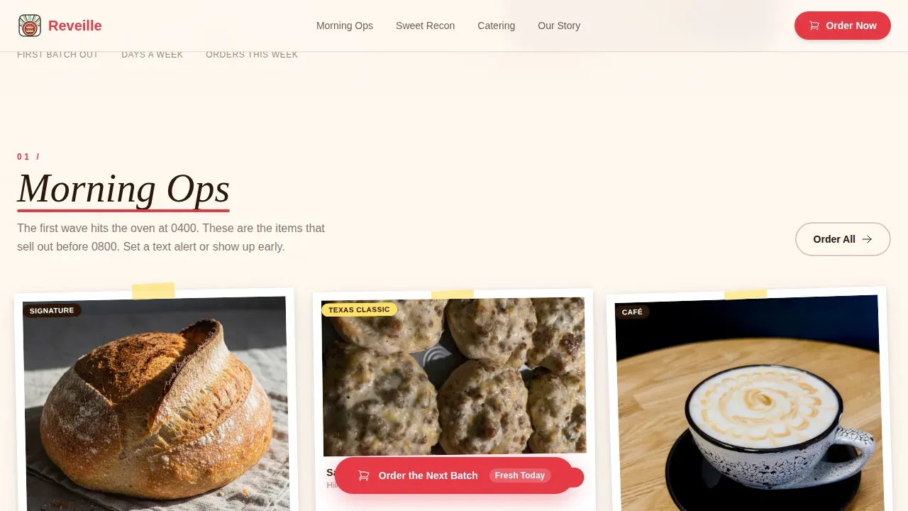
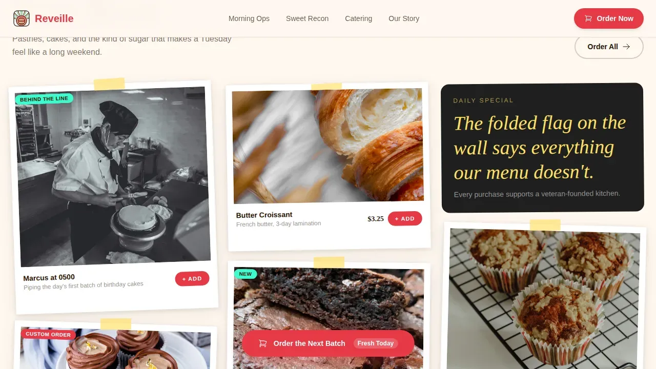
The core layout is a Pinterest-style masonry grid divided into three named clusters: Morning Ops, Sweet Recon, and Catering Missions. Each card uses a polaroid-edge frame and loads with a gentle pop animation triggered by scroll position. The staggered reveal pacing makes browsing feel like flipping through a scrapbook, not reading a menu. This approach to visual storytelling gives the page a sense of life and forward motion that static grid layouts cannot replicate. Cards display product photography, founder candids, chalkboard specials, and latte art side by side. The variety of content types within the grid creates a rich, curated collection feel that keeps visitors engaged and scrolling deeper into the page.
Sticky "Order the Next Batch" Call to Action
The primary call to action is pinned to the bottom of the viewport and remains visible throughout the entire scroll experience. After three seconds of scroll activity, the button begins a gentle pulse animation in diner-booth cherry red. This timing is deliberate: the visitor has seen enough of the page to feel ready, and the call to action appears exactly when that readiness peaks. The sticky placement means the button is never more than one tap away regardless of where on the page the visitor currently sits. This design removes the need to scroll back to the top to place an order, which directly reduces drop-off at the conversion moment. The call to action is built for mobile-native behavior where thumb reach and speed matter most.
Per-Card "Add to Box" Micro-calls to action
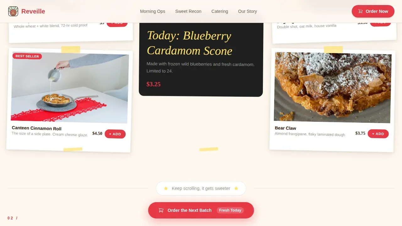
Every masonry card in the grid carries its own micro-call to action labeled "Add to Box." Each micro-call to action deep-links directly to that specific item inside the online ordering flow. There is no intermediate step, no category page, and no search required. The visitor sees a tray of bear claws glistening under heat lamps, taps "Add to Box," and lands directly on that product in the cart. This one-tap-to-cart behavior is what separates a click-through landing page from a traditional menu page. The micro-call to action system means every photo on the page is also a product link, turning the visual experience into a direct sales channel across all card types and content groups.
Device Mockup Hero with "Fresh Tomorrow" Badge
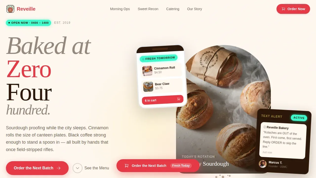
The hero section floats a phone and tablet at a slight angle over a flour-dusted butcher-block surface. Both screens show the bakery's online ordering interface loaded with glossy pastry thumbnails and a half-dozen kolaches already in the cart. A "Fresh Tomorrow" countdown badge in neon mint sits prominently on the device screens. Real crumbs and a smear of raspberry jam appear on the wood surface just behind the devices, collapsing the visual distance between screen and kitchen. This header approach communicates the ordering experience before the visitor has scrolled a single pixel. It answers the first question any new visitor has: what does it look like to actually order from this bakery?
Neo-Retro Dopamine Pop Visual System
The color system pairs diner-booth cherry (#E63946), soft buttercream yellow (#FFE066), deep espresso brown (#2B1709), and neon mint (#3DFACC) against a warm off-white (#FFF8F0) backdrop. The palette was designed to feel like a vintage diner sign buzzing to life at dusk: sugary, electric, and unapologetically warm. Neon mint activates on hover states and badge accents. Cherry red carries the primary calls to action. Buttercream yellow anchors section backgrounds and card highlights. Espresso brown grounds the typography and icon work. Together, the system creates a visual identity with strong emotional impact that distinguishes this page from mass-production competitors who rely on clean white and corporate blue.
Social Proof Section with Live Order Badge
The testimonials section includes three distinct voices: a neighborhood regular, an office manager who orders catering runs of two dozen or more, and a veteran family who feels the community before they read the menu. Each testimonial carries a star rating. A live badge reading "412 orders this week" appears alongside the social proof block to communicate active community demand. The folded flag wall moment from the bakery interior appears as a visual anchor in this section. Together, these elements build the kind of credibility that photography alone cannot create. They confirm that real people from the surrounding society trust this bakery and return to it regularly.
Page sections overview
| Section | Purpose |
|---|---|
| Hero Device Mockup | Introduces the ordering experience with a floating device mockup, butcher-block setting, and neon mint countdown badge |
| Morning Ops Grid | First masonry cluster displaying breakfast bakes and café moments with polaroid-edge cards and scroll-pop animation |
| Sweet Recon Cluster | Second masonry grid group featuring pastry close-ups and category badges for dessert and specialty items |
| Catering Missions Block | Wide feature card dedicated to bulk and office ordering with a direct catering call to action |
| Testimonials Section | Neighborhood voices, star ratings, veteran family moment, and live order count badge for social proof |
| Footer | Linear single-row footer with essential links and bakery contact information |
Design & branding system
The design system is built on the Neo-Retro aesthetic, which combines modern layout logic with the visual culture of mid-century American diners and vintage signage. The retro design evokes nostalgia and creates a strong emotional brand connection that mass-production competitors cannot easily replicate. Nostalgic branding elements include warm colors, vintage-style type treatments, and a sense of place that feels handmade rather than templated. The typography pairing of Fraunces and DM Sans reinforces this balance: Fraunces brings the serif weight and warmth of an old diner menu board, while DM Sans keeps the body text clean and readable at any size. Typography choices enhance the overall vibe of a bakery landing page in ways that generic sans-serif stacks simply cannot match.
- Fraunces serif display for headlines and section titles; DM Sans for all body text, card labels, and call to action copy
- Dopamine Pop color system: cherry #E63946 for primary actions, buttercream #FFE066 for section accents, espresso #2B1709 for type and icons, mint #3DFACC for hover states and badges
- Warm off-white (#FFF8F0) page backdrop that reads like parchment paper lining a pastry box, reinforcing the artisan and handmade brand identity
Mobile & speed optimization
The landing page is built mobile-first because the core conversion behavior, receiving a fresh-out-the-oven text alert and placing an order, is entirely mobile-native. The masonry grid adapts from a multi-column desktop layout to a single-column mobile scroll without losing the polaroid card framing or the staggered pop animation. The sticky call to action is thumb-positioned for mobile reach, and the per-card "Add to Box" micro-calls to action are sized for tap targets rather than mouse clicks. All sections of the landing page are mobile-responsive, ensuring seamless viewing across devices from a 375-pixel phone screen to a wide desktop monitor.
- Images across the masonry grid are lazy-loaded using native browser behavior, so the page body loads fast and images appear as the visitor reaches each card
- CSS smooth scroll behavior and Intersection Observer-based animation triggers keep the scroll reveal experience consistent across mobile and desktop environments
- The sticky ordering call to action remains accessible at the bottom of the viewport on all screen sizes without obscuring card content or overlapping the footer
How this template helps you convert
The entire landing page is engineered as a click-through funnel. There is no form, no email capture wall, and no friction between the visitor and the cart. The page earns the click by letting the photography and the storytelling do the persuasion work first, then makes the ordering action as close to instant as possible. This is the core theory behind a click-through landing page: reduce the number of decisions a visitor has to make between arrival and conversion.
- The hero device mockup shows the ordering interface immediately, so visitors understand the process before they scroll, and the "Fresh Tomorrow" badge creates time-anchored urgency that encourages same-session ordering rather than a return visit that may never come
- Every masonry card in the Morning Ops, Sweet Recon, and Catering Missions sections carries an "Add to Box" micro-call to action that deep-links to that specific product in the ordering flow, so the impact of a great food photo converts directly into a cart action without any intermediate navigation steps
- The sticky "Order the Next Batch" call to action pulses after three seconds of scroll, appearing exactly when the visitor has absorbed enough of the page to feel ready, and it remains pinned to the viewport so the conversion action is always one tap away regardless of scroll position
Other information about this template
This section covers additional context about the template's broader applicability, its design philosophy, and how it fits into the wider landscape of bakery landing page development tools and approaches. The Neo-Retro aesthetic combines modern design logic with nostalgic old-fashioned elements, making it a strong choice for any food and beverage business that wants to stand out in a world of minimal white-box layouts. Using a Neo-Retro style creates a distinct visual identity that helps a small bakery stand out from mass-production competitors who rely on generic presentation. The template is part of a growing society of food business owners who recognize that the landing page is not just a menu online; it is the first and often only impression a new customer will have of the brand.
The "Our Story" section of the website, represented through the founder candid photography and the folded flag wall moment woven into the testimonials section, highlights the bakery's history and military service to build authenticity. This approach is central to veteran-owned business branding across many cities where community trust is the primary driver of repeat visits and word-of-mouth growth. The page is focused on artisan, health-conscious, and locally sourced products, and it highlights the use of fresh-milled flour and sourdough methods that emphasize gut health and natural, organic ingredients. These values resonate with a society of consumers who are actively seeking premium alternatives to mass-produced bread, and the landing page communicates them through photography and copywriting rather than through a separate PDF or brochure download.
The template is fully compatible with no-code platforms and tools that allow users to create websites without extensive technical skills. No-code platforms can help bakeries establish an online presence quickly and efficiently, and many of them offer drag-and-drop interfaces that make customizing this template straightforward. Users can manage their bakery's website content easily with no-code solutions, swapping out photography, updating section copy, and adjusting color accents without touching a line of code or editing raw HTML. No-code tools can integrate with various third-party services to enhance functionality, including online ordering systems, social media feeds, and email alert platforms that power the fresh-out-the-oven text notification experience described in the Reveille concept. Subscription-based pricing models are common among no-code platforms, which means the ongoing support and update cycle for this template can be managed affordably over time.
AI-powered platforms can simplify the website development process for bakeries significantly. Using AI tools, bakeries can create production-ready websites without extensive coding knowledge, and natural language prompts can be used in AI platforms to streamline the website creation process further. AI-powered website development can enhance the functionality of bakery websites by automating backend processes, and subscription-based AI development platforms can provide bakeries with ongoing support and updates for their websites as their menu and catering offering grows. This template was built with that kind of iterative development in mind: the section structure is clear, the code is organized, and the HTML is readable enough that both human developers and AI-assisted build tools can work with it efficiently.
From a broader design theory perspective, vibe coding focuses on creating an emotional connection between the landing page and its users. Engaging bakery websites enhance customer experience and drive sales in ways that simple menu pages cannot. A unique vibe differentiates a bakery website from its competitors, and color schemes directly influence the emotional response of visitors. The Dopamine Pop system used here is built on exactly that theory: warm, electric, and familiar colors that create an immediate sense of comfort and appetite. Storytelling through content creates a memorable vibe for bakery websites, and Reveille does this by weaving the founder's military background, the early-morning baking ritual, and the neighborhood community into every visual and copy element across the page. The social impact of a well-told veteran business story extends beyond a single sale; it builds a loyal community that returns, refers, and advocates.
The page is also designed with analysis in mind. The section groupings, Morning Ops, Sweet Recon, and Catering Missions, each serve a distinct audience segment and conversion intent. This segmentation allows the bakery operator or their marketing co to analyze which sections drive the most cart activity and adjust photography or copy accordingly. The layout provides a clear basis for ongoing performance review without requiring complex tracking setup. Each section has a defined purpose, and that purpose is communicated visually so that even a first-time visitor understands the structure of the offering within seconds of arrival.
For bakeries operating across multiple cities or neighborhoods, this template provides a reusable foundation. The section structure, color system, and masonry grid can be adapted to reflect different locations, seasonal menus, or promotional campaigns without rebuilding the page from the ground up. The template's design rules are explicit and consistent, making it easy to maintain visual coherence across multiple deployments. The existence of a clear design system means that new contributors, whether designers, content writers, or operators, can work within the established visual language without needing a lengthy onboarding process.
The press-ready visual quality of the page is worth noting for bakeries that also receive local media coverage or social media attention. The polaroid-edge masonry cards are designed to be screenshot-worthy, and the device mockup hero is built to work as a promotional asset in its own right. When a local press outlet or food blogger shares a screenshot of the landing page, the Neo-Retro visual identity is immediately recognizable. This visual consistency across the page, social media, and press coverage reinforces brand recognition and helps build the kind of social credibility that drives new visitors to the site. The impact of consistent visual branding across digital and press channels compounds over time, creating a flywheel of recognition that is hard for competitors to disrupt.
The template also reflects the labor of the founder story in a visual and structural way. The candid of the founder piping frosting in a faded USMC tee is not a decorative element; it is a trust signal. It communicates that the person who made your cinnamon roll is the same person who served the country, and that the work ethic behind the bake is the same work ethic that once required rising before dawn for a different reason. This kind of storytelling is the heart of veteran-owned business branding, and it is baked into the template's section structure rather than left to the operator to figure out independently.
- The reveille neo retro veteran bakery landing page template is designed specifically for veteran-owned food businesses that want a landing page combining community storytelling with direct ordering conversion
- The page structure supports both neighborhood regulars discovering the bakery for the first time and returning customers who want the fastest possible path back to the cart
- Visual elements including polaroid card framing, neon mint badges, and the butcher-block hero surface play a crucial role in establishing the warm, artisan vibe of the bakery brand
- The template's existence as a complete, ready-to-deploy design means operators can focus on the kitchen rather than on website development decisions
- Response to new menu items or seasonal specials is straightforward: swap the photography in the relevant masonry card and update the micro-call to action deep link, with no layout changes required
- The design is an oasis of warmth and specificity in a world of generic food business templates that could belong to any restaurant in any city
Theme
Neo-Retro
Creative direction
Curated Collection
Color system
Dopamine Pop
Style
Masonry/Pinterest
Direction
Click-Through
Page Sections
Masonry Polaroid Grid with Scroll Animations
Sticky Pulsing Order Call to Action
Per-card Add to Box Micro-ctas
Device Mockup Hero Section
Neo-retro Dopamine Pop Color System
Social Proof Block with Live Order Badge
Related questions
Can I use this template without writing any code?
Does the masonry grid work on mobile devices?
How do the Add to Box micro-calls to action work?
Is this template suitable for a bakery that also offers catering?
Can AI-powered tools be used to customize and deploy this template?



