Independent Music Label Landing Page Template
Pressing is a futuristic neon independent record label landing page built for labels that move fast and sound different. It combines a dark void aesthetic with a Sunset Gradient neon palette to spotlight new drops, upcoming releases, live dates, and roster artists. Every section pulls visitors deeper, building toward one confident click: pre-save the drop.
by Rocket studio
Quick summary
Pressing is a single-column flow landing page designed for independent record labels. It pairs a deep void black canvas with a molten tangerine-to-magenta neon palette to create a music landing experience that feels as urgent as the night it represents. The page drives one action: get the pre-save click before the algorithm catches up.
Who this template is for
This landing page is built for labels and music collectives that operate at the intersection of house, hip-hop, and broken beat. It suits anyone building a release-cycle presence rather than a static website. The design rewards curators who want their taste to speak louder than their ad budget.
- Independent record labels running active drop cycles and seasonal release campaigns
- Producers, vocalists, and DJs seeking a home page that matches the energy of their sound
- Label managers who want to route visitors directly to Spotify, Apple Music, or Bandcamp pre-save flows
What problem this template solves
Most music landing pages bury the release. They lead with a logo, stack navigation links, and ask visitors to find the music themselves. Pressing solves that by placing the sound front and center from the first viewport, so visitors hear before they read.
- Artists lose pre-saves because visitors land on a cluttered page with no clear next step
- Labels struggle to communicate drop urgency without a focused, time-sensitive landing structure
- Generic website templates do not carry the visual weight or neon style that underground music culture demands
What you get with this template
This template includes a complete single-page flow organized around the current release cycle. Every section is purpose-built to move visitors from curiosity to a confirmed pre-save. The design is high-contrast, neon-forward, and mobile-first throughout.
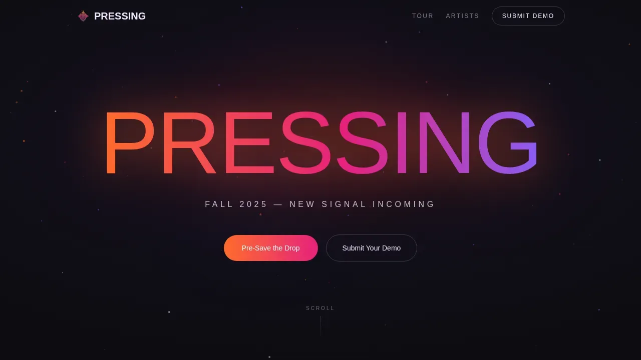
- A Dark Full-Bleed hero section with an oversized neon wordmark, particle field, and a single signal-white tagline
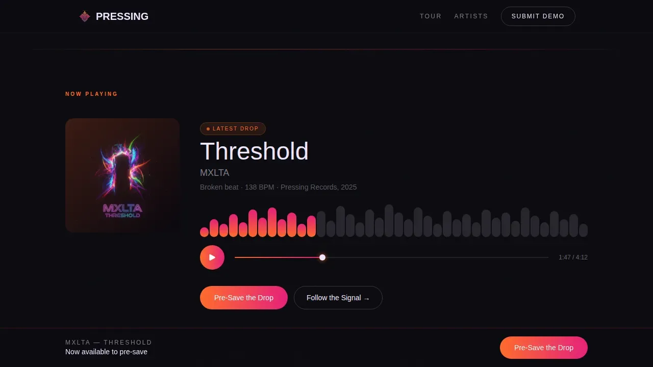
- A "Now Playing" section with an embedded waveform player, glowing album art, and a primary call-to-action button
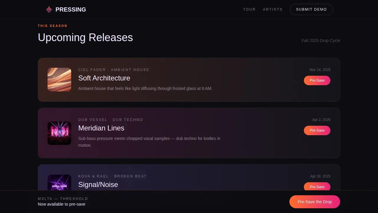
- Stacked animated release cards, an eight-date tour section, and an artist roster with violet-to-black gradient bios
Feature list
This template is built around a clear set of design and layout features drawn from the source brief. Each feature serves the single landing goal of driving pre-save clicks while communicating label identity with confidence.
Dark Full-Bleed Neon Hero
The header opens on a pure black canvas. The label wordmark renders in oversized DM Sans display type, each letter outlined in a tangerine-to-magenta neon gradient that radiates a soft bloom into the surrounding void. A subtle particle field drifts behind the type, replacing static images with motion that keeps the scene alive without photography.
Embedded Waveform Player
The "Now Playing" section places an embedded waveform player directly on the landing page alongside glowing album art. Visitors can hear the music immediately. Placing critical information like the track name and cover art in the first scroll zone ensures above-the-fold impact and builds trust through sound rather than claims.
Scroll-Triggered Release Cards
Three upcoming release cards animate into view as visitors scroll down the page. Each card shows the artist name, a one-sentence hook, and a pre-save button. Scroll-triggered animations keep attention active and create the feeling of a set building toward its peak, section by section.
Sticky Pre-Save Call-to-Action Bar
After visitors scroll past the fold, a sticky bottom bar keeps the primary call-to-action visible at all times. The glowing pill button in the tangerine-to-magenta gradient stands out against the dark background. A sticky call-to-action button remaining visible as users scroll ensures continuous engagement and reduces drop-off at the moment of decision.
Violet Duotone Tour Section
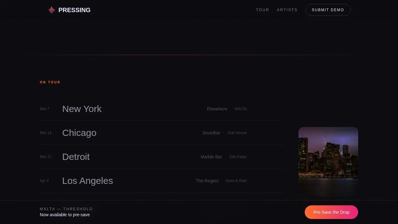
The "On Tour" section displays eight live dates with city names set in large type against venue images treated with an electric violet duotone filter. The treatment keeps images visually consistent with the neon design system while spotlighting live dates that build social proof and label credibility.
Artist Roster with Gradient Bios
The artist section presents each roster member with a bio rendered over a violet-to-black gradient background. The design gives each artist a distinct spotlight while staying inside the unified neon style. Visual hierarchy is controlled by neon color intensity, guiding the eye naturally from one profile to the next.
Page sections overview
| Section | Purpose |
|---|---|
| Hero wordmark | Establish label identity with neon glow and particle field |
| Now Playing | Feature latest single with waveform player and pre-save call to action |
| This Season cards | Preview three upcoming releases with animated scroll reveals |
| On Tour dates | Display eight live dates with violet duotone venue images |
| Artist roster | Introduce signed artists with gradient bio treatment |
| Footer | Minimal close with secondary links and label information |
Design & branding system
The design system is built around a Sunset Gradient palette that moves from warmth to synthetic edge. Deep void black (#0B0B0F) dominates every page background, making neon accents pop with high-contrast clarity. The neon color set runs from molten tangerine (#FF6B2B) through hot magenta (#E61F7A) into electric violet (#8B5CF6), while pale signal white (#F0E6FF) handles all primary typography. Gradient sweeps mark section transitions, and interactive hover states intensify the neon glow on buttons and links, pulsing like EQ meters in a dim control room.
- Typography: DM Sans for display headlines; Manrope for body text. Both are clean, modern sans-serif choices that hold legibility against dark backgrounds.
- Hover and animation states: glow pulses on album art, card reveals on scroll, and a particle field in the hero section create a layered sense of motion throughout the landing page.
- Neon accent logic: tangerine-to-magenta on featured release elements; violet-to-black on artist bio sections; both gradients sweep behind section breaks like light leaks across the page.
Mobile & speed optimization
The template is designed mobile-first because the core audience is primarily on phones, moving between venues and streaming platforms in real time. The single-column flow keeps the layout clean and organized on small screens without requiring separate mobile breakpoints or layout overrides.
- GPU-accelerated transforms power all particle, glow, and card animation effects, keeping motion smooth on mobile hardware.
- Intersection Observer handles all scroll-triggered reveals, so animations only fire when sections enter the viewport, reducing unnecessary processing.
- The sticky call-to-action bar is sized and spaced for thumb reach, ensuring the pre-save button is always accessible on portrait phone screens.
How this template helps you convert
This landing page is focused on a single goal: the pre-save click. Every design decision, from the waveform player at the top to the sticky bar at the bottom, serves that one outcome. There are no form fields, no navigation menus, and no distractions pulling visitors away from the music.
- Visitors hear the single immediately inside the "Now Playing" section, building trust through the music itself rather than through claims or social proof alone.
- The sticky pre-save call-to-action button remains visible through every section, so the moment a visitor decides to act, the route to Spotify, Apple Music, or Bandcamp is one tap away.
- The scroll rhythm accelerates through each section, growing denser and more urgent, pulling visitors toward the pre-save confirmation the way a DJ set builds toward the headliner drop.
Other information about this template
Choosing a website template is essential for establishing your brand and connecting with your audience online. Music website templates make it easy to quickly and seamlessly get your website up and running without building from scratch. You can customize this template to match your label style and swap out artist names, release details, and tour dates at the start of each drop cycle. You can switch website templates at any time for a fresh new look while keeping your content in place. Using high-quality images alongside the built-in neon design system keeps the visual standard professional across every section.
- The Pressing template sits within a broader catalog of website templates covering music, entertainment, and creative industries, allowing labels to find the right fit for their release style.
- Users can create commercial landing pages from this template and access it immediately after purchase, with all sections organized and ready to populate with real release information.
- The neon design approach aligns with the futuristic aesthetic that creative industries expect from modern landing page templates, making it a strong choice for labels building a distinct visual identity.
- The template is responsive, ensuring the landing page works well across devices, from desktop browsers in the studio to mobile screens at the venue door.
Theme
Futuristic Neon
Creative direction
Seasonal/Moment
Color system
Sunset Gradient
Direction
Click-Through
Page Sections
Dark Full-bleed Neon Hero
Embedded Waveform Player
Scroll-triggered Release Cards
Sticky Pre-save Call-to-action Bar
Violet Duotone Tour Section
Artist Roster with Gradient Bios
Related questions
Can I update the release cards each season without rebuilding the page?
Does the template work for labels with a small roster?
Where do the pre-save buttons route visitors?
Is this template suitable for non-technical users?
Can I use this design for a one-off single release rather than a full label?