Bold TikTok Agency Landing Page Template
Viral is a bold brutalist landing page template built for TikTok marketing agencies that engineer cultural moments. It pairs an asymmetric 60/40 grid with a manifesto-style narrative, hard-hitting metrics display, and a lead generation form, all wrapped in an electric indigo and void-black visual identity designed to provoke action the moment a visitor lands.
by Rocket studio
Quick summary
Viral is a single-page template built for TikTok marketing agencies. It uses an asymmetric 60/40 grid, a brutalist visual identity, and a manifesto-driven scroll to convert high-intent visitors into qualified leads. The page escalates conviction from the first headline to the final call to action, making every section feel urgent, credible, and impossible to ignore.
Who this template is for
This template is made for agencies that live and die by short-form video performance. It speaks directly to the people selling TikTok growth, not just talking about it.
- TikTok marketing agencies pitching DTC founders, legacy brand CMOs, and growth leads
- Creative studios and social media consultancies that need a page as bold as their work
- Agency operators who want a lead generation page that qualifies budget and intent upfront
What problem this template solves
Most agency websites look like everyone else's. They use safe layouts, polished photography, and corporate language that says nothing. Meanwhile, the brands this template targets are watching competitors go viral while their own content dies on arrival.
- Generic agency pages fail to convey creative edge or cultural authority
- Visitors leave before reaching the pitch because nothing stops the scroll
- Lead forms collect contacts but not the budget context needed to qualify them
What you get with this template
You get a full single-page layout built around confrontation and proof. Every section is sequenced to escalate credibility before asking for anything in return.
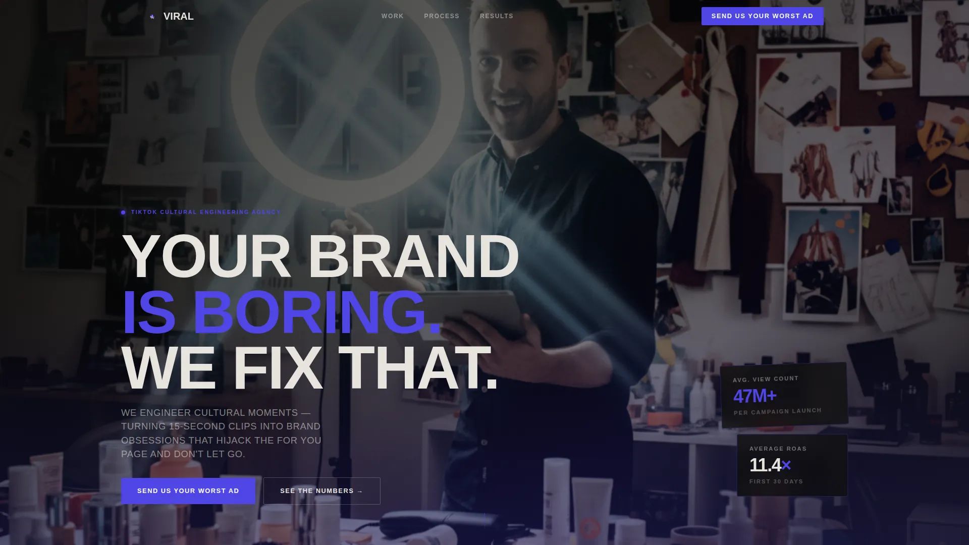
- A full-bleed photo header with an oversized brutalist manifesto headline
- An asymmetric 60/40 grid pairing large-format metrics with a vertical TikTok thumbnail feed
- A manifesto narrative broken into provocation, proof, and three numbered creative principles
- A lead generation form with a brand URL field, monthly ad spend selector, and an open-text qualifier field
- A sticky bottom bar that repeats the primary call to action throughout the scroll
Feature list
This section covers the core capabilities built into the Viral landing page template.
Full-Bleed Manifesto Header
The header fills the entire viewport with a raw, flash-lit creator photo. The composition is off-center and slightly tilted, intentionally stolen-feeling, not staged. A single oversized brutalist headline punches across the image: "YOUR BRAND IS BORING. WE FIX THAT." It sets the tone in under three seconds.
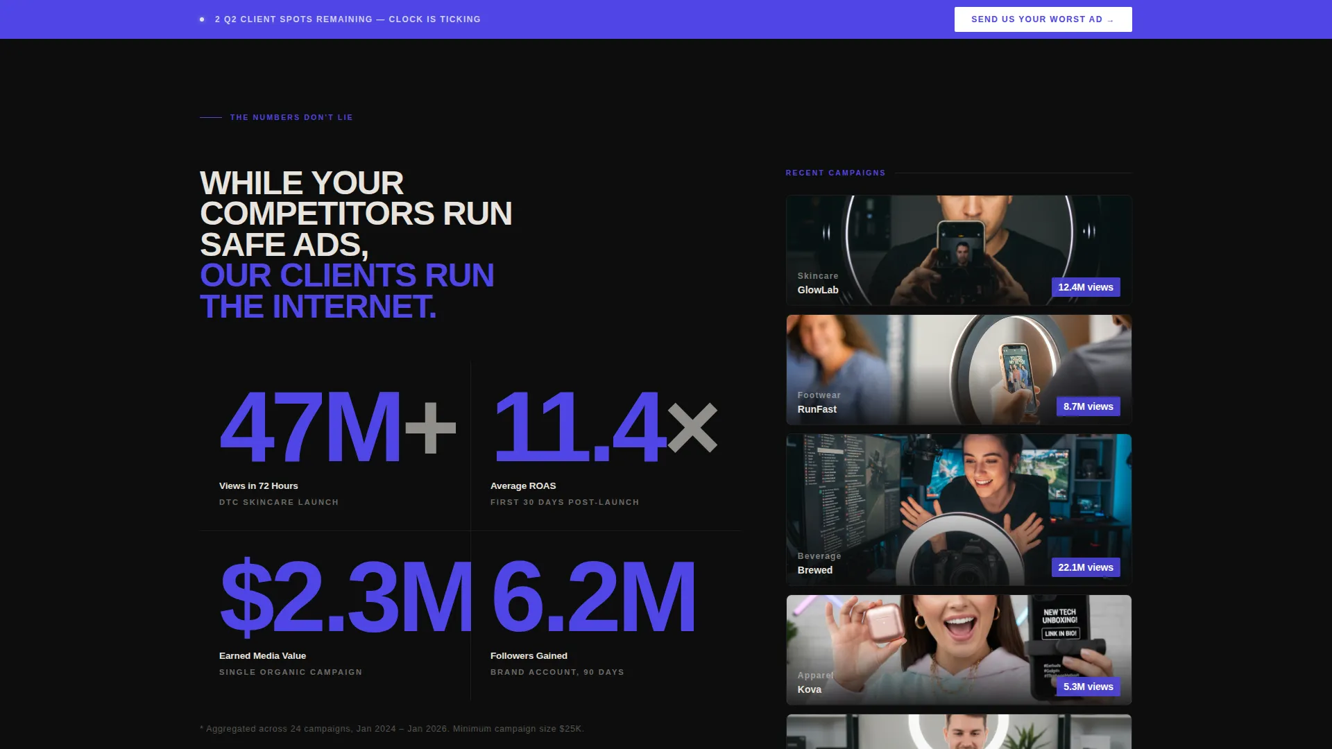
Asymmetric 60/40 Grid Layout
The page uses a structured 60/40 column split throughout the metrics section. The wider column carries massive view count, ROAS, and earned media value figures in large-format typography. The narrower column runs a vertical feed of TikTok thumbnails that autoplay on hover, proof and provocation sitting side by side.
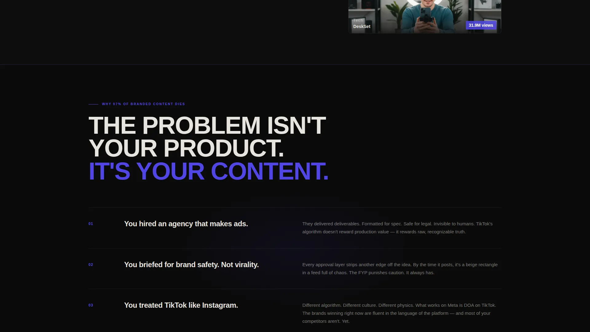
Manifesto-Driven Scroll Narrative
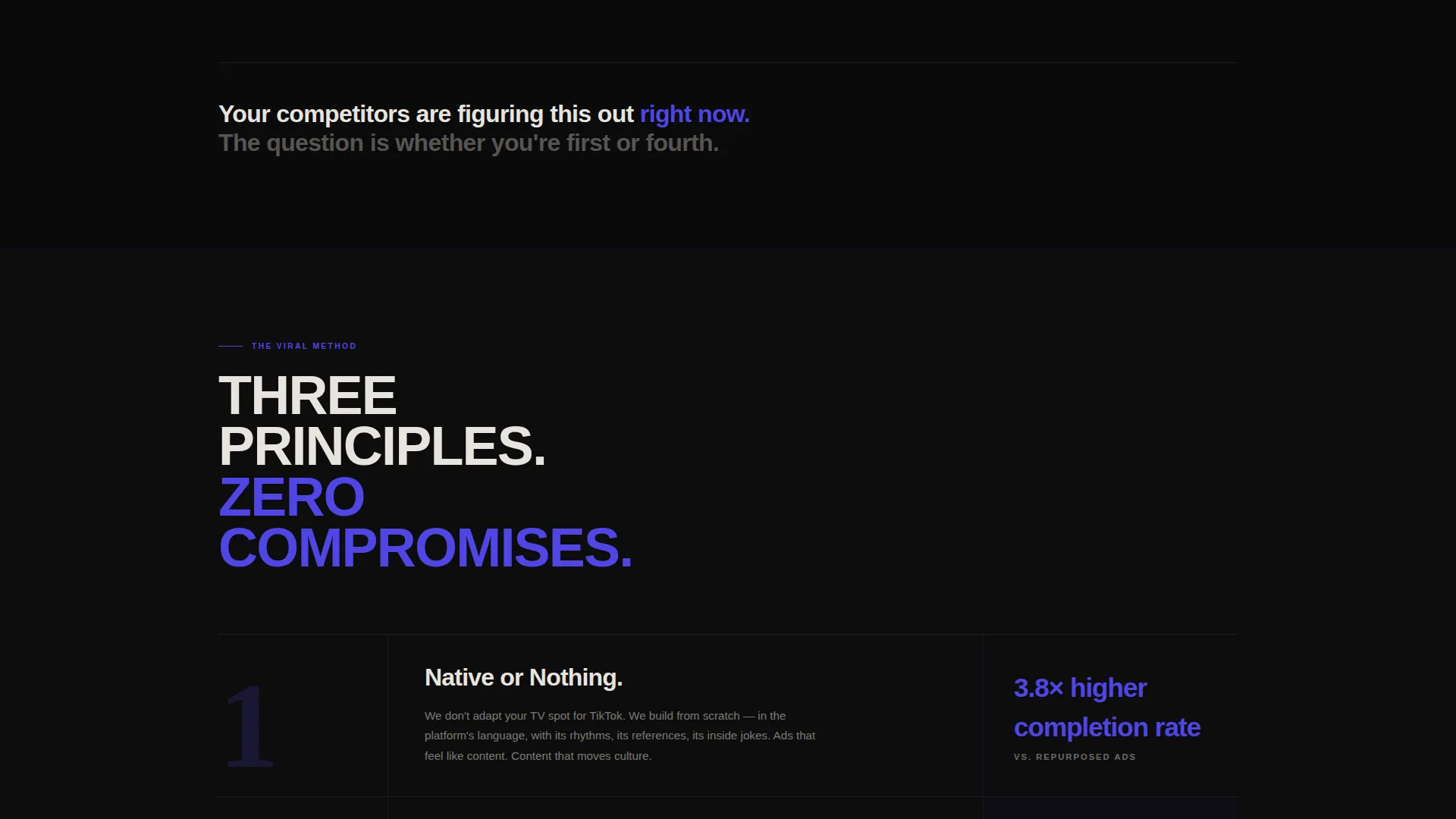
The copy structure follows a deliberate rhythm: provocation, proof, provocation, method. A dedicated section explains why most branded content fails. This is followed by three blunt, numbered creative principles that define the agency's process. The scroll never lets the visitor settle into comfort.
Qualified Lead Generation Form
The form is placed after the metrics proof section, when credibility is at its highest. It collects a brand URL, a monthly ad spend range (covering three tiers from ten thousand to over one hundred thousand dollars), and a single open-text field labeled "What's not working?", filtering serious prospects before the first call.
Sticky Call-to-Action Bar
A persistent bottom bar follows the visitor throughout the scroll. It repeats the primary call to action, "Send Us Your Worst Ad", so the conversion prompt is always one tap away, regardless of where the visitor is on the page.
Electric Indigo Visual Identity
The color system uses deep void black as the dominant background, raw concrete off-white for body text, electric indigo for headlines and calls to action, and neon violet reserved for hover states and data callouts. The palette is built to feel like a warehouse rave, ultraviolet, overexposed, and thrumming with energy.
Page sections overview
| Section | Purpose |
|---|---|
| Full-Bleed Header | Opens with provocation and sets visual tone |
| Metrics Proof Block | Displays hard performance numbers in large-format type |
| TikTok Thumbnail Feed | Shows real campaign thumbnails autoplaying on hover |
| Manifesto Copy Section | Explains why most branded content fails |
| Creative Process Principles | Outlines three numbered agency principles |
| Lead Generation Form | Captures brand URL, budget range, and open qualifier |
| Sticky call to action Bar | Repeats primary call to action on every scroll position |
Design & branding system
The visual identity is rooted in Bold Brutalism, raw, unapologetic, and built for impact. Nothing here looks templated or safe.
- Color palette: void black (#0D0D0D) as the base, raw concrete off-white (#E8E4DF) for text, electric indigo (#4F46E5) for headlines and calls to action, and neon violet (#7C3AED) for hover and callout states
- Typography: heavy brutalist type stacks with unkerned, oversized letterforms that sit heavy on the page, headlines feel spray-painted, not set
- Layout: the 60/40 asymmetric grid creates visual tension and keeps the eye moving between proof and provocation without losing structure
Mobile & speed optimization
The template is designed to translate the brutalist energy of the desktop experience into a format that works on the device your audience actually uses, their phone.
- The asymmetric grid reflows cleanly for single-column mobile viewing without losing the visual hierarchy
- Large-format metric typography scales down proportionally so numbers remain the dominant visual element on smaller screens
- The sticky call-to-action bar is built for thumb-friendly tapping at the bottom of the screen on mobile devices
How this template helps you convert
Every design and copy decision in this template is built to move a hesitant visitor toward submitting the lead form.
- The manifesto narrative creates urgency by making the visitor feel their competitors are already ahead, every stat and thumbnail reinforces that the clock is ticking.
- The form is deliberately placed after the metrics proof block, so visitors arrive at the ask already convinced of the agency's credibility and track record.
- The spend range selector and open-text qualifier do double duty: they reduce friction for the visitor while pre-qualifying budget and intent for the agency.
Other information about this template
This template is part of a broader set of agency and portfolio landing page templates built for high-intent niches. A few additional details worth knowing before you build:
- The template is designed as a single-page layout, all sections live on one scrollable page with no internal navigation to separate pages
- The TikTok thumbnail feed in the 40-column is set up for visual proof display; actual video content would need to be added by the user during setup
- The "Send Us Your Worst Ad" call to action and form field labels are fully editable to match your agency's voice and intake process
- This template fits naturally within the Social Media and Influencer Agency category and is optimized for the TikTok marketing agency niche specifically
- The Bold Brutalist theme and Electric Indigo color system are applied consistently across every section, making it straightforward to swap in your own brand assets without disrupting the layout
Theme
Bold Brutalist
Creative direction
Manifesto
Color system
Electric Indigo
Style
Asymmetric Grid (60/40)
Direction
Lead Generation
Page Sections
Full-bleed Manifesto Header
Asymmetric 60/40 Grid Layout
Manifesto-driven Scroll Narrative
Qualified Lead Generation Form
Sticky Call-to-action Bar
Electric Indigo Visual Identity
Related questions
Who is this landing page template built for?
Can I change the headline and call-to-action text?
What does the lead form collect from prospects?
Is this template suitable for a mobile audience?
Can I use this template if my agency covers more than just TikTok?


