Optometrist Booking Website Template
A split-screen optometrist patient education landing page built around a seven-question vision risk quiz. Each scroll section pairs a jargon-free clinical explanation with an interactive anatomical diagram or vision simulation. The Slate and Sky color system and animated line-art header create a calm, precise first impression that moves curious visitors toward booking a comprehensive eye exam.
by Rocket studio
Quick summary
This landing page template is a patient education hub for optometry practices. It uses a 50/50 split-screen layout to walk visitors through four eye health topics, then converts their curiosity into appointment intent through a gated seven-question vision risk assessment. The design feels clinical and trustworthy without being cold.
Who this template is for
This template is built for optometry practices that want to educate prospective patients before they ever sit in the exam chair. It speaks directly to people who already sense something is off with their vision but have not yet scheduled a visit.
- Optometrists and eye care clinics targeting adult patients who work long hours at screens
- Practices wanting to reach parents concerned about their child's worsening near vision
- Optometry offices serving diabetic patients who need regular retinal screenings
What problem this template solves
Most people delay eye exams because vague discomfort does not feel urgent enough to act on. This template closes that gap by turning passive curiosity into informed, motivated appointment intent.
- Visitors learn about refractive error, digital eye strain, pediatric myopia, and diabetic retinopathy in plain language
- Each section builds quiet clinical urgency without alarming the reader
- The progressive quiz converts education into a personal risk summary, making the decision to book feel logical and timely
What you get with this template
You get a fully structured single-page layout with five distinct content sections, an interactive quiz component, and a persistent call-to-action bar. Every element is purpose-built for an optometry patient education context.
- A full-viewport animated line-art hero with a headline fade-in and a primary "Check Your Vision Risk" call to action
- Four split-screen educational panels covering key vision conditions, each ending with a doubt-seeding question
- A seven-question progressive disclosure quiz with an email capture gate and a secondary "Book a Comprehensive Exam" path for high-risk results
Feature list
This template packages a focused set of interactive and visual capabilities drawn directly from the project brief.
Animated Line-Art Hero
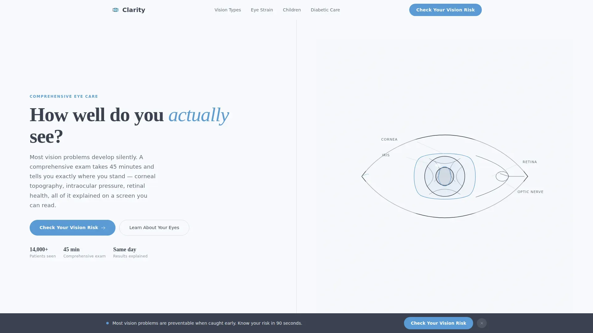
The header fills the full viewport with a continuous-stroke SVG illustration of the human eye. The line draws itself over two seconds on page load, labeling the iris, lens, retina, and optic nerve in quiet slate type. A headline fades in beside the illustration as the animation completes.
Split-Screen Expert Panels
Each of the four condition sections divides the screen equally between a plain-language clinical explanation on the left and an interactive anatomical diagram or simulated vision comparison on the right. The panels use scroll-triggered reveals and staggered entries to pace the reading experience.
Seven-Question Progressive Quiz
The vision risk assessment opens with low-friction lifestyle questions and moves into symptom recognition and family history flags. Results are gated behind an email capture field with the micro-copy "We'll send your personal risk summary and what to ask your optometrist."
Persistent Bottom Call-to-Action Bar
After the second scroll section, a fixed bottom bar keeps the primary call to action visible throughout the rest of the page. This ensures the quiz entry point is never more than a glance away.
Secondary High-Risk Conversion Path
Visitors who receive a high-risk score on the assessment see a "Book a Comprehensive Exam" button appear on the results screen. This secondary path converts educational engagement directly into appointment intent without interrupting lower-risk readers.
Vision Comparison Sliders
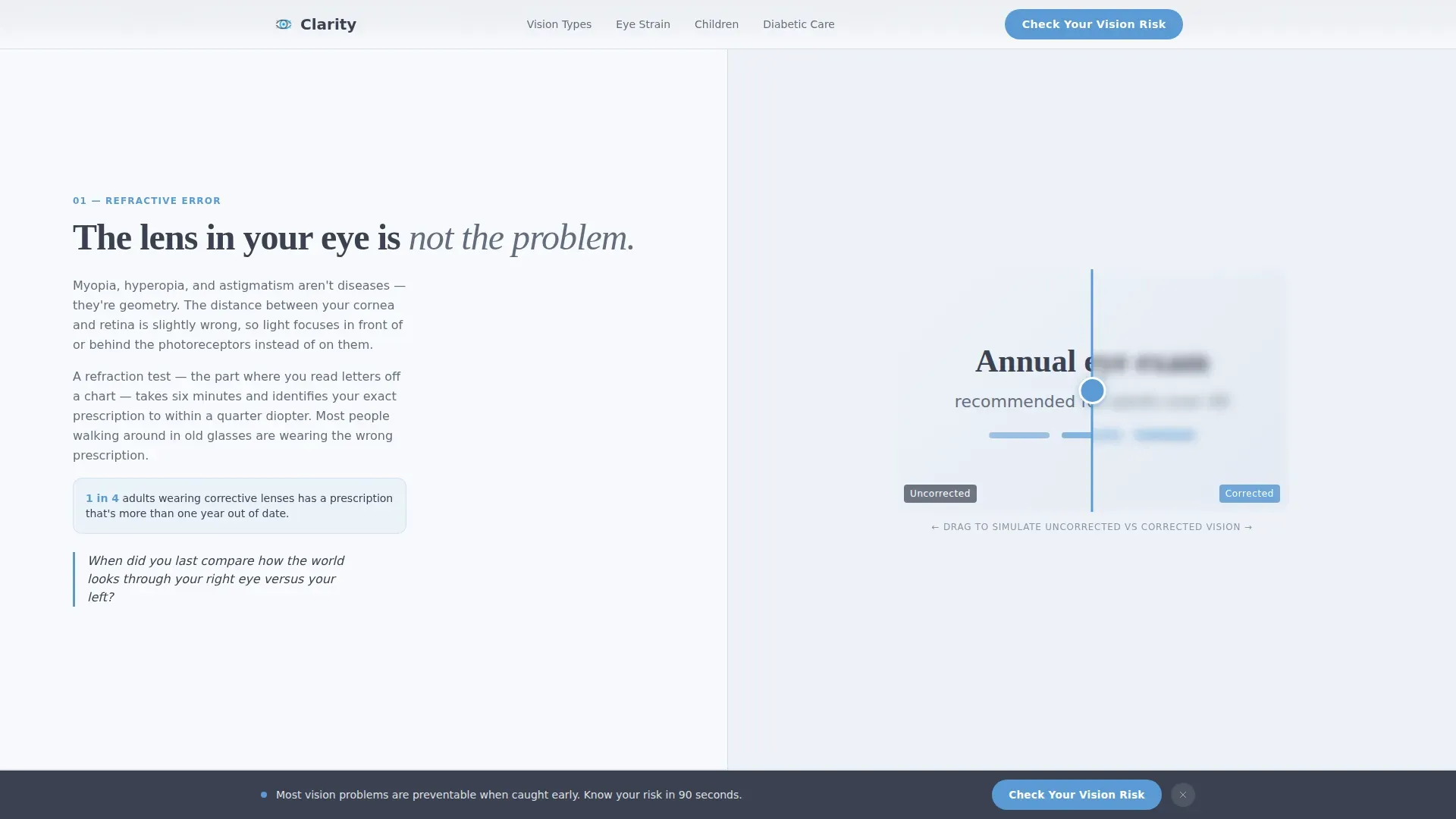
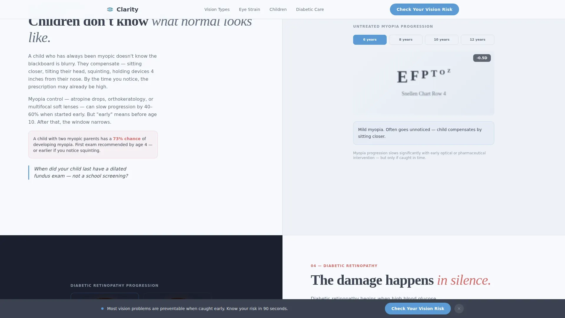
The refractive error and pediatric myopia sections include interactive vision simulation panels. Visitors can compare blurred and sharp vision states, making abstract conditions feel immediately personal and relevant.
Page sections overview
| Section | Purpose |
|---|---|
| Animated Hero | Introduces the brand, displays the self-drawing eye illustration, and presents the primary quiz call to action |
| Refractive Error Panel | Explains blurred vision causes on the left; shows a blurred-to-sharp vision comparison slider on the right |
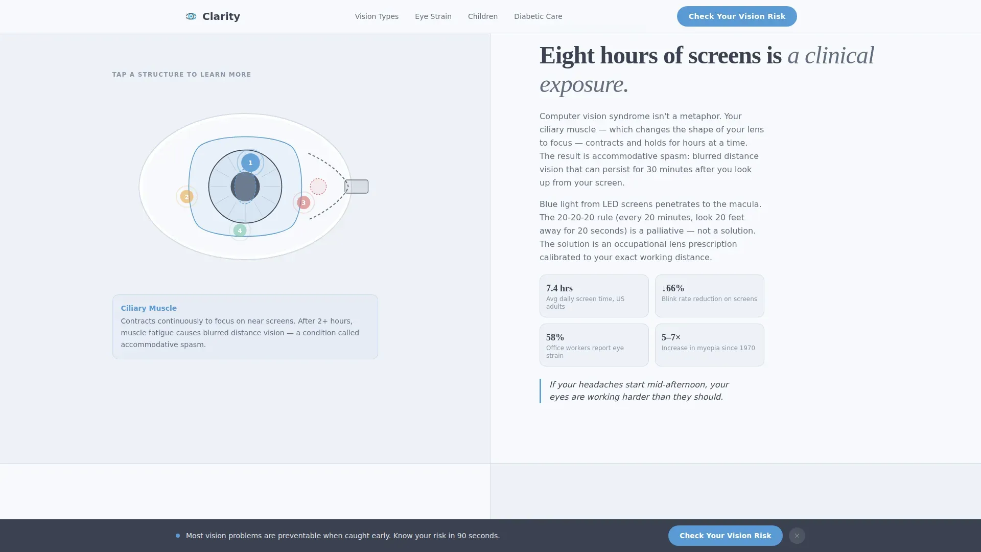
| Digital Eye Strain Panel | Covers screen-hour impact on the left; displays an interactive eye fatigue diagram on the right |
| Pediatric Myopia Panel | Presents parent-voice warning signs on the left; shows a child vision simulation on the right |
| Diabetic Retinopathy Panel | Delivers clinical urgency copy on the left; shows retinal damage progression visuals on the right |
| Persistent Bottom Bar | Keeps the quiz call to action fixed at the bottom of the viewport from the second section onward |
| Quiz and Results Screen | Hosts the seven-question assessment, email capture gate, risk summary output, and conditional booking path |
| Footer | Single-row linear footer pattern with practice contact and navigation links |
Design & branding system
The visual identity follows a Corporate Precision theme. The palette is described as resembling a freshly wiped optical lens held up to a clear morning: cool, trustworthy, and precise.
- Clinical charcoal (#3B4252) for primary text and navigation; polished slate (#636E7F) for secondary surfaces and labels; open-sky blue (#5B9BD5) for interactive elements, buttons, and progress indicators; clean-coat white (#F7F9FC) for all backgrounds
- Typography pairs DM Sans for body copy and user interface elements with Fraunces, a serif display typeface, for section callout headings
- The line-art illustration style and Corporate Precision theme carry a clinical authority tone that feels authoritative without being intimidating
Mobile & speed optimization
The template is designed desktop-first, with a deliberate mobile adaptation strategy built into the layout system.
- The 50/50 split-screen panels stack vertically on smaller screens, preserving readability without sacrificing content order
- Scroll-triggered reveals and staggered entries are handled through CSS animations on the static hero, with client-side components scoped only to the quiz and interactive diagram panels
- The SVG self-drawing animation and vision blur simulations are structured to run cleanly within the browser without requiring additional runtime dependencies
How this template helps you convert
The conversion architecture is layered deliberately, moving a visitor from passive reader to active quiz participant to appointment-ready patient.
- The primary "Check Your Vision Risk" call to action appears immediately under the hero, then again as a persistent bottom bar, keeping the entry point visible throughout every scroll section.
- Each educational panel ends with a single-line personal question that prompts the reader to apply the condition to their own life, increasing quiz start rates.
- The email gate on the results screen captures contact intent at the moment of highest engagement, and the conditional "Book a Comprehensive Exam" button surfaces only for high-risk respondents, making the booking ask feel earned rather than pushy.
Other information about this template
This template is categorized under Health and Medical, specifically the Optometrist Website subcategory, and is optimized for the Optometrist Patient Education Hub niche. It targets the United States market with English-language copy, USD references, and MM/DD/YYYY date formatting.
- The project intersection match score is 13, indicating a strong alignment between the template style, creative direction, and niche category
- The footer follows a Linear Single-Row pattern, keeping the page's closing section clean and uncluttered
- Social proof is built through condition-specific patient vignettes and clinical authority markers such as equipment names and exam process details woven into the educational panels
- The template is built for a B2C optometry context, making it suitable for independent practices and multi-location eye care groups alike
Theme
Corporate Precision
Creative direction
Expert Panel
Color system
Slate & Sky
Style
Split Screen (50/50)
Direction
Quiz/Assessment
Page Sections
Animated Line-art Eye Hero
Split-screen Educational Panels
Seven-question Vision Risk Quiz
Persistent Bottom Call-to-action Bar
Interactive Vision Comparison Sliders
Related questions
Can I adapt the quiz questions for my specific practice?
How does the split-screen layout behave on a phone screen?
Does the email capture on the results screen connect to a mailing list?
Is this template suitable for a multi-doctor or multi-location practice?
Can the 'Book a Comprehensive Exam' button link to an external scheduling tool?



