Geriatric Telehealth Landing Page Template
A warm, single-page booking landing page built for a geriatric telemedicine service. It guides mobility-limited seniors and their adult children from hesitation to a confirmed video visit in three simple form fields. The Organic Flow design, soft Alpine Fresh colors, and a 12-point comparison table remove every friction point before the visitor finishes worrying about it.
by Rocket studio
Quick summary
This landing page helps a geriatric telemedicine service turn anxious family members and mobility-limited seniors into booked video appointments. A line art hero, a 12-point clinic-versus-tablet comparison table, an animated appointment checklist, and a three-field booking form work together to build trust and remove barriers at every scroll position.
Who this template is for
This template was built for geriatric telemedicine providers who need to earn trust quickly and convert cautious visitors into scheduled video visits. It speaks directly to two real people: the senior who finds the drive to a clinic exhausting and the adult child coordinating care from another zip code.
- Geriatric telemedicine practices looking for a warm, conversion-focused landing page
- Healthcare providers serving older adults (ages 70 to 85) with mobility or transportation challenges
- Adult children (ages 45 to 58) who manage a parent's care remotely and need a clear, trustworthy booking path
What problem this template solves
Booking a medical appointment online can feel colder and more complicated than the clinic it is meant to replace. For older patients and their families, that friction is a real barrier. This template solves it by methodically showing every friction point and then removing it, one section at a time.
- Seniors and families abandon telehealth pages that feel clinical, rushed, or technically overwhelming
- Adult children coordinating care remotely need proof that the service is complete, not a shortcut
- Standard booking forms with insurance fields, date pickers, and account creation discourage the exact audience most likely to benefit
What you get with this template
You get a fully structured, single-page landing page designed around the geriatric telemedicine booking journey. Every section is purposeful, ordered to match how a cautious visitor thinks, and styled to feel warm rather than institutional.
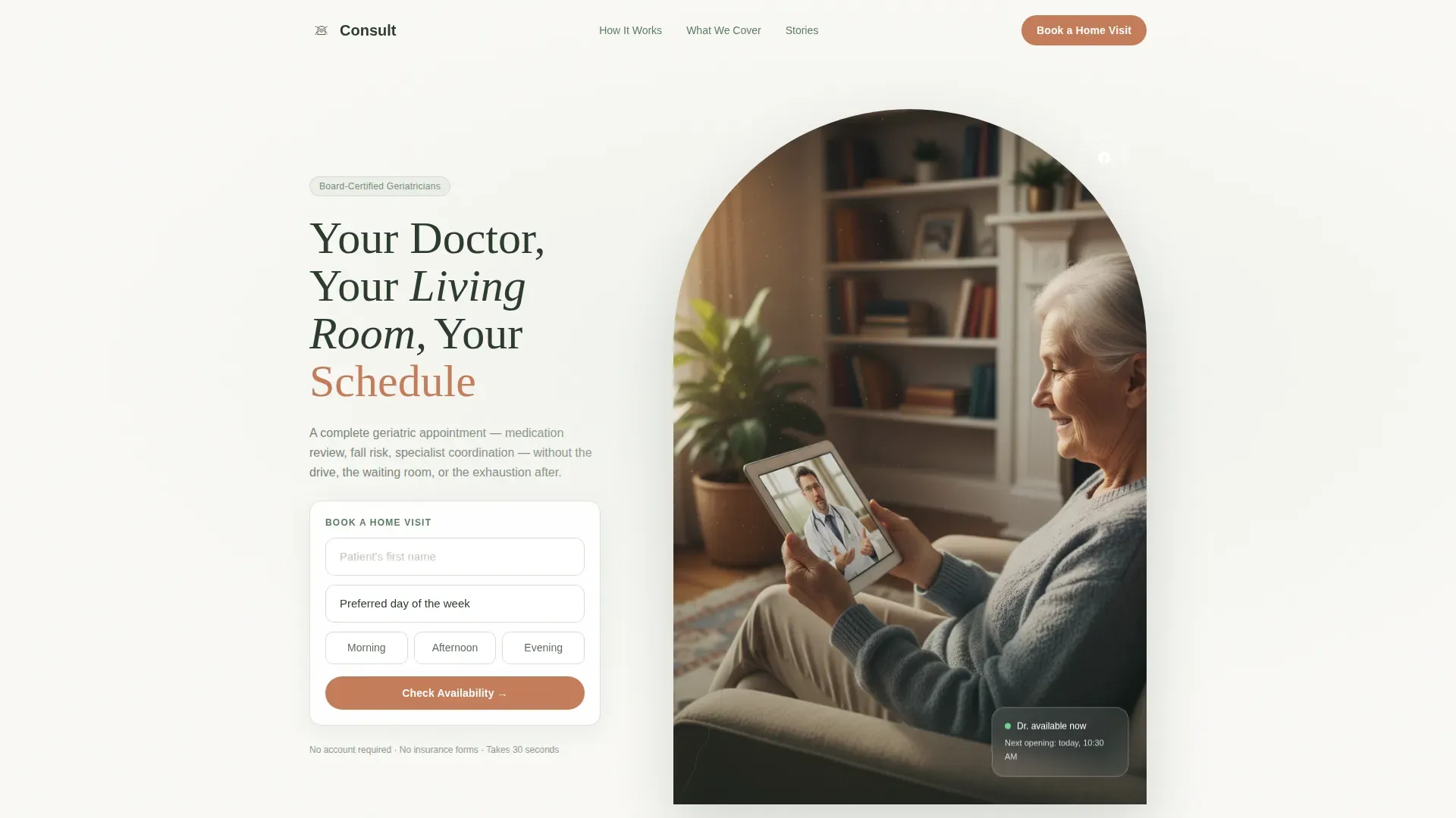
- A hero section with a line art SVG animation, a headline that types out word by word, and a three-field booking widget
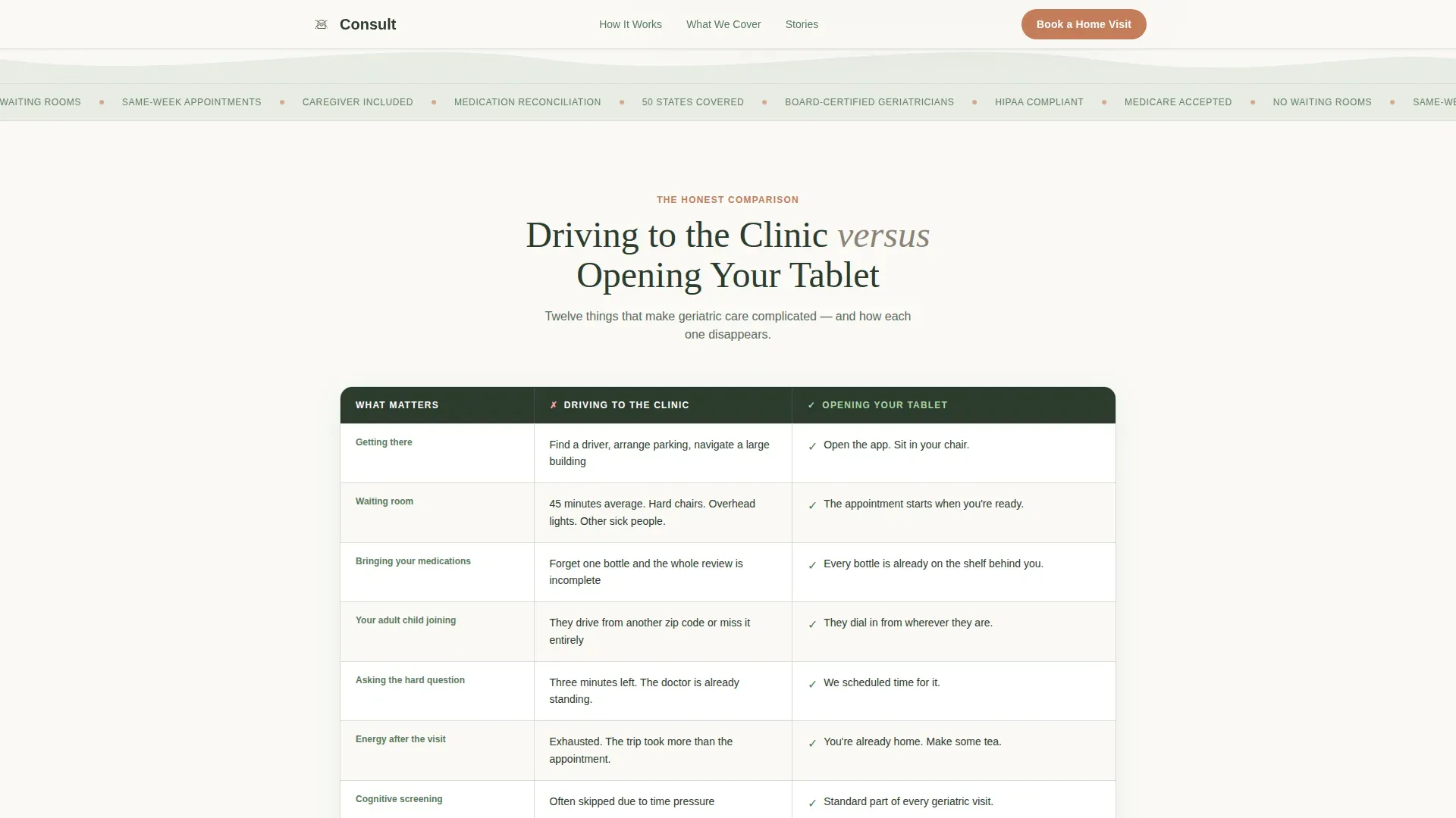
- A 12-point comparison table auditing clinic visits against tablet-based home visits across real friction points
- An animated appointment checklist, a social proof section with testimonials and a stats row, and a secondary PDF download path for undecided visitors
Feature list
This template delivers a precise set of interactive and visual components drawn directly from the service brief.
Animated Line Art Hero
A continuous single-stroke illustration draws itself on page load: an elderly hand holding a tablet, a doctor's face mid-smile on the screen, a steaming cup of tea, and a suggested window with soft curtain curves. The headline appears word by word as the line completes, creating a calm, unhurried first impression.
12-Point Comparison Table
The core conversion section places "Driving to the Clinic" and "Opening Your Tablet" side by side across twelve friction points. Parking, waiting rooms, medication lists left at home, and post-visit exhaustion are all named and resolved. Visitors see their exact worries reflected and then answered.
Animated Appointment Checklist
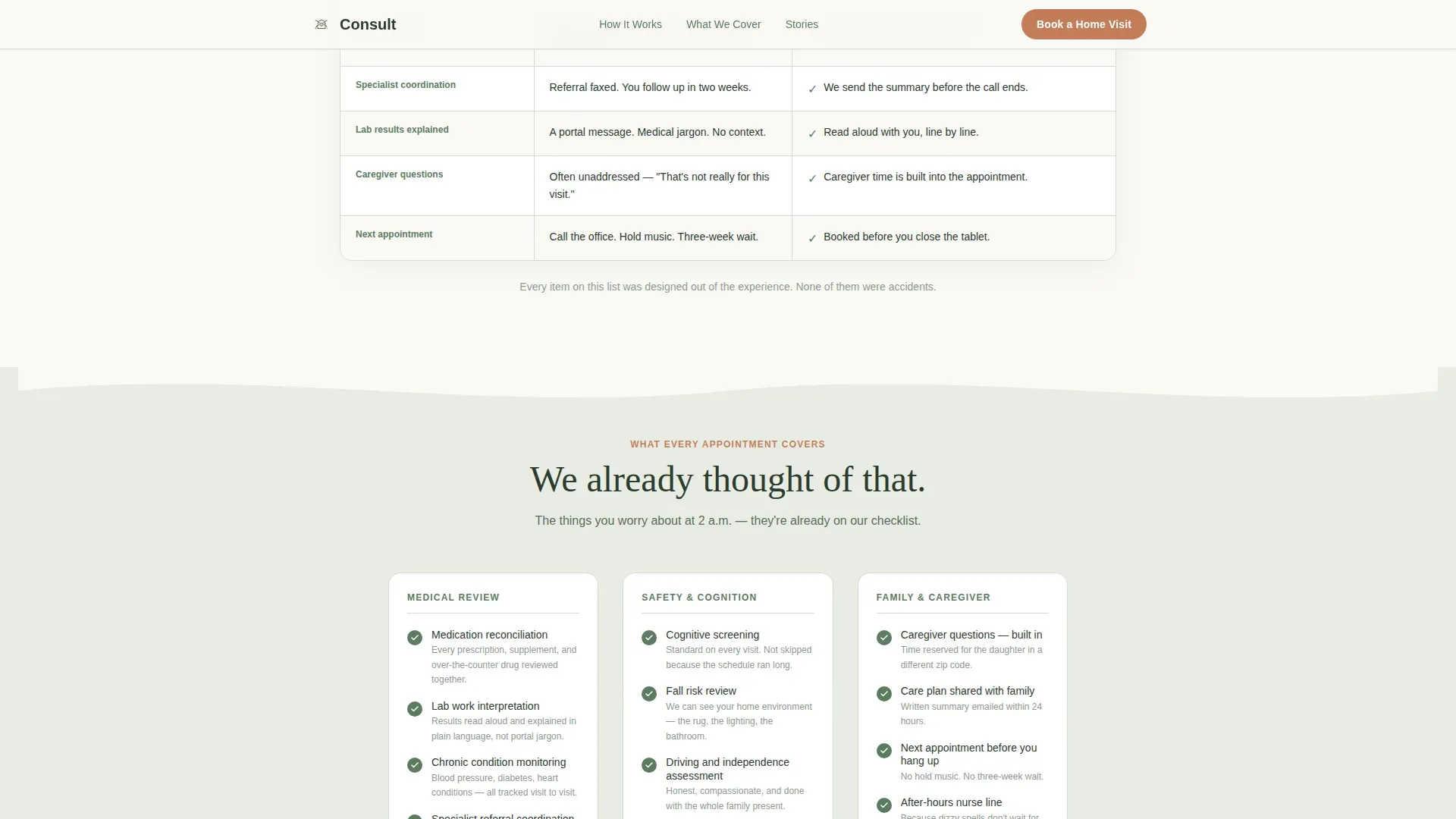
A tab-style interactive section reveals each appointment item with a soft checkmark animation as the visitor scrolls. Cognitive screening, fall risk review, medication reconciliation, caregiver questions, and specialist referral coordination each appear in turn, reassuring the visitor that nothing is skipped.
Three-Field Booking Form
The primary call to action asks only three things: the patient's first name, preferred day of the week, and best time of day (morning, afternoon, or evening). No insurance fields, no tiny date pickers, no account creation. The form proves that booking is as simple as the visit itself.
Secondary PDF Download Path
Visitors who are not ready to book are offered a printable Family Checklist that audits whether telemedicine fits their parent's needs. The download captures an email address gently, without pressure, keeping undecided visitors connected.
Social Proof and Credentials Strip
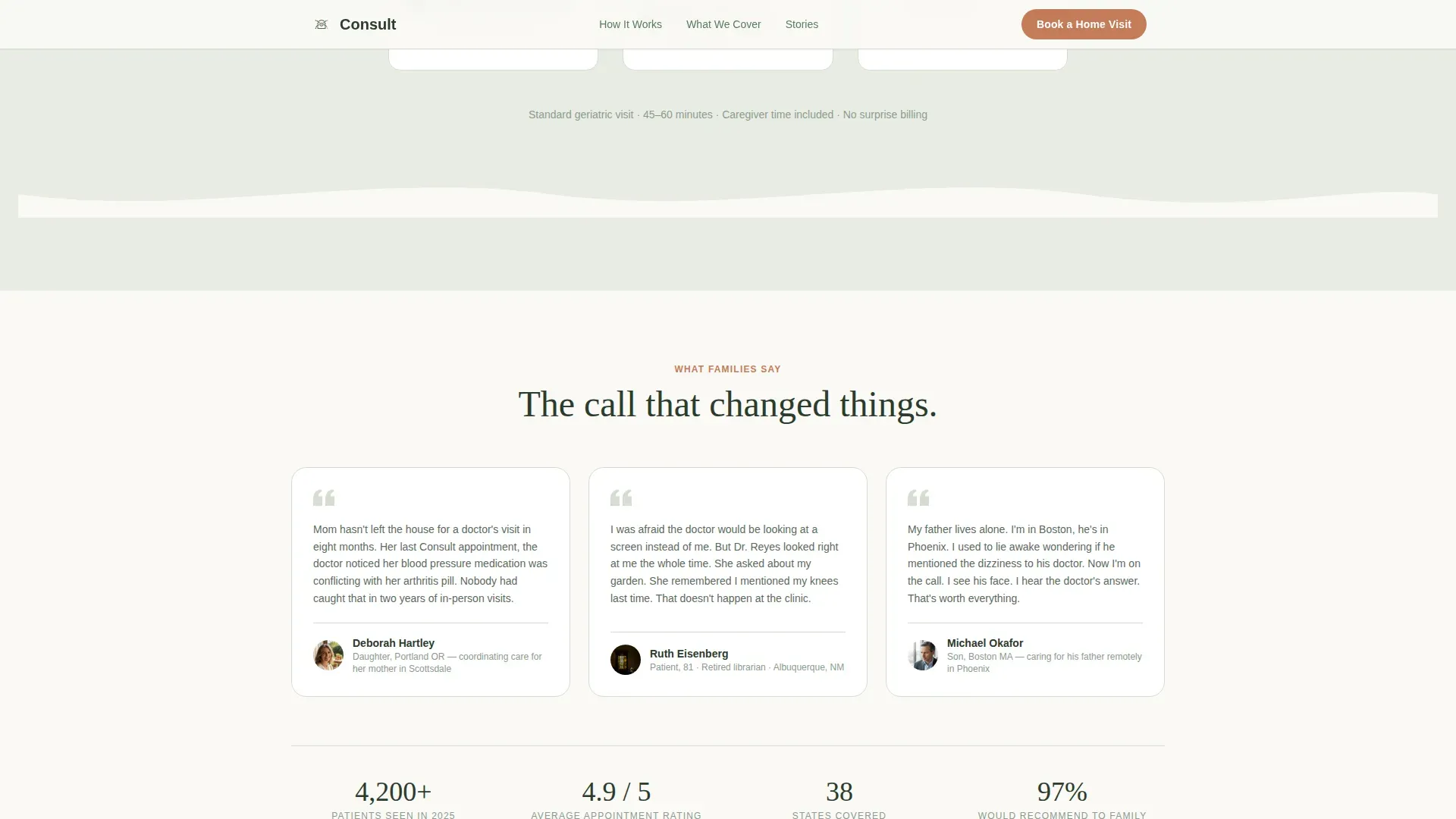
A marquee credentials strip highlights board-certification, Medicare acceptance, and Health Insurance Portability and Accountability Act compliance. A stats row shows patients seen, average rating, and states covered. Two warm testimonials, one from a daughter and one from a patient, add human context to the numbers.
Page sections overview
| Section | Purpose |
|---|---|
| Hero with Booking Widget | Introduces the service and captures intent with a three-field form |
| Credentials Marquee Strip | Builds immediate trust with board-certification and coverage credentials |
| Clinic versus. Tablet Table | Audits 12 friction points and resolves each one visually |
| Appointment Checklist | Shows exactly what each visit covers using animated checkmark reveals |
| Testimonials and Stats | Adds social proof through real patient and family voices plus a stats row |
| Footer Arc Pattern | Closes with logo, tagline, navigation links, and social icons |
Design & branding system
The visual identity follows an Organic Flow theme with the Alpine Fresh color system. Every design decision moves away from clinical sterility toward the quiet warmth of a trusted home visit.
- Color palette: soft pine (#5B7C5E) for headers and navigation, morning fog (#E8EDE4) for section backgrounds, birch bark white (#FAF9F6) for open space, and alpine wildflower (#C47D5A) reserved for buttons and interactive highlights
- Typography: Fraunces serif for warm, trustworthy headlines paired with DM Sans for clean, readable body copy
- Layout language: soft curves, arch shapes, and flowing section dividers throughout, with nothing sharp or institutional
Mobile & speed optimization
The template is built mobile-first because the primary visitor, an adult child coordinating a parent's care, is most often on a phone. Every interactive element is sized and sequenced for touch use.
- The three-field booking form is thumb-friendly, with large tap targets and no small date-picker grids
- Static content sections use server components while interactive elements (the checklist and booking form) are handled client-side, keeping the initial load light
- Scroll-triggered fade-ins, the marquee strip, and the SVG line draw animation are all calibrated for smooth performance on mid-range mobile devices
How this template helps you convert
The entire page is structured as a progressive trust-building journey. Each section removes one more reason to hesitate before the visitor reaches the booking form.
- The comparison table names every friction point the visitor already feels, then resolves each one, so the service earns credibility before making any ask.
- The animated checklist proves the visit is thorough and complete, reassuring adult children that telemedicine is not a lesser alternative.
- The three-field booking form and the secondary PDF download path offer two conversion moments, one for ready visitors and one for those who need a little more time.
Other information about this template
This template is designed for the Health and Medical category, specifically the Geriatrics Medicine subcategory and the Geriatrics Telemedicine Service niche. It was built from a high-confidence intersection match, meaning the template style, theme, and landing page direction were all validated against the specific niche before design began.
- Template style: Comparison Table, ideal for service categories where side-by-side clarity builds trust
- Creative direction: Checklist and Audit, where the scroll becomes a methodical inventory of concerns, each one resolved before the visitor moves on
- The footer uses Arc Pattern 7: logo and tagline on the left, navigation links on the right, and social icons aligned at the base
- The page is localized for English-speaking United States audiences, using USD currency references and United States date formatting where applicable
Theme
Organic Flow
Creative direction
Checklist & Audit
Color system
Alpine Fresh
Style
Comparison Table
Direction
Booking/Scheduling
Page Sections
Animated Line Art Hero Section
Point Clinic Versus. Tablet Comparison Table
Animated Appointment Checklist
Simple Three-field Booking Form
Secondary Family Checklist Download
Social Proof Strip and Testimonials
Related questions
Can I change the comparison table rows to match my own service details?
Does the booking form connect to a scheduling or calendar system?
Who is this landing page designed for, exactly?
Can I use the PDF download section to grow an email list?
Is the line art hero animation editable?



