Expert Pediatric Allergist Landing Page Template
Breathe is a pediatric allergy clinic landing page built to turn anxious parents into booked consultations. It pairs a transparent comparison table with an inline eight-step quiz, guiding families from late-night symptom searches toward a personalized allergy risk profile. The soft watercolor palette and editorial serif type create a warm, reassuring experience from the first scroll.
by Rocket studio
Quick summary
Breathe is a single-page pediatric allergy clinic template designed for one clear goal: replace parental guesswork with clinical confidence. The layout leads visitors through a myth-busting comparison table, a proof stats row, and an inline quiz that closes with a personalized risk profile and a consultation booking prompt.
Who this template is for
This template is built for pediatric allergy clinics that need to convert anxious parents into scheduled appointments. It also works well for allergy and immunology practices that receive referrals from general pediatricians.
- Parents of young children researching unexplained hives, eczema, or food reactions
- Pediatric allergy clinics running a direct-to-parent digital presence
- Referring pediatricians who need a credible destination to send complex cases
What problem this template solves
Parents dealing with a child's allergy symptoms are overwhelmed, not uninformed. They have already tried elimination diets, over-the-counter antihistamines, and late-night forum searches. The real problem is that none of those paths give them a clear, clinical answer. This template removes that uncertainty by showing, row by row, what home guessing misses and what a proper diagnostic workup actually delivers.
- Parents leave other sites more confused than when they arrived
- Generic clinic pages do not explain what allergy testing involves or why it matters
- There is no clear next step that feels low-commitment enough for a first visit
What you get with this template
The template ships as a complete, single-page layout with every section pre-built and logically ordered. Each section connects to the next so the visitor's confidence builds as they scroll.
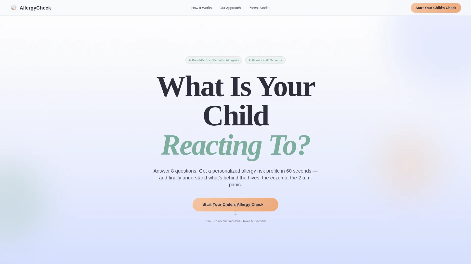
- A full-viewport hero with an oversized serif headline and a quiz call-to-action button
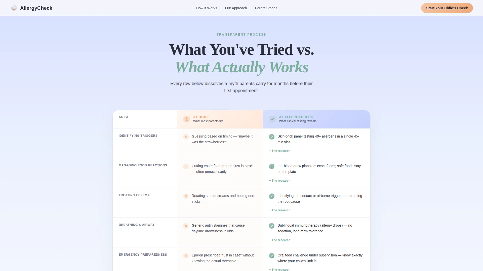
- A row-by-row comparison table contrasting home remedies with clinical diagnostic methods
- An inline eight-step quiz that produces a personalized allergy risk profile and a booking prompt
Feature list
A brief note on the feature set: every item below is drawn directly from the template brief and reflects what is built into the page layout.
Full-Viewport Gradient Hero
The hero fills the entire screen with a vertical soft gradient that fades from cloud white at the top to pale periwinkle at the bottom. The centered serif headline reads "What Is Your Child Reacting To?" with a supporting subline that sets up the quiz. No photography or icons compete with the message.
Myth-Busting Comparison Table
The comparison table places two columns side by side: what most parents try at home versus what clinical allergy testing actually reveals. Each row pairs a common behavior such as guessing triggers or relying on elimination diets with its clinical counterpart such as skin-prick panels or immunoglobulin E blood draws. Rows are accordion-style, expanding on interaction for detail.
Inline Eight-Step Quiz
The quiz opens directly on the page without redirecting to another screen. It walks through child age range, primary symptom type, onset timing, family history, and current medications across eight single-question screens. A sage-colored illustrated progress bar tracks advancement. Results deliver a personalized risk tier with a consultation booking button and an optional PDF download.
Sticky Bottom Call-to-Action Bar
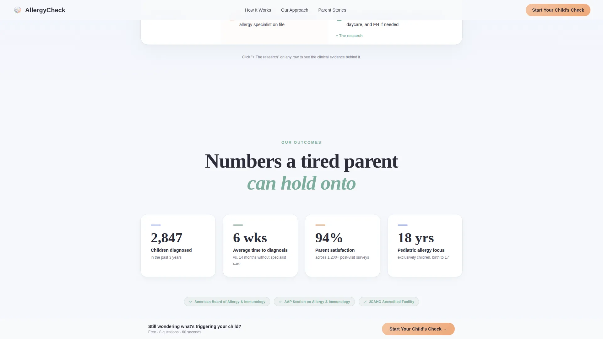
After a visitor scrolls past forty percent of the page, a sticky bar appears at the bottom of the screen. It carries the primary call-to-action button in apricot, keeping the booking prompt visible without interrupting the reading experience.
Proof Stats Row
A four-column metrics section displays clinical credibility figures such as cases resolved, average diagnosis time, satisfaction rate, and years of experience. This section builds trust between the comparison table and the testimonials.
Parent Testimonials Section
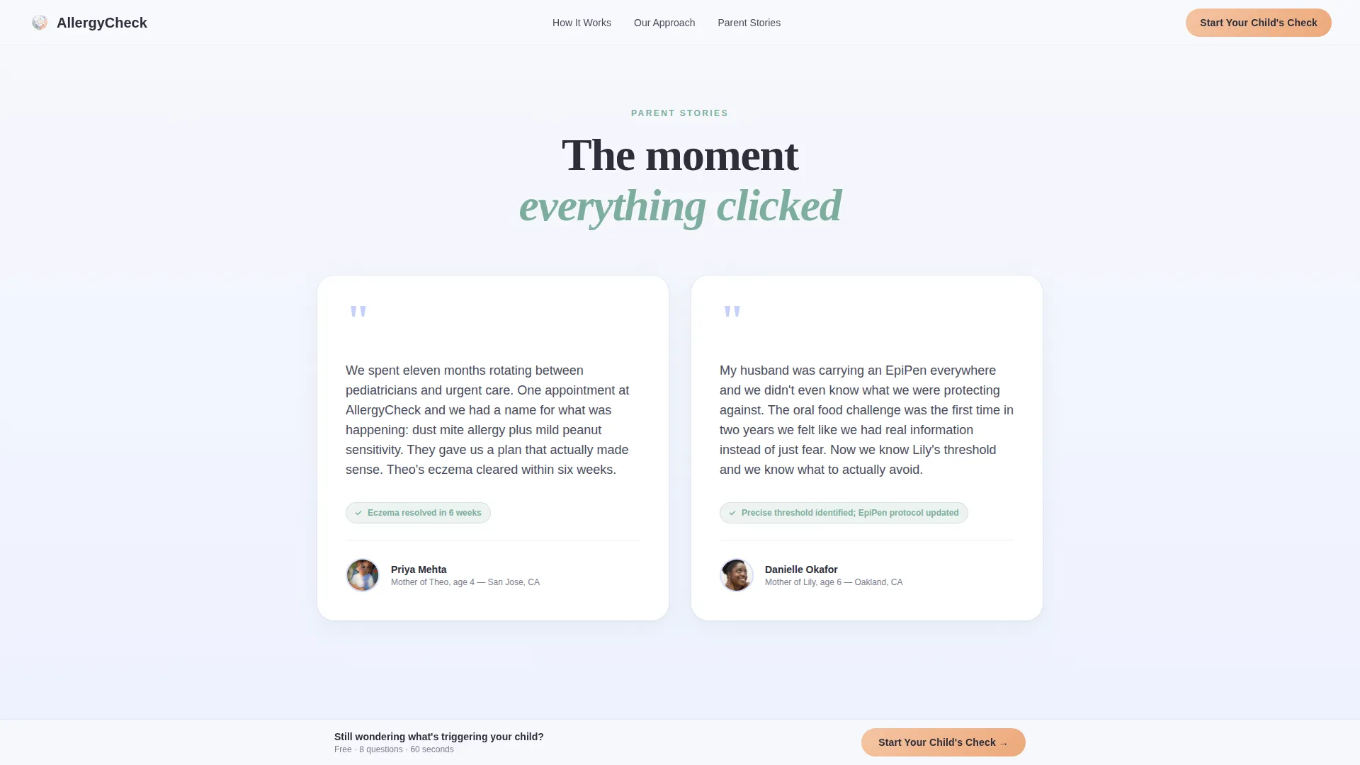
Testimonial blocks include specific details: a child's name, the symptom, and the outcome. This specificity makes the social proof feel real rather than generic, which matters for parents who are evaluating whether the clinic understands their child's situation.
Page sections overview
| Section | Purpose |
|---|---|
| Hero Headline | Introduce the clinic's core diagnostic promise and launch the quiz |
| Comparison Table | Show row-by-row contrast between home attempts and clinical testing |
| Proof Stats Row | Display four clinical credibility metrics to build trust |
| Parent Testimonials | Provide specific outcome-based social proof from real families |
| Quiz Entry Call-to-Action | Deliver the inline eight-step allergy risk assessment |
| Sticky Bottom Bar | Keep the primary booking action visible after forty percent scroll depth |
| Page Footer | Provide horizontal navigation flow and supporting clinic links |
Design & branding system
The visual language is built entirely around the Soft Mist color system. Every color choice has a functional role: cloud white and pale periwinkle create breathing room, sage signals positive outcomes, and apricot draws attention only where a decision is required.
- Cloud white (#F7F8FC) and pale periwinkle (#D6DFFE) form long vertical background gradients that feel like morning light
- Sage (#A8C5B8) marks checkmarks, trust badges, progress indicators, and affirmative row outcomes
- Apricot (#F4C4A1) is reserved exclusively for call-to-action buttons so nothing competes with conversion moments
- Fraunces serif is used for all display headlines; DM Sans handles body text for clean legibility at small sizes
Mobile & speed optimization
This template is built with a mobile-first approach because its primary audience reaches the page on a smartphone, often late at night. Every interaction is designed for a single thumb, not a desktop cursor.
- The inline quiz uses single-question-per-screen flow, which keeps each tap simple and fast on a small display
- Sticky bar reveal, fade-in scroll animations, and quiz step transitions are kept at medium weight to avoid heavy library dependencies
- The comparison table uses accordion rows so mobile visitors can expand only the rows they care about, reducing vertical scroll fatigue
How this template helps you convert
The page is structured as a confidence-building sequence. Each section removes one layer of doubt before asking for a commitment.
- The hero's quiz prompt offers a low-commitment first action: eight questions in sixty seconds, no appointment required yet
- The comparison table resolves the core objection by showing exactly what clinical testing provides that home methods cannot
- The quiz result screen delivers a personalized risk tier and a direct booking button, making the next step feel like a natural conclusion rather than a sales push
Other information about this template
This template sits at the intersection of the Health and Medical category, the Allergy and Immunology subcategory, and the Pediatric Allergy Clinic niche. It is built for a United States, English-language, direct-to-consumer audience billed in USD. The page direction is Quiz and Assessment, using a Comparison Table template style within a Soft Gradient theme and a Transparent Process creative direction. The header concept is Giant Headline Centered, and the footer follows a horizontal flow pattern.
- The intersection match score for this niche and template combination is rated at 13, indicating a strong alignment between the clinical use case and the chosen page structure
- The PDF download at the end of the quiz captures a parent's email and child's first name, providing a lead record alongside the risk profile
- The page references immunotherapy planning, specifically sublingual immunotherapy, as one of the clinical outcomes contrasted in the comparison table
- Animation is set to medium intensity: fade-in on scroll, quiz step transitions, and sticky bar reveal are included without relying on heavy front-end libraries
Theme
Soft Gradient
Creative direction
Transparent Process
Color system
Soft Mist
Style
Comparison Table
Direction
Quiz/Assessment
Page Sections
Full-viewport Gradient Hero
Myth-busting Comparison Table
Inline Eight-step Quiz
Sticky Bottom Call-to-action Bar
Proof Stats Row
Specific Parent Testimonials
Related questions
Who is this landing page template designed for?
What does the eight-step quiz actually do?
What makes the comparison table different from a standard features list?
Is this template suitable for a clinic that also accepts pediatrician referrals?
Can I adapt the color palette and typography to match my clinic's existing brand?



