Nourishing Macrobiotic Blog Landing Page Template
Nourish is a masonry-style landing page template for macrobiotic cookbook creators and recipe bloggers. It pairs a cinematic full-screen video header with a Pinterest-style gallery of recipe cards, two distinct conversion paths, a Seven-Day Reset email capture, and a Neo-Retro visual identity rooted in warm grain textures, fermented cream backgrounds, and blood orange call-to-action buttons.
by Rocket studio
Quick summary
Nourish is a single-page template built for food creators who treat recipes as a food philosophy and a form of care. It blends a scroll-driven masonry gallery with dual purchase and membership conversion paths. Warm Citrus Burst colors, Fraunces serif headlines, and staggered GSAP animations give every section the feel of a well-loved cookbook left open on a kitchen counter.
Who this template is for
This template is made for food writers and wellness creators whose meals carry real intention. It fits anyone launching a macrobiotic cookbook, a plant based cooking blog, or a recipe membership for readers who want to eat with purpose.
- Cookbook authors selling hardcover or digital editions with format-choice checkout
- Recipe bloggers building a paid membership around vegan, grain-forward, and fermented dishes
- Health and lifestyle creators targeting yoga teachers, new mothers, and health-conscious adults aged 35 to 55
What problem this template solves
Most food blog templates are built for general audiences. They cannot carry the weight of a specific food philosophy or guide visitors toward two separate conversion goals at once. Nourish solves that gap.
- Recipe creators lose readers when their page lacks visual rhythm; the masonry gallery keeps scroll momentum alive
- Cookbook sellers need a checkout path and a membership path running in parallel without one undermining the other
- Wellness food blogs need a lead magnet that earns the click; the Seven-Day Reset meal grid reveal does exactly that
What you get with this template
You get a fully structured landing page with eight distinct sections, two conversion flows, and a design system ready to carry your most delicious dishes from first scroll to checkout.
- A cinematic full-screen video header with a serif headline, a sticky blood orange call-to-action button, and a slide-out purchase drawer
- Three masonry recipe card clusters with staggered pin animations, ingredient-list previews, and a membership gate modal
- Two chapter interstitial panels with parallax ingredient photography, plus a Seven-Day Reset section with meal grid reveal and email capture form
Feature list
This template is built with high interactivity, rich visual storytelling, and practical conversion logic baked into every section.
Cinematic Full-Screen Video Header
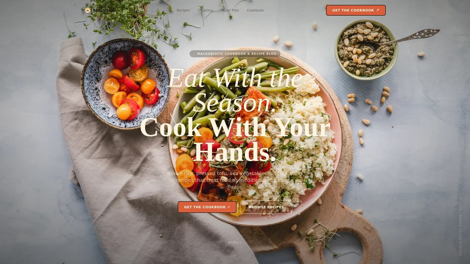
The header loops 16mm-style grain footage slowed ten percent and color-graded warm with lifted blacks. A single Fraunces serif headline fades in over the steam. A sticky blood orange peel call-to-action button stays visible as users scroll, and clicking it opens a slide-out drawer with hardcover, digital PDF, and bundle format options connected to a single-page checkout.
Masonry Recipe Card Gallery
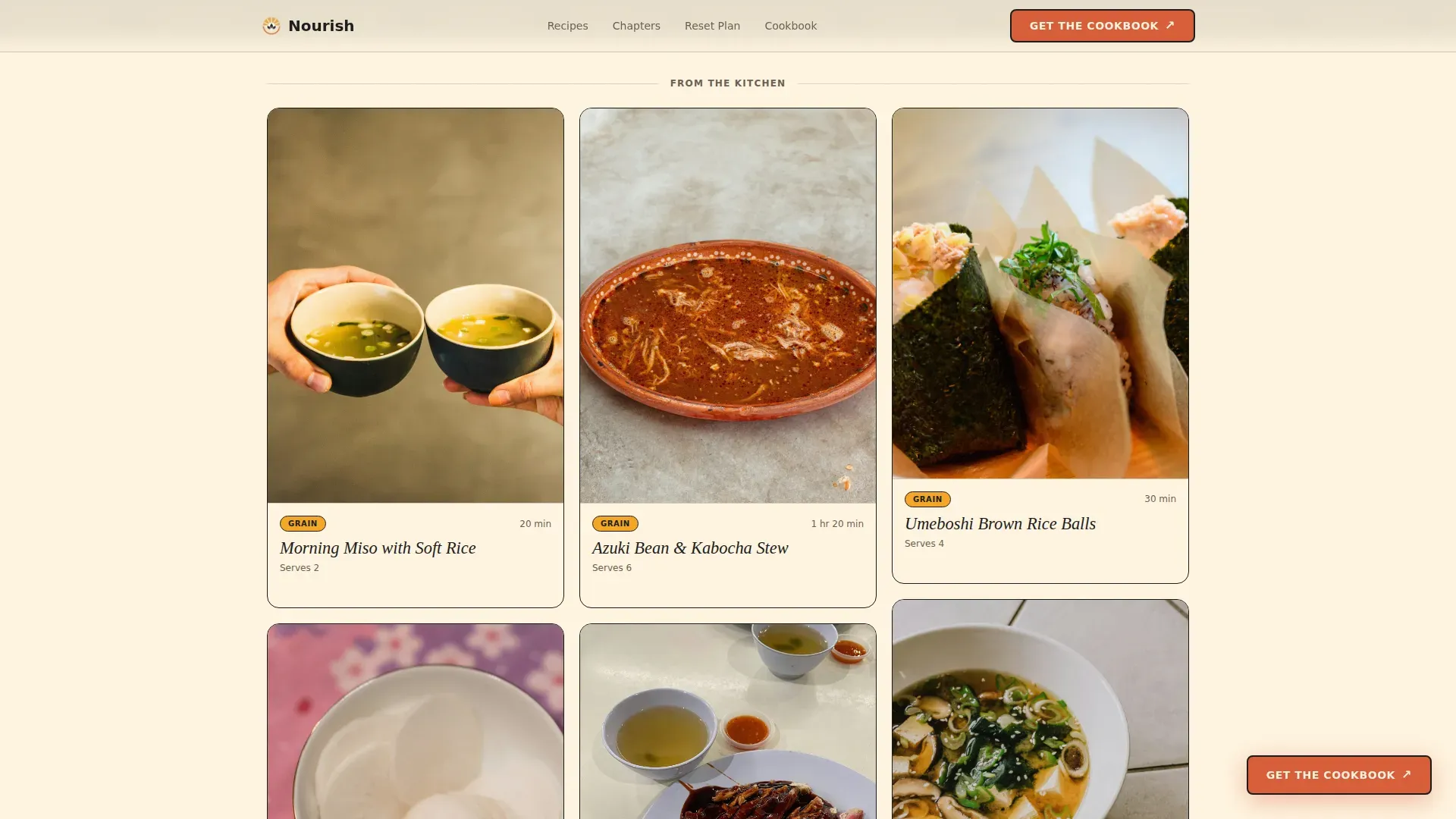
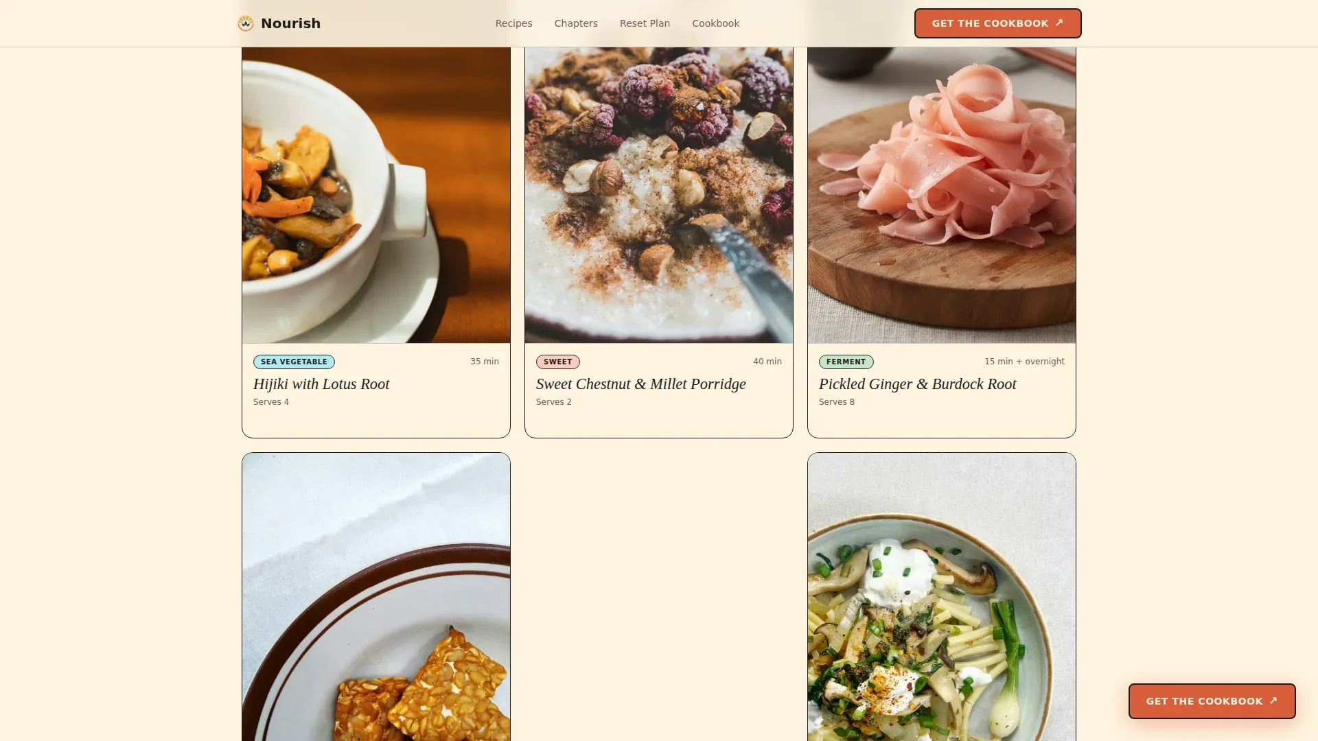
Sixteen recipe cards are arranged across three staggered clusters using GSAP ScrollTrigger. Each card displays a moody overhead food photograph, a handwritten-style title, and a small tag such as grain, sea vegetable, ferment, or sweet. Clicking any card opens a preview showing the ingredient list, with the cooking method blurred behind a membership unlock prompt.
Membership Gate and Recipe Preview Modal
Every recipe tile carries a built-in preview modal. Visitors can see the ingredients for dishes like miso soup, carrot and cucumber pressed salad, or tofu and greens bowls, but the method stays locked. A clear prompt invites them to access all recipes for five dollars per month, converting curious readers into paying members.
Seven-Day Reset Email Capture
At the midpoint of the page, a full seven-day meal grid appears before the capture form is shown. Visitors see the complete menu of meals, from morning rice bowls to dinner broth dishes, before being asked for a first name and email. This low-commitment entry point earns trust before making any ask.
Chapter Interstitial Panels
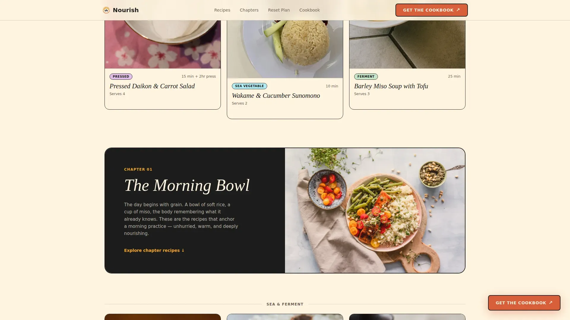
Two full-width parallax panels break up the masonry clusters. Each panel introduces a cookbook chapter with a short paragraph and a raw-ingredient photograph. The first covers morning meals and the second covers pressed and pickled preparations. They give the page breathing room and reinforce the food storytelling mission.
Neo-Retro Citrus Burst Design System
The visual identity uses fermented cream as the dominant canvas, sesame black for typography and card borders, yuzu gold for tags and hover states, and blood orange peel for call-to-action elements. Fraunces handles display type while DM Sans carries body copy. Warm grain textures and a sun-faded cookbook aesthetic run throughout every section.
Page sections overview
| Section | Purpose |
|---|---|
| Full-Screen Hero | Cinematic video header with sticky call to action drawer |
| Masonry Cluster One | Six recipe cards with staggered pin animation |
| Morning Bowl Panel | Chapter interstitial with parallax ingredient image |
| Masonry Cluster Two | Five recipe cards with membership gate preview |
| Seven-Day Reset | Meal grid reveal with email capture form |
| Pressed & Pickled Panel | Second chapter interstitial with parallax image |
| Masonry Cluster Three | Five recipe cards completing the gallery |
| Cookbook call to action Section | Purchase drawer trigger before footer |
| Horizontal Flow Footer | Site links and final conversion touchpoint |
Design & branding system
The Citrus Burst color system gives the page warmth, punch, and grounding at the same time. Every color choice references something edible: a navel orange sliced on black lacquer, a bowl of rice steaming at golden hour.
- Fermented cream (#FFF5E1) floods the canvas; sesame black (#1A1A1A) anchors type and borders; yuzu gold (#F4A623) lights up tags and hover states; blood orange peel (#D95D39) fires on every call-to-action element
- Fraunces serif handles all display headlines for a rich, editorial feel; DM Sans handles body paragraphs for clean readability
- Warm grain texture overlays and a sun-faded cookbook aesthetic create a Neo-Retro style that feels handmade and honest
Mobile & speed optimization
The template is built desktop-first because food photography demands generous screen real estate, but it is designed to deliver an excellent experience on smaller screens as well.
- Lazy image loading is built into the masonry gallery so recipe card photographs load progressively as visitors scroll
- CSS scroll-behavior keeps transitions smooth without blocking the main thread, and GSAP animations are sequenced to avoid layout jank on mobile viewports
- The masonry grid reflows into a single-column layout on mobile, keeping the recipe card format intact and touch-friendly
How this template helps you convert
Nourish is built around two parallel conversion paths that work together rather than competing. Every section moves visitors toward one of two revenue actions.
- The sticky blood orange call-to-action button and slide-out purchase drawer keep the cookbook sale visible at all times. Visitors can choose hardcover, digital PDF, or a bundle with meal-plan cards and complete a single-page checkout without leaving the page.
- The recipe preview modal inside each masonry tile creates a natural membership funnel. Visitors who want to cook the full method are invited to unlock all recipes for five dollars per month, turning casual browsers into recurring members.
- The Seven-Day Reset section captures email addresses from visitors who are not yet ready to buy. Showing the full meal plan grid before the sign form builds enough trust to earn the click without pressure.
Other information about this template
This template is designed for the US market with English copy and USD pricing built into the checkout drawer. It fits naturally into a California wellness lifestyle context as well as the broader macrobiotic tradition rooted in Japan.
- The macrobiotic diet consists of roughly 60 percent whole grains and 30 percent vegetables, a food philosophy this template communicates through its visual hierarchy and recipe tagging system
- Brown rice is rich in vitamins and minerals, and the template surfaces this through recipe card tags and chapter intros that highlight wholesome grain-forward cooking basics
- Meal planning content is a natural fit for this template; prepared dishes can be shown as ready for the fridge, served cold, at room temperature, or warmed, which broadens the appeal for busy family meal preppers
- Planning meals ahead helps reduce food waste and makes grocery shopping more efficient; the Seven-Day Reset section supports exactly this use case
- The nourish wholesome macrobiotic recipe blog landing page template is well suited to any creator whose mission is to make plant based cooking approachable, delicious, and visually irresistible
- Social proof elements including recipe tile view counts and a membership count badge are built into the template to build reader trust quickly
- The Vercel Horizontal Flow footer pattern closes the page with clean navigation and a final conversion touchpoint
Theme
Neo-Retro
Creative direction
Gallery Walk
Color system
Citrus Burst
Style
Masonry/Pinterest
Direction
Marketplace/Multi
Page Sections
Cinematic Full-screen Video Header
Masonry Recipe Card Gallery with Gate
Seven-day Reset Meal Grid and Email Capture
Chapter Interstitial Parallax Panels
Dual Conversion Path Architecture
Neo-retro Citrus Burst Design System
Related questions
Can I use this template to sell a cookbook and run a recipe membership at the same time?
Does the template include the Seven-Day Reset email capture section?
What type of cooking content works best with this template?
Is the masonry gallery easy to update with my own recipe photographs?
Who is this template built for?



