Proven Fertility Nutrition Landing Page Template
Nourish is an evidence-based fertility nutrition comparison table landing page template designed for infertility nutrition and diet programs. It guides visitors through a self-audit, a detailed dietary swap comparison table, and a clear call-to-action flow. Built on a warm Educational Guide aesthetic, it helps practitioners and program creators convert midnight researchers into enrolled clients with science-backed confidence.
by Rocket studio
Quick summary
Nourish is a single-page, conversion-focused template built for fertility nutrition programs. It pairs an interactive self-audit with an expandable comparison table so visitors can assess their own dietary habits row by row. The design feels like a trusted nutrition textbook: warm, clinical, and human. Every section moves the reader closer to understanding what to eat, what to swap, and why it matters for their cycle and their pregnancy goals.
Who this template is for
This template is built for practitioners, program creators, and wellness brands who work in infertility nutrition and diet. It suits anyone who needs to translate complex nutrition science into a page that clients can trust at midnight, when the stakes feel highest.
- Registered dietitian nutritionists and fertility-focused dietitians who want to present evidence based meal plans without a wall of clinical text
- IVF program coordinators and reproductive health coaches who need a landing page that supports click-through to a full enrollment flow
- Women's health brands and PCOS nutrition specialists who want to help clients assess their food intake and understand the diet swaps that affect hormone balance and fertility support
What problem this template solves
Getting an unexplained infertility diagnosis can feel overwhelming. Patients are sent home with a suggestion to "clean up their diet" and no roadmap. Standard nutrition pages list general advice. They rarely help a visitor assess, compare, or act. This template solves the gap between scientific credibility and practical guidance.
- Most fertility nutrition pages feel overwhelming because they lead with science and bury the plan. This template leads with the audit so clients can see themselves in the data immediately.
- Visitors who arrive mid-IVF cycle or post-PCOS diagnosis need to determine which of their current dietary habits are working against their cycle. A generic page cannot do that. A structured comparison table can.
- Program creators need a page that earns the click without requiring a form fill. This template is built specifically for click-through conversion, not lead capture, so the enrollment page carries the form.
What you get with this template
This template delivers a complete, structured landing page with every section ready to populate and publish. There are no placeholder layouts or undefined blocks. Each section has a clear purpose and a defined place in the reader's journey from confusion to clarity.
- A half-page photo and text hero header, a three-question self-audit, and a full expandable comparison table that grades each food choice as supportive or inflammatory
- A "Why the Swap Matters" evidence context section with a practitioner trust signal block, a primary call-to-action button, a secondary free checklist link, and a scroll-triggered sticky bottom bar
- Typography using Fraunces serif headings and DM Sans body text, set against a Cloud Canvas color system of parchment white, muted sage, warm graphite, and terracotta accents
Feature list
This template includes several purpose-built features that make the fertility nutrition comparison table landing page function as both an educational guide and a conversion tool. Each feature was designed with a specific audience behavior in mind.
Interactive Three-Question Self-Audit
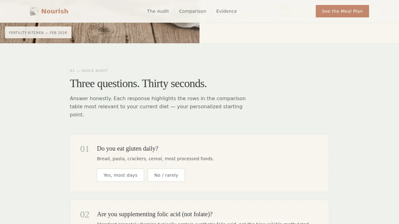
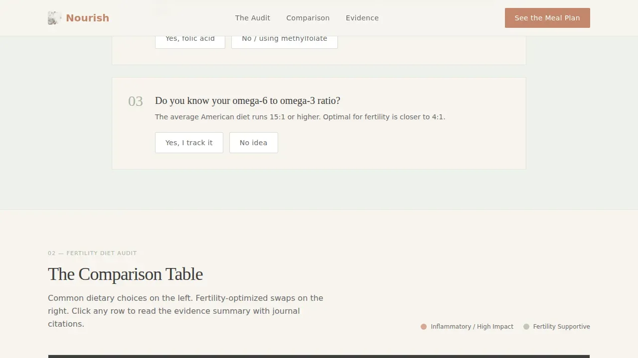
The self-audit sits directly below the hero header and asks three yes/no questions about the visitor's current diet. Do they eat gluten daily? Are they supplementing folate or folic acid? Do they know their omega-6 to omega-3 ratio? Each answer highlights the corresponding row in the comparison table below. This interaction makes the science personal immediately. Visitors do not just read about nutrition therapy; they apply it to their own food intake in real time.
Expandable Fertility Nutrition Comparison Table
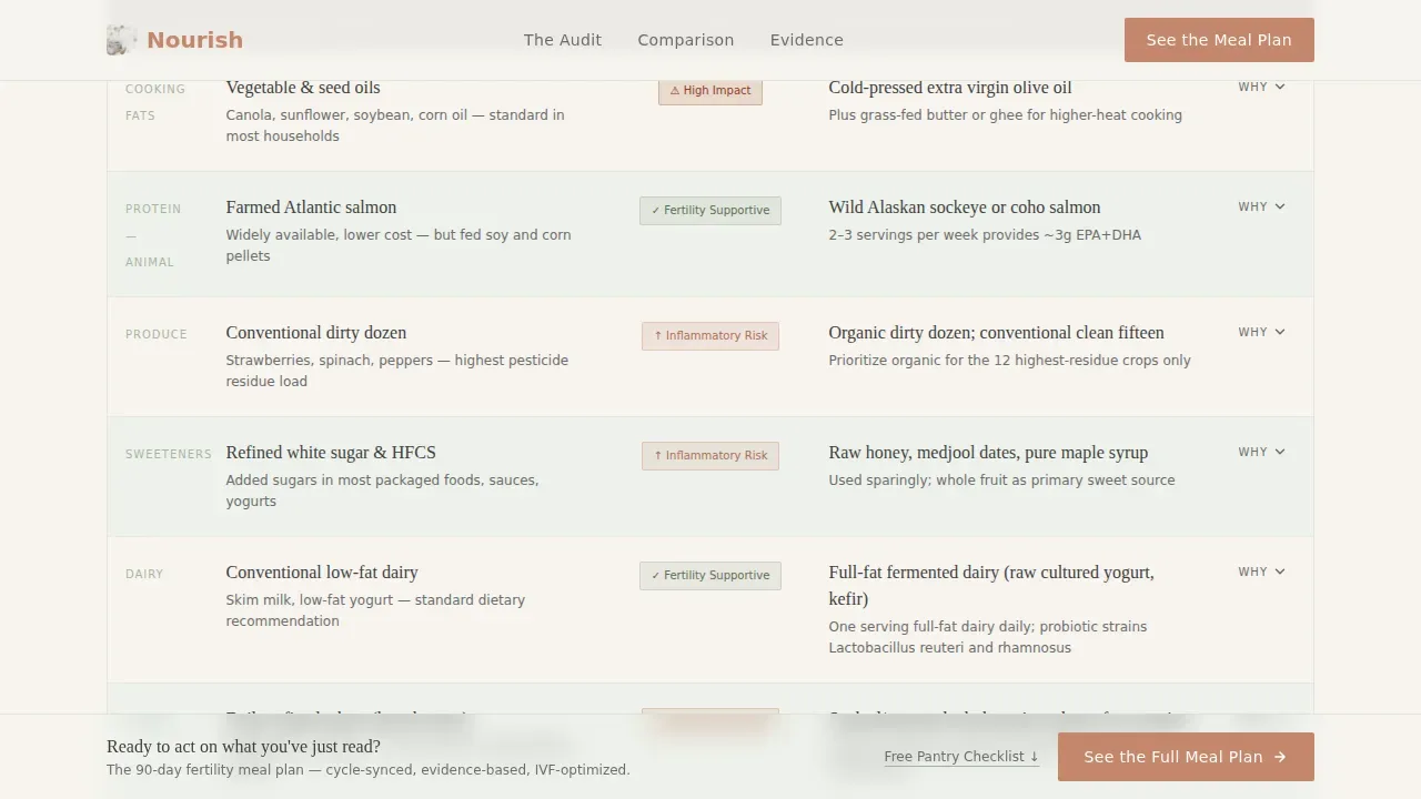
The comparison table is the spine of this template. It lists common dietary choices in the left column, fertility-optimized swaps in the right column, and a color-coded impact grade in the center. Sage indicates supportive choices; terracotta flags inflammatory ones. Each row expands on click to reveal a one-paragraph evidence summary with journal citation references. The table covers factors including ovulation support, egg quality, hormone balance, and insulin resistance management. Rows compare items such as conventional produce versus organic dirty-dozen selections, refined sugar versus raw honey and dates, soy protein isolate versus pasture-raised eggs, and standard prenatal vitamins versus methylated B-complex with CoQ10 and vitamin D3. The table is designed to be easy to scan on both mobile and desktop.
Scroll-Triggered Sticky Call-to-Action Bar
Once a visitor scrolls past the self-audit section, a sticky bottom bar activates and remains visible as they move through the comparison table. The primary call-to-action reads "See the Full 90-Day Fertility Meal Plan" and uses the terracotta button color for strong visual contrast. The sticky bar ensures the next step is always one tap away without interrupting the reading flow. A secondary text link beneath the main button offers a free fertility pantry checklist for visitors who are not yet ready to commit, giving them immediate value before the next touchpoint.
Half-Page Photo and Text Hero Header
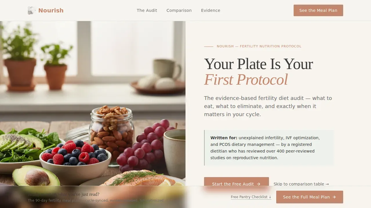
The header splits the screen horizontally. The left side holds a softly lit overhead photograph of fertility-friendly foods: wild salmon, avocado halves, dark leafy greens, pomegranate seeds, and a small dish of CoQ10 capsules arranged naturally. The right side carries a warm graphite headline and a single-line subhead that names the stakes plainly. The food photography grounds the science in something real and recognizable. Visitors see what to eat before they read why it matters.
Practitioner Trust Signal Block
The "Why the Swap Matters" section includes a dedicated area for expert endorsement. This block supports a photo, a short bio, and credentials for a reviewing dietitian, OB-GYN, or reproductive endocrinologist. Registered dietitian nutritionists hold university-level qualifications and pass credentialing exams, and surfacing that credential visually builds the trust that converts a skeptical midnight visitor into a confident click. The template also includes a designated area for contact or support information so clients know how to reach the program team.
Evidence-Based Badge and Citation System
Each expandable table row includes an inline citation block. The template includes a styled evidence badge that can display labels such as "Peer-reviewed" or "Clinically Supported" alongside the row summaries. This gives the comparison table the credibility of a structured nutrition review without the visual weight of an academic paper. The badge system reinforces that every swap recommendation is grounded in published research, not trends or generic wellness advice.
Page sections overview
| Section | Purpose |
|---|---|
| Hero Header | Split photo and headline introducing the audit premise |
| Self-Audit Block | Three yes/no questions that highlight comparison rows |
| Comparison Table | Expandable rows grading diet swaps by fertility impact |
| Why Swap Matters | Evidence context with practitioner trust signal |
| Primary call to action Block | Terracotta button linking to the 90-day meal plan |
| Secondary call to action Link | Free pantry checklist download for warm visitors |
| Sticky Bottom Bar | Scroll-triggered persistent call-to-action bar |
| Footer | Horizontal flow footer with contact and support information |
Design & branding system
The visual identity follows an Educational Guide theme using the Cloud Canvas color system. The palette feels warm enough to be human and structured enough to be trusted. Every design choice supports the tone of a well-annotated nutrition textbook left open on a sunlit kitchen counter.
- Colors include soft parchment white (#F7F4EF) for backgrounds, muted sage (#A8B5A2) for accents, warm graphite (#3D3D3D) for all body text and headings, and terracotta (#C4866C) reserved for call-to-action buttons and key callouts. Backgrounds alternate between parchment and the palest sage wash. Comparison table rows stripe in alternating warmth.
- Typography uses Fraunces serif for headings, giving the page an editorial authority, and DM Sans for body text and interface elements, keeping everything readable at small sizes on a phone screen.
- The visual rhythm is low-medium animation: rows expand and collapse smoothly, the audit highlights table rows on interaction, and the sticky bar activates only after the visitor has scrolled past the audit block. Nothing moves unless it serves the reader.
Mobile & speed optimization
This template is built mobile-first. The target visitor is often on a phone, searching late at night after a difficult consultation or a frustrating conversation with a specialist. Every layout decision accounts for that context. The comparison table is responsive and easy to read at thumb-scroll speed.
- The comparison table collapses to a single-column stack on small screens, keeping the swap and impact grade visible without horizontal scrolling. Row expand and collapse interactions are touch-friendly.
- The sticky bottom bar is sized for mobile tap targets. The self-audit questions are large enough to answer with one thumb. The hero header stacks vertically on small viewports so the food photography and headline remain visually balanced.
- The template is built static-first with no external data dependencies, keeping load behavior predictable and consistent across connection speeds common to late-night mobile browsing.
How this template helps you convert
This template earns the click by making the visitor realize, row by row, how many small dietary choices are silently working against their cycle. It does not push the reader toward enrollment; it guides them there through accumulated clarity. By the time they reach the call-to-action button, the 90-day meal plan feels like the obvious resolution to a problem they have just spent five minutes diagnosing themselves.
- The self-audit creates immediate personal relevance. Visitors stop reading about fertility nutrition in the abstract and start assessing their own food intake against an evidence based framework. That shift from passive to active reading increases time on page and deepens engagement before the comparison table even begins.
- The expandable comparison table rewards curiosity. Each row a visitor opens adds another data point to their self-assessment. The color-coded impact grades make the stakes visible without requiring a medical background to interpret. By the time a visitor has opened three or four rows, they understand both the problem and the structure of the plan that solves it.
- The dual call-to-action design serves two visitor readiness levels at once. The primary terracotta button captures visitors who are ready to enroll. The secondary free checklist link captures those who are not ready yet, giving the program a second touchpoint without requiring a form on this page. The sticky bar keeps the primary option visible without interrupting the read.
Other information about this template
This section covers additional context that helps practitioners, dietitians, and program creators understand how this template fits into the broader landscape of fertility nutrition and diet program marketing.
Registered dietitians and nutrition therapy providers often work with clients whose health goals extend well beyond a single diagnosis. Dietitians consider specific factors such as health history, age, genetics, living environment, and cooking skills when building a personalized plan. One size fits no one in fertility nutrition. This template is designed to communicate that specificity visually, so clients understand they are entering a program that will assess and adapt to their individual needs.
The comparison table format is particularly well suited to infertility nutrition contexts because the science is genuinely comparative. The mediterranean diet, for example, emphasizes whole grains, vegetables, fish, and olive oil, and has been studied extensively for its potential benefits on reproductive health. Research suggests that a correct balance of proteins, carbohydrates, lipids, antioxidants, and folate in the daily diet may enhance fertility outcomes. Findings from peer-reviewed research indicate that adequate intake of antioxidants, folic acid, and vitamin D is associated with shorter time to pregnancy. Omega-3 fatty acids from fish and cold-pressed olive oil sources are positively correlated with both spontaneous conceptions and IVF outcomes. These are not trends; they are evidence that the comparison table format can present with clarity and citation.
The template is also appropriate for clients managing conditions beyond infertility. Dietitians working with clients who have insulin resistance, PCOS, or type 2 diabetes will find the swap-and-grade format equally useful for communicating how specific dietary choices affect hormone balance, metabolism, and long term health. Clients managing digestive health conditions, including celiac disease, irritable bowel syndrome, or eating disorders, often face complex overlapping needs. A registered dietitian providing nutrition therapy in those contexts can adapt this template to reflect the relevant dietary habits and swap recommendations for those specific needs. The template structure supports that kind of content flexibility without requiring a redesign.
The Nourish evidence based fertility nutrition comparison table landing page template is built to serve programs that prioritize science over trends, personalization over generic advice, and clarity over complexity. It nourishes the reader's understanding meal by meal, swap by swap, until the plan ahead feels not just possible but necessary.
- The template includes a footer using a horizontal flow pattern with space for contact details, support links, and program navigation.
- The color system and typography are fully editable so practitioners can align the page with their existing brand identity while preserving the warm, clinical tone.
- The page includes no embedded form. All enrollment happens on the linked program page, keeping this landing page focused on the audit and click-through without the friction of a mid-page form.
- The practitioner trust signal block can display credentials for a registered dietitian, OB-GYN, or reproductive endocrinologist, supporting the kind of expert authority that clients expect from a fertility nutrition program.
- The self-audit and comparison table together help visitors assess their current dietary habits against evidence based fertility recommendations, making the free pantry checklist a natural warm-up offer for clients not yet ready to commit.
- The app of the sticky bar, secondary checklist link, and primary enrollment button gives the page three conversion layers without cluttering the reading experience.
Theme
Educational Guide
Creative direction
Checklist & Audit
Color system
Cloud Canvas
Style
Comparison Table
Direction
Click-Through
Page Sections
Interactive Three-question Self-audit
Expandable Fertility Nutrition Comparison Table
Scroll-triggered Sticky Call-to-action Bar
Half-page Photo and Text Hero Header
Practitioner Trust Signal and Evidence Badge System
Cloud Canvas Color System and Editorial Typography
Related questions
Who should use this landing page template?
Does this template include a form or sign-up flow?
Can I adapt the comparison table for conditions beyond infertility?
How does the self-audit feature work?
Is this template suitable for mobile users?



