Family Medicine Diagnostic Device Landing Page Template
Vitals is a hub and spoke landing page template built for a 3-in-1 pocket diagnostic device aimed at family medicine practitioners. It guides physicians through a clear problem-to-solution arc, covering device benefits, clinical workflows, and peer-reviewed validation, then moves qualified buyers toward a full product specifications and ordering page.
by Rocket studio
Quick summary
Vitals is a single-page, anchor-navigated landing page template for a compact family medicine diagnostic device. The layout walks physicians through the clutter problem, the unified device solution, real clinical workflows, and validation data. Every section builds confidence before presenting the primary call to action, making the click feel earned rather than forced.
Who this template is for
This template speaks directly to medical professionals who evaluate and purchase diagnostic equipment. The tone and structure are designed to match how physicians research and decide, not how general consumers browse.
- Solo practitioners running rural clinics who need one reliable, portable device
- Group practice managers standardizing equipment across multiple exam rooms
- Residency program directors outfitting new cohorts with easy-to-learn tools
What problem this template solves
Managing three separate diagnostic instruments creates real friction in a busy exam room. Clutter, multiple charging stations, and different learning curves for each device slow down both physicians and their staff.
- Three devices on the counter mean three points of failure and three maintenance routines
- Inconsistent equipment across exam rooms complicates staff training and workflow standardization
- Residents new to a practice need to learn each instrument separately, adding ramp-up time
What you get with this template
You get a fully structured, section-led landing page that takes a physician visitor from problem awareness to confident action. Every visual and copy block is purposeful and clinically grounded.
- A portrait-centered hero section with a headline that loads beneath the physician's hand
- Five content spokes covering the problem, solution, workflows, and validation
- A sticky anchor navigation bar with a persistent primary call-to-action button
- A secondary email capture path for visitors still in the comparison stage
Feature list
This template includes a focused set of built-in components that serve the educational arc from first scroll to final click.
Portrait-Centered Hero Section
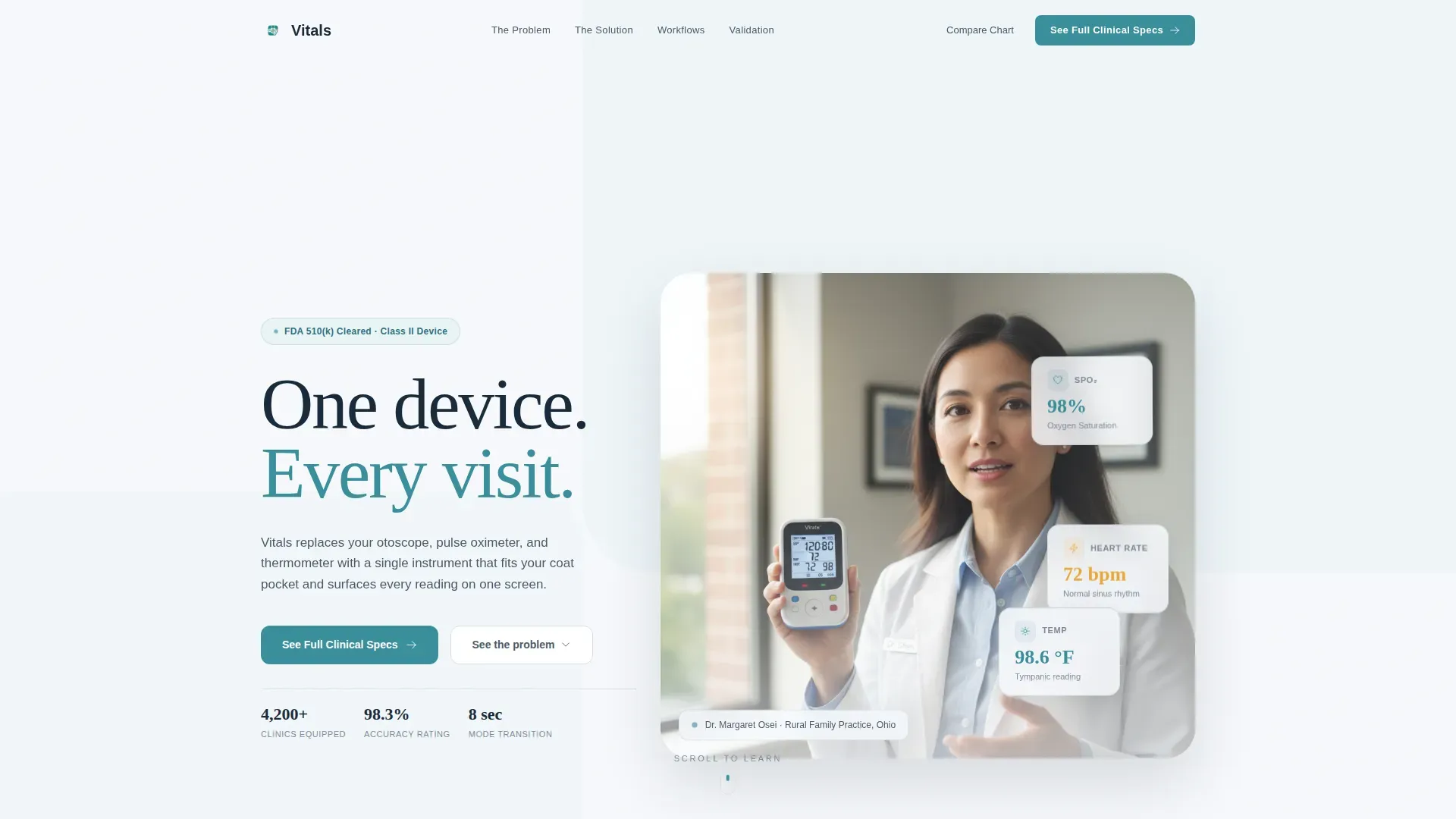
The hero places a real family physician mid-explanation, holding the device at collarbone height with the screen facing the visitor. Shallow depth-of-field framing keeps the stethoscope ambient while the headline fades in beneath her hand, creating immediate clinical credibility.
Anchor Navigation with Persistent Call to Action
A sticky hub navigation links directly to each content spoke. The primary "See Full Clinical Specs" button lives in the nav bar and persists as the visitor scrolls, so the path forward is always visible without interrupting reading.
Problem Visualization Block
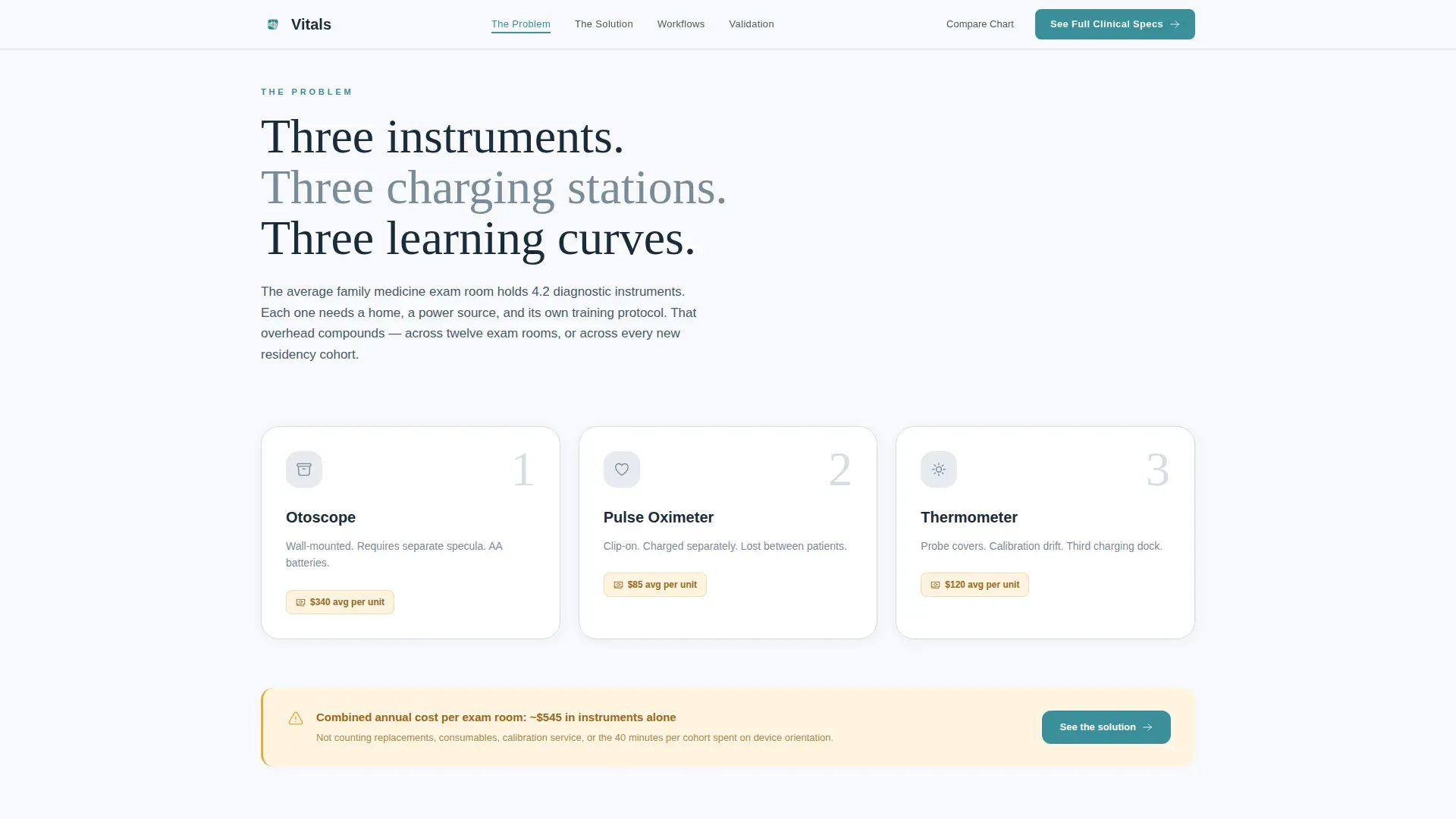
The problem section uses a comparison layout to make the three-device clutter tangible. Visitors see exactly what the device replaces before they learn what it delivers, grounding the value proposition in a real workflow frustration.
Exploded-View Solution Diagram
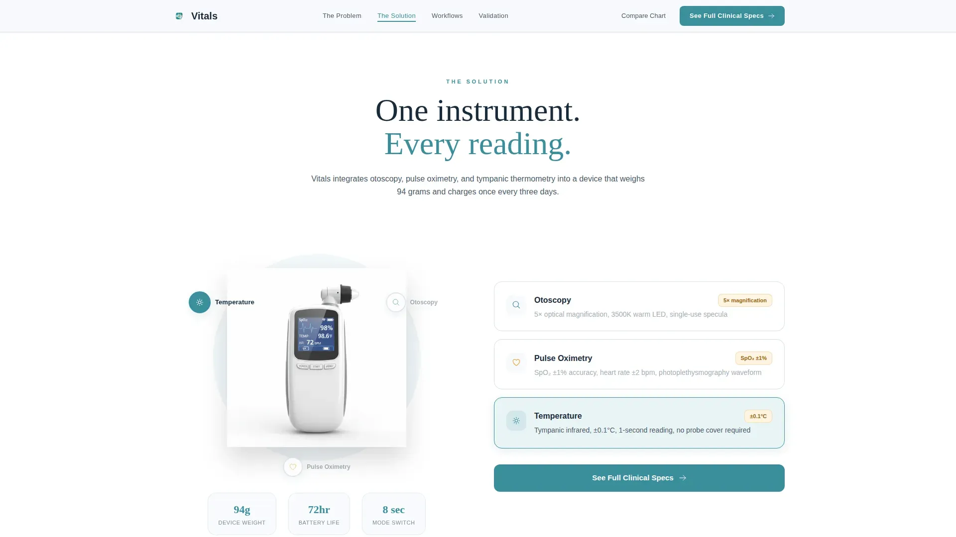
The solution section features an animated, exploded-view diagram of the device with labeled callouts. The animation reveals components progressively so the visitor understands the device architecture without needing to read a spec sheet first.
Clinical Workflow Scenario Cards
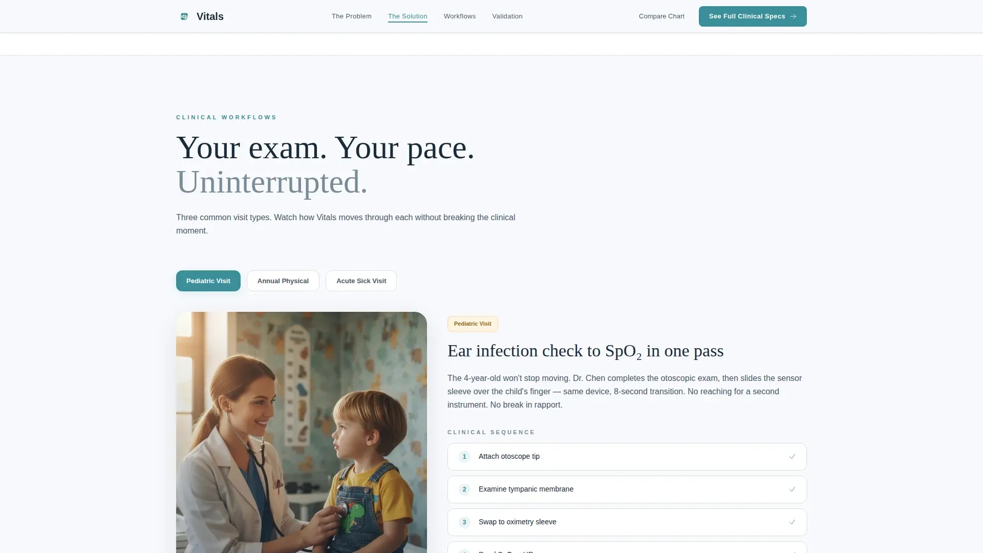
Three exam scenario cards walk through actual use cases with short looping videos. Each card is specific to a clinical moment, helping physicians picture the device in their own practice before they ever tap through to specs.
Validation and Email Capture Section
The final spoke stacks peer-reviewed citations and adoption statistics in a clean, readable layout. A single-field email capture offers a downloadable comparison chart for visitors who are still evaluating, providing a low-commitment secondary conversion path.
Page sections overview
| Section | Purpose |
|---|---|
| Hero | Introduce the device with a physician portrait and the headline "One device. Every visit." |
| The Problem | Visualize three-device clutter and name the friction it creates in daily practice |
| The Solution | Present the unified device through an animated exploded-view diagram with callouts |
| Clinical Workflows | Show three real exam scenarios via looping video cards to build use-case clarity |
| Validation | Display peer-reviewed stats and adoption data; offer comparison chart via email capture |
| Footer | Logo and tagline on the left, navigation links on the right |
Design & branding system
The visual identity follows an Educational Guide theme built on a Cloud Canvas color system. The palette feels clinical and warm at the same time, avoiding the sterile coldness of typical medical interfaces.
- Soft clinical white (#F7F9FC) dominates backgrounds so device photography has room to breathe
- Steady-pulse teal (#3A8F9C) anchors the navigation bar and all section headers for clear hierarchy
- Warm fog gray (#D6DDE6) separates content blocks like ruled lines in a patient chart, and notation amber (#E8A838) highlights tooltips, expandable diagrams, and key statistics
Mobile & speed optimization
The template is built desktop-first to match how physicians research equipment at their desks, with a solid mobile fallback ensuring the experience holds on any screen.
- Sticky navigation and scroll-triggered animations rely on client-side components to keep interaction smooth without slowing down static content loads
- Server-rendered components handle static sections, so the core page content is available quickly even before animations initialize
How this template helps you convert
The conversion strategy is educational rather than promotional. By the time a visitor reaches the call to action, they feel informed and ready, not pressured.
- The persistent "See Full Clinical Specs" button in the anchor nav keeps the primary path visible at every scroll position, reducing the effort needed to move forward
- The problem-to-solution arc builds trust section by section, so clicking through to the product specs page feels like a natural next step rather than a sales commitment
- The secondary "Download the Comparison Chart" email capture gives undecided visitors a low-friction way to stay engaged, expanding the qualified audience beyond those ready to order immediately
Other information about this template
This template is a strong fit for health and medical device brands operating in the family medicine space. A few additional details worth knowing before you build:
- Typography uses Fraunces for serif display headlines and DM Sans for body copy and interface text
- Animation is powered by GSAP ScrollTrigger, including clip-path image reveals, floating diagnostic cards, and staggered section entrances
- The footer follows a split layout with the logo and tagline on the left and navigation links on the right
- The page is localized for English (United States) with Imperial measurements (degrees Fahrenheit) and USD pricing references
- The template is designed for a click-through destination, moving qualified physicians to a detailed product specification and ordering page rather than completing a transaction on the landing page itself
Theme
Educational Guide
Creative direction
Problem→Solution Arc
Color system
Cloud Canvas
Style
Hub & Spoke (Anchor Nav)
Direction
Click-Through
Page Sections
Portrait-centered Hero with Fading Headline
Sticky Anchor Navigation Bar
Three-device Problem Comparison Layout
Animated Exploded-view Device Diagram
Clinical Workflow Scenario Cards
Validation Block with Email Capture
Related questions
Who is this landing page template designed for?
What call-to-action paths does the template include?
Does the template include animation and interactive components?
Can this template support a multi-room practice or a residency program?
What makes the design feel clinical without feeling cold?



