Research Center Landing page Template
A split-screen landing page built for family medicine research centers that serve suburban households managing multiple health needs. The template pairs a warm testimonial card hero with a sequential FAQ-driven layout, guiding visitors from first impression to a booked family visit. Gentle parallax, a slide-up booking modal, and a sticky call-to-action bar make the path to scheduling feel effortless.
by Rocket studio
Quick summary
This landing page template is designed for a family medicine research center. It uses a 50/50 split-screen layout, a testimonial card hero, and a conversation-style FAQ flow. Every section anticipates a patient question and answers it with clarity. The primary goal is to move suburban families from curiosity to a confirmed booking through warm design and honest, sequential copy.
Who this template is for
This template fits healthcare organizations that combine clinical research with everyday family care. It is especially well suited for practices where physicians and scientists work alongside each other.
- Family medicine research centers serving suburban communities
- Primary care practices offering evidence-based care across all age groups
- Healthcare groups managing chronic disease, pediatric, and geriatric programs under one roof
What problem this template solves
Suburban families often face fragmented care: separate specialists, disconnected records, and no single point of trust. This template solves the communication gap between a research-led practice and the families who need it most.
- Families cannot quickly understand what a research center offers versus a standard clinic
- Visitors leave before booking because common anxieties around trials, privacy, and insurance go unanswered
- There is no clear, low-pressure path for families who are comparing options but not yet ready to commit
What you get with this template
The template delivers a complete single-page booking experience built around the consultation-room feeling described in the brief. Every component has a specific role in moving visitors forward.
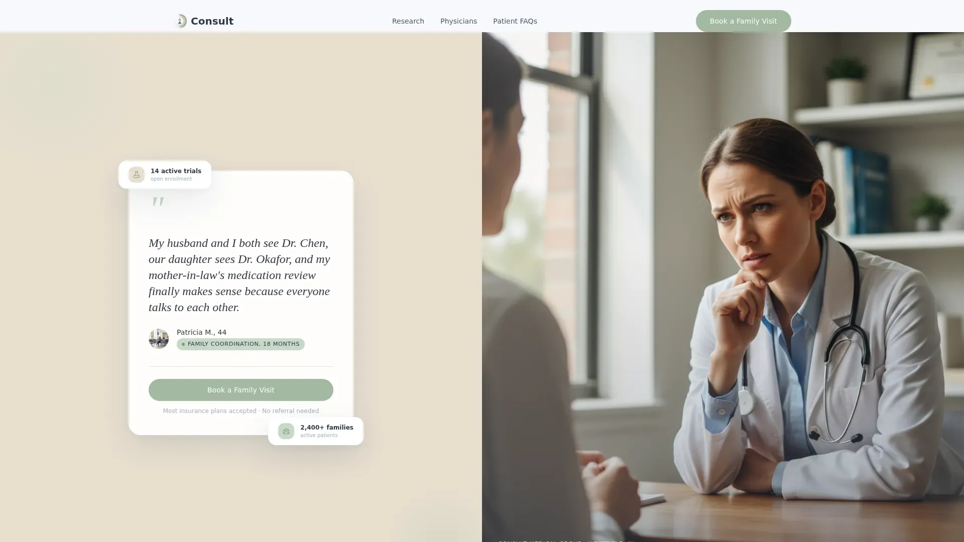
- A 50/50 split-screen hero with a parallax patient testimonial card on the left and a candid physician photograph on the right
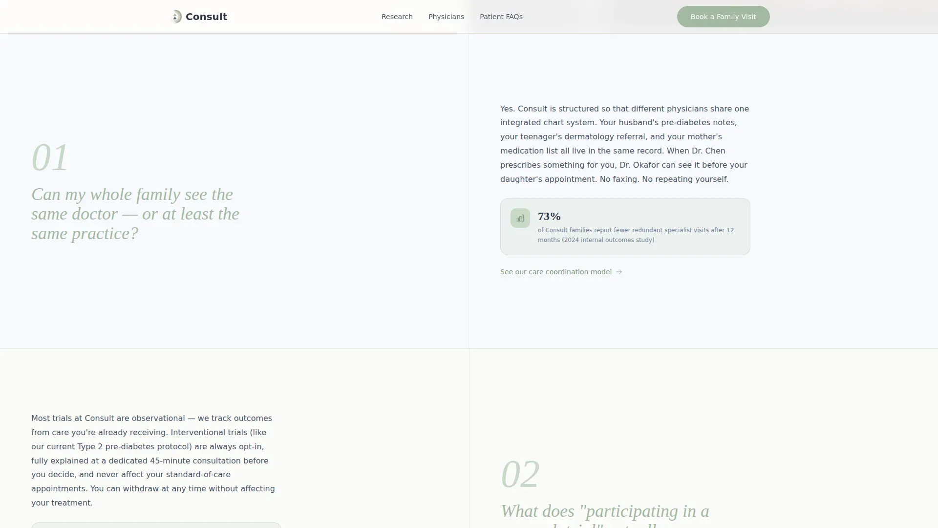
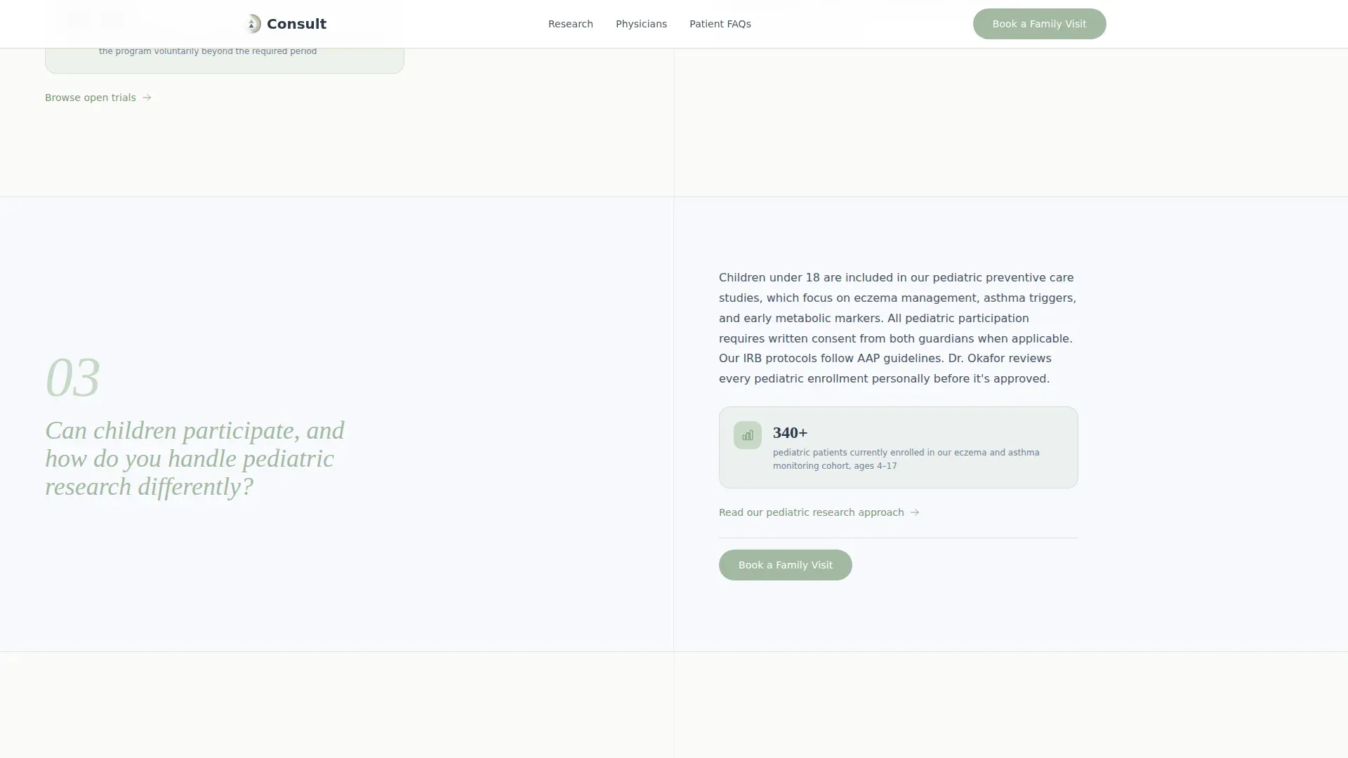
- A sequential FAQ scroll layout where each section poses one patient question in large sage type and answers it with a concise paragraph and an inline call to action
- A slide-up booking modal with visit type selection, physician preference, family size, and a date range picker
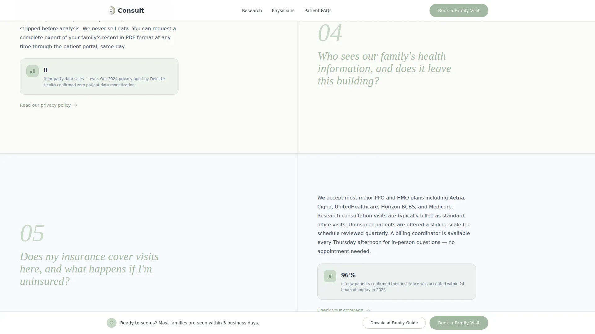
- A sticky bottom call-to-action bar that appears after the third FAQ section to maintain booking momentum
- A secondary email capture path ("Not ready? Download our New Family Guide") for visitors still in the comparison stage
Feature list
This template includes purpose-built features grounded in the project brief. Each one serves the core goal of converting a hesitant suburban family into a confirmed appointment.
Split-Screen Hero with Testimonial Card
The left half of the hero holds a softly shadowed patient quote card in warm serif type, including a first name, age, and a condition tag such as "Type 2 Management, 14 months." A subtle parallax shift makes the card feel layered and dimensional as the visitor scrolls.
FAQ-Driven Scroll Layout
Each scroll section poses a single patient question in large sage type on the left panel. The right panel answers it with a concise paragraph, a supporting data point from the center's own published research, and a small inline call to action. Questions progress from practical logistics to deeper concerns about privacy and clinical trials.
Slide-Up Booking Modal
The primary call to action, "Book a Family Visit," opens a gentle slide-up modal. The modal asks for visit type, preferred physician, number of family members attending, and a preferred date range. This keeps the scheduling experience focused without navigating away from the page.
Sticky Call-to-Action Bar
After the third FAQ section, a sticky bar anchors to the bottom of the screen. It keeps the "Book a Family Visit" prompt visible as the visitor reads deeper into the page, reducing the chance they scroll past the decision point without acting.
Secondary Lead Capture Path
A soft secondary option invites visitors to download a New Family Guide in exchange for their email address. This path serves families who are still comparing practices and not yet ready to book, reducing bounce without applying pressure.
Research Credibility Section
A bento-style layout presents published study highlights alongside physician profile cards. This section builds trust by showing that the care on offer is shaped by active, peer-reviewed clinical research conducted within the same building.
Page sections overview
| Section | Purpose |
|---|---|
| Hero Testimonial Card | Opens trust with a real patient quote and a candid physician photo in a 50/50 split |
| FAQ: Scheduling Logistics | Answers practical questions about seeing the same doctor for the whole family |
| FAQ: Research Trials | Explains what participating in a clinical trial actually means for patients |
| FAQ: Privacy and Data | Reassures families about who can access their health information |
| Research Credibility Bento | Showcases published studies and physician profiles to establish clinical authority |
| Footer Arc Split | Closes the page with navigational links and a final booking prompt |
Design & branding system
The visual identity follows a Healing Space theme. The palette and typography are chosen to feel like a well-lit consultation room: clean, unhurried, and human.
- Color system uses soft clinical white (#F7F9FC) for breathing room, calming sage (#A3B9A2) for section dividers and icon fills, warm linen (#E8DFD0) for background panels, and quiet slate (#4A5568) for body text
- Typography pairs Fraunces serif headings with DM Sans body text, giving the page warmth in large type and legibility in paragraphs
- Parallax animation on the hero card, scroll-reveal transitions on FAQ sections, and a modal slide-up interaction add motion that feels considered, not decorative
Mobile & speed optimization
The template is built desktop-first to support the 50/50 split-screen layout. On smaller screens, the split panels stack vertically so no content is lost and the reading flow stays logical.
- Split-screen columns reflow into a single vertical stack on mobile devices
- The sticky call-to-action bar and slide-up modal are both designed to work cleanly on touch screens
- Static sections use server components for fast initial load, while interactive elements like the modal and sticky bar are handled client-side
How this template helps you convert
The layout is structured as a guided conversation, not a sales page. Every design and copy decision reduces friction and builds the kind of trust that moves a hesitant visitor toward a confirmed family appointment.
- The testimonial card hero places a real patient voice at the very first moment of attention, establishing credibility before a single feature is listed
- The sequential FAQ format answers escalating anxieties in the order a real visitor would feel them, from scheduling and insurance to trial participation and data privacy, so the visitor never has to go looking for reassurance
- The two-path conversion system lets ready visitors book immediately while offering the New Family Guide to those still comparing, capturing value from both audiences without forcing a single outcome
Other information about this template
This template is part of a broader Health and Medical category and is specifically matched to the Family Medicine Research Center niche. It is a strong fit for practices that want their landing page to reflect the same standard of care they deliver in person.
- The template niche is Family Medicine Medicine, matched to suburban USA localization with English copy, United States dollar pricing context, and United States date formatting
- The Healing Space theme and Cloud Canvas color system are designed to distinguish a research-centered practice from a generic clinic, projecting warmth and clinical confidence at the same time
- The footer uses a Pattern 7 Arc Browser Split layout, providing a structured close to the page with room for navigation links and a final call-to-action repeat
- The template style is Split Screen (50/50), the header concept is a Testimonial Card, the creative direction is FAQ-Driven, and the landing page direction is Booking and Scheduling
Theme
Healing Space
Creative direction
FAQ-Driven
Color system
Cloud Canvas
Style
Split Screen (50/50)
Direction
Booking/Scheduling
Page Sections
Split-screen Testimonial Hero
Sequential FAQ Scroll Layout
Slide-up Booking Modal
Sticky Bottom Call-to-action Bar
Secondary Email Lead Capture
Research Credibility Bento Section
Related questions
Can I edit the patient testimonial and physician photo in the hero?
How does the booking modal work?
Can I use this template without an active clinical research program?
Does the secondary email capture connect to a mailing list?
Is this template suitable for a single-physician family practice?



