Bold Women-Owned Media Landing Page Template
Byline is a bold, Neo-Retro editorial landing page template built for women-owned media companies selling seasonal bundles direct to consumers. It combines a flat-lay hero image, a modular card grid, and a single-page checkout flow to move visitors from discovery to purchase. The Ink and Paper color palette and heavy serif typography give every section the authority of a print magazine.
by Rocket studio
Quick summary
Byline is a single-page, card-grid landing page template designed for women-owned media businesses that publish print quarterlies, podcast series, and limited-edition zines. It opens with a flat-lay bundle hero, flows through modular product cards and editorial-moment rows, closes with social proof and a streamlined checkout, and carries a Neo-Retro visual identity that feels like a well-loved magazine in every scroll.
Who this template is for
This landing page is built for women-led creative businesses that produce physical and digital media and need a direct-sales page that matches their editorial voice. It speaks to publishers, independent media founders, and cultural tastemakers who want a site that feels authentic to their brand rather than generic.
- Women-owned media companies selling seasonal product bundles directly to their audience
- Female entrepreneurs running a full time gig in independent publishing, podcasting, or print
- Creators and editors whose personal brands live in print, audio, and tactile objects rather than purely digital channels
What problem this template solves
Most e-commerce landing page templates are built for fashion or tech products. They lack the editorial authority, the storytelling rhythm, and the tactile visual language that a media business needs to earn the trust of its readers. A generic checkout page cannot convey the cultural weight of a hand-curated quarterly. This template solves that gap.
- Visitors land on a page that feels like a magazine, not an online store, so the brand's credibility lands immediately
- The layout guides users from curiosity to purchase without distracting navigation menus pulling them away
- The bundle pricing structure and built-in social proof section answer the key purchase objections before a visitor ever has to ask
What you get with this template
You get a fully structured, single-page landing page with every section pre-built and ready to customize. The layout is modular, so each card row can be edited independently. The color palette, typography, and animation behaviors are all defined in the design system, giving your team a consistent creative framework from the first section to the footer.
- A complete landing page structure covering hero, product cards, editorial moment, social proof, subscribe path, and footer
- Pre-styled components including a vintage price badge, sticky purchase bar, torn-paper pull quotes, and a flat-lay hero composition
- A built-in single-page checkout flow with bundle contents confirmation, shipping address, and payment fields in one uninterrupted experience
Feature list
This landing page template comes with purpose-built features that serve one goal: turning a culturally engaged reader into a seasonal bundle buyer.
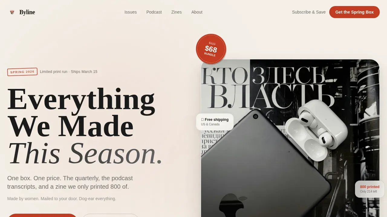
Flat-Lay Bundle Hero with Vintage Price Badge
The hero image area is designed as a flat-lay composition viewed from directly above. It includes a bold Fraunces serif headline, a typewriter-ribbon red price badge styled like a vintage rubber-stamp sticker with a struck-through original price, the bundle price, and savings called out in hand-lettered script. The upper half of the page captures attention immediately and sets the editorial tone before a visitor scrolls a single inch.
Modular Card Grid with Hover Lift
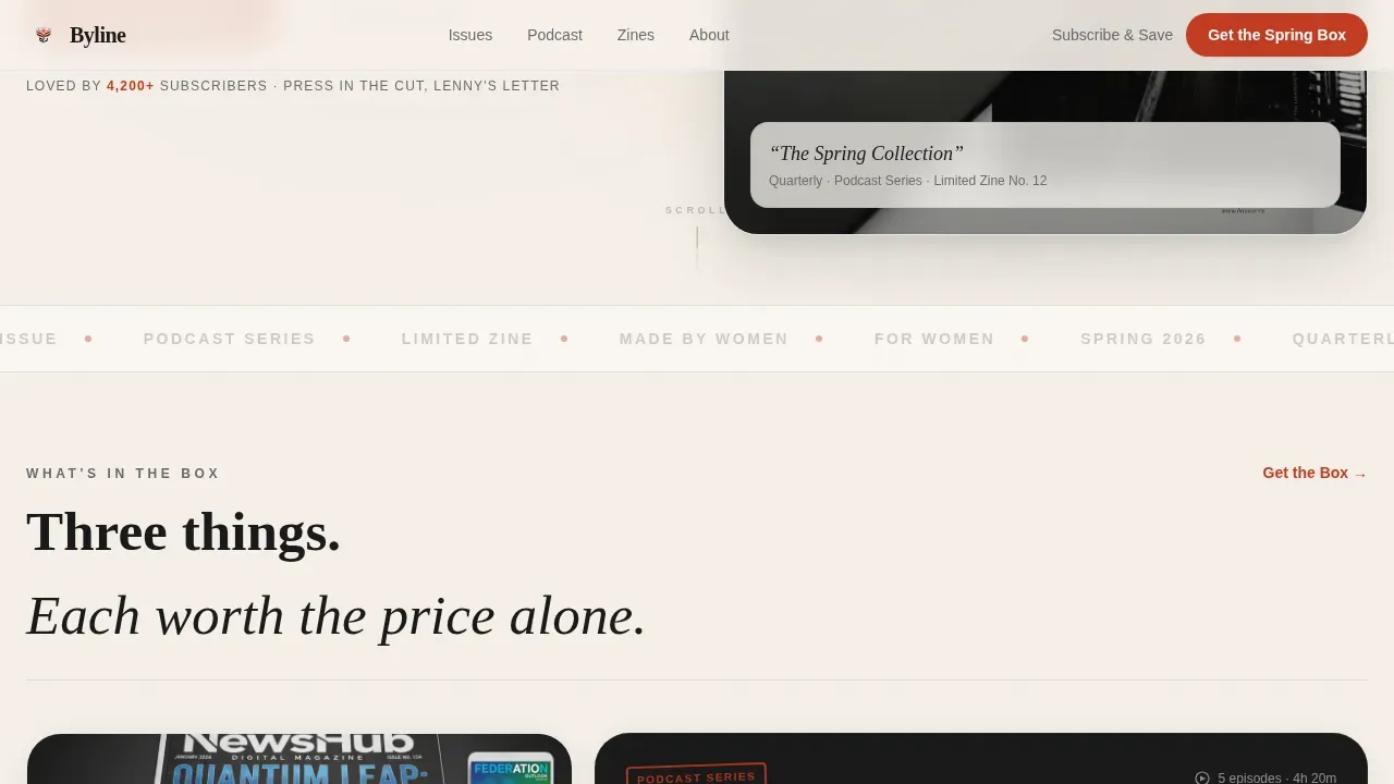
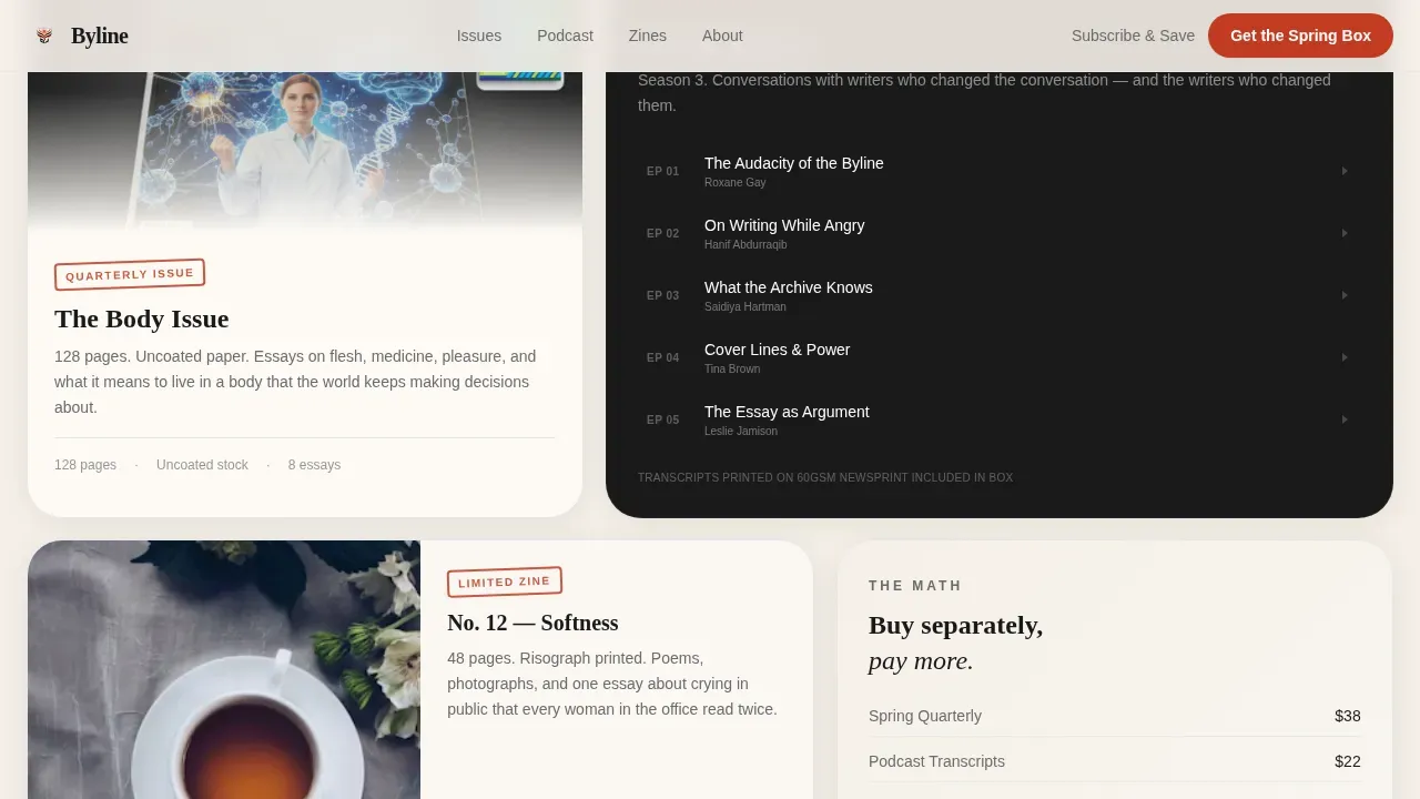
The template uses a bento-grid card layout with varied card sizes to give featured products more visual space. Each product gets its own card: the quarterly magazine with a flip-through animation tab, the podcast series card with episode titles and guest names, and the zine card with interior spread peeks. Hovering lifts any card off the page like picking up a printed piece from a table, making the landing page feel lively and tactile.
Editorial Moment Row
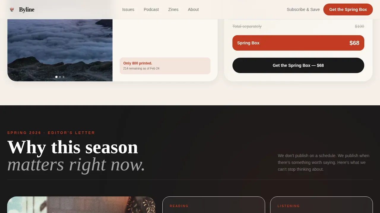
The second card row shifts from product display to cultural context. It presents short, punchy editorial writing about why this season matters, what the editors are obsessed with, and what conversations are happening right now. This section builds the value proposition in narrative form, helping visitors understand not just what they are buying but why it matters to their life this season.
Torn-Paper Social Proof Section
Social proof is styled as pull quotes printed on torn paper, combining subscriber testimonials, press name mentions, and a subscriber count badge. Including testimonials and reviews on landing pages helps build trust and credibility with potential customers, and this section delivers exactly that. The visual treatment makes social proof feel editorial rather than corporate, which keeps the page's tone consistent.
Sticky Purchase Bar with Single-Page Checkout
After the second card row, a sticky bar slides in from the bottom of the screen carrying the primary call to action. The single-page checkout flow confirms bundle contents visually, then takes shipping address and payment in one continuous form. This frictionless path from browsing to buying is designed to reduce drop-off and keep visitors moving toward one clear action.
Subscribe and Save Secondary Path
Below the primary call to action, a quieter secondary option offers automatic seasonal delivery at a lower per-box price. This path is visually subordinate but clearly legible, giving gift-subscription buyers and returning readers a reason to commit beyond a single season. Both conversion paths exist on the same landing page without competing for visual dominance.
Page sections overview
| Section | Purpose |
|---|---|
| Hero Bundle Flat-Lay | Introduce the seasonal bundle with a bold headline, flat-lay composition, and red vintage price badge |
| Quarterly Magazine Card | Show the print quarterly with a flip-through tab animation and cover detail |
| Podcast Series Card | Present the podcast with episode titles and guest names in a bento-grid card |
| Zine Interior Card | Reveal interior spreads of the limited-edition zine with peek imagery |
| Editorial Moment Row | Explain why this season matters with short punchy editorial copy |
| Torn-Paper Social Proof | Display subscriber pull quotes, press mentions, and a subscriber count badge |
| Subscribe and Save | Offer automatic seasonal delivery as a quieter secondary conversion path |
| Single-Page Checkout | Confirm bundle contents, collect shipping address, and take payment in one flow |
| Sticky Purchase Bar | Slide in a persistent call-to-action bar after the second card row |
| Editorial Minimal Footer | Close the page with a clean, horizontal footer carrying essential links |
Design & branding system
The visual identity is Neo-Retro editorial, drawing on the energy of a 1970s feminist broadsheet and refining it through a contemporary art direction lens. The result is bold, tactile, and unapologetically analog in spirit while being fully digital in execution. Every design decision in this landing page reinforces the feeling that the media behind it is made with care, intention, and craft.
- The Ink and Paper color palette uses deep editorial black for headlines, warm uncoated cream as the dominant background, typewriter-ribbon red strictly for prices and calls to action, and pencil-graphite gray for captions and metadata, creating a visually appealing hierarchy that mirrors premium print
- Elegant typography pairs Fraunces display serif for headlines and pull quotes with DM Sans for body text and user interface elements, giving the site an authoritative magazine-like confidence without sacrificing readability
- Soft colors like cream dominate to simulate unbleached paper stock, while bold colors appear with intention as red rubber-stamp accents, and each card carries a subtle cream-to-white gradient that reinforces the tactile, printed feel of the brand
Mobile & speed optimization
This landing page template is built desktop-first but delivers full mobile responsiveness so that the magazine layout remains readable on every screen size. Over 60 percent of web traffic is mobile, and the template addresses this directly with touch-friendly buttons and images that scale cleanly across breakpoints. The visual hierarchy stays intact from desktop to phone without requiring a separate mobile design.
- Large, touch-friendly call-to-action buttons and optimized images ensure the site remains fast-loading and user friendly on mobile devices
- GPU-accelerated transforms power the card hover states, parallax blobs, sticky bar slide-in, and GSAP entrance animations without relying on techniques that slow down scroll performance
- Native CSS smooth scroll keeps the single-page flow feeling fluid, so the landing page rhythm from hero to checkout reads naturally on both desktop and mobile screens
How this template helps you convert
Creating an engaging landing page for a women-owned media outlet requires balancing a bold editorial aesthetic with authority, trust, and inclusivity. This template is engineered around that balance. Every layout choice, from the flat-lay hero to the sticky purchase bar, guides visitors toward one decision: getting the seasonal bundle. A polished, professional landing page can improve your conversion rates, and this template gives you the structure to achieve that without starting from scratch.
- The flat-lay hero delivers a compelling value proposition in the upper half of the page immediately, so visitors understand the offer before they scroll, and the red price badge with struck-through pricing makes the bundle math instantly legible
- The modular card grid earns the purchase by showing each item in enough detail that every product feels worth the full price alone, and the well placed call to action in the sticky bar appears precisely when visitors have built enough desire to act
- Torn-paper social proof, press mentions, and subscriber count badges give potential customers the third-party validation they need, and the single-page checkout removes every friction point between wanting and buying
Other information about this template
This template is a purpose-built resource for women in media and publishing, but its modular card-grid structure and direct-sales landing page logic can be adapted for other use cases. Female entrepreneurs in adjacent creative fields such as independent fashion labels, art print businesses, and subscription box services will find the layout and flow directly applicable. The template is also a practical starting point for anyone turning a side hustle in content creation or independent publishing into a full time gig.
- The design avoids pink, floral, or cutesy visual clichés and instead delivers a mature, confident website design that serves women-led personal brands across other industries including wellness, cultural commentary, and specialty retail
- Users can check a live demo of the landing page before adopting it, and the modular layout makes it straightforward to swap card content, update color values, or redirect the checkout path to match a new product season
- This template belongs to a wider collection of website templates on the platform, and buyers who absolutely love the Byline style will find the design system transferable to blogs, online stores, and additional landing pages built around the same brand identity
- The byline bold editorial women owned media landing page template is categorized under Retail and E-Commerce, Women-Owned Business, making it easy to find alongside other resources built for direct-to-consumer publishing businesses
- Female entrepreneurs can use the template to create a one stop shop for a seasonal campaign: hero, product detail, editorial storytelling, social proof, and checkout all live on a single landing page without needing to open a new page for each step
- The clean layout and ample white space make key information scannable on a first page view, so visitors reach the call to action with full context and no confusion
- The template supports social media link placement in the footer and throughout the social proof section, so brands can connect their landing page audience to their broader community
- Before and after pictures of the template in use show how dramatically the Neo-Retro color palette and modular card grid transform raw product content into an editorial experience worth buying
- For teams that treat their publishing operation as a full time gig, the template reduces the time needed to launch a new seasonal campaign from weeks to hours, freeing resources for the editorial work that actually builds the brand
- The single-page checkout flow described in the template structure can support direct sales for small businesses and personal brands without requiring a separate e-commerce platform build, making this among the most practical website templates in the direct-to-consumer media category
- The template's dark background option for individual card sections creates visual contrast that makes product images and pull quotes pop, giving users a clever way to break the cream-dominant flow and signal a shift in content register
- Video testimonials can be embedded in the social proof section cards, and landing pages with video can increase conversions by up to 86 percent, making the social proof row a high-value area to invest additional production resources
- The platform allows users to explore a live demo of the Byline template, preview the full layout across breakpoints, and access all associated resources before committing, ensuring the service works as expected before any purchase is made
Theme
Neo-Retro
Creative direction
Seasonal/Moment
Color system
Ink & Paper
Style
Card Grid (Modular)
Direction
Direct Sales
Page Sections
Flat-lay Hero with Editorial Price Badge
Modular Bento-grid Card Layout
Editorial Moment Content Row
Torn-paper Social Proof Cards
Sticky Purchase Bar with Single-page Checkout
Subscribe and Save Secondary Conversion Path
Related questions
Who is this landing page template built for?
Can I adapt this template for a product other than a media bundle?
Does the template include the animations described in the design brief?
Is this landing page optimized for mobile devices?
How does the subscribe and save path work alongside the primary call to action?



