Specialist Videography & Film Portfolio Pre-Launch & Coming Soon Website Template
Vow is a cinematic wedding landing page template built for wedding filmmakers. It opens with a Before/After footage slider, unfolds through a depth-layered masonry grid of stills and silent looping clips, and closes with a parchment-card waitlist form. The Ink & Paper visual identity and Monochrome Steel palette give the page the quiet authority of a darkroom print.
by Rocket studio
Quick summary
Vow is a single-page landing page template designed for wedding filmmakers who want their work to do the talking. It pairs a cinematic Before/After slider header with a depth-layered masonry grid, a full-width ambient film moment, and a minimal waitlist form. The Monochrome Steel color system keeps every frame in focus.
Who this template is for
This template was built for independent wedding filmmakers who lead with craft and want a page that reflects that. It speaks to the filmmaker whose calendar fills by reputation, not by discount.
- Wedding filmmakers building a waitlist for a limited upcoming season
- Videographers transitioning from portfolio-only pages to an active lead-capture flow
- Film creatives targeting couples who value cinematic storytelling over slideshow packages
What problem this template solves
Most portfolio pages for videographers show work without earning trust. Visitors scroll a gallery, find no clear next step, and leave without connecting. Vow closes that gap by weaving narrative and intent into the same page.
- Couples feel the filmmaker's eye before reading a single word of copy
- The waitlist form appears at exactly the right emotional moment, after the full-width cinematic clip
- Scarcity framing ("limited to twelve films") earns action without relying on pricing or packages
What you get with this template
The template delivers a complete single-page layout with distinct, purposeful sections. Every component listed below comes directly from the design brief.
- Before/After footage slider header with a film-reel handle icon and a discreet logotype
- Staggered masonry grid with parallax depth, still frames, and silent looping clips
- Full-width ambient cinematic clip section with a floating parchment-card waitlist form
- Secondary email-only capture labeled "Just Watch the Reels" for earlier-stage visitors
Feature list
This template is built around a small set of carefully considered components. Each one earns its place in the page's emotional arc.
Before/After Footage Slider
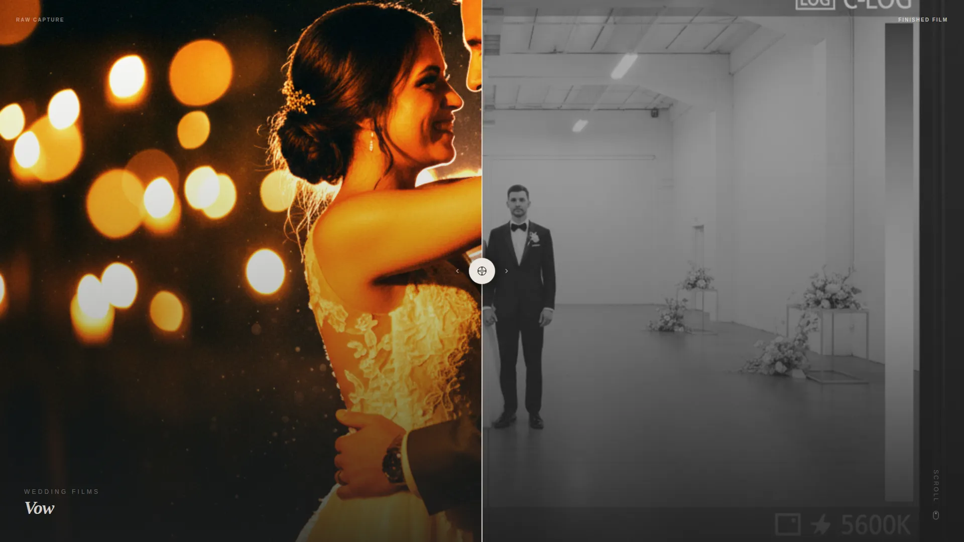
The header is a single split-screen slider. Left side shows raw, flat, ungraded footage. Right side reveals the finished grade with warm amber skin tones and deep shadow pooling. A thin vertical handle with a film-reel icon invites the visitor to drag and feel the transformation firsthand.
Depth-Layered Masonry Grid
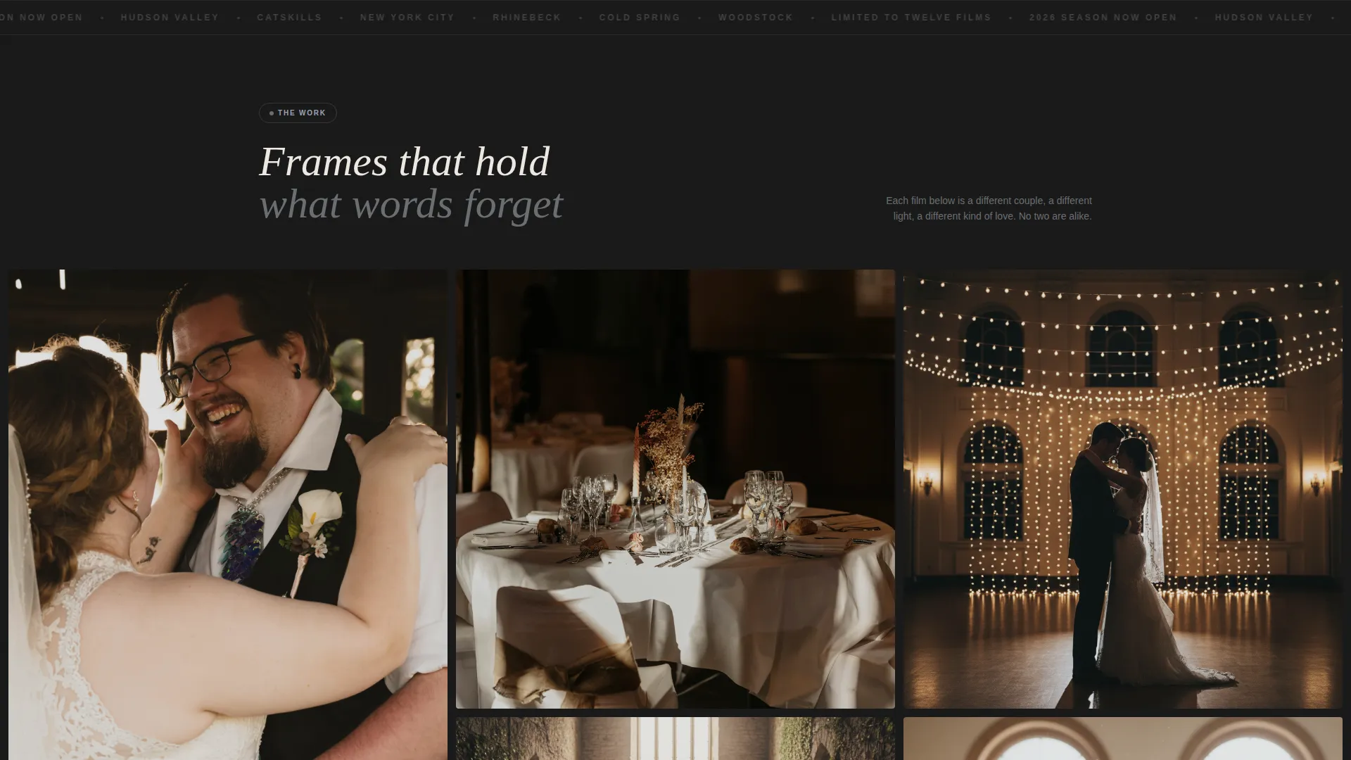
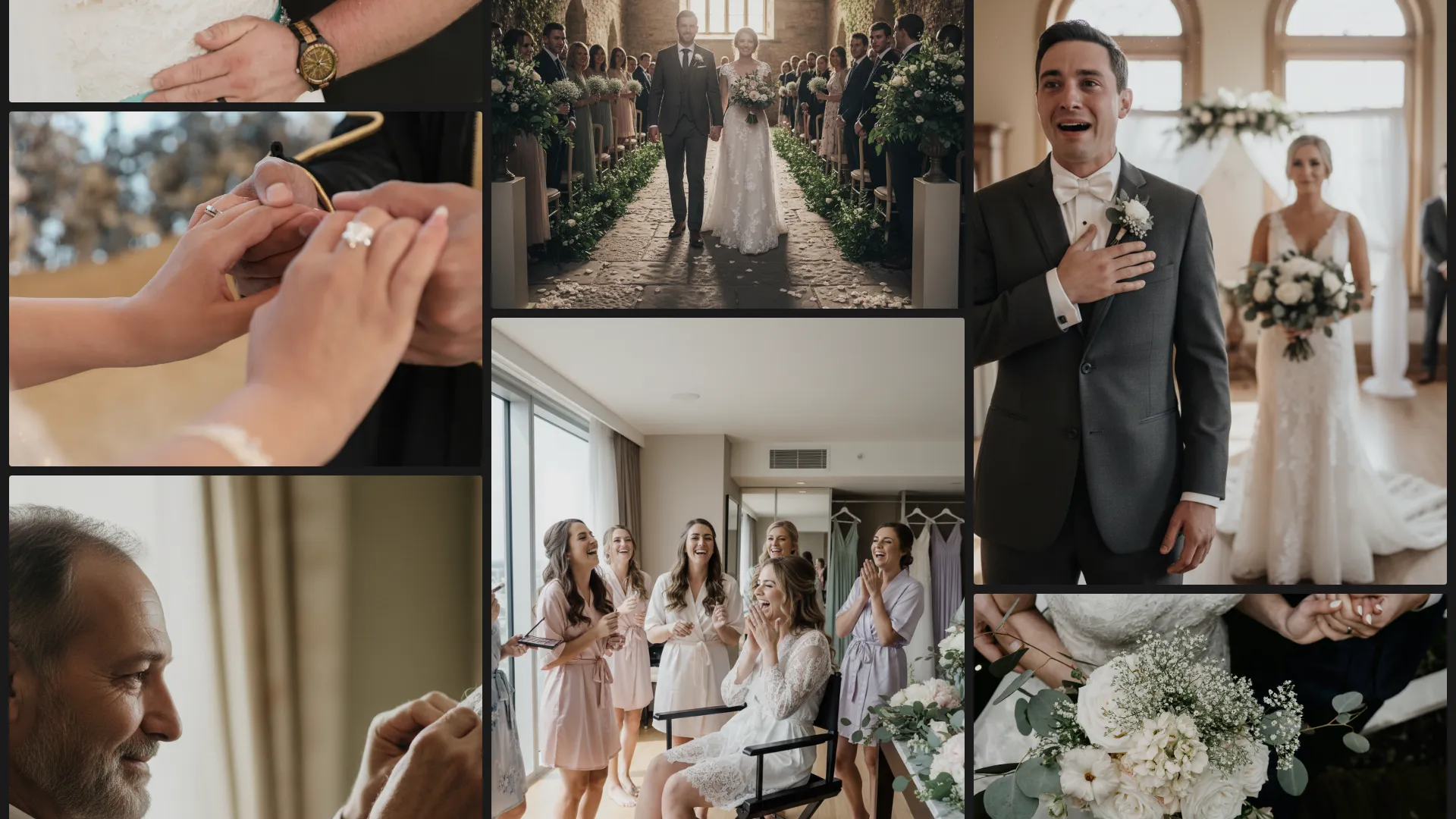
The masonry grid loads in staggered tiles, each showing a still frame or a silent looping clip from a real wedding moment. As the visitor scrolls, tiles parallax at different depths, some rising, some receding, creating the sensation of sifting through physical darkroom prints scattered across a table.
Full-Width Cinematic Clip Section
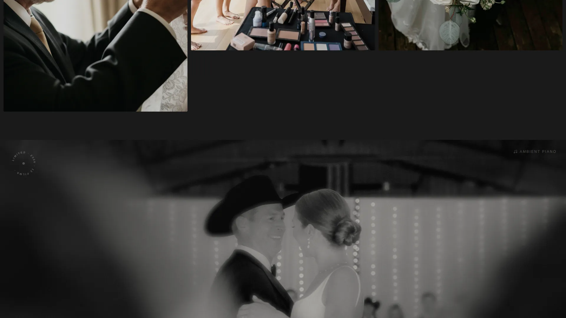
Midway through the scroll, the grid pauses for a single full-width clip running approximately thirty seconds. There is no sound icon, only ambient piano. The section resets the pace and signals the shift from emotional storytelling to craft and trust.
Floating Waitlist Form
After the cinematic clip, a parchment-card form floats into view. It asks only for first names, wedding date, and venue city, in that order. A single line below the form reads "2026 season, limited to twelve films," creating genuine scarcity without a pricing table.
Dual Capture Paths
The page offers two entry points for different visitor mindsets. "Reserve Your Date" targets couples ready to commit. "Just Watch the Reels" offers an email-only secondary path for visitors still browsing or not yet engaged, capturing intent without pressure.
Ink & Paper Visual Identity
The design system uses a Monochrome Steel palette: deep graphite for the background, brushed pewter for secondary surfaces, warm parchment for text blocks, and tarnished silver on hover states and interactive borders. The result feels like a darkroom print, not a digital filter.
Page sections overview
| Section | Purpose |
|---|---|
| Before/After Slider | Opens with raw versus. graded footage comparison to show the filmmaker's craft immediately |
| Masonry Grid Tiles | Displays a scrollable collection of wedding stills and silent looping clips with parallax depth |
| Full-Width Film Clip | Pauses the scroll with a thirty-second ambient cinematic moment to build emotional trust |
| Behind-the-Scenes Grid | Resumes the masonry layout with process shots: steadicam rigs, lens changes, editing timelines |
| Waitlist Parchment Card | Floating form capturing first names, wedding date, and venue city with scarcity messaging |
| Secondary Email Capture | Low-commitment "Just Watch the Reels" signup for visitors not yet ready to inquire |
Design & branding system
The Ink & Paper theme treats the screen as a physical surface. Every color choice references analog photography, not digital trend palettes.
- Deep graphite (#2B2B2B) as the primary background, brushed pewter (#6B6E72) for secondary surfaces, and warm parchment (#EDE8E1) for text blocks and negative space
- Tarnished silver (#9CA3AF) activates only on hover states and interactive borders, keeping the palette restrained
- The logotype appears as a letterpressed thin mark in the lower corner of the header, never competing with the imagery
Mobile & speed optimization
The layout is designed with a visual-first hierarchy that translates naturally to narrower screens. The masonry grid and slider components are built to reflow without losing the depth or pacing of the original scroll experience.
- The staggered tile loading and parallax behavior are structured to maintain the narrative arc on smaller viewports
- The floating parchment card form remains accessible and uncluttered on mobile screen sizes
- Silent looping clips use no autoplay sound, removing the need for visitor interaction before the page feels complete
How this template helps you convert
Vow is designed around a specific emotional journey, not a generic funnel. Every section earns the next section's attention before asking for anything in return.
- The Before/After slider creates immediate proof of craft in the first scroll moment, building trust before the visitor reads a word
- The full-width cinematic clip resets attention at the midpoint, priming the visitor emotionally before the waitlist card appears
- The dual capture paths reduce friction: couples ready to book use the date form, while browsing visitors give an email, so no intent goes uncaptured
Other information about this template
This template was designed for filmmakers operating at the premium end of their market, where positioning and perception carry more weight than a full pricing page.
- The "limited to twelve films" scarcity line is built directly into the form section and requires no separate copywriting
- The behind-the-scenes masonry tiles shift the narrative from emotional to process-driven, reinforcing the filmmaker's technical credibility
- The template style is Masonry/Pinterest with an Immersive Visual creative direction, making it suitable for visually portfolio-heavy creative niches beyond weddings
- The Waitlist/Coming Soon landing page direction makes this layout equally useful for a new filmmaker launching their first public-facing page or an established one opening a new season
Theme
Ink & Paper
Creative direction
Immersive Visual
Color system
Monochrome Steel
Style
Masonry/Pinterest
Direction
Waitlist/Coming Soon
Page Sections
Before/after Footage Slider Header
Depth-layered Masonry Grid
Full-width Ambient Cinematic Clip
Floating Parchment Waitlist Form
Dual Visitor Capture Paths
Ink & Paper Monochrome Steel Palette
Related questions
Is this template suitable for a wedding videographer just starting out?
Can I use this template for elopements or destination wedding films?
Does this landing page include a pricing section?
How many lead capture points does this landing page include?
What makes this landing page different from a standard portfolio page?



