Wedding Marketing & Agency Pre-Launch Website Template
Vow is a dark, cinematic landing page built for wedding video marketing agencies. It pairs an obsidian-and-gold visual identity with a floating-photo header, an interactive masonry proof grid, and a sticky waitlist bar. The layout turns a videographer's past work into an inquiry-generating showcase, designed to earn signups before the call to action even appears.
by Rocket studio
Quick summary
Vow is a boutique agency landing page for wedding filmmakers ready to grow. Built on a deep obsidian-and-gold palette with parallax film stills and an interactive masonry grid, the page builds trust through layered visual proof. The primary call to action is a sticky waitlist bar with a two-field form, making signups feel earned rather than pushed.
Who this template is for
This template is built for wedding video professionals who are ready to present their work with the visual authority it deserves. It serves anyone at the intersection of filmmaking craft and client growth.
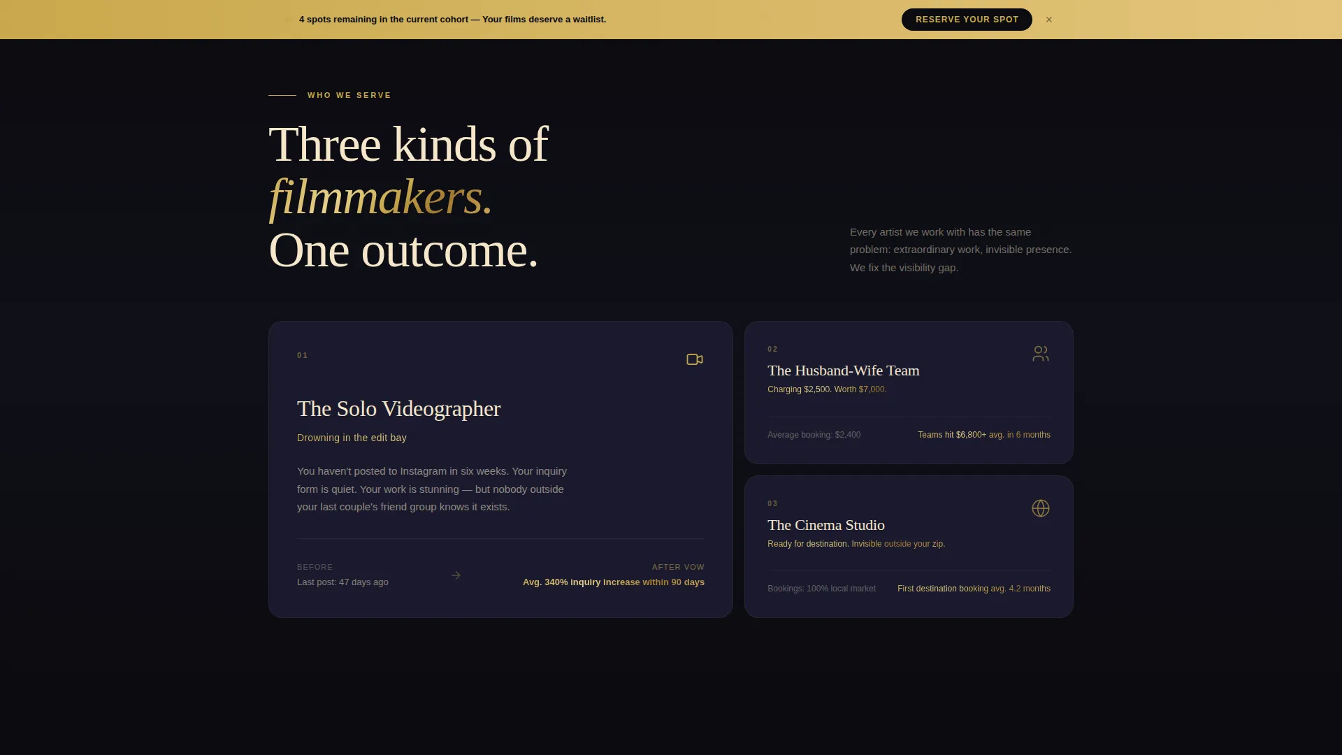
- Solo videographers who are skilled at their work but invisible on social media
- Husband-and-wife filming teams ready to raise their pricing and attract better-fit clients
- Small cinema studios targeting destination weddings beyond their local market
What problem this template solves
Many talented wedding filmmakers go underbooked simply because their online presence does not reflect the quality of their films. A plain portfolio page does not communicate transformation, and a generic contact form does not build urgency. This template addresses both.
- Visitors scroll through visual proof before ever reaching a form, so trust builds naturally
- The waitlist framing creates scarcity without sounding pushy or salesy
- The interactive grid replaces passive browsing with active discovery, keeping visitors engaged longer
What you get with this template
The Vow template delivers a complete single-page layout for a wedding video marketing agency. Every section is purposefully sequenced to move a videographer from curious visitor to committed signup.
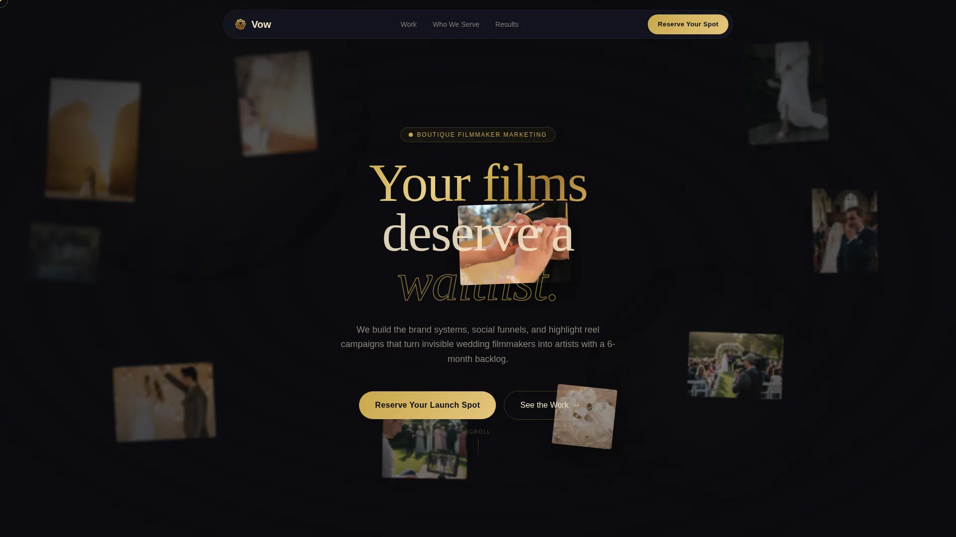
- A parallax floating-photo header with gold-foil headline typography
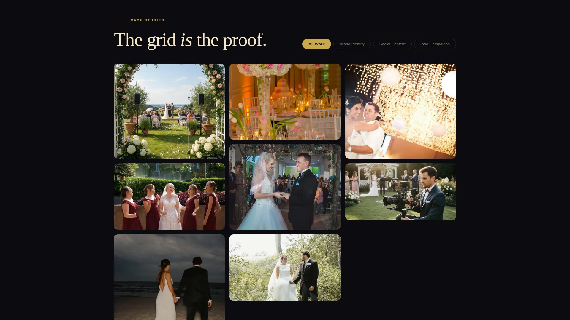
- An interactive masonry case study grid with hover-reveal metrics and filter tabs
- A sticky gold waitlist bar with a two-field form and a remaining-spots counter
Feature list
This landing page packs several layered interactive systems into one cohesive cinematic experience.
Parallax Floating Photo Header
Dozens of wedding film stills and behind-the-scenes frames drift across the viewport in parallax layers. Some images are sharp; others carry a soft gaussian blur to simulate camera depth of field. On mouse movement, the frames drift apart as though the visitor is spreading printed stills across a light table. A gold-foil headline, "Your films deserve a waitlist," anchors the center of the composition.
Interactive Masonry Case Study Grid
The grid below the header is built from case study thumbnails. On hover, each card expands to reveal a before-and-after performance metric, such as followers gained, inquiry rate, or average booking price increase. A film countdown leader micro-animation plays during the reveal. Scroll deeper and the grid reorganizes itself by category as the visitor clicks filter tabs for brand identity, social content, or paid campaigns.
Lightbox Transformation Reel
Each masonry card carries a "See the Reel" button. Clicking it opens a lightbox that plays a thirty-second transformation montage. The montage ends with the waitlist form overlaid on the final frame, turning every case study into a conversion moment without interrupting the browsing flow.
Sticky Waitlist Bar
A slim gold bar stays pinned to the bottom of the viewport throughout the entire scroll. It holds a two-field form collecting email address and Instagram handle. A subtle counter displays how many spots remain, keeping urgency visible without aggressive language.
Obsidian and Gold Branding System
The color palette uses true obsidian black as the dominant background, warm charcoal for card surfaces, antique gold on every interactive element and typographic accent, and soft champagne for body text. The result is a cinema screening room feel with light catching every edge.
Category Filter Navigation
Filter tabs above the masonry grid let visitors reorganize the case study cards by service category. Each click reshuffles the grid to show only the relevant proof, giving the visitor a sense of control and discovery rather than a passive scroll through a long page.
Page sections overview
| Section | Purpose |
|---|---|
| Floating Photo Header | Establish cinematic mood and brand authority with drifting film stills |
| Gold Headline Block | Deliver the core message with a single gold-foil typographic statement |
| Masonry Case Study Grid | Show layered proof through interactive, hover-reveal result cards |
| Category Filter Tabs | Let visitors sort grid cards by brand identity, social content, or campaigns |
| Lightbox Reel Player | Open thirty-second transformation montages with an embedded waitlist form |
| Sticky Waitlist Bar | Capture email and Instagram handle with a persistent two-field form |
| Remaining Spots Counter | Create visible scarcity with a live-style spot count inside the waitlist bar |
Design & branding system
The visual identity follows a Lens and Frame theme. Every color choice, type treatment, and interaction is calibrated to feel like a cinema screening room at golden hour, with velvet darkness and warm light catching every edge.
- Obsidian black (#0B0B0F) as the dominant background, warm charcoal (#1A1A2E) for card surfaces, antique gold (#C9A84C) on all interactive elements, and soft champagne (#F5E6C8) for readable body text
- Depth-of-field simulation through layered gaussian blur on select header images, making the header feel like a pulled film still rather than a flat photo collage
- Antique gold applied consistently to the sticky bar, filter tab highlights, hover states, and headline accents to create a coherent interactive language throughout
Mobile & speed optimization
The template is structured so the cinematic experience scales cleanly to smaller screens without losing the Lens and Frame atmosphere. Key interactive behaviors adapt to touch input.
- The parallax floating header reduces layer count on smaller viewports so the depth-of-field effect stays readable without visual overload
- The masonry grid shifts to a simplified responsive column layout on mobile, keeping card hover-reveal interactions accessible through tap gestures
- The sticky waitlist bar remains pinned at the bottom of the screen on all device sizes, keeping the primary call to action within thumb reach throughout the scroll
How this template helps you convert
The Vow landing page is built on a proof-first philosophy. The visitor encounters undeniable results before they ever see a form. By the time they reach the waitlist bar, they are not asking whether the service works. They are asking whether a spot is still available.
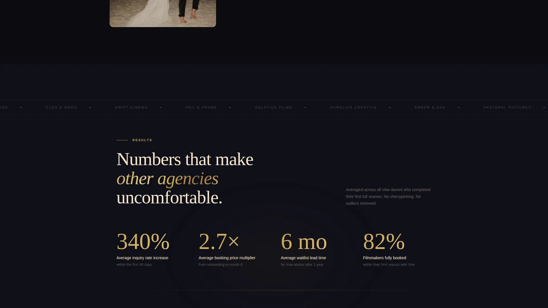
- The masonry grid does the selling before the form appears, using real before-and-after metrics and transformation reels to build confidence at every scroll depth
- The lightbox reel closes each case study with the waitlist form overlaid on the final frame, turning passive viewers into active signups at the moment of peak engagement
- The remaining-spots counter in the sticky bar adds visible scarcity that nudges hesitant visitors to commit without any hard-sell language
Other information about this template
The Vow template is designed specifically for the wedding video marketing niche. A few additional details worth knowing before you start customizing.
- The template style follows a masonry and Pinterest-style grid layout, which works well for visually rich creative agencies
- The waitlist and coming-soon page direction makes this template equally useful for new agency launches and seasonal capacity campaigns
- The header concept uses floating photos layered in parallax, a design approach suited to brands whose visual portfolio is their strongest selling point
- The interactive explorer creative direction means the page rewards curiosity, making it feel like discovery rather than a sales funnel
- This template works as a standalone launch page or as a high-intent entry point for a broader agency web presence
Theme
Lens & Frame
Creative direction
Interactive Explorer
Color system
Obsidian & Gold
Style
Masonry/Pinterest
Direction
Waitlist/Coming Soon
Page Sections
Parallax Floating Photo Header
Interactive Masonry Case Study Grid
Lightbox Transformation Reel Player
Sticky Gold Waitlist Bar
Category Filter Navigation
Obsidian and Gold Visual Identity
Related questions
Who is this landing page template designed for?
Can I customize the case study cards with my own work and metrics?
How does the waitlist form work?
Does the lightbox reel require video hosting?
Is this template suitable for an agency that is not yet launched?



