Newlywed Health Insurance Landing Page Template
Vow is a dashboard-style landing page template built for newlywed health insurance advisory services. It features a bold stacked-type hero, a scroll-driven interactive comparison grid, a two-step lead capture form, and a secondary email-gated checklist download. The layout pairs clinical data clarity with warm urgency, built to convert couples during the 60-day qualifying life event window.
by Rocket studio
Quick summary
Vow is a single-page lead generation template designed for a newlywed health insurance advisory service. It pairs a dramatic stacked-type hero with a live countdown timer, a scroll-driven plan comparison grid, and a two-step consultation form. The layout uses a crisp Arctic White palette to make complex insurance data feel approachable and actionable.
Who this template is for
This template is built for InsurTech and financial advisory businesses that serve newly married couples navigating their first joint health insurance decisions. It suits founders and marketers who want a data-forward first impression without sacrificing emotional resonance.
- Health insurance advisors targeting newlyweds inside the 60-day qualifying life event window
- InsurTech startups positioning around spousal coverage, merged deductibles, and plan comparison
- Freelance-plus-corporate couple services or dual-income household insurance consultancies
What problem this template solves
Most newlyweds do not realize their qualifying life event window is already ticking. Standard insurance pages are cluttered, jargon-heavy, and built for open enrollment, not for couples making urgent joint decisions days after a wedding.
- Couples comparing employer plan merges, marketplace options, and spousal riders have no clear starting point
- Generic insurance landing pages do not surface the specific costs and trade-offs that matter to newlyweds
- Services lose leads because visitors cannot see enough of the comparison data to feel the value before leaving
What you get with this template
This template delivers a full single-page layout with every section a newlywed insurance advisory service needs to capture, qualify, and convert leads. The design is intentional: clinical enough to feel credible, warm enough to feel human.
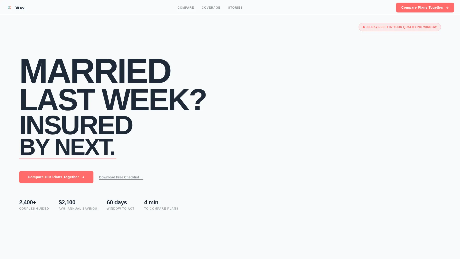
- Stacked-type hero with a live 60-day countdown timer and a floating coral call-to-action bar
- Interactive comparison data grid with side-by-side plan input cards and scroll-revealed comparison rows
- Two-step lead capture form plus a secondary email-gated "Newlywed Insurance Checklist" download
Feature list
This template includes six purpose-built components, each designed to move a couple from uncertainty to booked consultation.
Stacked Type Tower Hero
An enormous, vertically stacked sans-serif headline reads "MARRIED / LAST WEEK? / INSURED / BY NEXT." Each word occupies its own row, left-aligned and scaling from large to slightly smaller as the stack narrows. A pulsing coral underline beneath "NEXT" draws the eye without any illustration or imagery.
Live Qualifying Window Countdown
A small counter in the top-right corner displays the number of days remaining in the couple's 60-day qualifying life event period. The counter drops by one every 24 hours, creating immediate, honest urgency rooted in a real insurance deadline.
Interactive Plan Comparison Grid
Two side-by-side input cards let each partner describe their current coverage using employer, marketplace, or uninsured toggles. As the visitor scrolls, the grid populates dynamically with rows comparing monthly premium, combined deductible, copay structure, and annual maximum out-of-pocket across merged, stacked, and marketplace options.
Coverage Deep-Dive Bento Grid
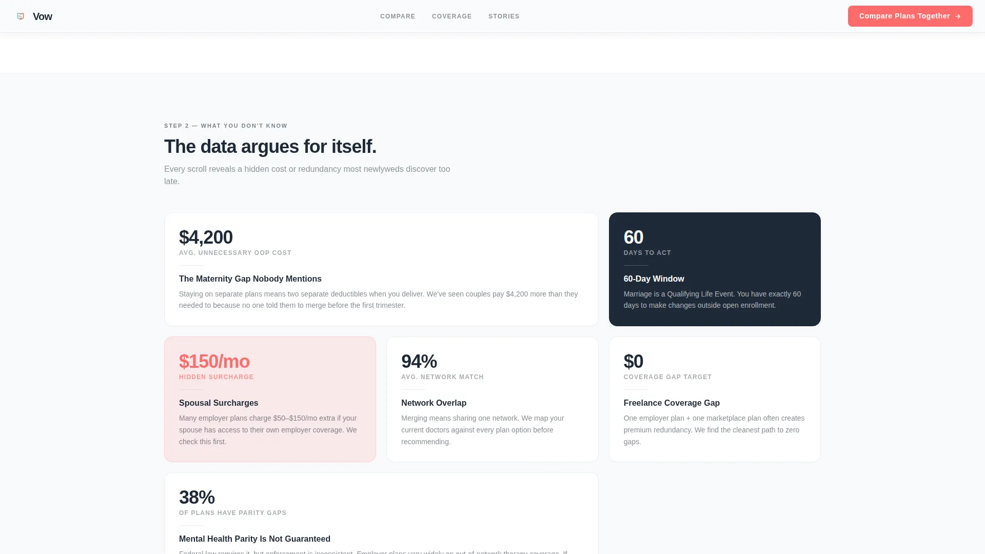
Deeper scroll layers surface hidden cost comparisons across prescription tiers, maternity coverage, mental health parity, and network overlap. The bento grid layout keeps each data point contained and scannable without overwhelming the reader.
Two-Step Consultation Form
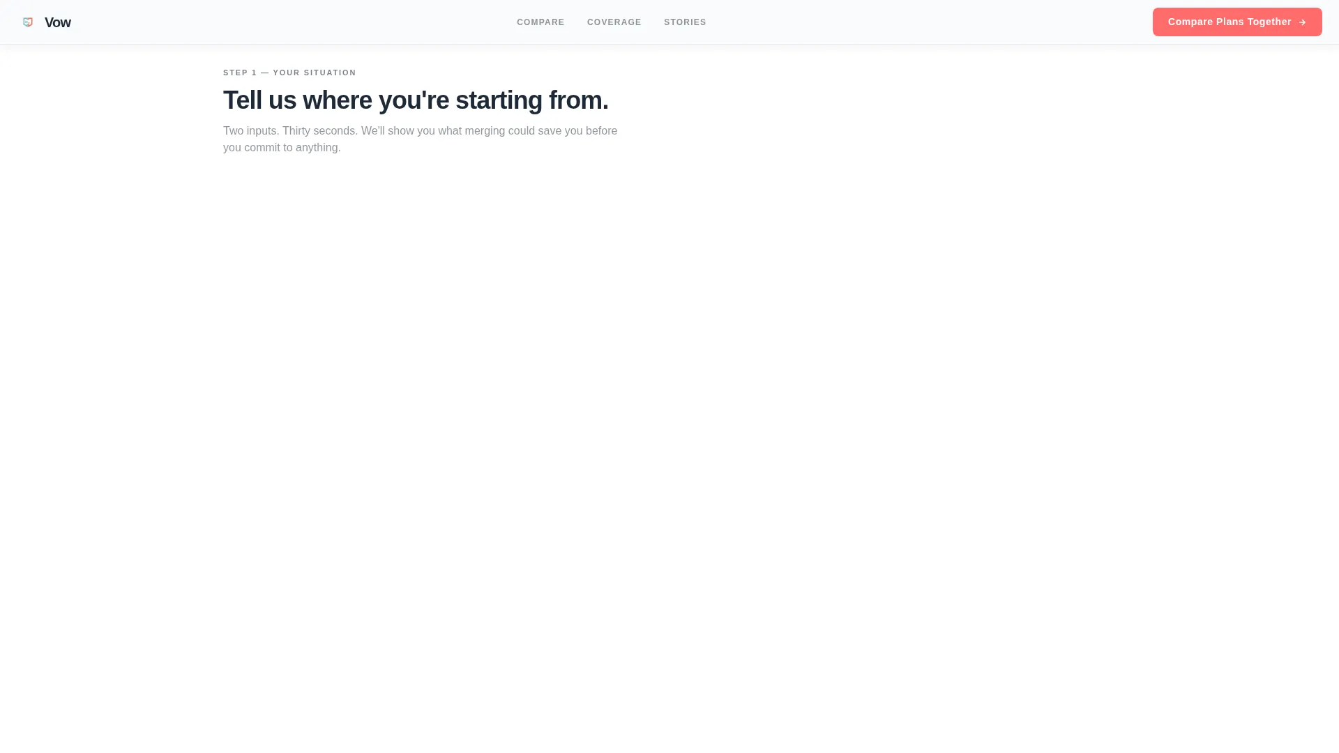
Step one captures wedding date, state, and current coverage type for each spouse. Step two asks household income range, planned dependents within twelve months, and preferred consultation format: video call, phone, or asynchronous report. The two-step structure reduces drop-off by breaking the ask into smaller pieces.
Email-Gated Checklist Download
A secondary conversion path offers a free "Newlywed Insurance Checklist" behind an email-only capture form. This path serves couples who are not yet ready to book a consultation, keeping them in the funnel without pressure.
Page sections overview
| Section | Purpose |
|---|---|
| Stacked Hero | Headline, countdown timer, and floating coral call-to-action bar |
| Plan Input Cards | Collect each partner's current coverage type via toggle |
| Comparison Data Grid | Side-by-side plan rows: premium, deductible, copay, out-of-pocket max |
| Coverage Deep-Dive | Bento grid for prescription, maternity, mental health, network data |
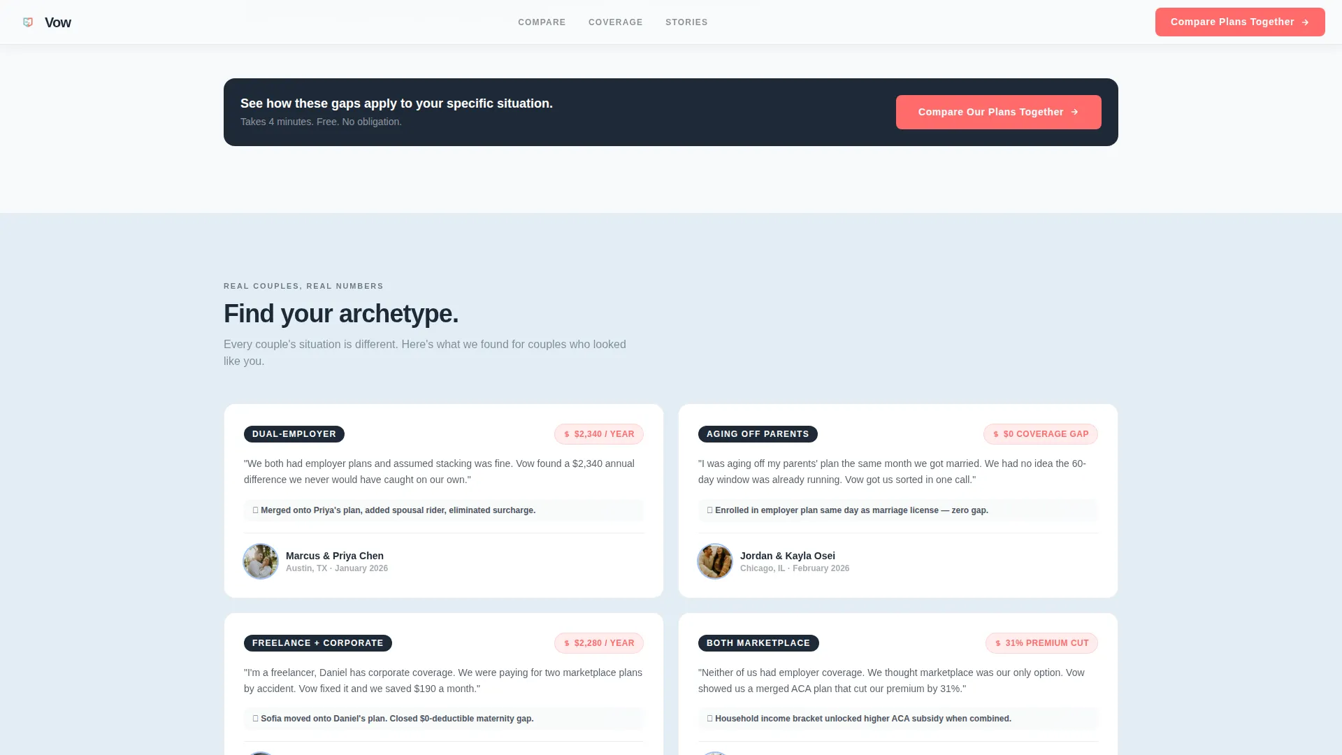
| Social Proof Cards | Couple-archetype testimonials with specific savings figures |
| Lead Capture Form | Two-step consultation intake form |
| Checklist Email Gate | Secondary free download path for earlier-stage visitors |
| Footer | Linear single-row footer with essential links |
Design & branding system
The visual identity follows a Startup Velocity theme. The palette is built around four deliberate roles: open background, data surface, type and grid lines, and a single accent color reserved for action and urgency.
- Arctic White (#F8FAFB) covers all open backgrounds, keeping the page uncluttered and clinical
- Pale Glacier Blue (#E3EEF6) fills data cards and comparison rows, separating information without adding visual noise
- Sharp Charcoal (#1E2A38) handles all body text and grid lines for strong contrast and readability
- High-voltage Coral (#FF6B6B) appears exclusively on call-to-action buttons, toggle active states, savings callouts, and the pulsing underline beneath the hero headline
Mobile & speed optimization
The template is built mobile-first, reflecting the reality that most couples search for insurance guidance on their phones immediately after the wedding. The desktop layout prioritizes the full comparison grid experience.
- The primary call-to-action button pins as a floating bottom bar on mobile for persistent, thumb-friendly access
- Comparison grid rows use scroll-reveal animation and staggered card entrances, loading progressively so the page feels fast on initial view
- The two-step form breaks the consultation intake into short, single-screen steps suited to smaller displays
How this template helps you convert
Vow is designed around a single conversion principle: show enough data to prove that savings exist, but not enough to quantify them without completing the form.
- The partially revealed comparison grid creates a clear information gap. Visitors can see that plan differences exist and that costs vary, but the exact numbers require form completion, pulling them naturally into step one of the consultation flow.
- The live countdown timer ties the call to action to a real 60-day qualifying life event deadline, giving couples a concrete reason to act today rather than return later.
- The email-gated checklist captures couples who are not ready for a full consultation, creating a second conversion path that keeps earlier-stage visitors in the funnel.
Other information about this template
This template is built specifically for the United States insurance market, using USD pricing, state-based insurance terminology, and the MM/DD/YYYY date format throughout. Typography is set in Plus Jakarta Sans, a modern geometric sans-serif well-suited to tight data grids and large display headlines. Animation is set to high: the pulsing coral underline, countdown timer, scroll-reveal grid rows, and staggered card entrances all activate as the visitor scrolls. The template follows a Dashboard and Data Grid layout style within the Startup Velocity theme. It is categorized under Finance and Insurance, specifically the Newlywed Health Insurance niche. The footer uses a linear single-row pattern for a clean, low-distraction close to the page.
- Built for the United States market with state-based insurance language and USD formatting
- Typography: Plus Jakarta Sans for both display headlines and tight data grid text
- Animation: pulsing coral underline, scroll-reveal rows, staggered card entrances, live countdown
- Template style: Dashboard and Data Grid within a Startup Velocity design theme
- Category: Finance and Insurance, Newlywed Health Insurance niche
Theme
Startup Velocity
Creative direction
Comparison Journey
Color system
Arctic White
Style
Dashboard/Data Grid
Direction
Lead Generation
Page Sections
Stacked Type Tower Hero
Live 60-day Countdown Timer
Interactive Plan Comparison Grid
Coverage Deep-dive Bento Grid
Two-step Lead Capture Form
Email-gated Checklist Download
Related questions
Who is this template designed for?
How does the comparison grid work for visitors?
What are the two conversion paths included in this template?
How does the template create urgency without feeling manipulative?
Is this template suited for mobile users?



