Wedding Officiant Specialist Booking Website Template
Vows is a single-page landing page template built for solo wedding officiants. It opens with a floating testimonial card, leads with bold credential stats, and walks couples through three ceremony tiers in a transparent comparison table. The booking flow collects date, venue, and a personal detail, turning a first click into a confirmed ceremony inquiry.
by Rocket studio
Quick summary
Vows is a landing page template designed for solo wedding officiants who book through trust, not volume. It leads with a real couple's testimonial, backs it with hard numbers, and uses a side-by-side ceremony comparison table to help couples choose the right tier. A clear, inline booking flow closes the deal without pressure.
Who this template is for
This template is built for independent officiants who handle everything themselves. It works especially well if you perform ceremonies across different styles, distances, and budgets and want clients to self-select the right package before they reach out.
- Solo officiants serving engaged couples, same-sex partners, and elopement clients
- Officiants who want bookings to arrive pre-qualified and ceremony-tier ready
- Independent ceremony professionals replacing a generic directory listing with a dedicated booking page
What problem this template solves
Most officiants lose bookings because their web presence is either too sparse or too cluttered. Couples do not know what to expect, what the process looks like, or how to choose between ceremony options. This template removes every one of those unknowns before the first message is sent.
- Couples leave without booking because they cannot compare packages or see real proof of experience
- No clear path from "interested" to "date confirmed" means inquiries stall in email back-and-forth
- Early-stage couples have no reason to stay in touch without a useful lead resource to download
What you get with this template
The template is a single, well-structured landing page that guides a couple from emotional connection to booking confirmation. Every section has a job, and the layout keeps attention moving forward without distraction.
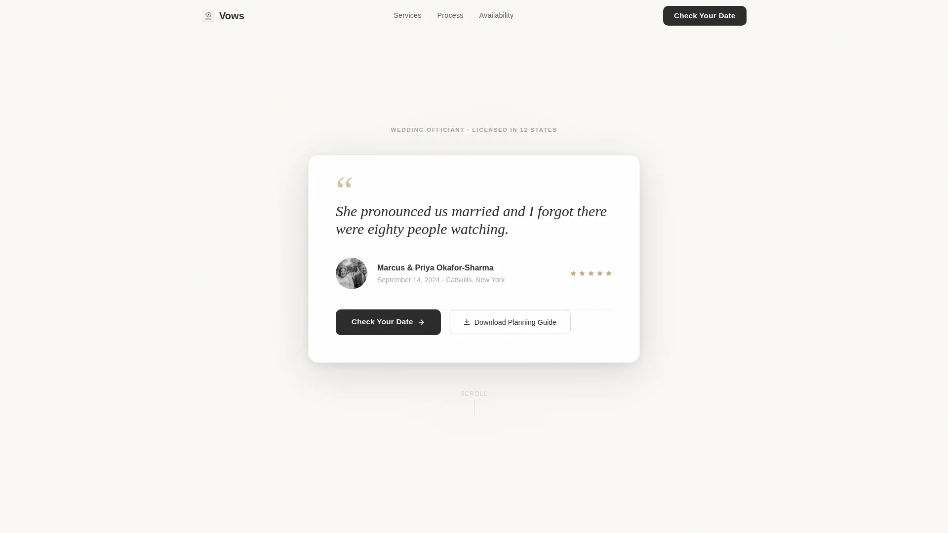
- A floating testimonial card header with real couple details: names, date, and venue
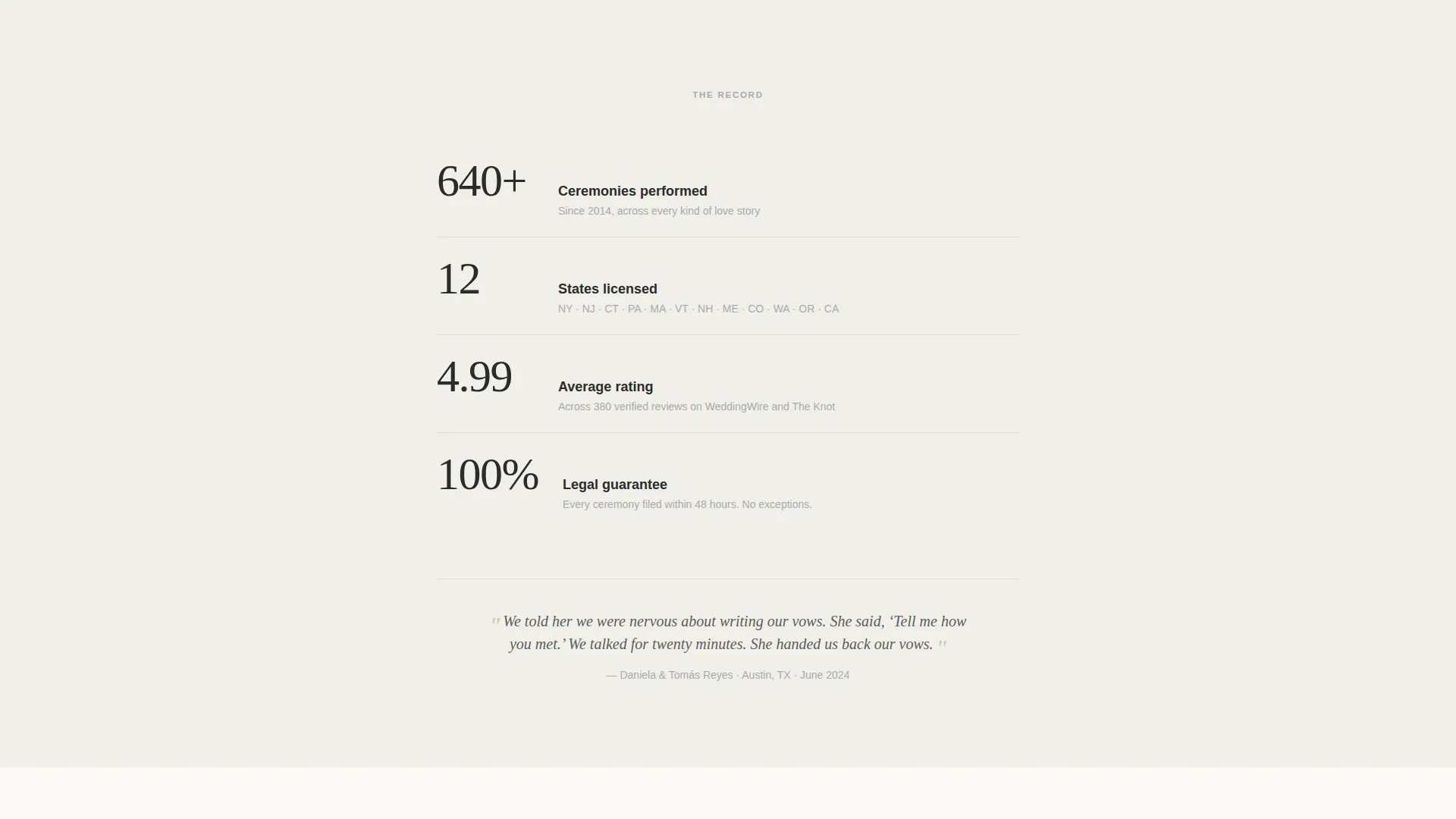
- A stats row featuring four credential proof points displayed as bold steel numerals
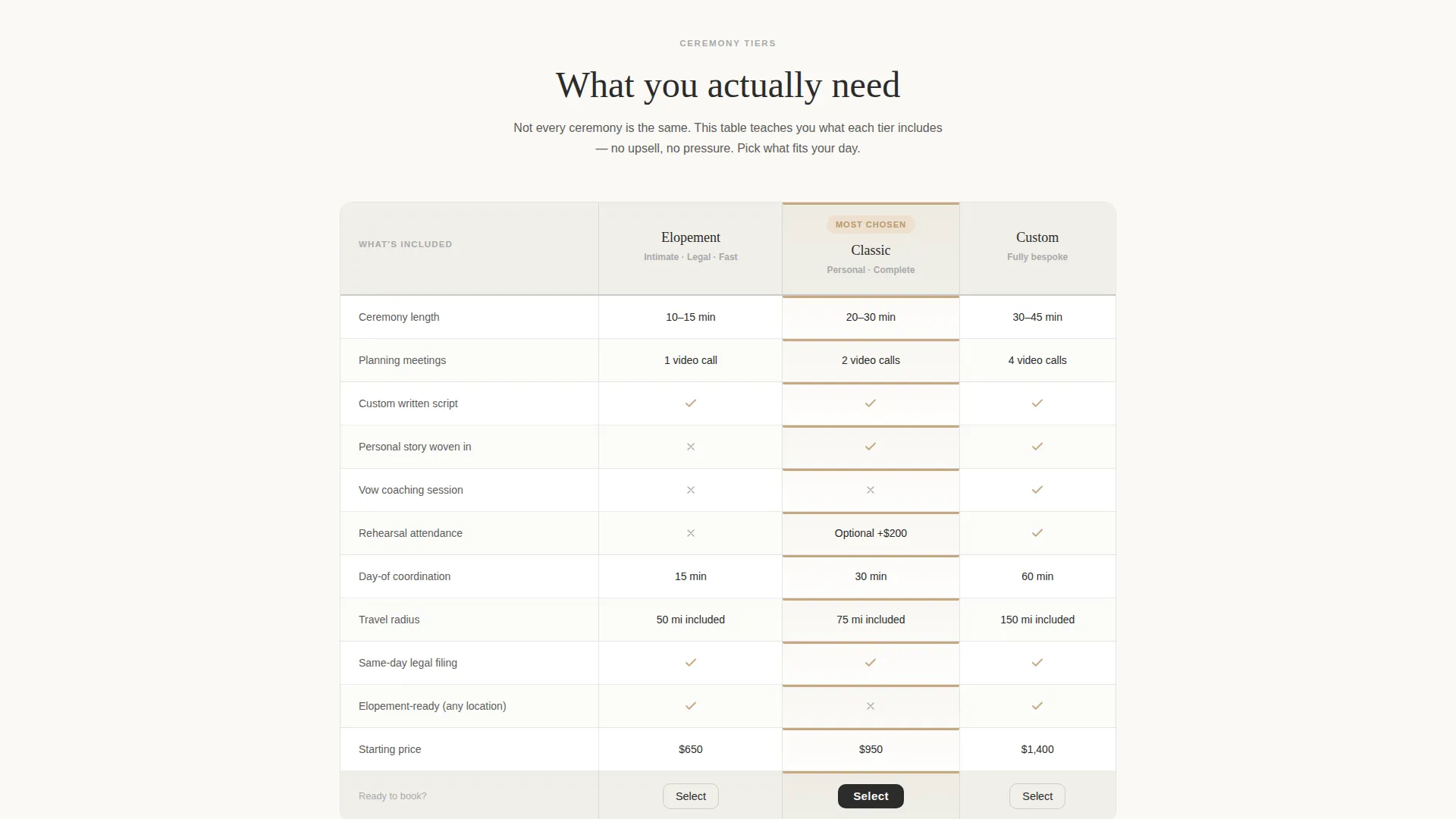
- A three-tier ceremony comparison table covering planning meetings, ceremony length, rehearsal, vow coaching, travel radius, and day-of coordination
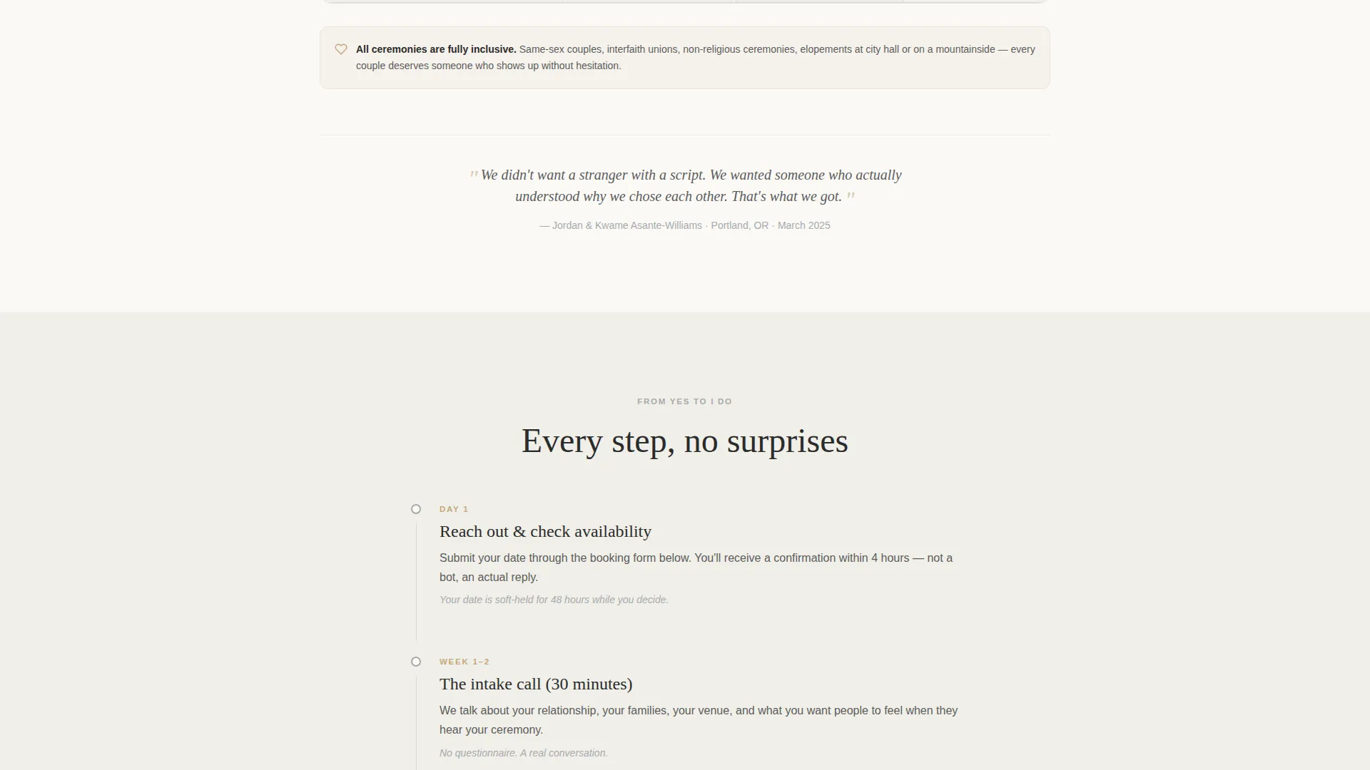
- A week-by-week booking-to-ceremony timeline section
- An inline calendar with a short booking form collecting names, venue city, tier preference, and one open personal field
- A secondary lead capture path for couples not yet ready to book
Feature list
This section covers the core functional components built into the Vows template.
Floating Testimonial Card Header
The page opens with a single oversized card on a soft vellum white background. It displays a real couple's quote in handwritten-style type, paired with a small couple photo, their names, their ceremony date, and their venue. The card casts a subtle shadow as if physically resting on the screen, creating an immediate sense of warmth and credibility.
Stats-First Credential Row
Immediately below the testimonial, four bold proof points are displayed as large steel numerals: 640 or more ceremonies performed, 12 states covered, a 4.99 average rating across 380 reviews, and a 100 percent legal guarantee. Each stat occupies a single line with no animation and no decoration, letting the weight of evidence speak for itself.
Three-Tier Ceremony Comparison Table
The Elopement, Classic, and Custom ceremony tiers are laid out side by side in an honest comparison table. Line items include number of planning meetings, ceremony length, rehearsal inclusion, custom vow coaching, travel radius, and day-of coordination minutes. The table is designed to educate couples on what they actually need, not to push them toward the most expensive option.
Week-by-Week Booking Timeline
A dedicated timeline section walks couples through the entire process from first inquiry to ceremony day. Each stage is clearly labeled so no step feels like a surprise. Short couple quotes anchor each section break, keeping the emotional tone present throughout the educational content.
Inline Calendar and Booking Form
The primary call to action, "Check Your Date," opens an inline calendar showing real availability. After selecting a date, a short form collects the couple's names, venue city, ceremony tier preference, and one open field: "Tell me one thing about your relationship." The form is brief enough to feel personal, not transactional.
Secondary Lead Capture Path
Couples who are not yet ready to book are offered a secondary option: "Not sure yet? Download the Ceremony Planning Guide." This captures an email address and keeps early-stage couples connected until they are ready to commit to a date.
Page sections overview
| Section | Purpose |
|---|---|
| Testimonial Card Header | Opens with peer proof and emotional warmth |
| Stats Credential Row | Establishes authority with hard numbers |
| Ceremony Comparison Table | Helps couples choose the right tier |
| Booking-to-Ceremony Timeline | Removes process uncertainty week by week |
| Inline Calendar and Form | Converts interest into a confirmed booking inquiry |
| Secondary Lead Capture | Retains early-stage couples via guide download |
Design & branding system
The visual identity follows an Educational Guide theme built on a Monochrome Steel color system. The palette is intentionally restrained, calling to mind the weight and finish of a beautifully bound ceremony program.
- Deep charcoal (#2B2B2B) for body text, headings, and structural elements; brushed platinum (#A8A9AD) for secondary labels and borders; soft vellum white (#FAF9F6) as the primary background
- Muted gold (#C5A880) used exclusively for call-to-action buttons, selected states, and pull-quote marks
- Handwritten-style type in the testimonial card, with clean editorial typography throughout the rest of the page, creating a contrast between warmth and authority
Mobile & speed optimization
The template is structured for clean performance on mobile devices, where many couples will first encounter the page. Every section stacks logically on a narrow screen without losing hierarchy or readability.
- The comparison table is designed to remain scannable at mobile widths, with tier columns accessible through a horizontal scroll or stacked layout
- The inline calendar and short booking form are sized for comfortable tap interaction on touch screens
- The stats row and testimonial card maintain their visual impact on smaller displays without relying on animation or heavy media
How this template helps you convert
The page is designed around a Booking/Scheduling conversion goal. Every section moves a visitor one step closer to clicking "Check Your Date" or submitting the short inquiry form.
- The testimonial card opens the page with borrowed credibility, letting a past couple's words do the first round of persuasion before a single claim is made about the officiant.
- The stats row immediately follows with four concrete proof points, replacing vague promises with specific, verifiable numbers that earn confidence quickly.
- The comparison table and timeline work together to remove hesitation: couples understand exactly what each tier includes and exactly what happens after they book, so the only remaining step is choosing a date.
Other information about this template
This template is a strong fit for officiants who want a polished, standalone booking page without building a full multi-page site. It is purpose-built for the wedding industry and can support ceremony styles ranging from intimate mountain elopements to structured ballroom celebrations.
- The Ceremony Planning Guide lead magnet provides a built-in email capture path for couples at the research stage of their vendor search
- Pull-quote breaks between sections let you insert real client words throughout the page, reinforcing trust at every scroll depth
- The template is designed as a single landing page, making it straightforward to publish, share directly with referral partners, and update seasonally as availability changes
Theme
Educational Guide
Creative direction
Stats-First Impact
Color system
Monochrome Steel
Style
Comparison Table
Direction
Booking/Scheduling
Page Sections
Floating Testimonial Card Header
Stats-first Credential Row
Three-tier Comparison Table
Week-by-week Booking Timeline
Inline Calendar and Booking Form
Secondary Lead Capture Path
Related questions
Can I customize the ceremony tiers shown in the comparison table?
What does the booking form collect from couples?
How does the secondary lead capture path work?
Is this template suitable for officiants who serve same-sex couples?
Do I need to replace the testimonial and stats with my own information?



