Comprehensive Expat Coverage Landing Page Template
Nomad is a dashboard-style landing page template built for portable expat life insurance brokerages. It combines a Cloud Canvas color system, interactive data grids, a five-step coverage assessment quiz, and a comparison journey scroll flow to turn complex insurance decisions into clear, confident choices for globally mobile professionals and their families.
by Rocket studio
Quick summary
Nomad is a single-page insurance landing page template designed for brokerages that sell portable life insurance to internationally mobile clients. It uses a Dashboard Pro visual theme with a frosted-glass aesthetic, an interactive coverage gap visualizer, a side-by-side comparison grid, and a five-question inline quiz that captures leads with minimal friction. Every section moves visitors from problem awareness to confident action.
Who this template is for
This template is built for insurance brokerages, independent advisors, and insurance company teams that sell portable or international life insurance to clients who live and work across multiple countries. It suits both business-to-business and direct-to-consumer insurance products in the expat and globally mobile segment.
- Tech contractors and remote workers rotating between cities every one to two years who need continuous coverage
- Trailing spouses managing family health coverage from abroad, and CFOs closing gaps in multinational group schemes
- Insurance providers and brokers who want a high-converting, lead-focused landing page without building from scratch
What problem this template solves
Most insurance landing page designs struggle to communicate complex, portable coverage in a way that feels calm and navigable. Standard templates built for auto insurance or domestic life insurance do not address the layered fears of an expat audience. Visitors land on the page mid-stress, already worried that their existing plan does not follow them across borders.
- Portable life insurance is hard to explain quickly; this template uses data grids and a comparison journey to make the difference between local group insurance and portable international plans instantly readable
- Many insurance plans for digital nomads only cover single trips or require that the individual spends most of their time in their home country, and the template surfaces that gap directly
- Without a structured quiz flow, visitors face overwhelming visitors of information and bounce before they understand their own coverage needs
What you get with this template
You get a complete, ready-to-customize single-page insurance landing page that guides visitors through the full decision journey, from recognizing a coverage gap to submitting their email for a personalized report. Every section is pre-structured and connected, so the narrative escalates naturally from awareness to action.
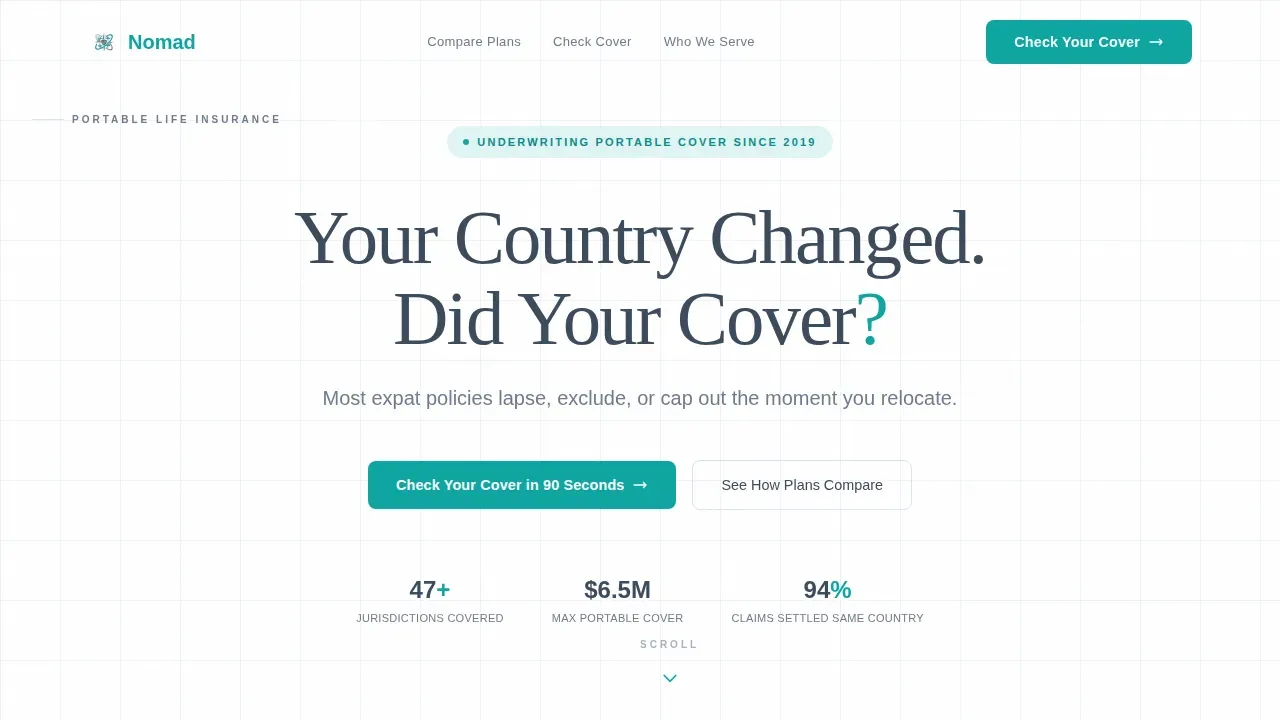
- A centered hero section with bold typography, a teal-accented headline, and a pulsing scroll chevron that sets a calm, authoritative tone
- An interactive coverage gap visualizer, a seven-criteria comparison grid, a five-question quiz module with a live score gauge, and a social proof section with client archetypes and trust metrics
- A sticky bottom call-to-action bar, a secondary calendar-embed booking path, and a structured footer using the Arc Browser Split pattern
Feature list
This template includes purpose-built components matched to the specific trust and conversion requirements of international insurance landing pages.
Centered Hero with Teal Typography Accent
The hero section carries a single oversized headline set in a large, medium-weight sans-serif font. The question mark in the headline renders in decisive teal, creating an immediate visual focal point. No hero image, no illustration: the typography holds the full viewport alone, supported by a soft pulsing chevron that invites the next scroll. This typographic confidence signals a premium, detail-oriented insurance company from the first second.
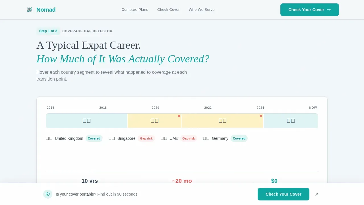
Interactive Coverage Gap Visualizer
The first data panel presents a residency timeline where visitors drag country flags onto a horizontal bar. As each country is placed, coverage gaps appear in real time, rendered in teal and graphite so the risk is immediately visible. This interactive feature converts an abstract insurance concept into a personal, data-driven moment. It answers the core fear before the visitor has to ask a question.
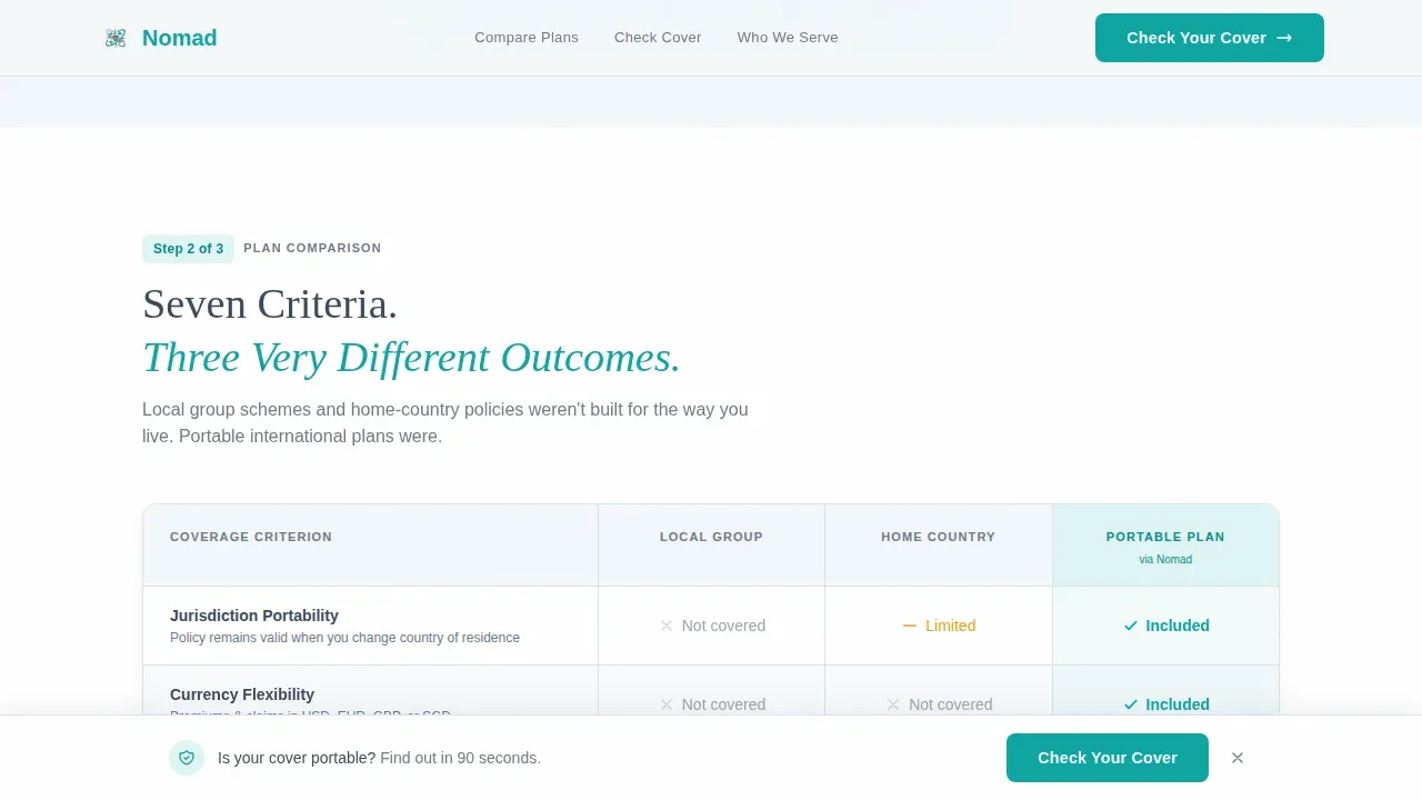
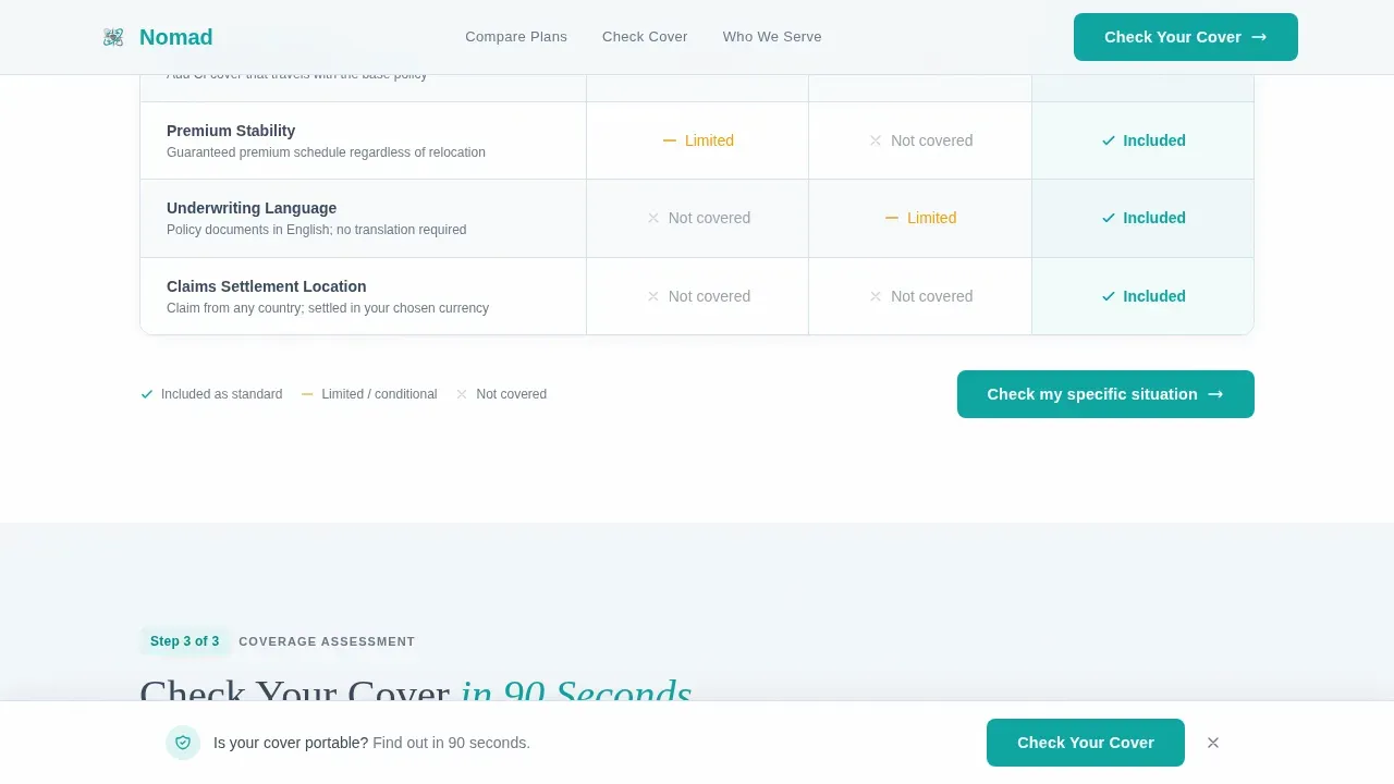
Seven-Criteria Comparison Data Grid
A side-by-side grid compares local group insurance, home-country policies, and portable international plans across seven criteria: jurisdiction portability, currency flexibility, repatriation of remains, critical illness bolt-ons, premium stability, underwriting language, and claims settlement location. Repatriation coverage includes medical evacuation or return of remains, and the grid makes this visible at a glance. Teal checkmarks and graphite dashes let the eye read the best plan instantly without reading dense text. Each row uses alternating pale sky wash backgrounds for clean scannability.
Five-Step Coverage Assessment Quiz
The primary call-to-action opens an inline quiz module with five progressive questions. Visitors answer their current country of residence, nationality, number of dependents, existing policy type, and next planned relocation window. Each answer visibly adjusts a live coverage score gauge that moves from red through amber to teal. On completion, the visitor sees a personalized gap summary and is asked only for an email address to receive the full report. No phone number, no surname, no pressure.
Sticky Call-to-Action Bar and Dual Conversion Paths
A sticky bottom bar reading "Check Your Cover in 90 Seconds" appears after the first scroll, keeping the primary action visible throughout the page without overwhelming visitors. A secondary conversion path sits in the footer: "Already Know What You Need? Book a 15-Minute Review" links to a calendar embed. This dual-path structure respects different buyer readiness levels and improves overall conversion rate for the insurance business.
Social Proof and Trust Signal Section
The template includes a dedicated section for client archetype profiles, coverage metrics, and jurisdiction badges. Specific figures such as coverage amounts and country counts are pre-slotted to guide visitors toward trusting the insurance company. Social proof and trust signals are placed at the natural point where visitors move from comparison to commitment, building the credibility essential for financial decisions of this scale.
Page sections overview
| Section | Purpose |
|---|---|
| Hero Headline | Anchors the visitor's fear and sets a calm, authoritative tone |
| Coverage Gap Visualizer | Shows personal coverage gaps through a drag-and-drop residency timeline |
| Comparison Data Grid | Contrasts three plan types across seven portability criteria |
| Coverage Assessment Quiz | Qualifies and scores each visitor with a live gauge and email capture |
| Social Proof Section | Builds trust through client profiles, metrics, and jurisdiction badges |
| Sticky call to action Bar | Keeps the primary action visible throughout the full scroll |
| Footer with Calendar | Offers a secondary booking path for high-intent visitors |
Design & branding system
The visual identity follows a Dashboard Pro theme built on a Cloud Canvas color system. The palette was designed to feel like a well-organized spreadsheet projected onto frosted glass: precise, calm, and completely noise-free. White space is used deliberately across every panel to keep content digestible and keep users engaged throughout the full scroll.
- Cloud white (#F4F7FA) for panel backgrounds, muted graphite (#3B4A5C) for primary text and data labels, and pale sky wash (#D6E4F0) for alternating grid rows and card borders
- Decisive teal (#0EA5A1) reserved exclusively for interactive elements, toggle states, and call-to-action buttons, ensuring every teal pixel signals action
- DM Sans as the primary typeface for data clarity, with Fraunces as a serif accent for editorial moments that need warmth and editorial weight
Mobile & speed optimization
The template is built desktop-first to match the target audience's behavior: a professional opening this insurance landing page on a laptop in an airport lounge. At the same time, over 57% of all web traffic comes from mobile devices, so the template ships with full mobile parity across every interactive section.
- The quiz module, comparison grid, and coverage visualizer each reflow cleanly to single-column layouts on smaller screens
- Medium GSAP-powered scroll reveals, staggered grid row animations, and gauge animations are scoped to client-side components only, keeping the static shell fast to load
- The sticky call-to-action bar and the calendar embed footer path remain fully functional and tappable on smartphones
How this template helps you convert
Creating a landing page for portable life insurance aimed at expats and digital nomads requires a focus on trust, mobility, and clear information. This template is structured as a Comparison Journey, guiding visitors through a logical escalation from problem recognition to personalized solution. Insurance landing pages that use this kind of structured, single-focus flow generate stronger lead volumes than generic multi-purpose pages.
- The hero headline immediately communicates the value proposition, the comparison grid educates visitors on exactly why other plans cover less, and the quiz personalizes the experience so each visitor feels the page was built for their situation
- Frictionless forms that minimize the number of fields reduce bounce rates and improve conversion rates: the quiz asks only five questions and captures a single email address, removing every barrier between curiosity and commitment
- The dual-path footer structure means high-intent visitors who already understand their needs can book a 15-minute review directly, while earlier-stage visitors complete the quiz at their own pace, protecting the conversion rate at both ends of the funnel
Other information about this template
This template sits at the intersection of international insurance best practices and modern dashboard design. It was built with the specific behavioral patterns of globally mobile professionals in mind, from the visual calmness of the color system to the sequenced information architecture of the scroll flow.
- International insurance is designed for people who live, work, retire, or travel outside their home country; this template is structured to speak directly to that lifestyle without condescension or unnecessary jargon
- Digital nomads often require comprehensive medical coverage that includes emergency care, dental coverage, and routine check-ups; the comparison grid and quiz can be adapted to surface health coverage gaps alongside life coverage gaps
- Many countries require proof of international insurance as a prerequisite for visa or residency applications, and the template supports messaging that addresses this requirement directly in the comparison or frequently asked question sections
- The template supports messaging around emergency evacuation, emergency assistance, and repatriation, all of which are critical trust signals for the international expat audience; these are displayed clearly in the comparison grid row set
- 69% of all insurance purchases begin with a simple search, and companies using landing pages generate 55% more leads than those that do not; a focused insurance landing page like this one is a practical business asset for any insurance company targeting expats
- World Nomads and comparable specialist insurance providers have demonstrated that clearly structured insurance products with visible claims process transparency and coverage scope perform better with the digital nomads audience than generic plans
- The template can support messaging around travel insurance for shorter stays, nomad insurance for longer rotations, and global health insurance for families; advisors can adjust the quiz dropdown options and comparison grid criteria to match their specific insurance products without redesigning the page
- The application and quote process is positioned as 100% digital and online-only, with simplified digital underwriting that does not require a fixed permanent address, which is a key trust signal for the target audience of internationally mobile professionals working abroad
- Flexible insurance options that allow adjustment of coverage as life changes are a core message the template is designed to carry; the quiz relocation-window question directly signals to visitors that the plan adapts to their timeline, not the other way around
- The page is built to reference health insurance, life insurance, and broader international insurance in a layered way, so advisors covering multiple insurance products can use one plan to address the full spectrum of expat needs without needing separate landing pages for each product line
Theme
Dashboard Pro
Creative direction
Comparison Journey
Color system
Cloud Canvas
Style
Dashboard/Data Grid
Direction
Quiz/Assessment
Page Sections
Interactive Coverage Gap Visualizer
Seven-criteria Comparison Data Grid
Five-step Quiz with Live Score Gauge
Sticky Call-to-action Bar
Social Proof and Trust Signal Section
Dual-path Footer with Calendar Embed
Related questions
Does this template work for brokerages that sell travel insurance as well as life insurance?
Can the quiz be adapted to capture health insurance or health coverage gaps?
Does the template address waiting periods or pre-existing condition concerns?
Is the quiz email capture the only lead form on the page?
How does the comparison grid show the difference between a standard plan and portable international coverage?


