Latino Media Landing Page Template | Neo-Retro Design
Voz is a masonry-style landing page template built for Latino media companies that produce documentaries, podcasts, and bilingual editorial content. It features a Neo-Retro visual identity, a candid lifestyle header, a scrollable project card grid, full-width testimonial breaks, and an upsell path guiding existing clients toward tiered content partnerships.
by Rocket studio
Quick summary
Voz is a single-page landing page template designed for a Hispanic-owned media house. It combines a warm, grainy lifestyle header with a dynamic masonry grid of project cards. Testimonial breaks and a tiered upgrade path round out the experience, making it equally effective for attracting new brand partners and converting existing clients into fuller content packages.
Who this template is for
This template is built for creative media organizations that tell stories rooted in Latino culture. It fits teams who work across multiple content formats and need one polished page to represent all of them.
- Latino and bilingual media companies producing documentary series, branded podcasts, and editorial content
- Hispanic-owned creative studios pitching CPG brand managers, streaming platforms, and nonprofit clients
- Media founders who need a single page that doubles as a portfolio and a commercial proposal
What problem this template solves
Most media company landing pages either look too corporate or too chaotic. Neither builds the trust that brand partners need before committing a budget. Voz fixes that gap.
- It brings diverse content formats together in one coherent visual experience, so nothing looks like an afterthought
- It removes friction from the client upgrade conversation by showing a tiered comparison table and a before/after case study before the form ever appears
- It gives authentic, culturally specific work a design home that feels as considered as the content itself
What you get with this template
The template delivers a complete, section-led landing page with a clear visual flow from discovery to conversion. Every element is drawn directly from the brief and serves a defined purpose.
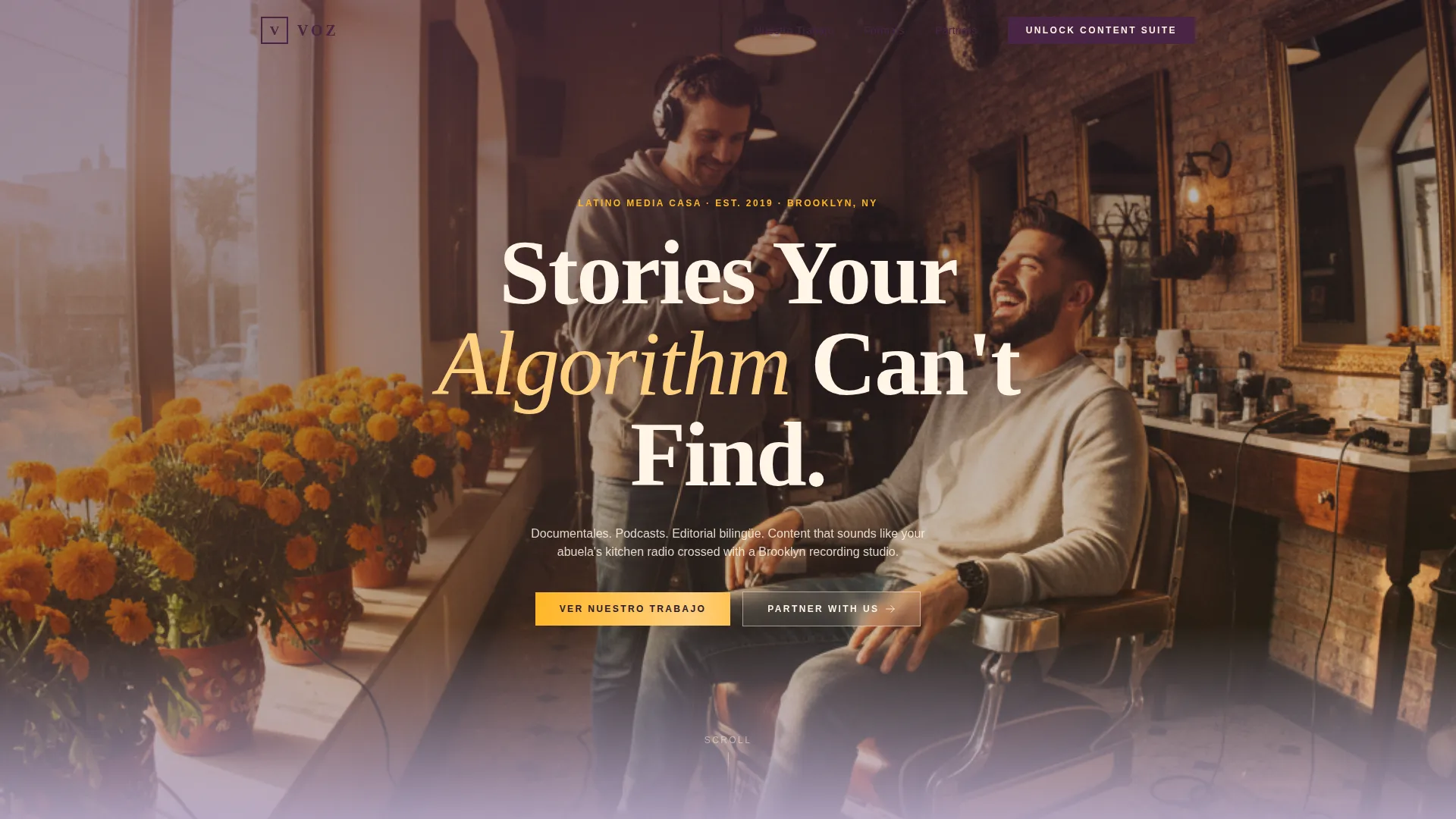
- A wide-angle lifestyle header with a chunky retro serif headline floating over a candid production photograph
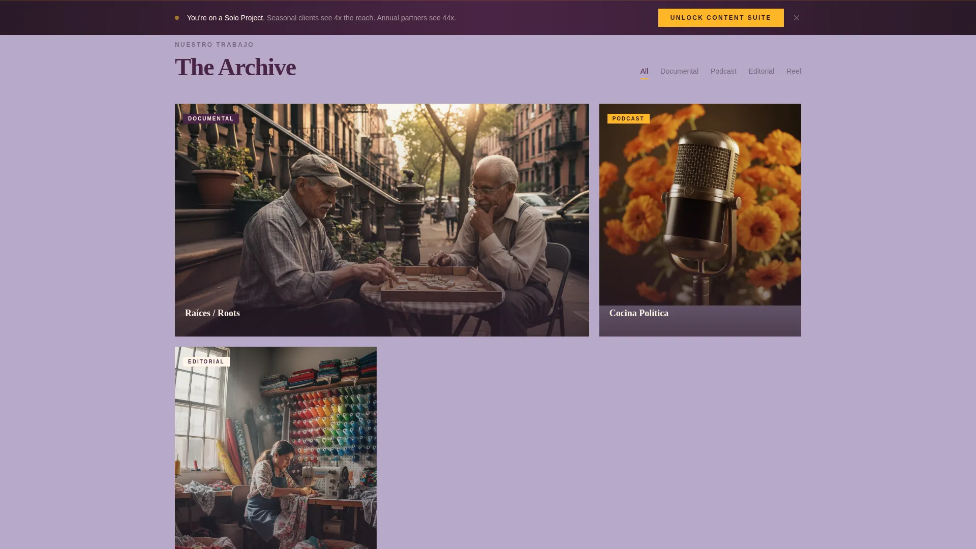
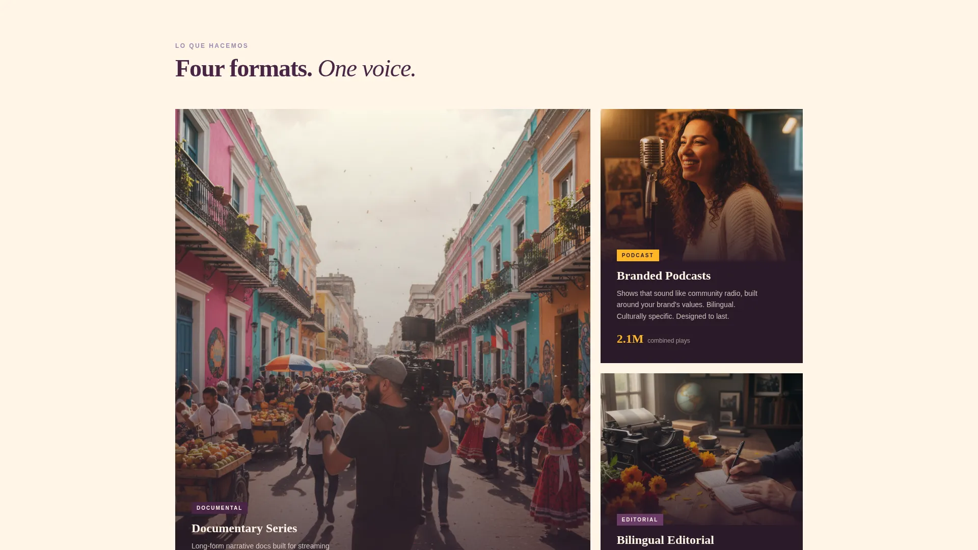
- A masonry project grid that mixes 16:9 documentary stills, square podcast covers, tall editorial photos, and short motion-graphics reel thumbnails
- A persistent bottom bar with upgrade call-to-action, a tiered comparison table, and a pre-filled upgrade form with a before/after case study above it
Feature list
This template is built around a specific set of functional and visual components. Each one comes from the source brief and serves a real purpose on the page.
Candid Lifestyle Header
A wide-angle photograph anchors the top of the page. The composition is candid and slightly grainy, styled after Kodak Portra 400 film stock. A chunky retro serif headline reads "Stories Your Algorithm Can't Find," floating directly over the image.
Masonry Project Card Grid
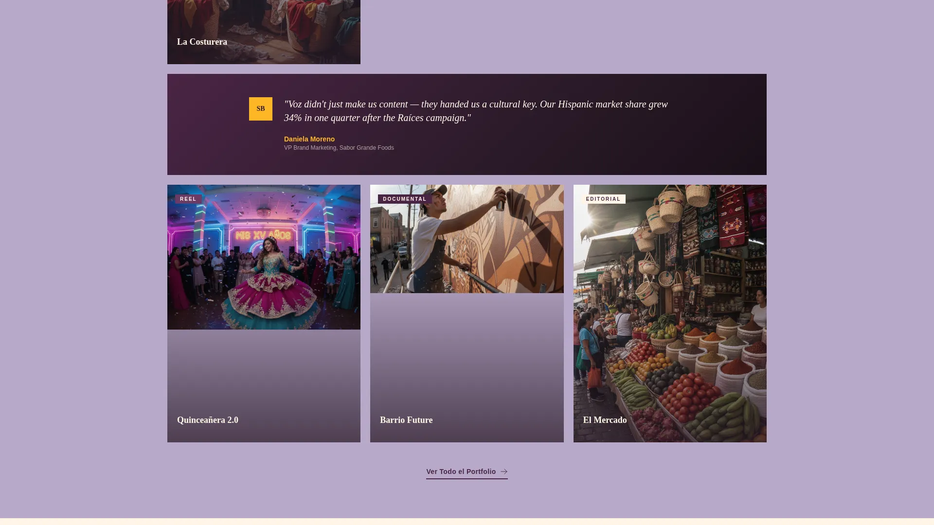
The main content area uses a masonry layout with project cards at varying heights. Cards display different content formats side by side, creating a browsing experience that feels like moving through a cultural archive. Every third row, a full-width testimonial from a brand partner grounds the scroll in commercial proof.
Full-Width Testimonial Breaks
Testimonials from brand partners interrupt the masonry grid at regular intervals. These are not sidebars or small quotes. They sit across the full width of the page, creating visual pauses that reinforce credibility at the exact moment a visitor is most engaged with the portfolio work.
Tiered Upgrade Comparison Table
A structured table lays out three client tiers: Solo Project, Seasonal Package, and Annual Partnership. The table is part of the upsell path and appears before the upgrade form, giving clients a clear view of what they would gain by moving up.
Pre-Filled Upgrade Form
The upgrade form is designed for existing clients. It pre-fills their company name and current plan, then asks only for a quarterly budget range and a checkbox grid of formats they want to add: podcast, documentary, editorial, and social series. The short form reduces friction and keeps the focus on the decision, not the data entry.
Before/After Case Study Block
A dedicated case study sits directly above the upgrade form. It shows a brand's reach metrics at the single-project level versus the full-suite level. The numbers appear before the call-to-action button, so the data earns the click before any ask is made.
Page sections overview
| Section | Purpose |
|---|---|
| Lifestyle Header Shot | Opens with candid team photography and the brand headline |
| Masonry Project Grid | Showcases documentary, podcast, editorial, and reel content |
| Testimonial Row Breaks | Inserts full-width partner quotes every third grid row |
| Upsell Bottom Bar | Persists on scroll with the "Unlock Your Content Suite" call to action |
| Tier Comparison Table | Compares Solo Project, Seasonal Package, and Annual Partnership |
| Before/After Case Study | Shows reach metrics across single-project and full-suite levels |
| Upgrade Request Form | Pre-filled form for existing clients to select formats and budget |
Design & branding system
The visual identity follows a Neo-Retro theme that feels nostalgic without looking dated. The palette references vintage telenovela print work while staying sharp and modern in digital form.
- Color system: dusty lilac (#B8A9C9) as the primary background wash, deep plum (#4A2545) for headlines and navigation, warm cream (#FFF5E6) for card surfaces, and electric marigold (#FFB627) activating hover states and play buttons
- Typography: chunky retro serif for headlines, creating visual weight that holds its own against rich photography
- Texture and grain: the header photograph is styled with a warm, slightly grainy finish referencing analog film stock, giving the page a handmade quality that digital-first layouts rarely carry
Mobile & speed optimization
The layout is designed to adapt across screen sizes without losing the visual character that makes it distinctive. The masonry grid and card hierarchy reflow gracefully at smaller viewports.
- Card grid columns reduce on smaller screens while preserving the varied-height layout that gives the page its browsing quality
- The persistent bottom bar and upgrade path remain accessible and functional regardless of the device or screen size in use
- Typography scales are set so the retro serif headline remains legible and impactful even on compact displays
How this template helps you convert
The page is structured to move a visitor from curiosity to commitment in a logical sequence. Each section earns the next one.
- The candid lifestyle header and masonry grid establish cultural credibility immediately, so brand partners feel they are looking at a real, active studio rather than a spec portfolio.
- Full-width testimonials placed inside the scroll create repeated moments of social proof without interrupting the visual experience, building trust progressively as the visitor moves down the page.
- The before/after case study places concrete reach data in front of the visitor before the upgrade form appears, letting the numbers do the persuasion work so the call-to-action feels like a natural next step rather than a push.
Other information about this template
This template was designed with a specific cultural and commercial intersection in mind. A few additional details are worth noting for anyone evaluating it for their project.
- The page type is a single landing page, not a multi-page site, so all content and conversion elements live in one continuous scroll
- The curated collection creative direction means the masonry grid is meant to deepen as the visitor scrolls, with more ambitious work appearing further down the page
- The Neo-Retro theme and the Lavender Dream color palette work together to signal both cultural specificity and professional polish, a combination that tends to resonate with brand managers evaluating niche creative partners
- This template suits organizations in the Hispanic-owned business space that need to communicate both artistic credibility and commercial viability on the same page
Theme
Neo-Retro
Creative direction
Curated Collection
Color system
Cloud Canvas
Style
Overlap/Layered
Direction
Direct Sales
Page Sections
Candid Lifestyle Header with Serif Headline
Masonry Project Card Grid
Full-width Testimonial Breaks
Tiered Upgrade Comparison Table
Pre-filled Client Upgrade Form
Before/after Case Study Block
Related questions
Who is this landing page template designed for?
Can I use this template if I only offer one content format right now?
What makes the upgrade path different from a standard contact form?
Does the template include testimonial content and case study data?
Is this template suitable for a bilingual audience?



