Iconic Empire Tours Landing Page Template
Trek is a storybook travel landing page template built for Peru tour operators. It guides visitors through a chronological gallery walk, from Cusco cobblestones to glacier passes to cloud forest, using full-bleed photography, pinned elevation markers, and immersive narrative panels. Every scroll builds anticipation, and a single rust-colored call-to-action button converts that feeling into a click toward the itinerary.
by Rocket studio
Quick summary
Trek is a cinematic, single-page travel landing page template designed for adventure tour operators running hiking trips through dramatic terrain. It uses a chronological gallery-walk layout, full-bleed photography, and sticky narrative text panels to walk visitors through a multi-day trek before presenting one focused call-to-action. The result is a landing page that earns the click by making visitors feel like they have already started walking.
Who this template is for
This template is built for tour operators and travel brands running small-group or private hiking experiences in high-altitude destinations. It suits businesses that sell through story and image rather than through a long booking form on the first visit.
- Peru tour operators offering routes like the Salkantay trek or Sacred Valley walk
- Adventure travel companies targeting experienced hikers, milestone-birthday couples, and small friend groups
- Solo-travel specialists and guided walking tour brands seeking a desktop-first, immersive travel landing page
What problem this template solves
Most travel landing page designs ask visitors to book before they feel anything. A generic hiking website with a header, a bullet list of features, and a form creates distance. Trek closes that distance by building atmosphere first.
- Visitors scroll through a trip narrative that mirrors a real field journal, building emotional investment before any ask appears
- The gallery-walk pacing slows visitors down, reducing the bounce rate that plagues standard tour pages with too much information too early
- The single call-to-action placement after four immersive gallery frames means visitors who click are already committed, not casually browsing
What you get with this template
Trek delivers a complete, production-ready travel landing page structure. Every section is pre-designed and editable, so a tour operator can replace placeholder photography with their own trail images and launch quickly.
- A full-bleed golden-hour hero section with a parallax headline and depth layers
- Five chronological gallery frames, each holding a full-viewport photograph with a pinned elevation marker and a short narrative description
- A rust-colored call-to-action button with a magnetic interaction that appears after the fourth gallery frame, linking visitors through to a detailed itinerary page
Feature list
This landing page template is built around five core capabilities, each grounded in the brief and visible in the finished design.
Chronological Gallery Walk Layout
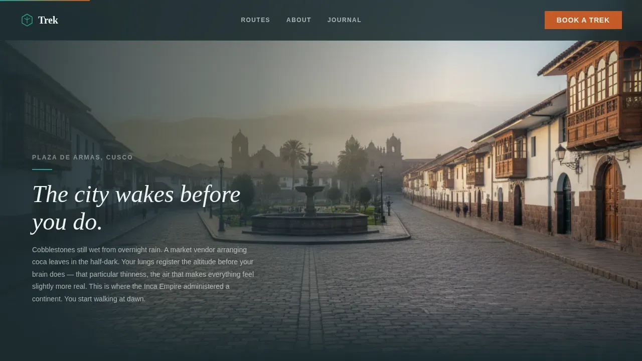
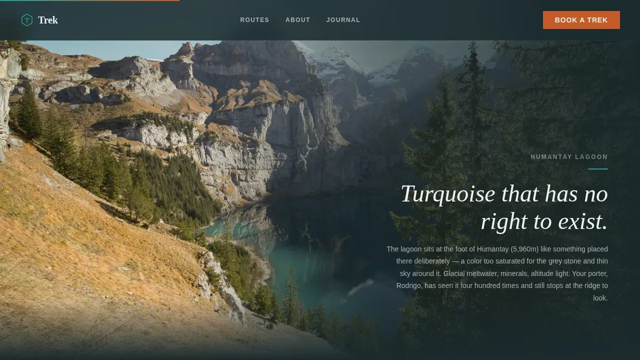
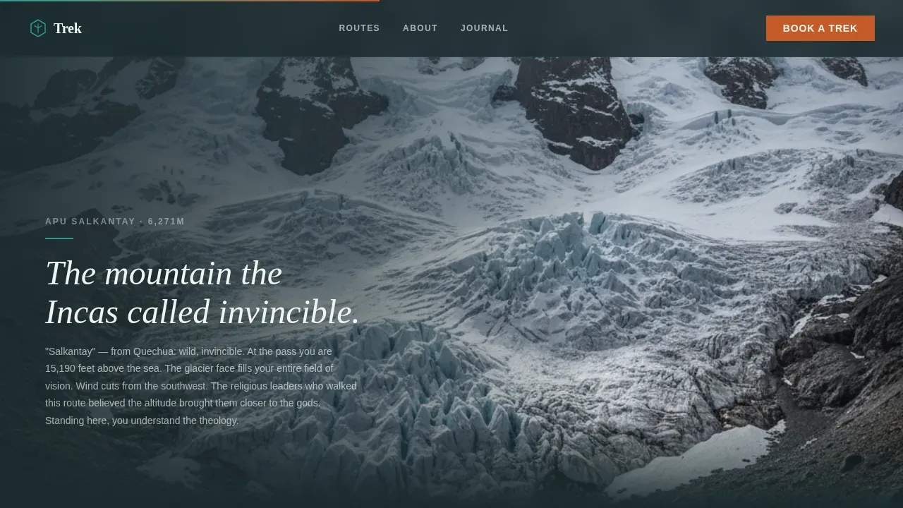
The page is structured as a visual journey through the trip, day by day. Each full-viewport section displays one photograph from a different stage of the trek: Cusco cobblestones at dawn, the turquoise Humantay Lagoon, the Salkantay glacier face, a cook tent with steam rising at camp, and finally the cloud forest descent. Visitors scroll through the trip the way they would walk it, which keeps them on the page and deepens their connection to the route before any purchase decision is requested.
Parallax Hero Section with Immersive Headline
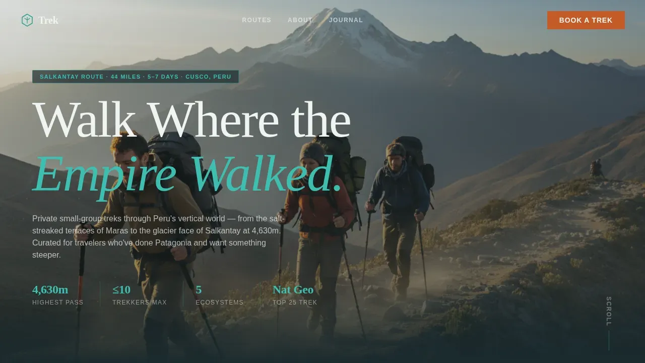
The opening section is a wide-angle lifestyle shot of three trekkers mid-stride on a narrow trail carved into a green mountainside, with Veronica peak filling the upper frame with snow. Golden-hour side-light catches dust from the trail. The headline "Walk Where the Empire Walked" lands over the sky area using a serif display font. Parallax depth layers separate the foreground figures, midground ridge, and background peak, giving the hero genuine visual weight from the first second visitors land on the page.
Pinned Elevation Markers and Sticky Narrative Panels
Each gallery section carries a pinned elevation marker in the corner, showing the altitude for that day of the trek. Sticky narrative panels hold a short paragraph of field-journal-style writing alongside the photograph as the visitor scrolls. This combination of precise data and immersive prose gives the hiking experience both credibility and atmosphere, helping visitors understand the physical scale of each day's walk without needing a separate description page.
Single-Focus Click-Through Call to Action
The template uses a click-through landing page direction. There is no form on the page. Instead, a rust-colored button labeled "See This Trek Day by Day" appears after the fourth gallery frame. The button uses a magnetic interaction that responds to cursor proximity. This placement ensures that only engaged visitors reach the call to action, and when they click, they arrive at the itinerary page ready to choose a departure date and group size.
Alpine Fresh Color System and Editorial Typography
The design uses four colors drawn from high-altitude Andean terrain. Glacier meltwater teal (#2A9D8F) marks section transitions and hover states. Weathered poncho rust (#C45B28) highlights the call-to-action button and any pricing callouts. Deep Andean basalt (#1B2A2E) anchors body text and navigation. High-altitude sky white (#F0F4F2) provides breathing space between full-bleed photography sections. Fraunces serves as the serif display typeface for headlines, and DM Sans handles body text and interface elements, creating an editorial adventure aesthetic that feels like a well-designed field journal.
Page sections overview
| Section | Purpose |
|---|---|
| Hero Trail Shot | Opens with golden-hour trekkers, parallax headline, and Veronica peak backdrop |
| Gallery Day One | Cusco cobblestones at dawn, 3,400m elevation marker, cultural arrival narrative |
| Gallery Day Two | Humantay Lagoon turquoise water, 4,630m Salkantay Pass, ecosystem transition narrative |
| Gallery Day Three | Glacier face and cook tent steam, 3,900m camp, expedition intimacy narrative |
| Gallery Day Five | Cloud forest descent and Machu Picchu reveal, 2,430m, rust call-to-action button |
| Footer Row | Minimal linear single-row footer with essential links |
Design & branding system
The visual identity follows an Adventure Terrain theme built around the Alpine Fresh color system. Every color choice references a specific element of the physical landscape, so the design never feels abstract or generic.
- Teal (#2A9D8F) carries hover states and section transitions, referencing glacier meltwater; rust (#C45B28) marks every call-to-action and pricing point, referencing a weathered poncho; basalt (#1B2A2E) grounds all body typography; sky white (#F0F4F2) breathes between photography panels
- Fraunces serif display type sets headlines with weight and character; DM Sans provides clean, readable body and interface text at every size
- The overall aesthetic is editorial adventure: every design decision serves the field-journal narrative, from the full-bleed image sequence to the pinned elevation markers that display altitude data in the corner of each frame
Mobile & speed optimization
The template is built desktop-first, as the gallery-walk experience is designed for full-viewport photography on larger screens. A mobile-responsive fallback ensures the page remains functional and visually coherent on smaller devices.
- Scroll-linked gallery transitions and cursor-reactive parallax use GPU-accelerated transforms to keep animation smooth without layout reflow
- Image lazy loading is built into the template structure, so photographs load as visitors scroll rather than all at once, reducing initial load weight
- The single-page, click-through structure means there are fewer total pages for the server to deliver, keeping the experience lean for visitors on any device
How this template helps you convert
A well-built hiking travel landing page earns trust through atmosphere before it asks for anything. Trek structures the entire page around a single conversion goal: the click to the itinerary page.
- The chronological gallery walk makes visitors feel emotionally invested in the trip before they reach the call to action, so the "See This Trek Day by Day" button appears at the moment of peak engagement rather than at the start of a cold page
- Pinned elevation markers and specific place names like Salkantay Pass and Humantay Lagoon provide factual credibility alongside the visual story, giving analytically minded visitors the concrete information they need to trust the tour operator
- The single-focus click-through direction removes all distractions: there is no form, no pop-up, and no competing link until the visitor is ready, which concentrates all traffic toward one measurable outcome
Other information about this template
The Trek template sits inside a broader category of travel landing page templates built for adventure tourism. Several supporting details are worth noting for tour operators and travel brands evaluating this template for their hiking website.
- The term "Empire Trek Walk" broadly refers to historical paths forged by major empires, and this template adapts that heritage framing for Peru's Andean routes, where Inca stonework remains visible underfoot on many trail segments
- Guided walking tours often explore historic sites connected to powerful civilizations. Hadrian's Wall, for example, was constructed in 122 AD by the Roman Empire to mark the northern frontier of Roman Britain. Similarly, trek experiences in Peru center on Inca-era infrastructure that predates many European landmarks
- Walking tours can vary in difficulty and length, catering to different fitness levels. A compelling travel landing page should communicate those differences clearly, including preparation information, gear requirements, and the best seasons to walk each route
- A strong travel landing page should include a high-quality hero image of iconic landmarks on the route, testimonials from past trekkers to provide social proof, logistical information such as price, duration, distance, and difficulty, and a clear call-to-action to guide visitors toward booking
- Seasonal information helps visitors plan. Highlighting the best times to walk, such as dry-season months with clear glacier views, gives the landing page added utility
- Tour operator websites that embed an interactive visual map help visitors understand the route layout before they commit. This template's gallery-walk structure provides a chronological substitute for a static map, walking visitors through each day's terrain in sequence
- Social media platforms can be used to drive traffic to a travel landing page like Trek. Campaign data gathered from those platforms helps tour operators understand which traffic source is performing best
- When visitors interact with this landing page through referred links from social media platforms or paid campaigns, tools like Google Analytics can track unique visitors, session length, and bounce rate to provide information about how the page is performing
- Google Analytics can store a randomly generated number in a cookie to identify unique visitors. That cookie stores information anonymously, meaning no personally identifiable data is attached to the identifier. These analytics analytical cookies help measure key performance indexes from the site's analytics report without collecting sensitive user data
- For certain functionalities, especially those involving third party features or other third party features like embedded maps or social widgets, operators should review how each tool handles campaign data and visitor preferences. Cookie stores information anonymously in most analytics contexts, but the site owner remains responsible for disclosing how cookies function to visitors
- Unicorn Platform offers an intuitive drag and drop website builder with designer-made templates, including this one, optimized for booking and travel sites. Users can create a landing page in just 3 minutes using the platform's visual editor. All pages built on the platform automatically adapt to mobile devices, ensuring the travel website looks great on any screen size. Templates are highly customizable, allowing operators to control colors, fonts, spacing, and layout without writing a single line of code
- The platform provides affordable monthly plans to suit businesses of all sizes, and it integrates with popular booking systems so operators can connect their Trek landing page to their reservation workflow. It also offers a blog builder and email marketing tools for operators who want to build content around their hiking trips over time
Theme
Adventure Terrain
Creative direction
Gallery Walk
Color system
Alpine Fresh
Style
Storybook/Full-Page
Direction
Click-Through
Page Sections
Chronological Gallery Walk Layout
Parallax Hero with Immersive Headline
Pinned Elevation Markers and Narrative Panels
Single-focus Click-through Call to Action
Alpine Fresh Color System and Editorial Typography
Scroll-linked Animation and Parallax Transitions
Related questions
Is this template designed for a single trip or multiple hiking routes?
Can I replace the placeholder photography with my own trail images?
Does the landing page include a booking form?
Who is the ideal visitor for this landing page?
Can I track performance after launching this landing page?