Luxury Cultural Immersion Travel Company Website Template
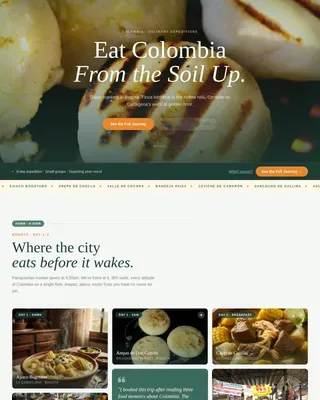
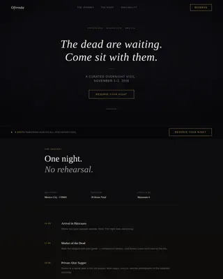
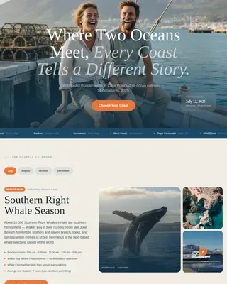
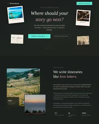
Immerse is a luxury cultural immersion travel landing page built for companies that place well-traveled professionals inside a culture, not in front of it. The page uses a masonry layout, atmospheric imagery, scroll-linked animations, and a single benefit-driven call to action to move visitors from quiet curiosity to a decisive click, without a form, a price, or a hard sell in sight.
by Rocket studio
Quick summary
Immerse is a single-page landing page template designed for luxury cultural immersion tour companies. It combines a full-bleed portrait hero, a shifting masonry grid, and high-contrast gold call-to-action buttons to guide affluent travelers through an atmosphere of accumulated desire. The result is a travel website that feels less like a brochure and more like a quiet invitation.
Who this template is for
This landing page is built for travel brands whose value is felt, not listed. It fits operators who sell depth over convenience and whose clients have already done the resort circuit. If your tours are built around genuine human connection and rarely advertised destinations, this template speaks your language.
- Luxury cultural immersion tour operators targeting well-traveled professionals in their forties and fifties
- Boutique travel companies offering curated trips to destinations like Morocco, Mexico, and Japan
- Solo travel specialists and small-group journey designers who lead with story, not itinerary bullet points
What problem this template solves
Most travel website templates push bookings through urgency, pricing banners, and long forms above the fold. That approach alienates the affluent traveler who has already decided price is not the barrier. The real barrier is trust, atmosphere, and the sense that this experience was made for them.
- Generic travel page layouts fail to reflect the sophistication that luxury travelers expect from a first impression
- Standard templates rely on search filters, flights, and packages before the visitor has felt anything
- Form-heavy pages create friction for considered purchases where desire must be built slowly and deliberately
What you get with this template
You get a complete, ready-to-customize landing page structured around atmosphere-first storytelling. Every section is designed to build emotional investment before asking for a single click. The page ships with clearly defined layout rows, a governed color palette, and two call-to-action states that guide visitors toward a detailed itinerary page.
- A full-bleed vertical hero section with a delayed ivory text reveal and a ghost call-to-action button
- Three masonry grid rows that shift from sparse to dense as the visitor scrolls, each tile revealing a destination name and sentence on hover
- A mid-page solid gold "Step Inside" call-to-action button placed after the third masonry row, earned through accumulated longing
Feature list
This landing page template includes a focused set of purpose-built features. Each one serves the goal of inspiring luxury travelers to explore further and sign their intent through a single, confident click.
Atmospheric Portrait Hero Section
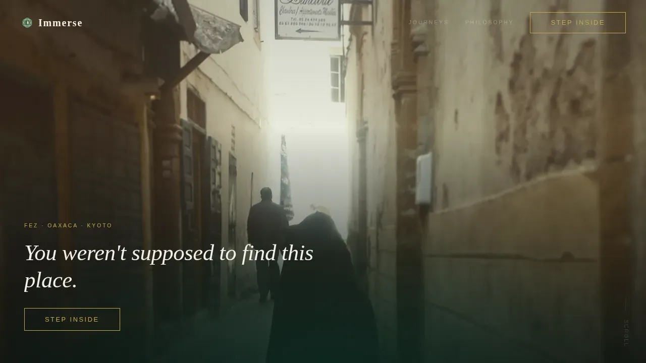
The header fills the entire viewport with a tall, intimate portrait photograph. No headline appears on load. After a brief pause, a single line of warm ivory text fades in at the base of the image. A gold-outlined ghost button follows, placing the call to action above the fold without breaking the mood.
Scroll-Shifting Masonry Grid
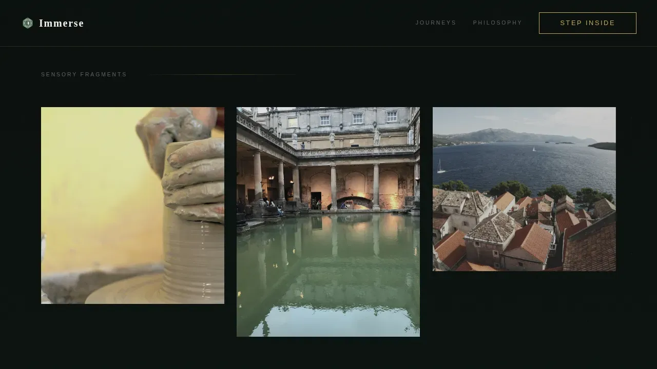
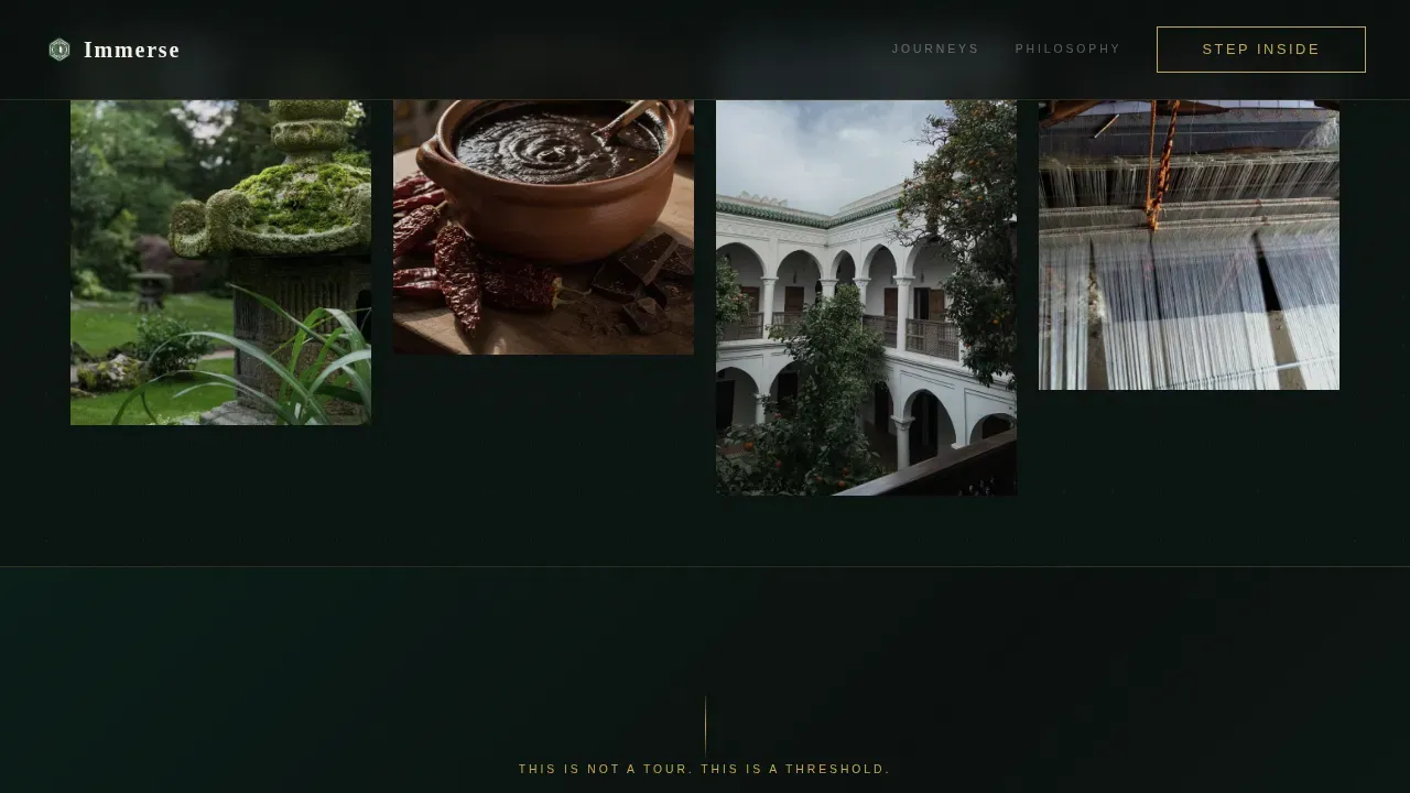
The page uses a three-row masonry layout that changes density as the visitor scrolls. The first row is sparse and spacious. The second row adds varied tile heights for a richer blend of imagery. The third row becomes lush and overlapping, pulling visitors deeper into the journey. Hover reveals on every tile show a destination name and one atmospheric sentence.
Dual-State Call-to-Action System
The "Step Inside" call to action appears twice. It launches as a ghost button in the hero, then resurfaces as a solid antique gold button after the third masonry row. This placement follows best practice: high-contrast buttons for calls to action should appear in the hero section and at key section transitions, reducing booking anxiety by replacing generic phrases with benefit-driven language.
Luxe Minimal Dark Emerald Color System
The palette is built on four values: deep jungle emerald as the dominant background, black lacquer for typography and negative space, antique gold reserved exclusively for interactive elements and fine-rule dividers, and warm ivory for text and card surfaces. The result is understated elegance with a colonial-library atmosphere that travelers associate with quality and sophistication.
Editorial Typography Pairing
Headlines use Fraunces, an editorial serif that carries warmth and authority. Body copy and interface labels use DM Sans for clean, legible contrast. This typography pairing keeps the page readable while reinforcing the bold, considered personality of a luxury travel brand. Good travel website design always uses typography to reflect the tone of the experience being sold.
High-Animation Interaction Layer
The template includes Ken Burns motion on the hero image, a scroll-linked parallax effect across the masonry rows, staggered tile entrance animations, and smooth hover reveals. These subtle web animations enhance the immersive experience without slowing the page. GPU-accelerated transforms and image lazy loading keep speed reliable even with dense, high-resolution imagery.
Page sections overview
| Section | Purpose |
|---|---|
| Portrait Hero | Full-bleed viewport image with delayed ivory text reveal and ghost call to action button |
| Masonry Row One | Sparse three-tile row; sensory fragment imagery with hover destination reveals |
| Masonry Row Two | Medium-density four-tile row; deeper atmospheric imagery, varied tile heights |
| Mid-Page call to action | Solid gold "Step Inside" button earned through scroll journey |
| Masonry Row Three | Dense five-tile overlapping row; full immersion imagery push |
| Minimal Footer | Centered superhuman-style footer with essential links |
Design & branding system
The visual identity is built around a dark, rich palette that communicates luxury without announcing it. Every color decision serves a clear role: backgrounds recede, text reads cleanly, and gold draws the eye only where action is needed. The design embraces simplicity and smart use of negative space so the imagery does the convincing.
- Deep jungle emerald (#064E3B) as the dominant background, creating serenity and depth across the entire page
- Black lacquer (#0B0F0E) for typography and negative space, antique gold (#C9A84C) for interactive elements and dividers only, warm ivory (#F5F0E8) for readable text and card surfaces
- Fraunces editorial serif for headlines, DM Sans for clean body and interface text, combining elegance with functional clarity
Mobile & speed optimization
Over 70% of travel searches happen on mobile devices, so this template is built to be fully responsive across screen sizes. The masonry layout reflows cleanly on smaller viewports. Animations use GPU-accelerated transforms only, and images use lazy loading to maintain speed without sacrificing the density of high-quality visual storytelling.
- Responsive masonry grid that adapts tile layout for tablet and mobile visitors without losing the atmospheric progression
- Image lazy loading and GPU-only transforms to keep the site smooth even with multiple high-resolution destination photographs
- Desktop-first design proportions that preserve the intended immersive experience for the primary audience of affluent professionals on larger screens
How this template helps you convert
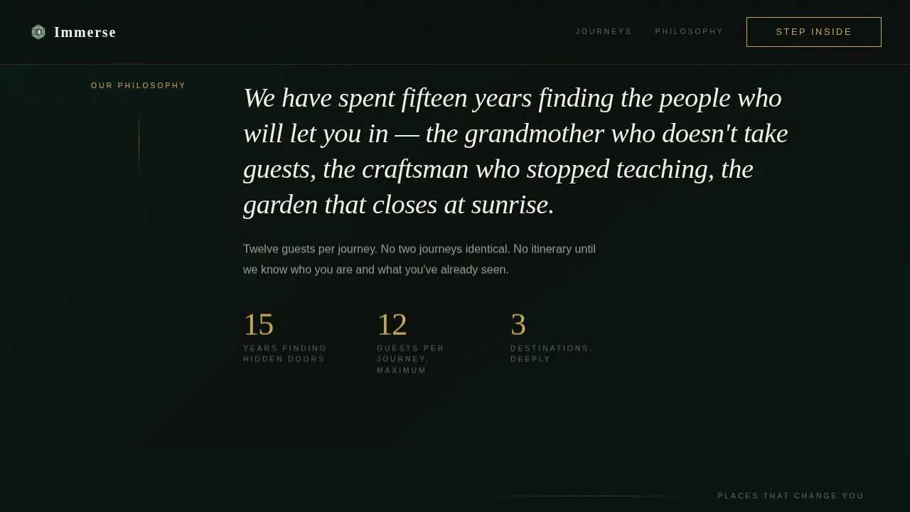
This landing page is designed around one conversion goal: earning the click to the itinerary page. It does this through desire accumulation rather than urgency tactics. Visitors are not pushed. They are pulled. Each section adds another layer of sensory connection before the call to action appears. The page treats the booking decision as an invitation, not a transaction.
- The hero section leads with a benefit-driven mood, placing the call to action above the fold without revealing price or date, following the principle that a compelling value proposition should focus on the experience rather than the destination
- The masonry grid builds longing tile by tile, so by the time users reach the mid-page solid gold button, clicking feels like accepting an invitation they have been waiting for, directly reducing booking anxiety through atmospheric momentum rather than discount-driven pressure
Other information about this template
This template is a strong fit for luxury travel brands that want a modern landing page with a distinctive visual identity and a clear single call-to-action flow. It is built as a desktop-first page with responsive behavior for travelers on all devices. Buyers exploring design examples across the travel and hospitality categories will find that this page stands apart from cluttered tour-listing formats.
- The Immerse Luxe Cultural Immersion Travel Landing Page Template is available on Envato, where users can explore a full catalogue of travel landing page templates across many categories
- The page does not include built-in booking tools, payments processing, or flights search by design; it is a click-through landing page intended to lead visitors toward a separate itinerary page where those commerce and booking features can live
- Designers and travel brands creating their next adventure page can use this template as a starting point, then adapt the imagery, hover-reveal sentences, and destination names to reflect their own tours and member perks
- The clean layout and focused interface make it practical for users with limited web design experience to customize without breaking the visual system
- Articles, blog posts, and travel content that reflect the cultural depth of each journey can be linked from the footer, giving the site room to grow with additional pages in the future
- Solo travel operators and small-group tour leaders will find the tone and visual flair well matched to an audience that values personal connection over packaged convenience
- The page uses metrics-conscious placement for its two call-to-action states, informed by best practices for high-converting travel website design
Theme
Luxe Minimal
Creative direction
Atmosphere & Mood
Color system
Dark Emerald
Style
Masonry/Pinterest
Direction
Click-Through
Page Sections
Atmospheric Portrait Hero with Delayed Reveal
Scroll-shifting Masonry Grid Layout
Dual-state Step Inside Call to Action
Dark Emerald Luxe Minimal Color System
Editorial Typography Pairing
High-animation Interaction Layer
Related questions
Does this template include a booking form or payments system?
Can I change the destinations and imagery shown in the masonry grid?
Is this template suitable for a solo travel brand or small-group operator?
What typography and color choices come with the template?
Is the page responsive for mobile visitors?