Hospital & Clinic Construction Booking Website Template
Ward is a modular card-grid landing page built for healthcare interior design studios. It guides hospital administrators, clinic owners, and architects through a five-phase design process, from Discovery Audit to Installation Proof. The Pastoral Calm visual identity, phase-progress navigation, and evolving call-to-action buttons work together to move qualified visitors toward a consultation booking page.
by Rocket studio
Quick summary
Ward is a click-through landing page template designed for hospital and clinic interior design practices. It presents a five-phase design process through a scroll-driven card grid, earning trust phase by phase before routing visitors to a consultation booking page. The Forest Trust color system and full-bleed hero photography set a tone that is clinical in precision but warm in feel.
Who this template is for
This landing page is built for healthcare interior design studios that serve institutional clients. It speaks directly to the people who commission large-scale facility renovations and need a design partner with proven code expertise.
- Hospital administrators overseeing capital renovation budgets
- Private clinic owners expanding into new specialty spaces
- Healthcare architects who need an interiors partner fluent in infection-control codes and wayfinding
What problem this template solves
Most design studio pages treat healthcare clients the same as residential ones. A medical landing page for this niche needs to do more: it must communicate regulatory fluency, show process transparency, and build trust before a single form is filled out.
- Prospects leave without booking because they cannot see the design process clearly
- Generic studio pages fail to address infection-control compliance or patient-flow expertise
- No single page ties emotional proof of comfort to documented design methodology
What you get with this template
This landing page template delivers a complete, structured presentation of a healthcare interior design practice. Every section is a deliberate step toward moving qualified visitors to a scheduling page.
- A full-bleed parallax hero with a fade-in headline and a primary call-to-action button
- A five-phase card grid that unfolds Discovery Audit, Concept Boards, Regulatory Alignment, Material Specification, and Installation Proof
- Persistent, evolving call-to-action buttons after every phase row, plus a square footage counter and testimonial quote slots per phase
Feature list
This landing page template is structured around features that serve both visual credibility and conversion goals.
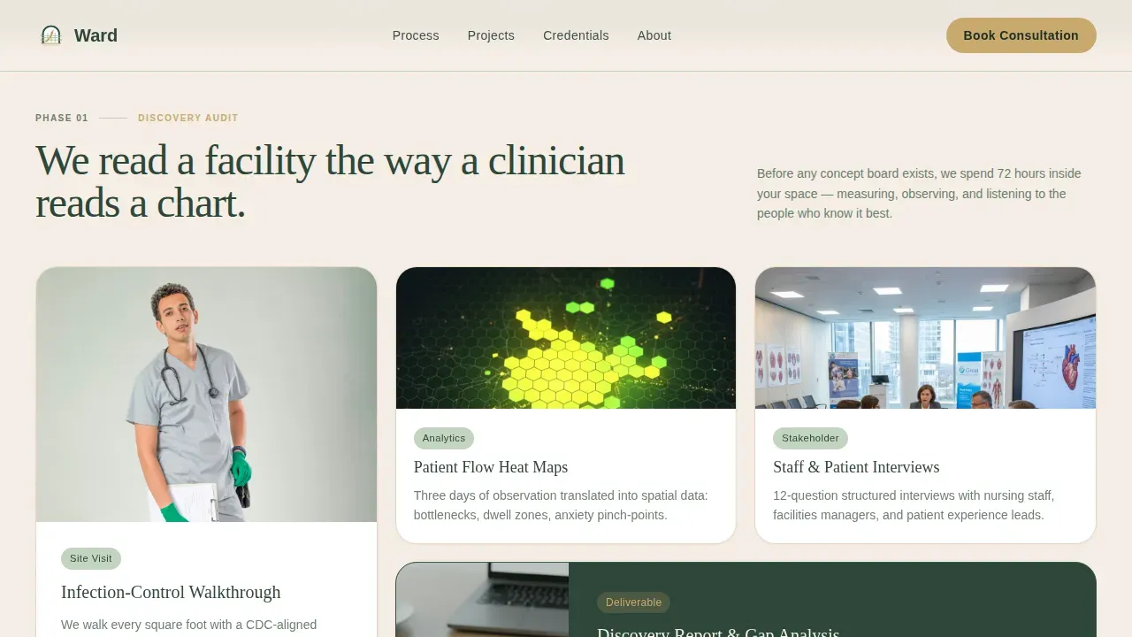
Five-Phase Card Grid Layout
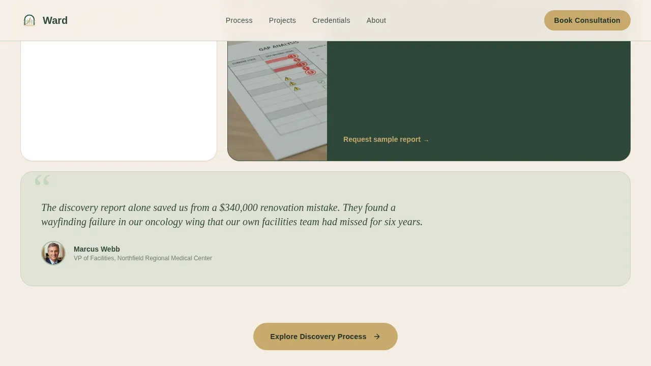
Each phase of the design process gets its own row of modular cards. Cards show deliverables, real project photography, and a facilities director testimonial quote. Scrolling through the page feels like turning pages in a project manual.
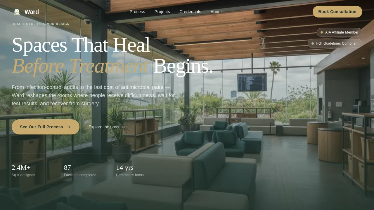
Parallax Full-Bleed Hero
The header uses a wide-angle, naturally lit interior photo with a headline that fades in on load. A primary call-to-action button sits inside the hero, giving visitors an immediate path to the scheduling page.
Evolving Persistent Call-to-Action
The call-to-action button text changes as visitors scroll: from "See Our Full Process" to "Explore Discovery," "View Material Library," and finally "Book a Facility Walkthrough." Each click routes to the same consultation booking page.
Phase Progress Indicator
A visible progress indicator tracks which design phase is in view as the visitor scrolls. This gives the page a structured, professional feel that mirrors how a doctor or facilities director thinks about project stages.
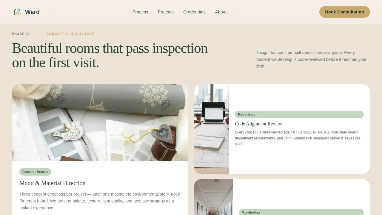
Code Compliance Credential Card
A dedicated card in the Concept and Regulatory phase displays compliance credentials visibly. This signals that the practice understands the rules that govern hospital and clinic construction environments.
Square Footage Counter
An animated counter shows total square footage designed across healthcare environments. This single number offers immediate, credible social proof without requiring visitors to read through case studies.
Page sections overview
| Section | Purpose |
|---|---|
| Hero with call to action | Introduce the practice and prompt the first click |
| Discovery Audit Cards | Show phase one deliverables and site documentation |
| Concept and Regulatory | Present material boards and compliance credentials |
| Material Specification | Display material library cards and specification sheets |
| Installation Proof | Show completed rooms with patients and square footage counter |
| Footer Arc Split | Logo, tagline, and navigation links |
Design & branding system
The visual identity follows a Pastoral Calm theme built on the Forest Trust color system. The palette is grounded, unhurried, and instinctively reassuring for healthcare decision-makers.
- Deep evergreen (#2D4739) for primary backgrounds and navigation; soft sage (#A3B8A0) for card surfaces and dividers; warm birch (#F4EDE4) as the dominant canvas
- Quiet gold (#C9A96E) reserved for buttons, progress indicators, and hover states
- Fraunces serif for headlines paired with DM Sans for body text and interface elements
Mobile & speed optimization
The template is designed desktop-first, reflecting how hospital administrators and architects typically review vendor materials at their workstations. It is fully responsive for mobile review.
- Static page sections are structured as Server Components for efficient rendering
- Counter animations and scroll-triggered card reveals are handled as Client Components
- Staggered card entry animations and a parallax hero use medium animation intensity to keep load feel smooth
How this template helps you convert
A well-designed medical landing page should guide visitors toward a clear next step without confusion. This template is built entirely around that goal.
- Every phase row ends with a persistent call-to-action button, so visitors always have a visible path to the booking page regardless of where they are on the page.
- Trust is built incrementally: code compliance credentials, testimonial quotes, and a square footage counter all appear before any booking prompt, so visitors arrive at the scheduling page already confident.
Other information about this template
This template is part of a broader set of healthcare landing page templates designed to enhance the online presence of medical and clinical practices. Medical landing page templates like Ward allow studios to add their own brand colors, text, and logos with straightforward changes to the design system.
- A medical landing page serves as a specific URL that communicates a particular health service or specialty to targeted visitors
- Landing pages for medical services can drive targeted traffic to specific treatments and offer a strong foundation for advertising campaigns
- This modern landing page design uses a neutral-leaning palette, which research into health landing page design consistently shows helps attract and retain visitors
- Teams getting started can use the template's modular card structure to find the right layout quickly, with design filters built into the card grid system to help set priorities
- A healthcare website built on this template can look polished and credible from day one, giving a doctor, facilities director, or clinic administrator the confidence to sign off on the studio's capabilities
Theme
Pastoral Calm
Creative direction
Step-by-Step Guide
Color system
Forest Trust
Direction
Click-Through
Page Sections
Five-phase Card Grid Layout
Parallax Full-bleed Hero
Evolving Persistent Call-to-action
Phase Progress Indicator
Code Compliance Credential Card
Animated Square Footage Counter
Related questions
Who is this landing page template designed for?
Does the page include any contact forms?
Can I customize the colors, fonts, and content?
How does the page build trust before a visitor books?
Is this template suitable as the basis for an advertising campaign?


