Laundry Room Renovation Portfolio Website Template
Washboard is a single-page landing page template for laundry room interior designers. It opens with bold monospaced metrics, then guides visitors through three escalating case studies in a zigzag layout. A lead generation form invites visitors to share their space, while a sticky bar captures email from those still browsing. The design is matte, unhurried, and built to convert.
by Rocket studio
Quick summary
Washboard is a purposefully designed landing page template for laundry room interior design practices. It skips the typical hero photograph and opens instead with three stark data points. Three zigzag case study sections build belief progressively. A lead capture form and sticky email bar close the page with two distinct conversion paths.
Who this template is for
This template is built for design professionals who specialize in functional home spaces. It speaks directly to the people who need to prove that a small, unglamorous room can earn its square footage.
- Homeowners mid-renovation who keep skipping the laundry room on the mood board
- Custom home builders who need every square foot to justify its cost
- Real estate stagers who know a well-designed utility room photographs well and adds perceived value
What problem this template solves
Laundry rooms are the most skipped space on renovation mood boards. Designers who work in this niche struggle to communicate value before a potential client dismisses the idea entirely. This template solves that confidence gap by leading with proof instead of promises.
- Visitors arrive skeptical; the metrics hook opens with hard numbers that reframe the room's importance before a single photo appears
- Clients often assume their room is too small or their budget too limited; three case studies of escalating constraint dismantle both objections
- Designers lose leads from browsers not yet ready to book; the sticky bottom bar offers an easier first step to stay in contact
What you get with this template
You get a complete, single-page lead generation layout built around a case study narrative structure. Every section has a defined role, and the design system is cohesive from the header to the footer.
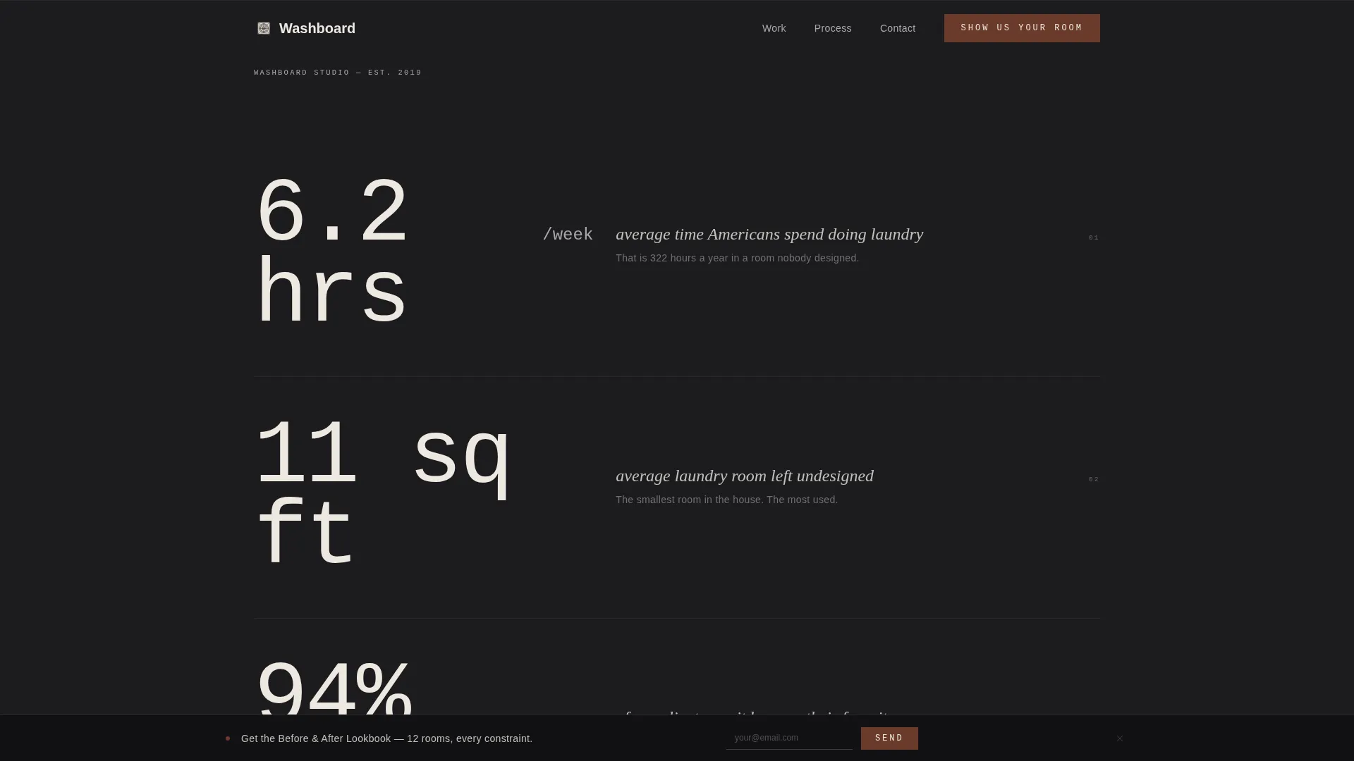
- A metrics-led hero section with oversized monospaced type, three client proof statements, and no photography required at launch
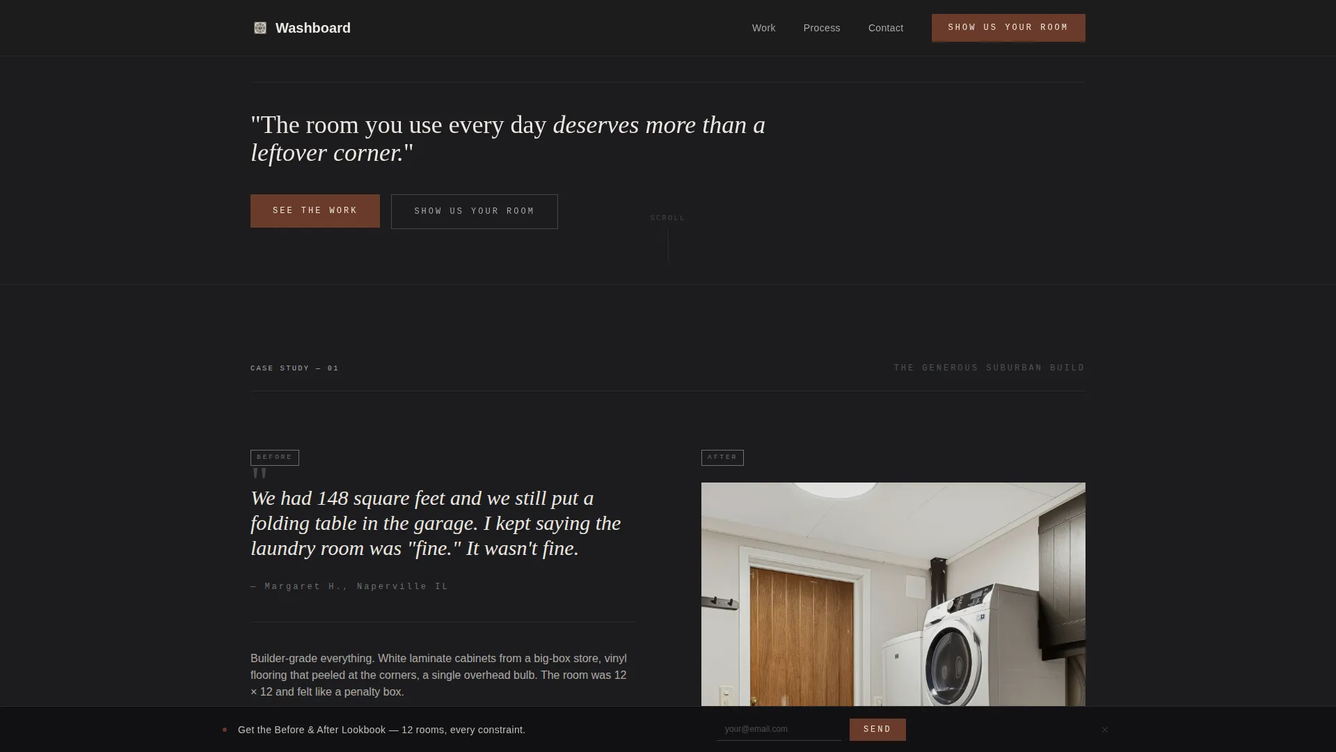
- Three zigzag alternating case study sections, each with a client quote panel and a finished-space editorial photograph panel
- A lead generation form with photo upload, room dimension input, and an open frustration field, plus a sticky bottom bar for email capture
Feature list
This template is built around a carefully structured set of purpose-driven components that work together to move visitors from curiosity to contact.
Metrics-Led Hero Section
The page opens with three oversized numbers set in monospaced type against a forge black background. No photography is needed. The restraint creates immediate credibility and gives the reader a reason to keep scrolling.
Zigzag Case Study Layout
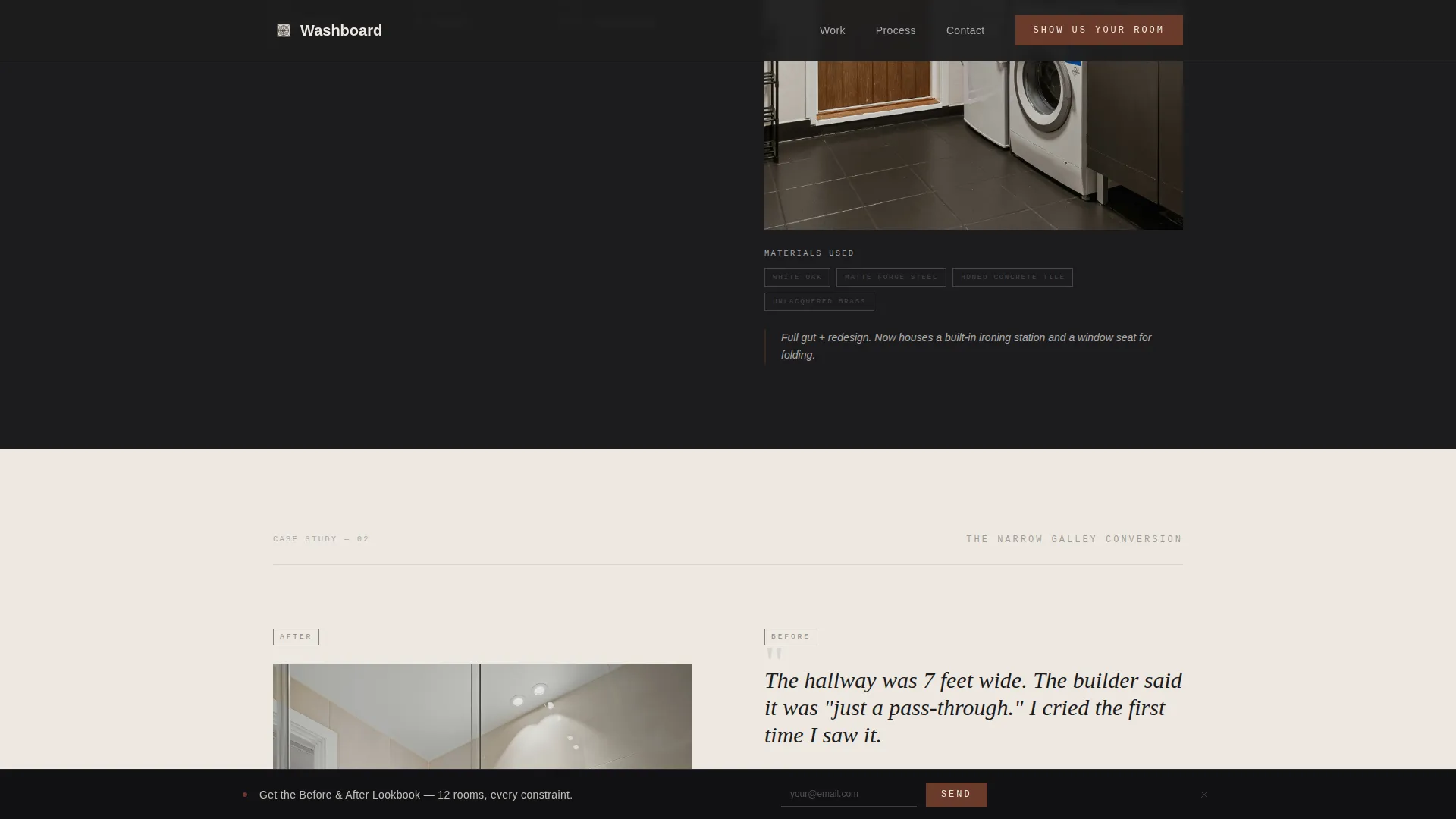
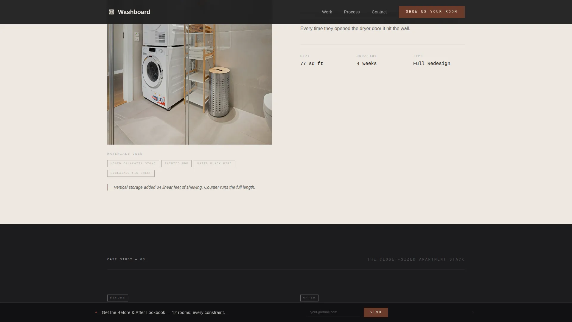
Three alternating left-right sections each tell one client story, moving from a generous suburban build to a narrow galley to a closet-sized apartment stack. Each section pairs a verbatim client quote with a single editorial photograph, material notes, square footage, and project duration.
Lead Generation Form with Photo Upload
After the third case study, a short form invites visitors to share their current space. It asks for a photo upload, a room dimensions dropdown, and one open text field asking what frustrates them most. The timing of the form is intentional, placed when belief in the designer's work is highest.
Sticky Email Capture Bar
A persistent bottom bar offers a Before and After Lookbook in exchange for an email address. It gives visitors a lower-commitment conversion path and keeps the designer building an audience even from visitors who are not yet ready to book.
GSAP ScrollTrigger Animations
Section reveals, staggered metric counters, and scroll-linked parallax effects are built in using GSAP ScrollTrigger. Static sections use Server Components for performance, while animated sections use Client Components.
Agrarian Root Design System
The full design language is built around a Monochrome Steel palette. Typography uses DM Mono for metrics and labels, Fraunces for headings, and Manrope for body copy. Every element reinforces the matte, worn, and unhurried character of the brand.
Page sections overview
| Section | Purpose |
|---|---|
| Metrics Hero | Opens with three bold statistics to reframe the laundry room's value before any image appears |
| Case Study One | Suburban build story with client quote panel and finished-space photograph |
| Case Study Two | Narrow galley conversion with alternating layout and before context |
| Case Study Three | Closet apartment stack, the tightest constraint, building final proof |
| Lead Gen Form | Collects photo, room dimensions, and frustration note from ready-to-book visitors |
| Sticky Bottom Bar | Persistent email capture offering the Before and After Lookbook to browsing visitors |
| Minimal Footer | Horizontal footer following a clean, minimal layout pattern |
Design & branding system
The visual identity follows an Agrarian Root theme expressed through a Monochrome Steel color system. The palette feels like a farmhouse utility sink: matte metals against sun-bleached cloth, nothing polished, everything worn to exactly the right softness.
- Colors: forge black (#1C1C1E) for backgrounds, raw linen white (#EDE8E1) for alternating sections, galvanized tin (#A8A9AD) for secondary text and dividers, and oxidized iron (#6B3A2A) reserved for hover states and call-to-action elements
- Typography: DM Mono carries all metrics and labels, Fraunces sets the headings, and Manrope handles body copy throughout
- The zigzag rhythm alternates linen white and forge black backgrounds so each case study section feels visually distinct without needing extra decoration
Mobile & speed optimization
The template is designed desktop-first and built to be fully responsive on smaller screens. Animated sections are handled by Client Components while static sections use Server Components to keep the page lean.
- GSAP ScrollTrigger animations are scoped to Client Components so they do not slow down static rendering
- The photo upload form, sticky bottom bar, and hover states all work across device sizes
How this template helps you convert
The page is structured as a deliberate belief-building journey. Each section removes one more objection before the conversion moment arrives.
- The metrics hero reframes the room's value instantly, giving skeptical visitors a reason to stay and read instead of bouncing.
- Three escalating case studies build accumulated proof, showing that even the smallest or most constrained laundry room can become a client's favorite space.
- Two conversion paths, the lead form and the sticky bar, meet visitors at different stages of readiness so no interested visitor leaves empty-handed.
Other information about this template
This template is part of a growing library of niche-specific landing page templates designed for home service and renovation professionals. A few additional details worth noting:
- The footer follows a horizontal minimal layout pattern, keeping the end of the page clean and uncluttered
- Localization is set for English, United States Dollar pricing context, and a United States audience
- The template is intended for use by a laundry room interior designer or design practice marketing their services directly to homeowners, builders, and stagers
- All three case study sections can be updated with real client photography, actual project specs, and genuine client quotes to match the designer's portfolio
- The sticky bottom bar and the lead generation form are independent conversion paths, allowing either to be adjusted or replaced without affecting the other
Theme
Agrarian Root
Creative direction
Case Study Narrative
Color system
Monochrome Steel
Style
Zigzag/Alternating
Direction
Lead Generation
Page Sections
Metrics-led Hero Section
Zigzag Case Study Layout
Lead Generation Form with Photo Upload
Sticky Email Capture Bar
GSAP Scrolltrigger Animations
Agrarian Root Design System
Related questions
Can I use this template without having client photography ready?
Is this template suitable for a design practice that works beyond laundry rooms?
How does the lead generation form work?
Can the sticky bottom bar be customized or removed?
What makes the zigzag layout effective for a service like this?



