Compelling Science Podcast Landing Page Template
Frequency is a single-column landing page template built for science podcasts that want to earn listens before asking for them. It pairs a cinematic scroll-triggered hero, an editorial archive of episode cards, and a persistent app-download bar into one beautifully paced page. The design feels like a leather-bound monograph, scholarly, warm, and genuinely compelling.
by Rocket studio
Quick summary
Frequency is a science podcast landing page template designed to convert curious visitors into first-time listeners. A scroll-triggered video hero, stacked editorial episode cards, and a sticky platform call-to-action bar work together in a single-column flow. The visual identity feels like a museum-grade monograph, dense ideas made beautiful.
Who this template is for
This template is built for podcast creators who want a page that reflects the quality of their content. It suits science communicators, researcher-hosts, and independent producers who need something that looks as considered as the work they put into every episode.
- Science podcast hosts translating academic research into accessible audio stories
- Independent producers who want an editorial, magazine-quality presence without a full site build
- Science educators and researchers launching a show aimed at curious, informed listeners
What problem this template solves
Most podcast landing pages are generic. They list episodes, drop some buttons, and call it done. For a show rooted in peer-reviewed research, that flatness kills credibility before the visitor even presses play.
- Generic templates fail to communicate the depth, tone, or trust level that a research-led podcast requires
- Visitors leave without listening because nothing on the page earns their attention or time
- No single template combines cinematic storytelling, editorial design, and a frictionless app-download path in one scroll
What you get with this template
You get a fully structured single-column landing page with five purpose-built sections and a persistent conversion bar. Every section has a defined job: earn attention, build context, prove value, and hand off to the app.
- A scroll-triggered video hero with an animated gold waveform and a typewriter headline
- A stacked editorial episode catalog, an origin story section, a viral-episode pull-quote block, and a community proof section
- A sticky dual-platform app-download bar pinned to the bottom of the viewport after the hero clears
Feature list
This template includes the following built-in features, each grounded in the source brief.
Scroll-Triggered Waveform Hero
The viewport opens black and still, holding only a thin gold waveform flatlined at center. As the visitor scrolls, the waveform animates to life, audio fades in mid-sentence, and the background dissolves to reveal a cinematic microphone close-up. The headline then types itself in a sharp serif display font.
Typewriter Headline Effect
The hero headline renders character by character using a CSS typewriter animation. It gives the opening line a sense of arrival, rewarding visitors who pause rather than rush.
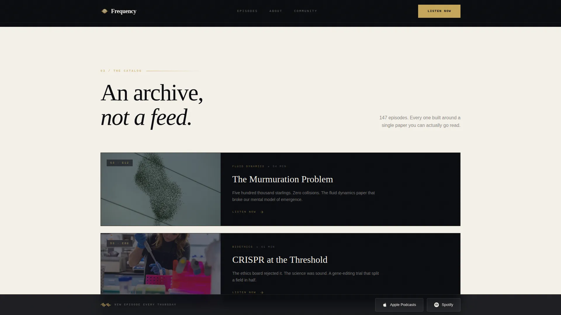
Stacked Editorial Episode Catalog
Episodes are displayed as vertical magazine covers, each with an illustration, a title, and a single-line teaser. The archive layout makes browsing feel like leafing through a back-issue shelf rather than scanning a plain list.
Viral Episode Pull-Quote Block
The turning-point episode gets a full-width treatment with a large pull-quote and an animated listener count ticker. The number ticks upward on scroll entry, turning social proof into a moment rather than a footnote.
Community Voice Memo Section
Listener testimonials are transcribed in a handwritten-style typeface and tagged with each contributor's city and profession. The format reads like a letters column in a Sunday supplement and makes social proof feel personal.
Sticky App-Download Bar
A persistent bar carrying both platform buttons stays pinned to the bottom of the viewport after the hero section clears. It removes friction by keeping the primary conversion action visible at every scroll depth.
Page sections overview
| Section | Purpose |
|---|---|
| Hero waveform video | Captures attention with cinematic scroll-triggered animation and typewriter headline |
| Origin story | Explains the founding moment behind the podcast with an asymmetric editorial layout |
| Viral episode quote | Highlights the breakout episode with a full-width pull-quote and listener count ticker |
| Episode archive catalog | Displays episodes as stacked magazine covers for editorial browsing |
| Community voice memos | Shows listener testimonials in handwritten-style type, tagged by city and profession |
| Sticky download bar | Keeps app-platform buttons visible and tappable throughout the entire scroll |
Design & branding system
The visual identity follows an Editorial Magazine theme built around four carefully chosen colors. Every design decision supports readability and a sense of scholarly luxury without tipping into sterile formality.
- Deep obsidian (#0B0C10) dominates the background in full-bleed alternating sections; warm parchment (#F4F0E8) provides breathing room between them
- Tarnished gold (#C5A55A) appears only on interactive elements, episode numbers, pull-quotes, and accent details, treating every highlight like gilt lettering on a first edition
- Typography uses Fraunces for serif display headlines, DM Sans for body copy, and IBM Plex Mono for episode numbers and labels
Mobile & speed optimization
The template is built mobile-first, which makes sense for a podcast whose listeners are on a commute. Desktop polish is layered on top, not the other way around.
- CSS animations are preferred throughout, with Intersection Observer used for scroll-triggered reveals to keep performance lean
- Scroll-triggered waveform animation, staggered section reveals, and the sticky conversion bar are all designed to behave cleanly on small screens
- Native smooth scroll is built in, keeping the single-column flow feeling continuous and intentional on any device
How this template helps you convert
The page is structured so visitors hear the product before they are asked to install anything. Conversion is earned through experience, not pressure.
- The scroll-triggered hero plays audio mid-sentence, letting the visitor sample the show's tone and warmth before any call to action appears
- A secondary gold button labeled "Start with Our Most-Loved Episode" appears mid-page after the viral-episode section, deep-linking directly into the app player for immediate listening
- The sticky dual-platform bar stays present throughout the scroll, so when a visitor is ready to tap, the button is already there without requiring a scroll back to the top
Other information about this template
This template is a strong fit for science podcast creators who want their landing page to reflect the editorial care they bring to each episode. A few additional details worth knowing before you build with it.
- The template is designed as a single-column flow, meaning all content moves in one continuous vertical scroll rather than across multiple pages
- Animation intensity is high by design; the waveform SVG, counter ticker, typewriter effect, and staggered GSAP-style CSS reveals are all part of the intended experience
- The page intentionally avoids email capture forms, keeping the conversion path focused on a single goal: app installs and first-listen completions
- Magnetic button hover states and hover interactions on episode cards are included for desktop visitors


Theme
Editorial Magazine
Creative direction
Origin Story
Color system
Obsidian & Gold
Style
Single Column Flow
Direction
App Download
Page Sections
Scroll-triggered Waveform Hero
Typewriter Headline Animation
Editorial Episode Archive
Viral Episode Pull-quote Block
Handwritten Community Proof Section
Sticky Dual-platform Download Bar
Related questions
Is this template suitable for an existing podcast or only a new launch?
Does the page include buttons for both Apple Podcasts and Spotify?
How many episodes do I need to make the catalog section look complete?
Is there an email sign-up form included in this template?
Can I adapt this template for a podcast that covers topics outside of science?


