Empty Nester Insurance Pricing Website Template
The Wayfarer landing page is a sidebar companion template built for empty nester travel insurance providers. It opens with a live three-question coverage estimator, then guides users through a scrollable audit of policy depth. Every section is structured to show price early and prove value on the way down, so visitors feel ready to sign before they reach the final call to action.
by Rocket studio
Quick summary
The Wayfarer landing page puts a real-time coverage estimator front and center, then uses a persistent sidebar checklist to walk users through every protection layer as they scroll. Built for travel insurance providers serving the 50-plus demographic, this landing page makes the quote visible immediately and earns the click by showing coverage depth before asking for any commitment.
Who this template is for
This landing page is designed for travel insurance brands that specialize in longer, more complex trips taken by adults in their fifties, sixties, and seventies. The template suits providers whose coverage goes beyond basic plans and whose clients need to understand what they are actually buying before they sign.
- Insurance providers focused on empty nester or 50-plus travel markets
- Agencies and brokers who handle extended-stay, multi-country, or adventure travel policies
- Teams who want a landing page that converts by showing price first and proving value second
What problem this template solves
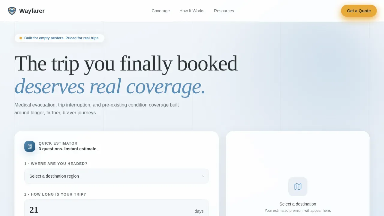
Standard insurance landing pages ask visitors to fill out a long form before showing any numbers. That friction causes a lot of drop-off, especially among older travelers who already know what can go wrong and want honest answers fast. The Wayfarer landing page solves this by putting the estimator above the fold, so users get a figure immediately without wading through complicated copy.
- Visitors leave when a landing page buries pricing behind a complicated multi-step form
- People exploring coverage for trips over 30 days find that most insurance pages miss the specific questions they have
- Travelers with pre-existing conditions often cancel their session when a page fails to address their situation early
What you get with this template
This landing page gives you a full sidebar companion layout with five content sections and a footer. Everything works together to convert cautious visitors into confident quote completions. The structure follows a Checklist and Audit creative direction, which means each scroll stage checks off a coverage concern rather than just listing policy names.
- An interactive three-question estimator with live premium animation and a coverage summary panel
- A persistent sidebar packing-list tracker that signs off each coverage area as the visitor scrolls
- Scenario cards, a comparison audit section, a secondary guide-download call to action, and a single-row footer
Feature list
This landing page is built around a small number of high-impact components. Each one has a clear job on the page and makes the overall experience feel organized and trustworthy.
Live Coverage Estimator Header
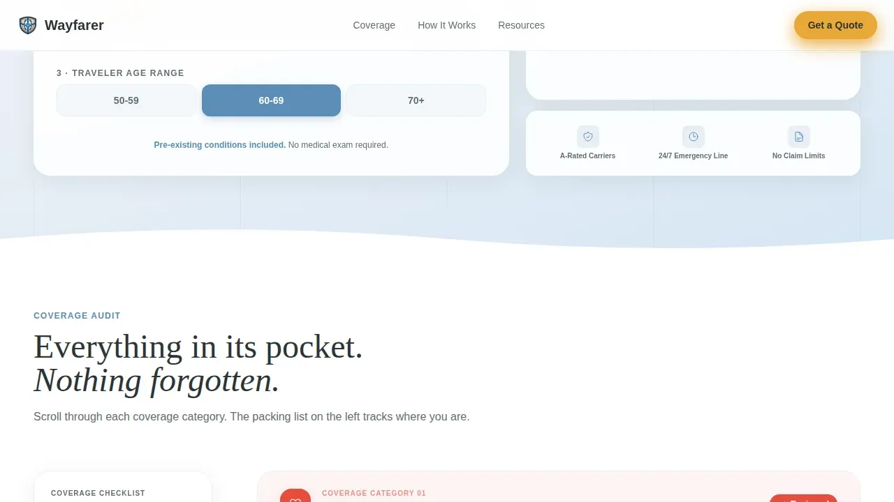
The header is a clean three-question calculator. Users select a destination region from a flag dropdown, set trip length on a draggable slider running from 7 to 90-plus days, and pick a traveler age range using a toggle between three bands. As each field is completed, an estimated premium and a coverage summary animate into view on the right side of the screen. A single line of microcopy reads: "Pre-existing conditions included. No medical exam required." No stock images, no distraction, just the tool and the numbers.
Persistent Sidebar Checklist
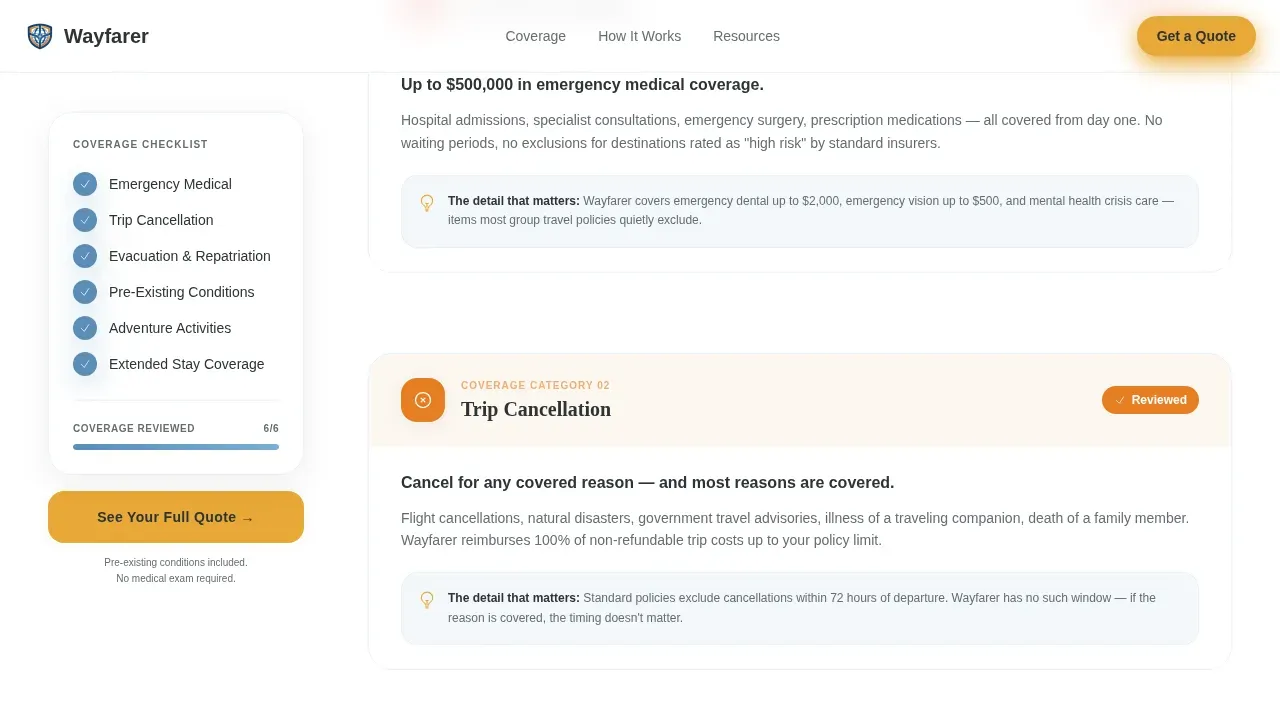
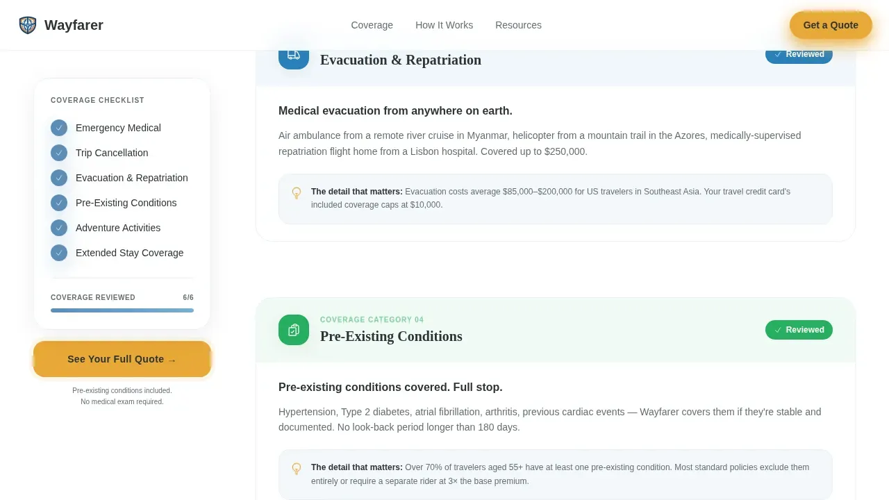
A sticky sidebar runs the full length of the page and tracks the visitor's progress like a packing list. Each coverage area checks off as the user scrolls past its section: Emergency Medical, Trip Cancellation, Evacuation and Repatriation, Pre-Existing Conditions, Adventure Activities, and Extended Stay Coverage. This sidebar keeps the full list of coverage names visible at all stages of the scroll, resulting in a strong sense of reassurance that nothing has been left out.
Coverage Audit Sections with Scenario Cards
The main content area treats each coverage topic as an audit. It shows what standard travel insurance misses, then shows what this policy catches. Scenario cards illustrate real situations, for example: "You break your ankle on day 14 of a 60-day Lisbon rental. Here is what happens next." Stakes scale up as the visitor moves deeper into the page, moving from a simple European holiday to multi-country overland journeys, so the coverage feels more essential with every section.
Amber Call-to-Action System
The primary call to action, "See Your Full Quote," appears first inside the estimator header and then stays fixed to the bottom of the sidebar as the visitor scrolls. Clicking it routes to the carrier's full quoting engine with pre-filled data from the estimator fields. A secondary text link, "Download the Pre-Existing Conditions Guide," captures an email address for visitors who are not yet ready to buy.
Dashboard Pro Visual Framework
The page is built on a Dashboard Pro theme with a Cloud Canvas color system. The layout uses an instrument-panel aesthetic: organized, calm, and easy to read. Typography combines DM Sans for body copy and Fraunces serif for editorial headings. The contrast between soft altitude white backgrounds and horizon blue primary elements makes the page easy to scan, while boarding-pass amber draws the eye to every call to action and progress indicator.
Page sections overview
| Section | Purpose |
|---|---|
| Estimator Header | Live three-question premium calculator above the fold |
| Sidebar Checklist | Persistent coverage tracker visible throughout the scroll |
| Coverage Audit | Shows gaps in standard plans with scenario card illustrations |
| Scenario Cards | Real trip stories demonstrating coverage depth in action |
| Guide Download | Secondary call to action capturing email for pre-existing conditions guide |
| Footer | Single-row linear footer with essential links |
Design & branding system
The visual identity is built around the Cloud Canvas color system, which uses four carefully adjusted tones to create the feeling of looking out an airplane window at altitude. The palette works through contrast: cool background tones set the stage, and warm amber makes every interactive element impossible to miss.
- Altitude white (#F4F7FA) as the page background, horizon blue (#5B8DB8) for primary elements and sidebar headings, passport-stamp charcoal (#2D3436) for body text
- Boarding-pass amber (#E8A838) reserved for calls to action, progress indicators, and interactive highlights throughout the landing page
- DM Sans for clean body copy across all landing sections; Fraunces serif for editorial headings that add warmth and readability to audit content
Mobile & speed optimization
The Wayfarer landing page is designed desktop-first because the sidebar companion layout needs horizontal space to show the checklist and main content side by side. However, the template includes a responsive mobile collapse so the landing page remains fully usable on smaller screens. Mobile optimization is important here because a lot of potential visitors will explore the page on a phone before returning on desktop to complete their quote.
- The sidebar collapses gracefully on mobile so users can still run through the checklist without zooming in or losing context
- Buttons and toggle controls are sized so they are easy to tap on mobile without zooming, keeping the form experience smooth
- The estimator fields, including the slider and dropdown, are adjusted for touch interaction so mobile users can input data quickly and without frustration
How this template helps you convert
Every element on this landing page works toward a single object: getting the visitor to click "See Your Full Quote." The page earns that click by showing the number first, then spending the scroll proving the coverage behind it. By the time visitors reach the bottom, the figure they saw at the top feels like a bargain.
- The estimator puts real data on screen above the fold, so users understand the cost before they invest time reading the full page. This removes the most common reason people cancel their session on an insurance landing page.
- The sidebar checklist keeps attention on coverage progress at every scroll stage, resulting in a consistent sense of forward movement that makes it easy for visitors to stay engaged and reach the final call to action.
- Scenario cards and the comparison audit build trust by showing specific situations rather than generic policy language, so visitors find the coverage feels relevant and are more ready to buy.
Other information about this template
The Wayfarer landing page is designed for a travel insurance product, but the layout methods apply across a range of financial services use cases where showing price early and proving value through scroll depth are both important conversion strategies. The page was brought together with a clear set of principles: show the number, check off the concerns, earn the click.
- The Wayfarer landing page features a mobile version covering a login view, a home screen view, and an individual destination page view, giving teams a variety of screen-level views to work from
- The design of the Wayfarer landing page uses contrasting colors, particularly warm amber against cool blues and greens, to enhance visibility and guide attention through the page in a way that feels natural, not forced
- No-code tools enable teams to create and launch a landing page like this without traditional programming skills; platforms like Rocket.new allow users to build production-ready landing pages and apps from natural-language prompts, making new methods of app development accessible without a background in code
- AI-powered platforms can automate backend integrations and code generation, and these new methods streamline the process of bringing a landing page from concept to live product for non-technical users
- The Wayfarer smart coverage estimator landing page template is built for the empty nester insurance niche but can serve any insurance provider whose audience values transparency and detail over simplified, one-size-fits-all plans
- The Wayfarer landing uses the York convention for single-row footer layouts, keeping the bottom of the page clean and uncluttered so the final call to action is the last thing users see before they sign off or proceed to quote
- A/B testing different elements, such as the estimator microcopy or the sidebar label names, can help teams find what works best for their specific audience and improve conversion rates over time
- Companies using landing pages generate 55% more leads than those that do not, making this a strong product choice for insurance providers who want to scale their quote pipeline without a complicated multi-page sign-up flow
Theme
Dashboard Pro
Creative direction
Checklist & Audit
Color system
Cloud Canvas
Style
Sidebar Companion
Direction
Click-Through
Page Sections
Live Three-question Coverage Estimator
Persistent Sidebar Packing-list Tracker
Coverage Audit with Scenario Cards
Amber Call-to-action System
Dashboard Pro Theme with Cloud Canvas Colors
Related questions
Who is this landing page template built for?
Does the estimator show real pricing on the page?
How does the sidebar checklist work?
Can this landing page be launched without coding skills?
Is the landing page optimized for mobile devices?



