County Tourism Donation Landing Page Template
Waypoint is a card-grid donation landing page built for county tourism offices that need to turn data into dollars. It leads with an animated icon grid, escalates through human-scale story cards, and closes with a trail-marker gold donation form tied to tangible outcomes. Grant reviewers, local business owners, and out-of-county families all get exactly what they need to take the next step.
by Rocket studio
Quick summary
Waypoint is a modular, stats-first donation landing page designed for county tourism offices running grant and public fundraising campaigns. The layout opens with a bold icon grid, walks visitors through animated impact counters and story cards, and closes with a frictionless donation form. Every scroll section builds an evidence case that turns curiosity into commitment and website visitors into active supporters.
Who this template is for
This template is built for county tourism offices, rural destination marketing organizations, and small government or nonprofit teams that need to present a clear, credible funding case to multiple audiences at once. It handles three very different visitors in a single page flow without losing any of them.
- State grant reviewers who need economic data, impact metrics, and a mission statement they can cite in a funding memo
- Local business owners who want proof that the tourism tax generates real weekday foot traffic and measurable economic return
- Out-of-county families browsing weekend options who need a reason to stop scrolling and make a plan
What problem this template solves
County tourism offices often struggle to communicate impact across audiences with completely different priorities. A grant reviewer reads spreadsheets. A family scrolls Instagram. A business owner wants a bottom line. A single brochure-style page fails all three. Waypoint solves this by building an evidence case card by card, so every visitor finds the proof they need before they reach the donation form.
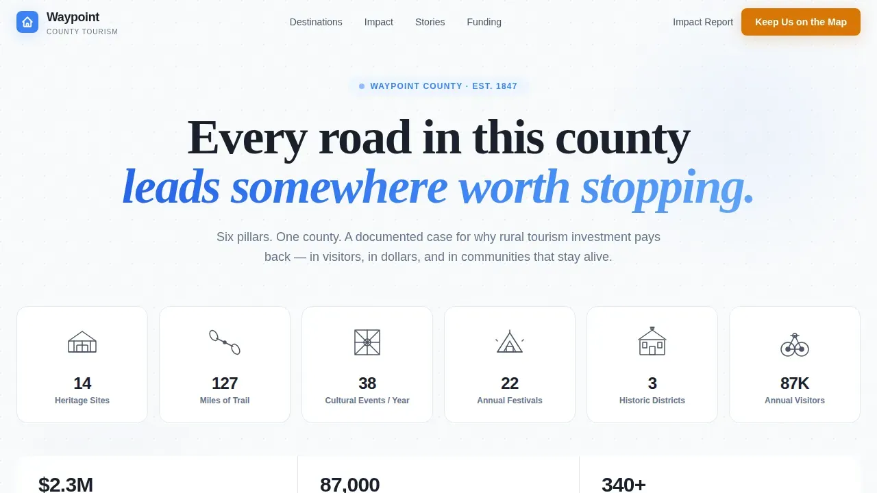
- No hero photo means no generic landscape that blurs into every other tourism page; the icon grid earns attention by leading with data instead of scenery
- Without a donor journey map guiding the page structure, potential donors arrive, scan, and leave without ever reaching the call to action
- A fragmented donation process that asks visitors to navigate away to give loses both one time donor conversions and recurring donors who needed one more reason to commit
What you get with this template
You get a fully structured, single-page donation landing page with six distinct scroll sections, each designed to move a different type of visitor forward along the donor journey. The layout is built around a modular card grid system, which means every section can be updated independently without rebuilding the page. Compelling visuals in icon form replace generic photos and make the page feel like a practical field guide rather than a tourism brochure.
- A six-icon header grid with bold stat callouts, animated impact counter sections, a human stories bento grid, a funding stakes section, a donation call to action section with a pre-set donation form, and a linear single-row footer
- A floating "Keep This County on the Map" donation bar in trail-marker gold that becomes prominently displayed after the second scroll section
- A secondary lead-capture path offering an Impact Report download for supporters who need board approval before making an online donation
Feature list
This section covers the core built-in capabilities of the Waypoint template as defined by the project brief.
Animated Icon Grid Header
The header replaces a traditional hero photo with a clean mosaic of six hand-drawn-style icons covering the county's tourism pillars: a covered bridge, a kayak paddle, a barn quilt, a festival tent, a historic courthouse, and a cycling wheel. Each icon sits inside a slate card with a single bold stat beneath it. Every icon is clickable, pulling website visitors deeper into the supporting data without leaving the page.
Stats-First Animated Counter Sections
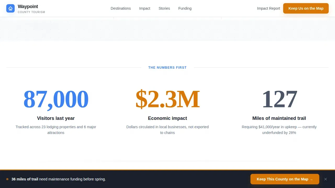
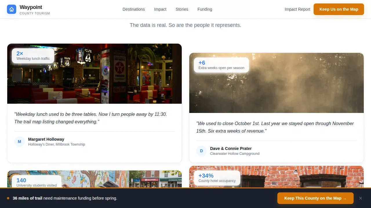
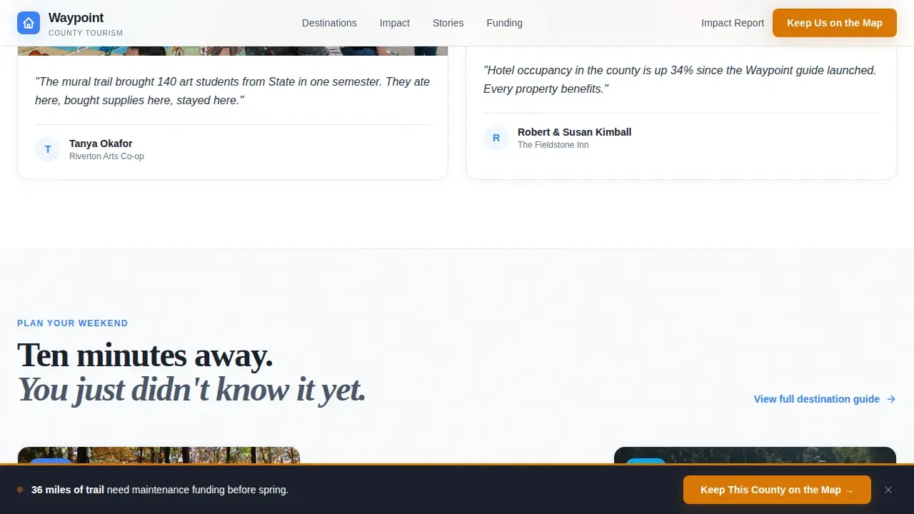
Each major scroll section opens with a large animated counter showing visitor counts, hotel occupancy lift, or miles of trail maintained. The counter animation runs as the section enters the viewport, so the number lands before the narrative does. Beneath each counter, a card grid breaks the stat into human-scale stories: a diner owner, a campground, a mural trail. This escalating structure builds the evidence case that makes the donation page persuasive to grant reviewers and families alike.
Tiered Donation Form with Tangible Outcomes
The donation form uses three pre-set donation amounts tied to specific, real-world outcomes. "$25 prints 500 visitor guides." "$75 maintains one mile of trail for a season." "$150 sponsors a heritage site marker." A custom donation amount field sits alongside the presets. This approach connects each gift size directly to a visible result, which increases trust and encourages higher giving without overwhelming visitors with choices.
Floating Donation Call to Action Bar
After the second scroll section, a floating bar locks to the bottom of the viewport. The bar carries the primary call to action in trail-marker gold and stays visible as visitors continue reading. This keeps the donation button prominently displayed throughout the evidence-building sections, so the path to giving is always one tap away without interrupting the reading flow.
Impact Report Lead Capture
A secondary conversion path offers visitors the option to download the county's Impact Report in exchange for an email address. This path is built for prospective donors who operate inside organizations, such as board members or department leads, who need documentation before they can authorize a gift. It captures donor data from supporters who are not yet ready to give online but are clearly engaged.
Expandable Story Cards and frequently asked question-Style Panels
The human stories bento section and the funding stakes section both use expandable card panels. Visitors can open individual story cards to read more without the page becoming cluttered. This frequently asked question-style expandable approach keeps the initial view clean and skimmable while giving curious visitors and grant reviewers access to deeper detail on demand.
Page sections overview
| Section | Purpose |
|---|---|
| Hero Icon Grid | Leads with six tourism pillar icons, each carrying a bold stat, replacing a hero photo with data |
| Animated Impact Stats | Opens each scroll beat with a large counter, then breaks the number into human-scale story cards |
| Human Stories Bento | Presents diner owner, campground, mural trail, and art student stories in an expandable card grid |
| Funding Stakes Section | Frames what one dollar of tourism investment protects and what the county would lose without it |
| Donation Call to Action | Hosts the pre-set donation form, floating bar, and Impact Report email capture path |
| Linear Footer | Provides a single-row footer with navigation, contact, and legal links |
Design & branding system
The visual identity follows an Educational Guide theme. The palette is called Slate and Sky, and it is designed to feel like a clear October morning at a scenic overlook: cool stone underfoot, open sky overhead, and a single warm blaze marking the path forward. Typography pairs Plus Jakarta Sans for body text with Fraunces display serif headings, which gives the page a trail-guide authority without feeling stiff or bureaucratic.
- Weathered slate gray (#4A5568) for card backgrounds and body text; open-sky blue (#3B82F6) for data callouts and interactive highlights; horizon white (#F8FAFC) for the page canvas
- Trail-marker gold (#D97706) is reserved exclusively for the donation call to action elements and progress indicators, so every gold element on the page signals a giving opportunity
- Card animations use staggered reveals on scroll entry, and counter animations run as each section enters view, keeping motion purposeful rather than decorative
Mobile & speed optimization
The template is built desktop-first to serve grant reviewers working at a desk, with strong mobile layout support for families browsing on phones during weekend planning. Over 50% of nonprofit traffic typically arrives from mobile devices, so the donation form and floating call to action bar are both fully responsive. Mobile optimization protects conversion rates by ensuring the donation process never breaks on smaller screens.
- The donation form is responsive and touch-friendly, with pre-set donation amount toggles designed for thumb navigation on mobile devices
- Counter animations and staggered card reveals are handled by client-side components, keeping static sections fast to load while interactive elements stay smooth
- Non-essential navigation is removed from the page to prevent overwhelm visitors from losing focus before reaching the donation form
How this template helps you convert
Waypoint is built around a single conversion principle: the stats do the persuading, and the call to action just opens the door. The page does not ask for a gift on the first screen. It earns it across six sections of escalating evidence before the donation form is ever the focus.
- The icon grid captures attention at the awareness stage by leading with data points that make the county's tourism value immediately legible, so potential donors and grant reviewers form a positive first impression before any narrative begins.
- The animated counters and story cards carry visitors through the decision stage by turning abstract numbers into recognizable human outcomes, building an emotional connection that makes the donor journey feel natural rather than pressured.
- The floating donation bar and pre-set donation form close the loop at the giving moment by making the online donation process frictionless: one tap to select a donation amount, clear payment options, and a transparent statement of how donated funds are used.
Other information about this template
This section covers platform context, practical usage guidance, and additional details relevant to buyers evaluating this template for their organization's online fundraising efforts.
- The Waypoint keep this county on the map donation landing page template is purpose-built for government-adjacent and nonprofit organization use cases where the audience includes both public grant reviewers and private individual donors.
- Non profit landing pages like this one are designed to drive a single action by removing distractions. Landingi is a dedicated landing page platform where this template lives, enabling teams to build and launch optimized donation landing pages without coding.
- A landing page builder like the one powering this template simplifies online fundraising by providing a drag-and-drop editor, ready-made structure, payment integrations, and mobile optimization out of the box.
- The donation form supports a monthly donation button so visitors can opt into a monthly giving program directly from the preset toggle. Monthly recurring donations and recurring giving options are valuable because recurring donors generate predictable revenue for ongoing operations like trail maintenance.
- To double the donation potential from corporate supporters, the template's Impact Report lead-capture path can be paired with a matching gift outreach sequence. Board members and corporate contacts who download the report are strong candidates for matching gift conversations.
- The donor journey map embedded in the page structure moves visitors from awareness stage discovery through the decision stage and into the advocacy stage without requiring a separate email sequence. Every stage of the donor journey is an opportunity to build loyalty, and this page is designed to serve all of them.
- Transparency about how donated funds are used is built into the donation form's preset labels. Showing donors exactly what each donation amount achieves is one of the most reliable ways to build credibility and encourage donors to complete the donation process.
- High-performing donation page examples from organizations like Feeding America, the North Texas Food Bank, and World Vision share this template's approach: a clear mission statement, compelling visuals, prominently displayed impact data, and a frictionless donation process.
- Organizations like the United Nations Population Fund use donation landing pages that combine a clear mission statement, emotional storytelling, and strong social proof. These same page principles apply here, adapted for a county tourism and heritage context rather than global causes like climate change or care for seriously ill children and ill children supported by large international nonprofits.
- Charity Navigator and similar rating bodies reward nonprofit website transparency. Including an annual report download and showing exactly how donated funds are spent supports that credibility publicly.
- The secondary lead-capture path serves prospective donors who are not ready to give as a one time donor on first visit. Redirecting donors to a thank-you page with additional resources, free tips for planning a county visit, or a digital marketing asset like a trail guide PDF supports continued support and personalized engagement after the initial conversion.
- Online fundraising goals tied to specific county outcomes, such as funding 10 new heritage site markers or maintaining 50 miles of trail, make the donation page's progress bar meaningful and encourage new donors to join before a goal closes.
- Apple Pay and other digital wallet payment options alongside standard card processing help accommodate mobile donors and reduce processing fees friction at checkout.
- Attract donors who are in research mode by making recruit volunteers and community involvement options visible near the donation form. Not every visitor is ready for a financial gift; some will become advocates first and donors later, which is the advocacy stage working as intended.
- Donor behavior research consistently shows that offering different gift size presets and multiple payment options leads to more donations and a higher average gift size per session.
- Online donation forms that use a multi step form layout reduce cognitive load and keep the donation process from feeling like a chore. This template's preset-toggle approach achieves the same effect in a single-step format.
- Continuously monitor the donation page to identify drop-off points and refine the online donation page over time using testing and analytics. Tracking donor data and conversion rates transforms the page from a static asset into a performance-driven fundraising tool that supports your broader online fundraising goals.
- The mission statement is woven into the page's opening grid rather than buried in a footer paragraph. A clear mission statement placed at the top of the donor journey helps guide donors from the very first scroll and reduces bounce at the awareness stage.
Theme
Educational Guide
Creative direction
Stats-First Impact
Color system
Slate & Sky
Style
Card Grid (Modular)
Direction
Donation/Fundraising
Page Sections
Animated Icon Grid Header
Stats-first Animated Counters
Tiered Pre-set Donation Form
Floating Gold Donation Bar
Impact Report Lead Capture
Expandable Story Card Panels
Related questions
Can this template support both one-time and recurring giving options?
Who is the primary audience this donation page is designed for?
Does the floating call to action bar interfere with reading the page content?
What makes this donation landing page different from a standard tourism webpage?
Can the Impact Report download capture leads from supporters not ready to give immediately?