Cultural & Heritage Tourism Booking Website Template
Waypoint is a masonry-style landing page template built for indigenous cultural tour operators. It combines a cinematic panoramic header, a staggered grid of tour experience cards, and full-width elder quote interstitials to guide visitors toward booking. The Ocean Calm color palette and Neo-Retro visual style create a warm, immersive first impression that feels earned rather than sold.
by Rocket studio
Quick summary
Waypoint is an immersive single-page template designed for indigenous cultural tour operators. It opens with a horizon-spanning aerial photograph, then unspools a masonry grid of tour experience cards that grow richer as visitors scroll. Every design choice builds cultural weight and narrative trust before a single click is requested.
Who this template is for
This template is built for operators who need their landing page to carry the emotional gravity of the experience itself. It suits businesses where trust, cultural depth, and visual storytelling are the primary selling tools.
- Indigenous cultural tour operators offering guided Country experiences for international or domestic visitors
- School group coordinators and corporate retreat planners seeking curriculum-aligned or team-building itineraries
- Travel brands and tourism designers who need a ready-made, visually distinctive single-page layout to launch quickly
What problem this template solves
Most tour landing pages rely on bullet-point itineraries and discount banners. That approach flattens experiences that deserve reverence. Waypoint solves the mismatch between a profound cultural offering and a generic digital presentation.
- Visitors bounce when a page feels transactional; this template builds wonder before it asks anything
- Cultural nuance and storytelling get lost in standard grid layouts; the masonry structure and interstitial quotes restore that narrative weight
- Operators struggle to guide different audience types toward the same booking action; Waypoint's layered scroll path moves couples, school groups, and corporate planners toward one clear next step
What you get with this template
You receive a fully structured single-page layout with every section pre-built and ready to populate with your own photography and copy. The template hands you a visual and narrative system, not just a page skeleton.
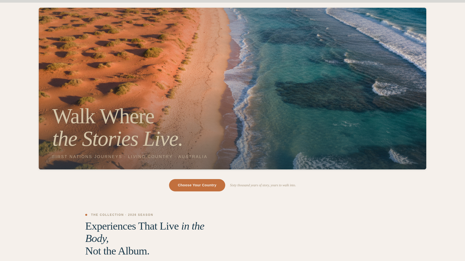
- A cinematic 2.39:1 panoramic header with grain overlay, rounded vintage corners, and a floating hand-lettered headline placement
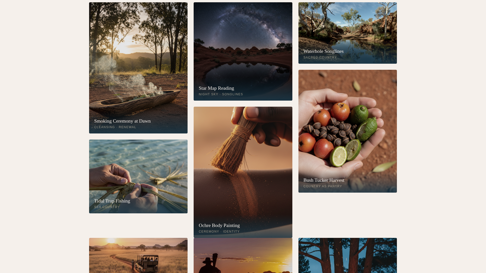
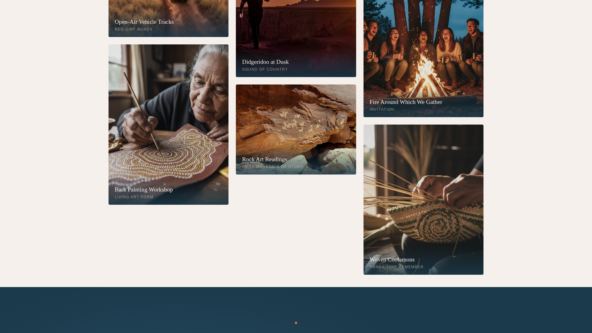
- A staggered masonry grid of mixed-aspect-ratio tour experience cards, each designed to hold a grainy, warmly saturated photograph and a short poetic label
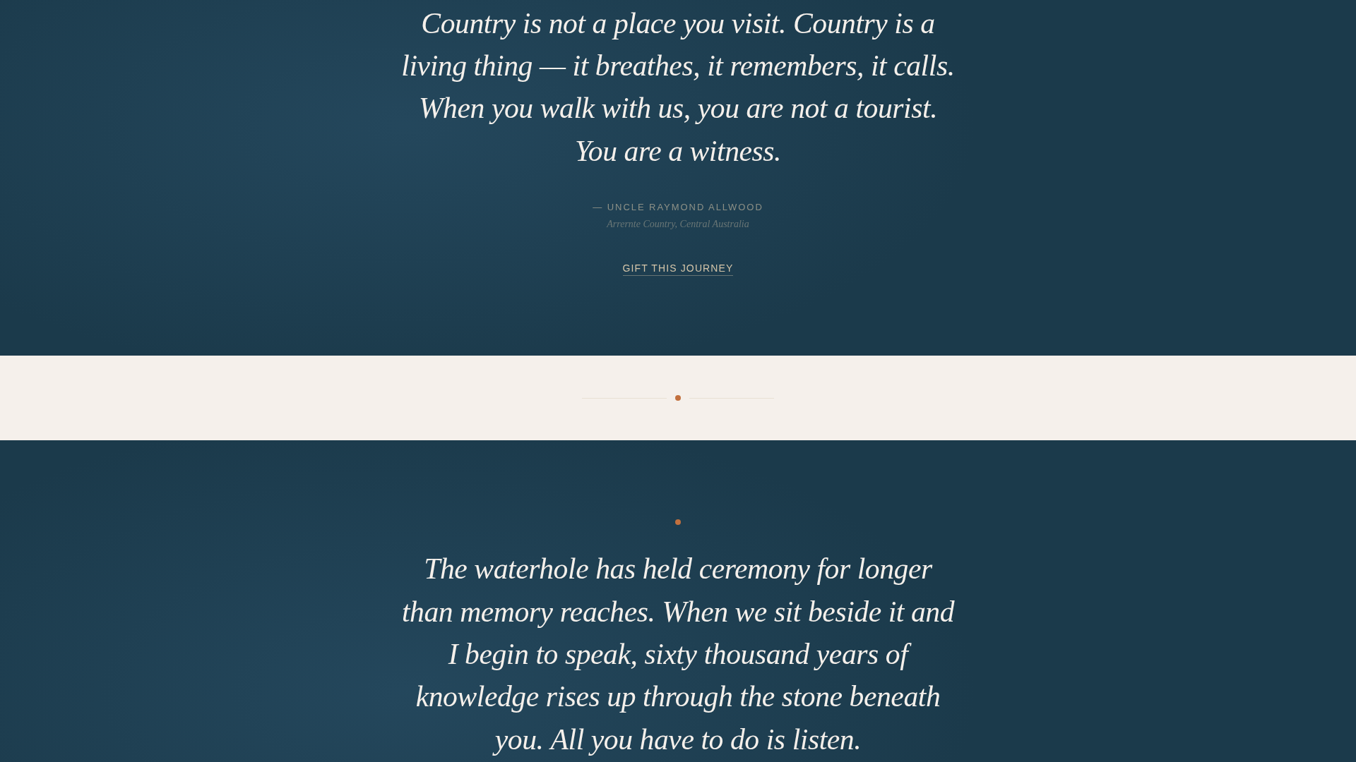
- Full-width elder quote interstitials on deep tidal blue, placed every three rows to reset rhythm and deepen the story
Feature list
This template is built around a handful of carefully considered components. Each one serves the scroll experience and the booking goal.
Panoramic Cinematic Header
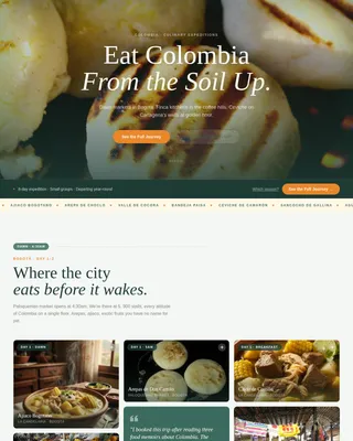
The header spans the full viewport width at a 2.39:1 cinematic ratio. A subtle grain overlay and rounded corners recall vintage postcard printing. A hand-lettered headline in driftwood tone floats low in the frame, and no navigation appears until the visitor begins to scroll.
Masonry Tour Experience Grid
Tour experiences are laid out in a Pinterest-style staggered grid where each tile holds a different aspect ratio. Cards display grainy, warmly saturated photography alongside short poetic labels such as "Smoking Ceremony at Dawn" or "Star Map Reading." Tiles breathe with generous gutters that keep the collection feeling curated rather than crowded.
Elder Quote Interstitials
Every three rows of the masonry grid, a full-width panel breaks the layout. White text sits against deep tidal blue, presenting a direct elder quote. These interstitials reset the visual rhythm and anchor the cultural narrative between waves of imagery.
Anchored and Floating Call-to-Action
The primary call-to-action, "Choose Your Country," appears as an ochre pill button immediately after the header. It reappears as a floating element once the visitor passes the third masonry row. Both instances route to a detailed itinerary and booking calendar on the next page.
Secondary Gift Path
A "Gift This Journey" secondary call-to-action sits in driftwood tone beneath each interstitial quote. It provides an alternative conversion path without disrupting the primary scroll flow or adding any form to this page.
Ocean Calm Color System
The template uses a four-tone palette applied with strict hierarchy. Deep tidal blue and salt-crust white alternate as section backgrounds. Driftwood carries body text and card borders. Ochre activates only on hover states, booking prompts, and wayfinding dots, keeping the visual temperature calm until action is needed.
Page sections overview
| Section | Purpose |
|---|---|
| Panoramic Hero Header | Opens the experience with a full-width cinematic landscape and floating headline |
| Primary call to action Block | Anchors the "Choose Your Country" ochre pill button after the header |
| Masonry Grid Row 1-3 | Introduces landscape-scale tour imagery and poetic card labels |
| Elder Quote Interstitial 1 | Breaks the grid with a full-width quote panel on deep tidal blue |
| Masonry Grid Row 4-6 | Shifts from observation to participation with closer, more intimate imagery |
| Elder Quote Interstitial 2 | Resets scroll rhythm and deepens cultural narrative mid-page |
| Masonry Grid Row 7-9 | Closes the visual story with faces mid-laugh around a fire |
| Elder Quote Interstitial 3 | Final quote panel with "Gift This Journey" secondary call-to-action |
| Floating call to action Trigger | Reappears as a floating element after the visitor passes row three |
Design & branding system
The template uses an Ocean Calm palette drawn from coastal and desert Australia. Every color has a defined role, and the system is designed to stay restrained until action calls for warmth.
- Four tones in strict hierarchy: deep tidal blue (#1B3A4B), sunbleached driftwood (#D4C5A9), salt-crust white (#F5F0EB), and ochre accent (#C2703E) reserved for interactive and booking elements only
- Neo-Retro visual style with grain overlays, rounded vintage-print corners, and warmly saturated photography that references faded 1970s print aesthetics
- Backgrounds alternate between salt-crust white and deep tidal blue across sections, while driftwood tones unify card borders and body text throughout
Mobile & speed optimization
The masonry layout and full-width interstitials are structured to reflow cleanly on smaller screens. The template keeps visual complexity manageable without reducing the immersive character of the experience.
- The masonry grid reflows from multi-column to a single-column stacked view on mobile, preserving card legibility and poetic labels at any screen width
- The floating call-to-action is positioned to remain accessible without obscuring photography on narrow viewports
- Grain overlays and rounded-corner treatments are applied as lightweight CSS-level effects rather than additional image files, keeping the visual style intact without multiplying load weight
How this template helps you convert
This template treats the scroll itself as the persuasion engine. By the time a visitor reaches the booking call-to-action, they have already moved emotionally from observer to invited guest.
- The masonry grid sequences photography deliberately, starting with wide landscape shots and moving toward close-up human moments, so the visitor's connection deepens with every row rather than plateauing after the header.
- The ochre call-to-action reappears as a floating element at precisely the moment curiosity peaks, after three rows of immersive imagery, making the click feel like a natural continuation rather than an interruption.
Other information about this template
Waypoint is part of a template collection designed for travel and hospitality operators who need a distinctive digital presence without starting from scratch. It is particularly well-suited to cultural heritage tourism contexts where visual storytelling carries more persuasive weight than price-led copy.
- The template is built for a single-page, click-through flow with no embedded forms; all lead capture happens on the linked itinerary and booking calendar page
- Photography placeholders are pre-sized to the aspect ratios specified in the design brief, making it straightforward to drop in your own images without resizing
- The Neo-Retro theme and Ocean Calm color system are consistent with broader indigenous cultural tour branding needs, where analog warmth and restraint signal authenticity more effectively than high-gloss digital polish
Theme
Neo-Retro
Creative direction
Curated Collection
Color system
Ocean Calm
Style
Masonry/Pinterest
Direction
Click-Through
Page Sections
Cinematic Panoramic Header
Staggered Masonry Experience Grid
Full-width Elder Quote Interstitials
Anchored and Floating Call to Action Button
Secondary Gift Journey Path
Ocean Calm Color Hierarchy
Related questions
Can I use this template for a cultural tour operator outside of Australia?
Does this template include a booking form on the page?
How does the floating call-to-action work?
Is the template suitable for school groups and corporate retreat audiences as well as couples?
Can I remap the Ocean Calm color palette to my own brand colors?