Socks & Hosiery Dropshipping Landing Page Template
Weave is a single-page landing page template built for socks and hosiery dropshipping stores. It opens with an oversized search bar as the hero, then guides shoppers through stacked, overlapping comparison cards covering styles, materials, and lengths. Every section funnels toward filtered catalog pages, turning curious browsers into confident buyers without a cart on the page.
by Rocket studio
Quick summary
Weave is a landing page template designed for hosiery dropshipping stores with vast, hard-to-browse catalogs. Its Directory and Discovery theme organizes thousands of styles through a search-first header and a Comparison Journey scroll. Layered cards educate shoppers on sock types before routing them to filtered results. The goal is confident click-through, not on-page checkout.
Who this template is for
This template suits store owners who sell socks and hosiery through a dropshipping model and need a landing page that does the sorting work for shoppers. It is especially useful when your catalog is wide, your audience is mixed, and your product differences need explaining before anyone reaches the cart.
- Dropshipping store owners carrying a broad range of sock and hosiery styles from ankle to thigh-high
- Gift shoppers, office workers, and fitness buyers who need guidance before committing to a style
- Sellers who route traffic from ads or search results and need a high-converting landing page to bridge discovery and purchase
What problem this template solves
A large hosiery catalog is both a strength and a problem. When a shopper lands and sees thousands of options, confusion replaces curiosity. They leave without buying because nothing told them which sock was right for them.
- Shoppers abandon wide catalogs when they cannot quickly identify the right style or material for their needs
- Without comparison context, even motivated buyers stall between athletic, compression, and dress sock categories
- Generic store homepages do not pre-filter intent, so ad traffic lands cold and converts poorly
What you get with this template
You get a fully structured, single-page layout that moves visitors from discovery to a filtered catalog click in one smooth scroll. The design is built around the Cloud Canvas color system and uses overlapping card layers to create depth and visual rhythm without clutter.
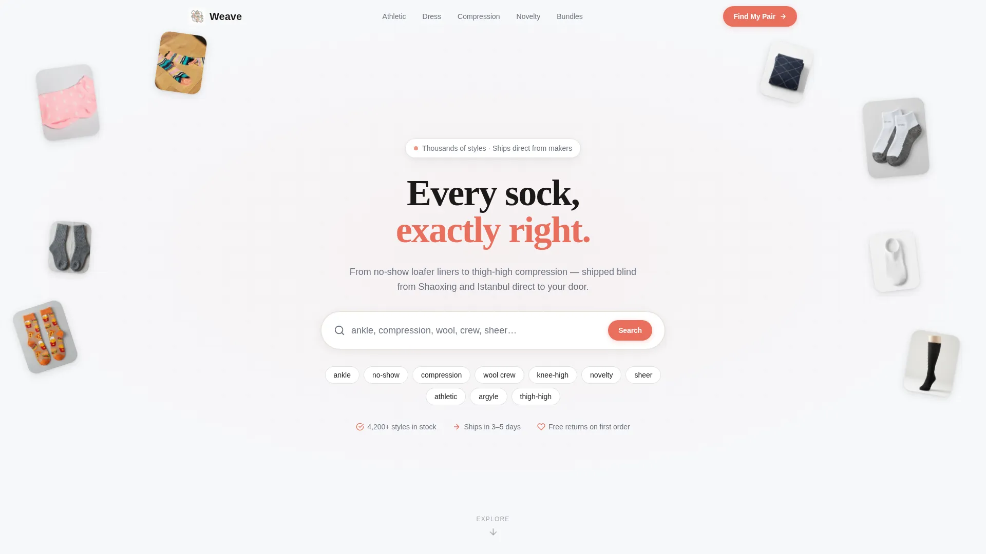
- A search-bar hero section with floating sock thumbnails at varying depths and rotations
- Stacked, overlapping comparison panels covering style, material, length, and bundle choices
- A footer quiz prompt with three-tap logic routing shoppers to a pre-filtered results page
Feature list
This template packs several purposeful design and structural decisions that work together to reduce bounce and increase catalog engagement.
Search-Bar Hero Section
The header centers an oversized input bar on a cloud-white field. Ghost text reads "ankle, compression, wool, crew, sheer..." and floating sock thumbnails surround it at varying angles, implying a catalog too large to browse without asking first.
Overlapping Comparison Cards
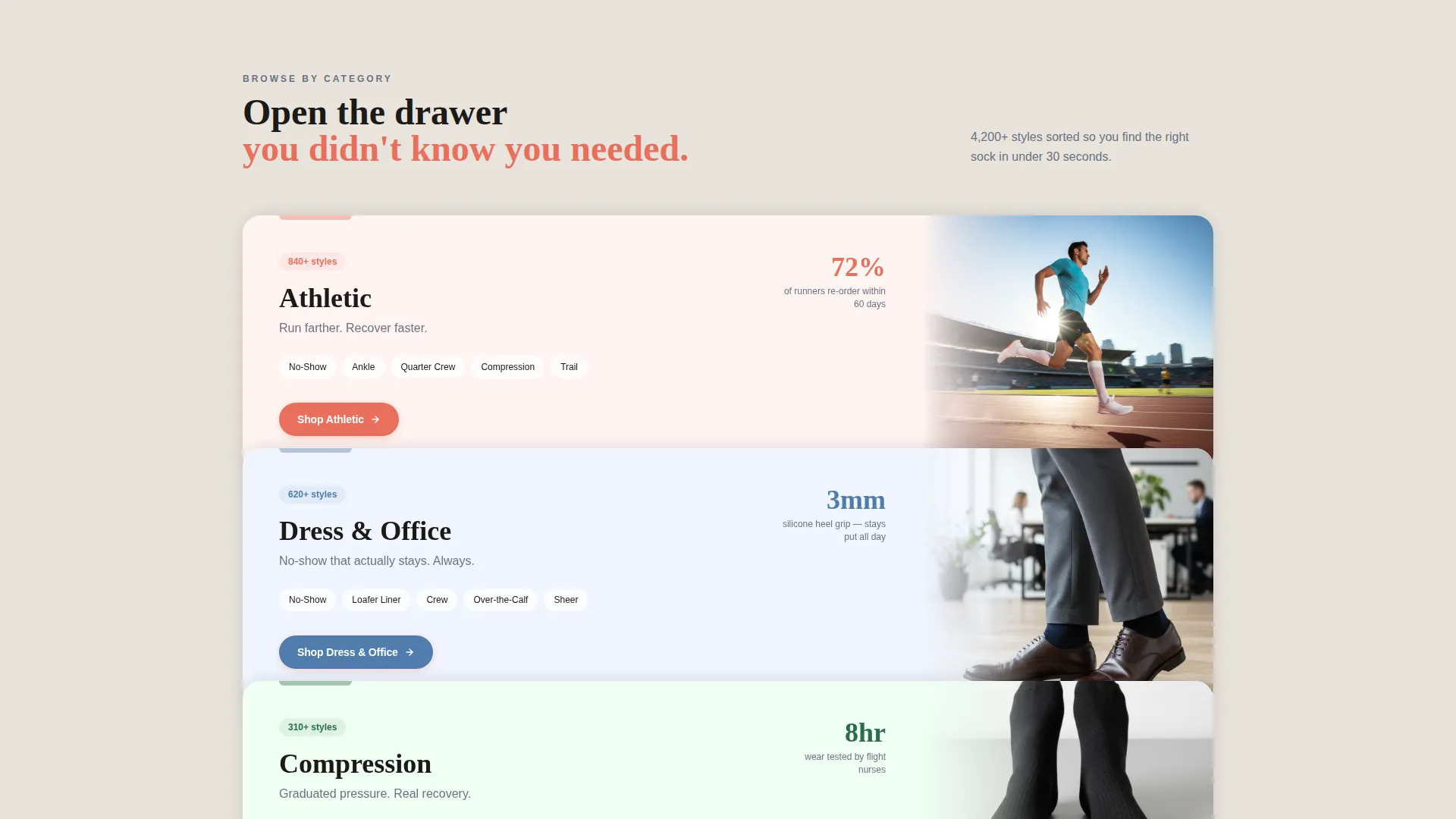
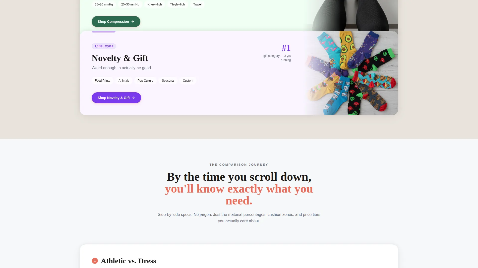
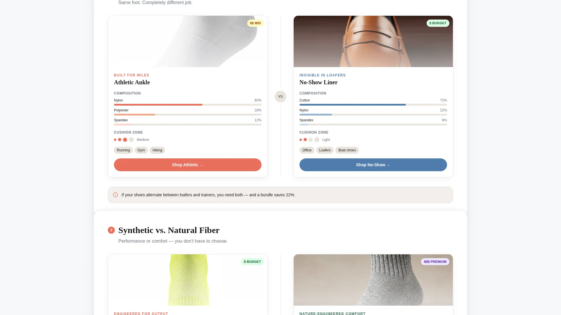
Stacked category cards slide up as the visitor scrolls, each partially covering the last like drawers in a filing cabinet. Each panel pairs two sock styles side by side with a quick-scan spec strip showing material percentage, cushion zone diagram, and price tier badge.
Persistent Coral Call-to-Action Button
A coral-colored "Shop This Style" button appears on every comparison card. It carries pre-applied filter parameters so each click lands the shopper exactly where the card left off, reducing re-navigation friction inside the catalog.
Three-Tap Footer Quiz
The footer offers a minimal quiz: use case, length, and budget. Three taps route the shopper to a filtered results page. No email capture, no long form. Just fast routing to the right products.
Cloud Canvas Color System
The palette uses soft cumulus white, warm linen, pencil-sketch gray, and elastic-snap coral. Neutral tones let product colors carry the visual weight, so neon argyle and muted merino can coexist without competing for attention.
Layered Card Depth Layout
Cards overlap with soft drop shadows on a linen ground. The overlap/layered template style creates visual hierarchy and forward momentum without heavy imagery or busy backgrounds.
Page sections overview
| Section | Purpose |
|---|---|
| Search Bar Hero | Entry point; sets catalog scale expectation and starts intent filtering |
| Floating Thumbnail Ring | Surrounds search bar with product samples to imply range and variety |
| Athletic versus. Dress Panel | First comparison card introducing use-case segmentation |
| Fiber Type Comparison | Side-by-side synthetic versus natural material breakdown with spec strip |
| Length Category Drawer | Ankle, crew, and knee-high comparison panel with cushion zone diagrams |
| Bundle Value Card | Final comparison between single pair and bundle purchase with price badge |
| Footer Quiz Prompt | Three-tap use-case, length, and budget router to filtered catalog page |
Design & branding system
The visual identity follows a Directory and Discovery theme built on the Cloud Canvas color system. The palette is deliberately restrained so product photography carries the color story, not the interface.
- Colors: soft cumulus white (#F7F8FA) as the base, warm linen (#E8E3DC) as the card ground, pencil-sketch gray (#6B7280) for text and labels, and elastic-snap coral (#E86F5C) reserved for buttons, badges, and hover states
- Layered card treatment: soft drop shadows and partial overlaps create depth on the linen ground without visual weight or heavy backgrounds
- No competing hero image: the search bar is the visual anchor, keeping the focus on navigation rather than brand storytelling
Mobile & speed optimization
The overlap/layered layout is structured to translate the stacked card experience to smaller screens without losing the comparison logic or the scroll momentum.
- Comparison panels reflow to single-column stacks on mobile so spec strips and badge details remain readable
- The three-tap footer quiz is thumb-friendly by design, with large tap targets suited to mobile shoppers browsing on the go
- Floating thumbnails in the hero section scale and reposition to avoid crowding the search input on narrow viewports
How this template helps you convert
Weave is a click-through landing page, not a checkout page. Its entire structure is designed to dissolve doubt before the shopper reaches the catalog, so they arrive with a clear intent and a pre-applied filter.
- The search-bar hero signals catalog depth immediately, so shoppers know they are in the right place and feel prompted to express their need rather than scroll blindly.
- Each comparison card answers the most common pre-purchase question ("which type is right for me?") before the shopper has to ask it, reducing drop-off between landing and catalog entry.
- The footer quiz catches undecided visitors and routes them to a relevant filtered page rather than letting them leave with unresolved intent.
Other information about this template
This template is part of a broader set of retail and e-commerce landing page templates built for niche dropshipping stores. It is especially well-suited for stores operating in the socks and hosiery dropshipping space where catalog depth is a core differentiator.
- Template style: Overlap/Layered with a Directory and Discovery theme
- Header concept: Search Box hero with no competing imagery
- Creative direction: Comparison Journey scroll flow
- Landing page direction: Click-Through with pre-filtered catalog routing
- Designed for dropshipping models where no inventory is held on-site and product variety is the main sales argument
Theme
Directory & Discovery
Creative direction
Comparison Journey
Color system
Cloud Canvas
Style
Overlap/Layered
Direction
Click-Through
Page Sections
Search-bar Hero with Floating Thumbnails
Overlapping Comparison Card Scroll
Persistent Coral Call-to-action
Three-tap Footer Quiz
Cloud Canvas Color System
Layered Card Depth Layout
Related questions
Does this template include a shopping cart or checkout section?
How does the three-tap footer quiz work?
Is this template best suited for large sock and hosiery catalogs?
Can I replace the default comparison card categories with my own?
Does this template work for a dropshipping model with no physical inventory?



