Sustainable Fashion Landing Page Template
Weave is a card grid landing page template built for slow-fashion collectives and sustainable clothing makers. It opens with an interactive Before/After Slider, unfolds like an unboxing experience through four layered card rows, and closes with a sticky call-to-action that drives qualified visitors into a full product catalog. Every section is designed to build trust before a single click.
by Rocket studio
Quick summary
Weave is a modular card grid landing page template for sustainable fashion brands. It guides visitors through a tactile unboxing narrative, from an interactive header slider through maker stories, material close-ups, product cards, and postcard-style reviews. The layout is built to earn trust through transparency and convert that trust into catalog click-throughs.
Who this template is for
This template is made for brands and collectives that sell slow fashion and want their landing page to reflect the craft behind each garment. It suits storytellers as much as retailers.
- Slow-fashion collectives and independent makers selling deadstock or natural-fiber garments
- Sustainable fashion marketplaces that want to lead with brand story before product listings
- Gift-focused retailers whose shoppers need context and intention before they browse
What problem this template solves
Most fashion landing pages push visitors straight to a product grid before any trust is built. Shoppers who care about ethics and craft leave quickly when the story is missing. This template solves that by layering information the way a well-packaged garment reveals itself.
- Greenwashed generics lose buyers fast; this layout leads with specific stats and named makers to prove credibility
- Standard product grids give no context; the unboxing card flow explains sourcing, craft, and impact before the catalog link appears
- Broad fashion templates feel cold; this one uses a warm, intentional palette and tactile scroll transitions to match the brand promise
What you get with this template
You get a fully structured single-page layout built around a sequential unboxing narrative. Every section has a defined role, and the visual system is consistent from header to footer.
- An interactive Before/After Slider header with a reveal moment and a single headline that appears mid-drag
- Four layered card rows covering brand story, material sourcing, garment product cards, and customer review postcards
- A sticky plum call-to-action bar that appears after the second card row and stays visible as visitors scroll deeper
Feature list
This template is built around specific components described below. Each one contributes to the landing page's core goal of earning qualified clicks into the catalog.
Interactive Before/After Slider Header
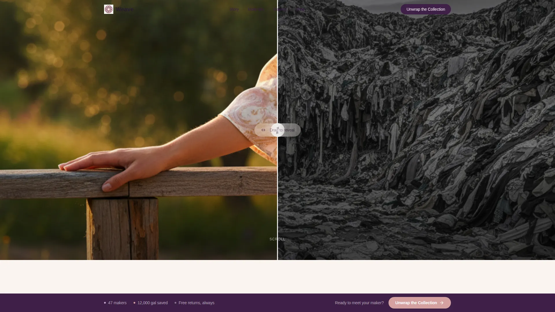
The header uses a draggable slider that lets visitors physically pull a garment reveal out of a landfill image. The left side is cold and desaturated; the right side shows warm golden-hour styling. A single line of copy appears once the slider crosses center, making the message feel earned rather than announced.
Layered Unboxing Card Grid
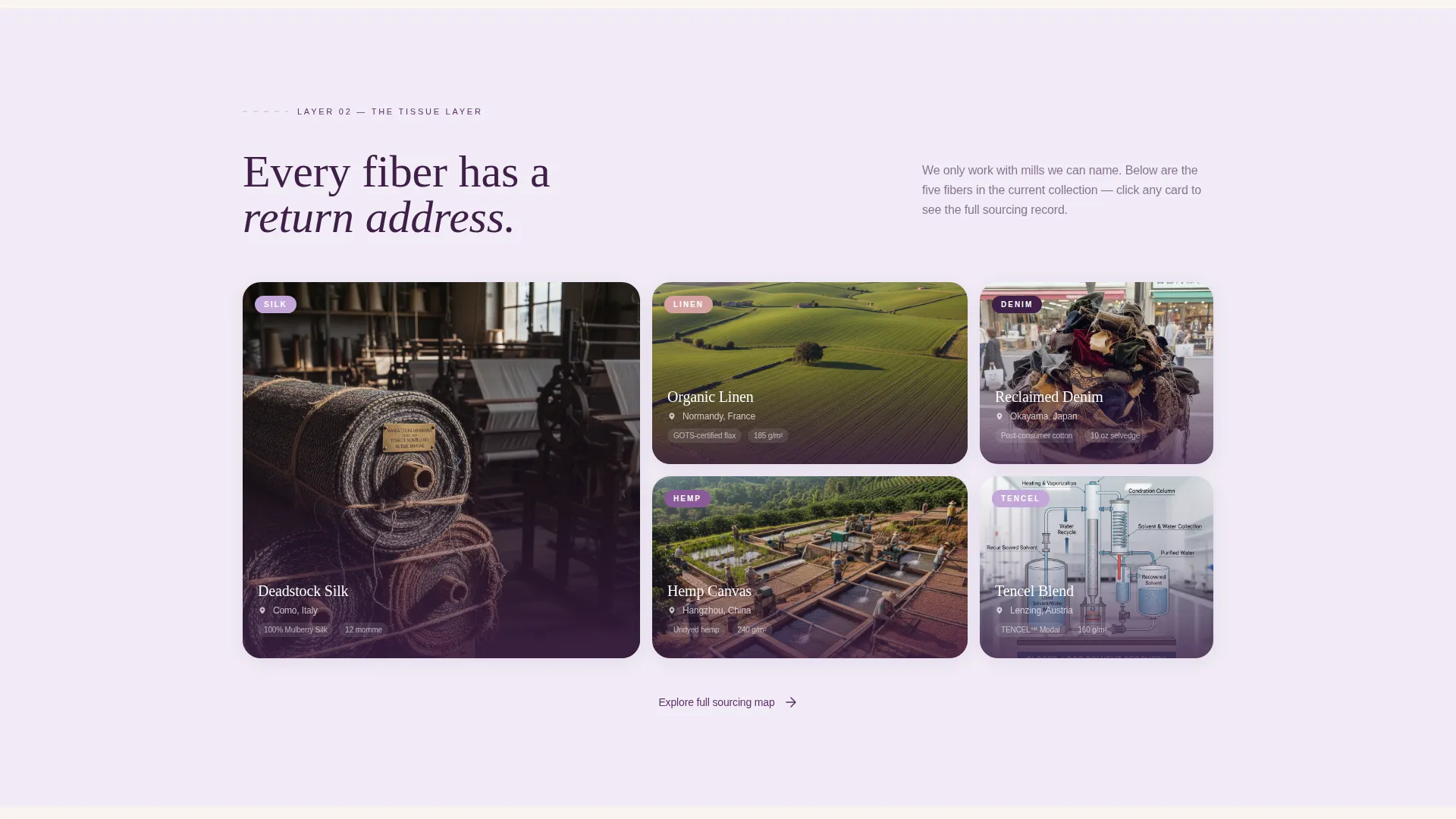
Four card rows are structured to mimic unwrapping a kraft-box delivery. The first row covers brand story and mission statistics. The second shows material close-ups and fiber sourcing maps with pinned mill locations. The third presents product cards with hover-zoom and maker quotes. The fourth displays customer reviews styled as handwritten postcards.
Sticky Click-Through Call-to-Action Bar
A deep plum bar reading "Unwrap the Collection" becomes sticky after the visitor scrolls past the second card row. It remains on screen without interrupting reading, prompting the click-through to the full catalog at the moment trust has been established.
Product Cards with Maker Transparency
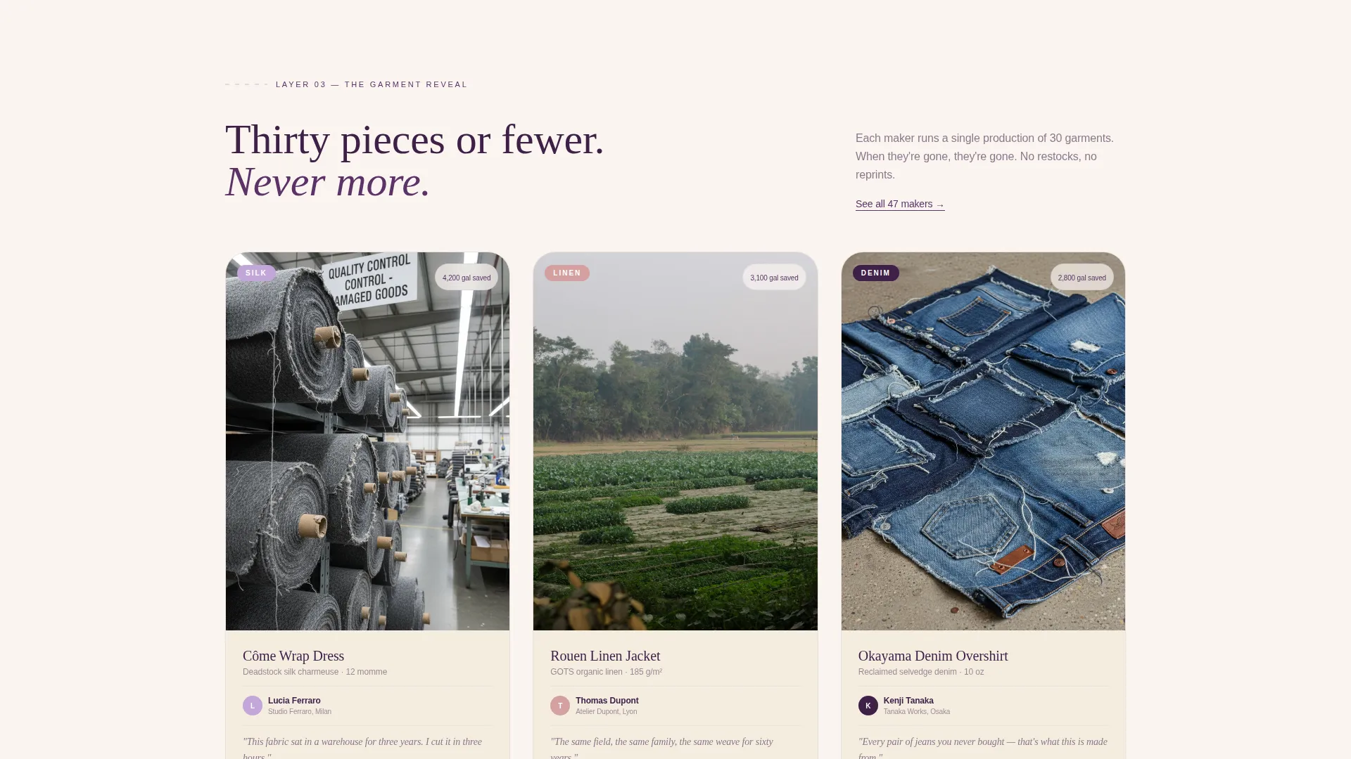
Each product card in the third row shows fabric weight and a one-sentence quote from the maker. Hover interactions include a zoom effect. A secondary call-to-action, "See This Piece," links to the individual listing rather than adding directly to a cart.
Paper-Peel Scroll Transitions
Each section transition uses a subtle paper-peel animation so the scroll between card rows feels tactile. The motion reinforces the unboxing concept without becoming distracting or mechanical.
Postcard-Style Review Display
Customer reviews in the fourth card row are styled as handwritten postcards rather than standard star-rating widgets. The format matches the handcrafted tone of the brand and adds warmth to social proof.
Page sections overview
| Section | Purpose |
|---|---|
| Before/After Slider Header | Lets visitors drag a visual reveal from waste to beauty, with a headline that appears mid-interaction |
| Brand Story Row | Introduces the collective, mission, and specific impact statistics such as gallons saved and maker partners |
| Material Sourcing Row | Shows fiber close-ups and a map pinned with mill locations to prove traceable sourcing |
| Product Card Row | Presents garments with hover-zoom, fabric weight, maker quotes, and a "See This Piece" link |
| Sticky call to action Bar | Anchors "Unwrap the Collection" on screen after the second card row to catch click-ready visitors |
| Customer Postcard Row | Displays reviews as styled postcards to humanize social proof |
Design & branding system
The visual identity uses a palette described as dried lavender pressed into linen. Every color has a specific role, and the overall effect is quiet and considered rather than trend-driven.
- Soft lilac (#C3A6D8) backgrounds, sun-bleached cream (#FAF5EF) canvas, deep plum (#3E1F47) for headlines and navigation, and dusty rose (#D4A0A0) for hover states and primary buttons
- The Marketplace Grid theme organizes content into clean modular columns that let garment imagery dominate without clutter
- Paper-peel transitions and kraft-box visual cues carry the unboxing metaphor through every scroll layer, keeping the aesthetic consistent from header to footer
Mobile & speed optimization
The card grid layout is modular by design, which means it adapts naturally to narrower viewports. The unboxing narrative still flows in sequence on smaller screens.
- The Before/After Slider is touch-enabled so mobile visitors can drag the reveal with a swipe gesture
- Card rows restack vertically on smaller screens, keeping maker quotes, sourcing maps, and product images readable without horizontal scrolling
- The sticky call-to-action bar remains accessible on mobile, sitting above the thumb zone so it does not block product card content
How this template helps you convert
This landing page is built for qualified click-throughs, not impulse purchases. Every design decision moves the visitor closer to a confident catalog browse.
- The interactive header creates immediate personal involvement. Dragging the slider is an action, not passive viewing, and that engagement primes the visitor for the story that follows.
- The layered card rows build trust in a specific order: mission first, sourcing second, product third, peer proof fourth. By the time the visitor sees the sticky bar, they already understand what makes the brand different.
- Keeping the cart off the landing page removes pressure and increases curiosity. Visitors who click "Unwrap the Collection" are already invested, which raises the likelihood of a meaningful catalog session.
Other information about this template
This template sits in the Retail and E-Commerce category under the Fashion and Clothing Store subcategory. A few additional points are worth noting for teams evaluating it.
- The Intersection Match Score for this template is 9 out of 10, reflecting a strong alignment between the template's design choices and the sustainable fashion niche it serves
- No cart or checkout component is included by design; the landing page is a click-through gateway, not a storefront
- The template style is Card Grid (Modular), which means individual card rows can be reordered or replaced without rebuilding the overall layout
- Specific impact statistics shown in the brief, such as 12,000 gallons of water saved and 47 maker partners, are placeholder examples included to demonstrate the transparency-first content approach
- The Lavender Dream color system is distinct from the Obsidian and Gold system referenced in the intersection row; the prompt-specified palette takes precedence for this template

Theme
Neo-Retro
Creative direction
Curated Collection
Color system
Obsidian & Gold
Style
Card Grid (Modular)
Direction
Upsell/Upgrade
Page Sections
Interactive Before/after Slider Header
Layered Unboxing Card Grid
Sticky Click-through Call to Action Bar
Maker-transparent Product Cards
Paper-peel Scroll Transitions
Postcard-style Review Cards
Related questions
Does this template include a shopping cart or checkout flow?
Can I update the mission statistics and maker names with my own brand details?
Is the Before/After Slider touch-friendly for mobile users?
Can I reorder the card rows to fit a different content sequence?
Who is this landing page template best suited for?



