Pediatrician Reviews Website Template
Wellcheck is a pediatrician patient portal landing page template built for families who need answers at midnight, not hold music. It opens with a verified-parent testimonial, walks visitors through an expert panel, presents a clear comparison table, and closes with a personalized five-question care plan quiz that turns worried parents into enrolled portal members.
by Rocket studio
Quick summary
Wellcheck is a single-page pediatrician patient portal template designed for anxious, mobile-first parents. It leads with emotional proof, builds trust through an expert panel, dismantles friction with a comparison table, and converts visitors through a guided quiz. The Forest Trust color system and Organic Flow visual style make it feel warm, clinical, and trustworthy all at once.
Who this template is for
This template is built for pediatric practices that want to move families off the phone and into a digital portal. It speaks directly to parents who reach for their phones before they reach for the car keys.
- First-time parents Googling symptoms at 2 a.m. who need fast, credible reassurance
- Working parents managing sick-day logistics and juggling multiple children's health records
- Foster caregivers tracking complex medication schedules for children with layered care needs
What problem this template solves
Parents facing a sick child at midnight have no good options through traditional phone-tag systems. They wait on hold, leave voicemails, or drive to the emergency room out of pure anxiety. This template presents a credible, calming alternative from the very first scroll.
- No clear after-hours communication channel makes parents feel abandoned between appointments
- Scattered vaccination records and milestone trackers create confusion and missed follow-ups
- No personalized entry point means generic portals feel overwhelming rather than helpful
What you get with this template
You get a complete, section-led landing page that guides a parent from emotional recognition all the way to portal enrollment. Every section is purposeful, and the layout handles both the skeptic and the ready-to-sign-up parent with equal care.
- A hero section with a floating testimonial card, an expert panel with three named pediatricians, a comparison table, a five-question quiz flow, and a features bento grid
- A Forest Trust color system with four defined tokens, DM Sans headings, and Manrope body type already applied throughout
- A secondary demo path that lets skeptical visitors explore the portal without committing upfront
Feature list
This template is built around a small set of high-impact components. Each one serves a specific job in moving a parent from worried to enrolled.
Floating Testimonial Hero Card
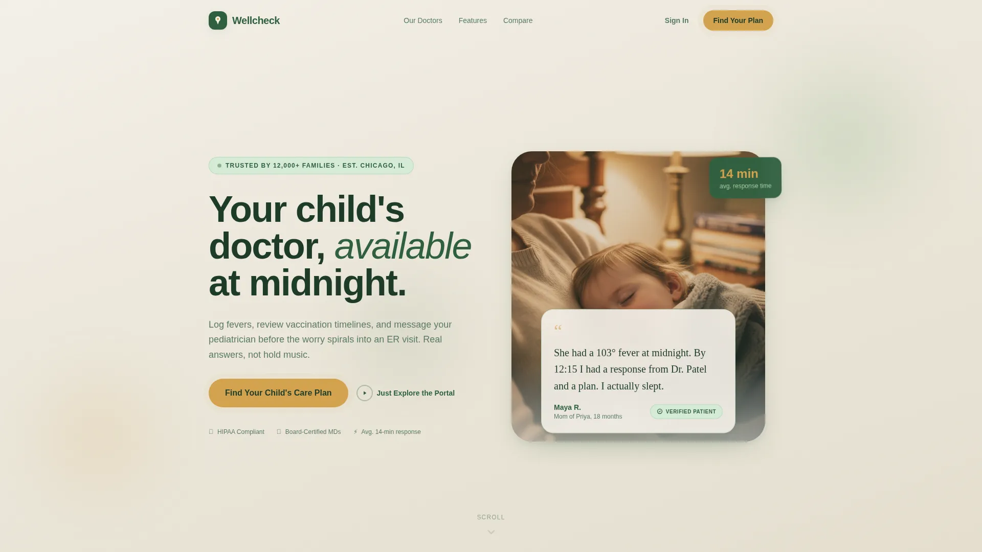
The page opens with a softly rounded card layered over a warm, blurred photograph of a parent holding a sleeping toddler. A real parent quote in handwritten-style type, a first name, the child's age, and a verified-patient badge appear before any product explanation. Emotional proof lands first.
Named Expert Panel
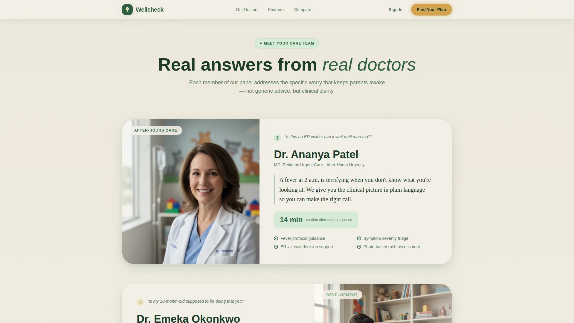
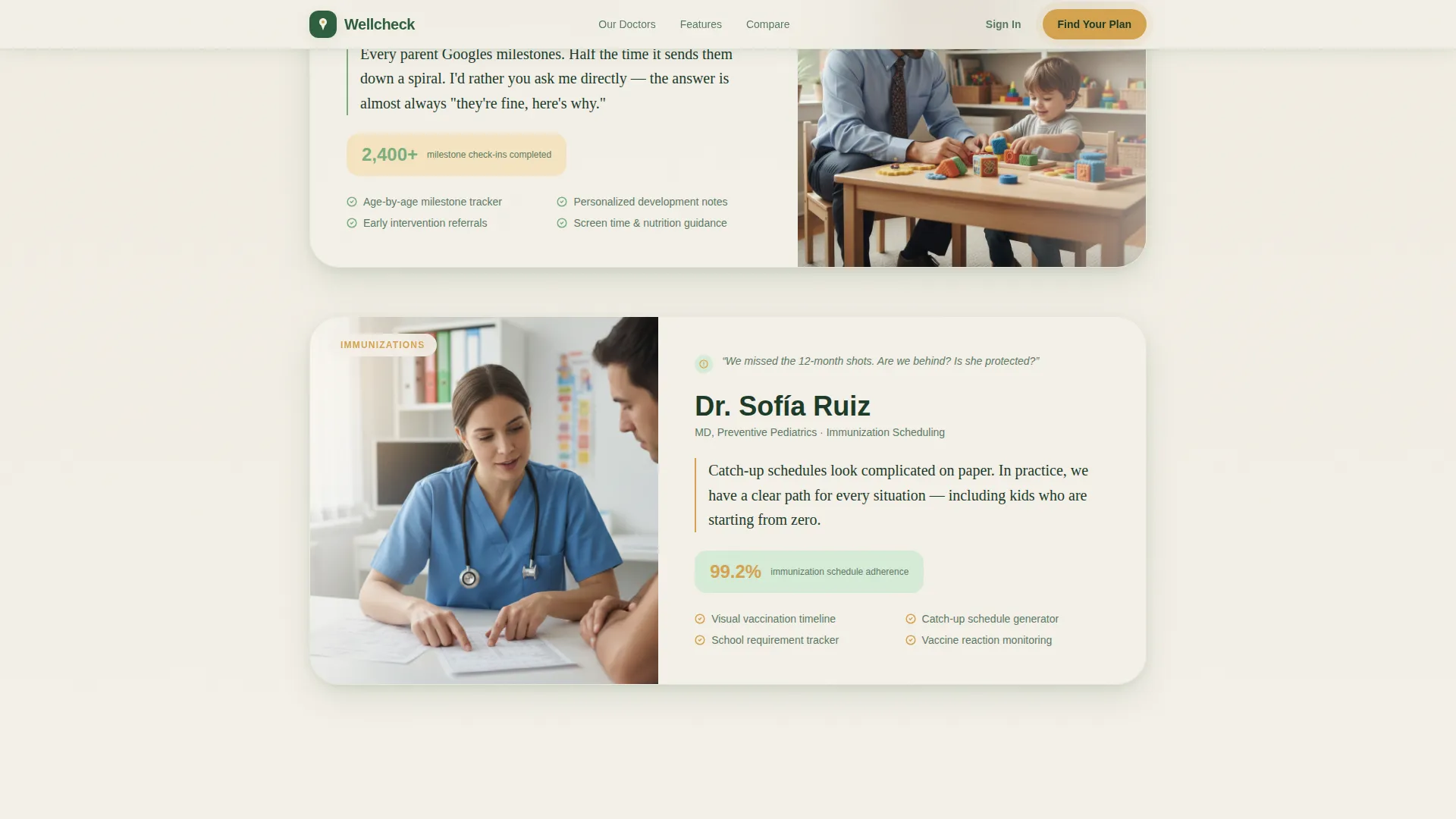
Three pediatricians each own a dedicated scroll section. Dr. Patel addresses after-hours urgency, Dr. Okonkwo covers developmental milestones, and Dr. Ruiz focuses on immunization scheduling. Each doctor section is tied to a specific parental anxiety, making the trust-building feel personal rather than promotional.
Portal versus. Phone-Tag Comparison Table
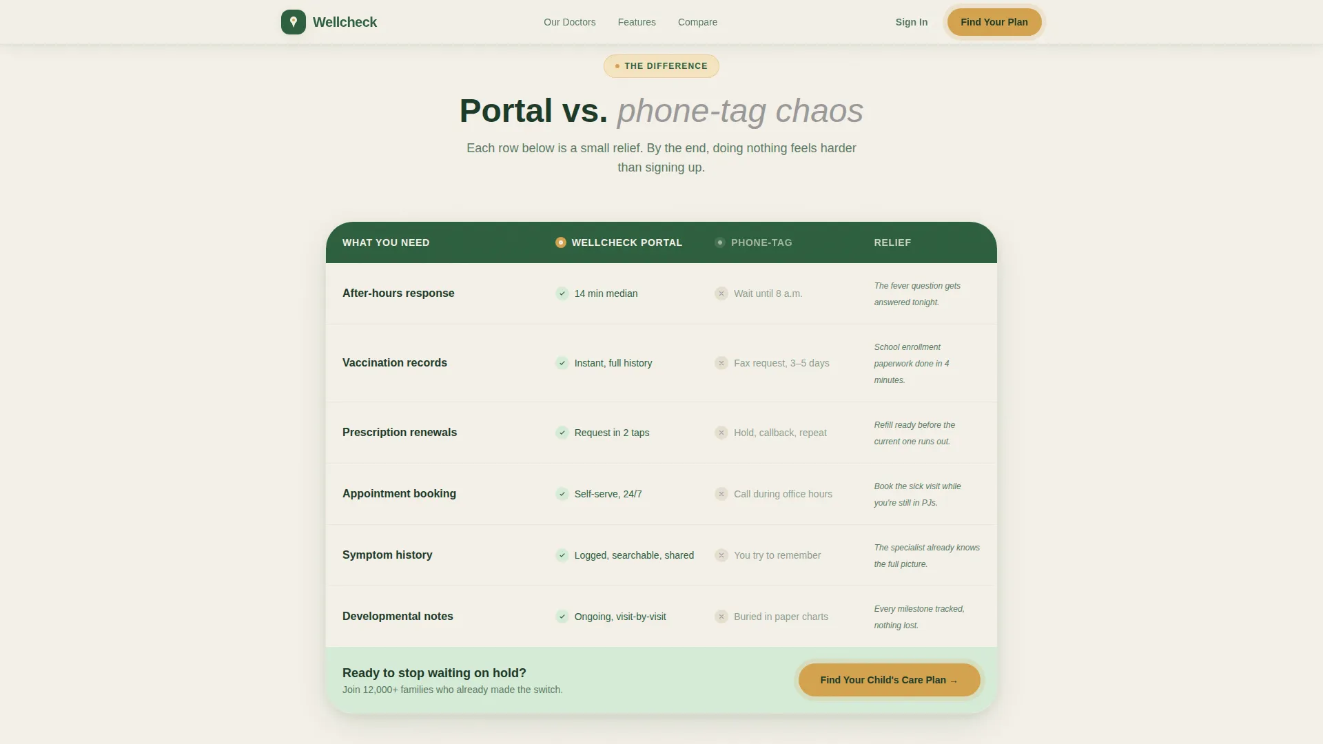
A mid-page comparison table contrasts portal features against traditional phone-tag chaos. Rows cover response time, record access, prescription renewals, and appointment booking. Each row is designed to land as a small relief, with staggered scroll reveal animations reinforcing the effect.
Five-Question Care Plan Quiz
The primary call to action launches a guided assessment asking about the child's age range, number of siblings, any chronic conditions, preferred communication style, and the parent's biggest current worry. Results deliver a personalized portal walkthrough matched to the family's specific answers.
Demo Explorer Path
A secondary call to action labeled "Just Explore the Portal" lets skeptical visitors click through a demo without creating an account. An email is captured only when the visitor tries to send a test message, keeping the low-commitment path genuinely low-commitment.
Features Bento Grid
An asymmetric bento grid near the bottom of the page presents portal capabilities at a glance. The grid layout lets multiple features share visual space without competing for attention, giving detail-oriented parents the full picture before they decide.
Page sections overview
| Section | Purpose |
|---|---|
| Hero Testimonial Card | Opens with verified parent proof before any product copy |
| Dr. Patel Panel | Addresses after-hours urgency with doctor-led credibility |
| Dr. Okonkwo Panel | Covers developmental milestone tracking and parent guidance |
| Dr. Ruiz Panel | Focuses on immunization scheduling and vaccination timelines |
| Comparison Table | Contrasts portal benefits against traditional phone-tag friction |
| Care Plan Quiz | Guides parents through a five-question personalized assessment |
| Features Bento Grid | Shows full portal capabilities in an asymmetric visual layout |
| Footer | Horizontal footer pattern with practice navigation and links |
Design & branding system
The visual identity follows an Organic Flow theme that feels like a morning walk through a botanical garden: alive and unhurried, shaded but never dark. Every color token has a defined role, and nothing competes with the content.
- Birch bark cream (#F4F0E8) anchors all backgrounds; canopy green (#2D5F3E) carries headings and navigation; sun-dappled fern (#7BAE7F) softens secondary text and dividers
- Warm sap amber (#D4A24E) is reserved for buttons, calls to action, and progress indicators, creating a consistent pulse on every interactive element
- DM Sans is used for all headings and navigation labels; Manrope handles all body text for a clean, readable pairing throughout
Mobile & speed optimization
This template is built mobile-first because parents searching for health answers are almost always on a phone. The layout decisions, touch targets, and scroll behavior all reflect that priority.
- The hero card, quiz flow, comparison table, and bento grid are each designed to reflow cleanly on small screens without losing visual hierarchy
- Client-side interactivity, including the quiz state machine and demo explorer, is scoped to only the components that need it; the static hero loads without waiting for JavaScript
- Scroll reveal animations and comparison row stagger effects are set to medium-high intensity while keeping the static hero fast to paint
How this template helps you convert
The page is structured so that hesitation shrinks with every section. It does not rush the parent; it earns their trust one step at a time and then gives them a clear, low-risk action.
- The testimonial card at the top creates an immediate emotional connection before any feature is explained, lowering the guard of a visitor who arrived skeptical.
- The expert panel and comparison table work in sequence to replace vague trust with specific, expert-backed reasons to enroll, so that doing nothing starts to feel harder than signing up.
- The dual call-to-action path catches both ready-to-commit parents and cautious browsers, with the demo explorer capturing intent even from visitors who are not yet ready to create an account.
Other information about this template
This template is suited for independent pediatric practices, multi-provider pediatric groups, and healthcare organizations building a patient-facing portal experience. It is structured as a single landing page with a strong conversion architecture.
- The quiz flow supports five question types: age range, sibling count, chronic conditions, communication preference, and a parent-native worry selector with options like "sleep regression" and "ear infections that keep coming back"
- Animation intensity is set to medium-high, covering scroll reveals, floating card behavior, comparison row stagger, and the quiz state machine transitions
- The footer follows a horizontal layout pattern and supports practice navigation links
- The template is localized for United States audiences using English language, USD currency references, and MM/DD/YYYY date formatting
Theme
Organic Flow
Creative direction
Expert Panel
Color system
Forest Trust
Style
Comparison Table
Direction
Quiz/Assessment
Page Sections
Floating Testimonial Hero Card
Named Pediatrician Expert Panel
Portal Versus. Phone-tag Comparison Table
Five-question Care Plan Quiz
Demo Explorer Secondary Path
Asymmetric Features Bento Grid
Related questions
What sections are included in the Wellcheck template?
Can I replace the pediatrician names and focus areas in the expert panel?
How does the personalized quiz flow work?
Is there a path for visitors who are not ready to create an account?
What kind of practice is this template designed for?



