Pediatrician New Patient Landing Page Template
Wellchild is a single-page pediatrician landing page template built for neighborhood practices that win new families through proof, not promises. It leads with three animated headline stats, flows into a side-by-side comparison table, and closes with a warm apricot call-to-action that sends visitors straight to a scheduling portal. No form fields, no clutter, just the numbers that earn the click.
by Rocket studio
Quick summary
Wellchild is a pediatrician new patient landing page template designed around a Stats-First storytelling approach. Three billboard-scale metrics open the page, a scroll-animated comparison table builds the case, and a single clear call-to-action button drives families to book. The design feels calm and trustworthy, a nursery window at dawn rather than a clinical directory.
Who this template is for
This template is built for independent and neighborhood pediatric practices that are actively accepting new patients. It speaks directly to the kinds of families who research doctors late at night on a phone and need reassurance fast.
- Solo or small-group pediatricians ready to differentiate from large corporate clinics
- Practices welcoming military families, relocating parents, or first-time parents building a care team
- Pediatric offices that want a polished new patient welcome page without a complex multi-page build
What problem this template solves
Parents searching for a new pediatrician face a wall of identical clinic directory listings. Nothing feels personal, nothing builds trust, and nothing answers the question every anxious parent is silently asking: "Will this doctor actually know my child?" This template solves that by replacing generic copy with stacked, specific proof.
- Families comparing practices have no easy way to see real differences, so the comparison table makes advantages visible at a glance
- First-time parents and families new to an area need fast reassurance, and the animated stat block delivers it in seconds
- Practices lose prospective patients who are not yet ready to call, so a secondary download link captures those families before they leave
What you get with this template
You get a complete, single-page landing page layout structured around five distinct content sections. Every section is purposefully sequenced to build trust before asking for a commitment.
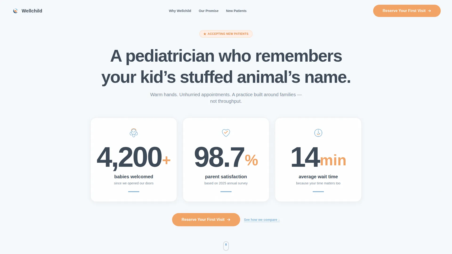
- A hero stat block with three animated numerals, each paired with a hand-drawn icon and an apricot call-to-action below
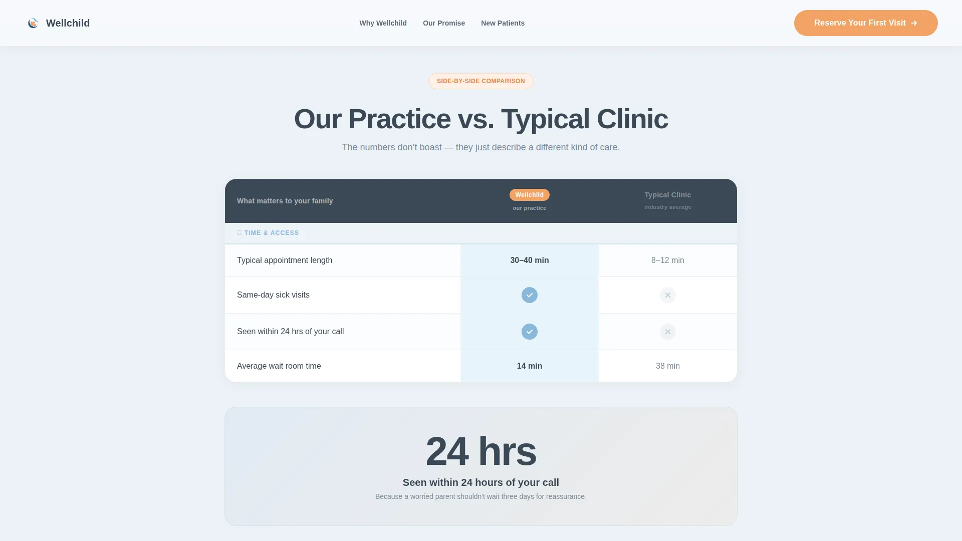
- A scroll-triggered comparison table contrasting your practice against a typical clinic across five care dimensions
- Callout cards, a mid-table single-stat break, a floating final call-to-action button, and a secondary download link for families not ready to book
Feature list
This template ships with a focused set of interactive and layout features derived directly from its Stats-First, Click-Through design brief.
Animated Stat Hero Block
Three oversized numerals count up on page load using GSAP scroll-triggered animation. Each stat is paired with a small hand-drawn icon, a swaddled newborn, a heart with a checkmark, and a smiling clock, communicating warmth and credibility before any body copy is read.
Scroll-Triggered Comparison Table
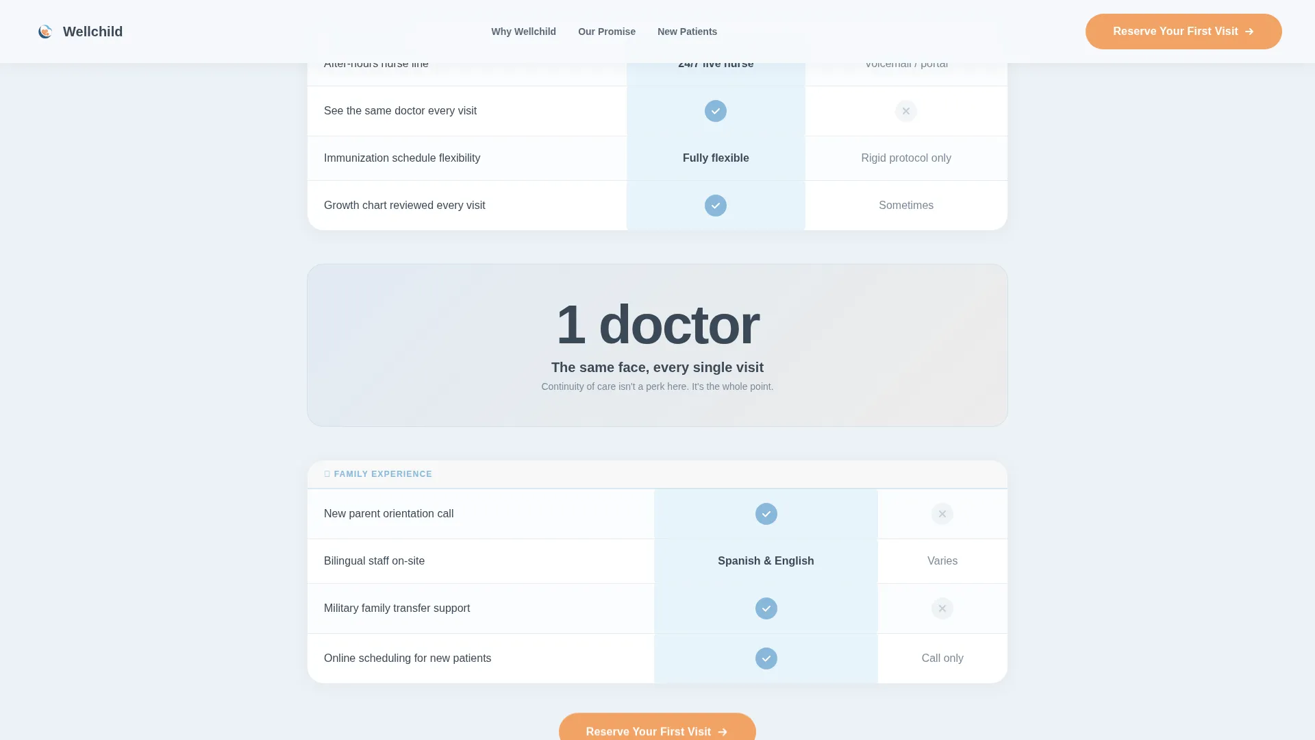
The core narrative section contrasts your practice against a typical clinic across five rows: appointment length, same-day sick visits, after-hours nurse line access, immunization scheduling flexibility, and continuity of care. Each row reveals on scroll, with a sky-blue highlight sliding across the "Our Practice" column to guide the eye naturally.
Mid-Table Single-Stat Callout
A bold, isolated callout breaks the comparison table rhythm mid-scroll. It surfaces one high-impact proof point, such as "Seen within 24 hours of your call", keeping the experience feeling like accumulating evidence rather than reading a brochure.
Dual Call-to-Action Structure
The primary "Reserve Your First Visit" button appears twice: anchored below the hero stats and floating at the base of the comparison table. A secondary text link invites families to download a New Parent Welcome Packet, capturing interest from visitors who are not yet ready to schedule.
Continuity Proof Cards
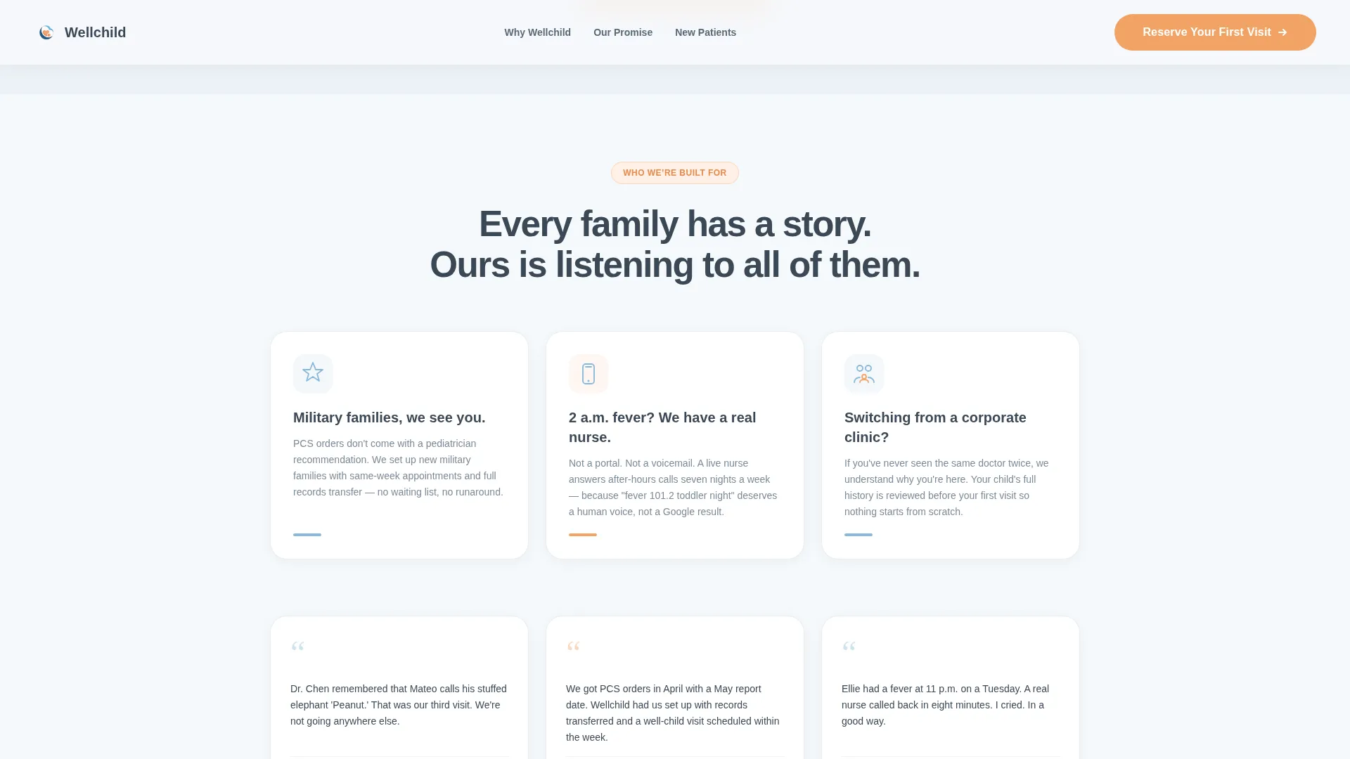
Two callout cards below the comparison table highlight doctor continuity and after-hours nurse line access. These cards address the specific fears of families switching from impersonal corporate clinics where they never saw the same provider twice.
Organic Flow Design System
The layout uses alternating cloud white and pale slate-tint backgrounds with generous whitespace throughout. Typography pairs DM Sans for headlines and stats with Manrope for body copy, creating a clinical-calm aesthetic that feels warm rather than sterile.
Page sections overview
| Section | Purpose |
|---|---|
| Hero Stat Block | Open with three animated proof numerals and an apricot call-to-action |
| Comparison Table | Show practice advantages row by row with scroll-linked sky-blue highlights |
| Mid-Table Callout | Break scroll rhythm with a single high-impact stat card |
| Continuity Proof Cards | Reinforce doctor consistency and after-hours access for switching families |
| Final Call-to-Action Block | Close with a floating apricot button and a secondary welcome packet link |
| Footer | Single-row linear footer pattern for clean page closure |
Design & branding system
The visual identity follows an Organic Flow theme built around a Slate and Sky color system. Every design decision prioritizes calm trust over clinical sterility, echoing a nursery window at dawn.
- Core palette: deep clinical slate (#3B4856) for text and headers, morning sky blue (#89B8D9) for icons and table highlights, cloud white (#F6F9FC) for backgrounds, and warm apricot (#F2A365) reserved exclusively for call-to-action buttons and trust badges
- Typography: DM Sans drives headings and billboard-scale stats; Manrope carries all body and supporting copy for a friendly, readable pairing
- Backgrounds alternate between cloud white sections and pale slate-tint sections, while the comparison table rows use generous whitespace and sky-blue cell highlights to guide reading without feeling cold
Mobile & speed optimization
This template is built mobile-first, reflecting the reality that most new-patient research happens on a phone, often late at night. The layout and animation choices prioritize smooth performance on smaller screens.
- All GSAP ScrollTrigger animations, including the stat count-up, table row reveals, and sky-blue highlight slide, are structured for Client-side rendering while static content uses Server Components
- The single-page structure keeps the layout lean, with no embedded forms, no heavy media assets, and no stock photography to slow the initial load
- Floating call-to-action placement ensures the "Reserve Your First Visit" button remains reachable without requiring a scroll back to the top on any screen size
How this template helps you convert
The entire page is sequenced as a proof-stacking journey. Every section earns the next click rather than asking for it upfront.
- The animated stat hero opens with hard numbers, babies welcomed, satisfaction rate, and average wait time, so visitors arrive at the comparison table already primed to believe what they read.
- The scroll-triggered comparison table makes your advantages feel inevitable rather than boastful, and the mid-table callout keeps momentum high so visitors reach the final call-to-action with confidence rather than fatigue.
- The dual call-to-action structure captures two types of visitors: families ready to book now, and families who need one more reassurance before committing, addressed by the downloadable welcome packet link.
Other information about this template
This template is a strong fit for pediatric practices that want a dedicated new patient acquisition page separate from a broader practice website. A few additional details worth knowing before you build:
- The page is designed as a Click-Through landing page with no on-page form fields; the scheduling portal is an external link destination that you configure
- The footer follows a Pattern 1 linear single-row layout, keeping the page closure clean and minimal
- Localization defaults are set for English, United States date format (MM/DD/YYYY), and USD currency references where applicable
- Animation intensity is set to high by default, using GSAP ScrollTrigger for table row reveals, stat count-ups, and the sky-blue highlight slide; these can be adjusted if a lower-motion experience is preferred
- The hand-drawn icon style in the hero avoids stock photography and stethoscope clichés entirely, which helps the page feel distinctive in a crowded healthcare search landscape
Theme
Organic Flow
Creative direction
Stats-First Impact
Color system
Slate & Sky
Style
Comparison Table
Direction
Click-Through
Page Sections
Animated Stat Hero Block
Scroll-triggered Comparison Table
Mid-table Single-stat Callout
Dual Call-to-action Structure
Continuity Proof Cards
Organic Flow Design System
Related questions
Does this template include a patient intake or booking form?
Can I update the stats in the hero section with my own practice numbers?
What does the comparison table cover?
Is this template suitable for a multi-provider pediatric group?
What does the secondary download link do?



