Compassionate Gastro Care Landing Page Template
The Digest landing page template is built for private gastroenterology practices that need to earn patient trust before asking for a booking. It combines a warm split-screen hero, a scroll-driven testimonial mosaic, a prep-to-visit timeline, and an inline booking form into one cohesive, professionally designed landing page that turns anxious first-time visitors into scheduled appointments.
by Rocket studio
Quick summary
The Digest template is a gastroenterology landing page designed for private medical practices that treat patients who have been searching for answers on their own. It pairs warm, clinical design with clear booking pathways, patient testimonials, and a transparent visit timeline. The result is a landing page that feels trustworthy before a single word is read, and converts once a patient feels genuinely heard.
Who this template is for
This landing page template is built for gastroenterology practices that serve patients who are anxious, self-researching, or long overdue for a specialist visit. It is especially well-suited for independent physicians who want their online presence to reflect the same care and attention they deliver in the consultation room. The template is ideal for practices ready to improve their new patient acquisition without a custom build from scratch.
- Private gastroenterology practices looking for a professional landing page that builds immediate trust with self-referred patients and primary care referrals.
- Physicians and clinic staff who want a warm, credible first impression that explains services clearly and guides visitors toward booking an appointment.
- Practice managers and health business owners who want to launch a polished medical landing page quickly, without extensive coding knowledge or development overhead.
What problem this template solves
Many gastroenterology landing pages feel cold, clinical, and transactional. They list procedures without context and ask for an appointment before a patient feels safe enough to share their health concerns. Patients dealing with ongoing symptoms are often anxious. They need reassurance that this practice will listen, understand, and act. A generic medical website does not solve that problem. This landing page template does.
- Most medical landing pages fail to reduce patient anxiety before asking for a booking. This template leads with social proof, allowing patient voices to build confidence before the call to action appears.
- Practices lose visitors when the path from landing to appointment is unclear. This template includes a visible prep-to-visit timeline that explains exactly what to expect, step by step, before a new patient arrives.
- Short contact forms with dropdown options for specific health concerns reduce friction. This template includes a focused inline booking form that captures essential details without overwhelming visitors.
What you get with this template
The Digest template delivers a complete, single-page landing experience designed for the gastroenterology medical field. Every section is intentional. Every design decision supports the goal of converting a cautious website visitor into a booked patient. The template is structured to develop trust progressively, from the opening hero through the testimonial mosaic to the final booking form.
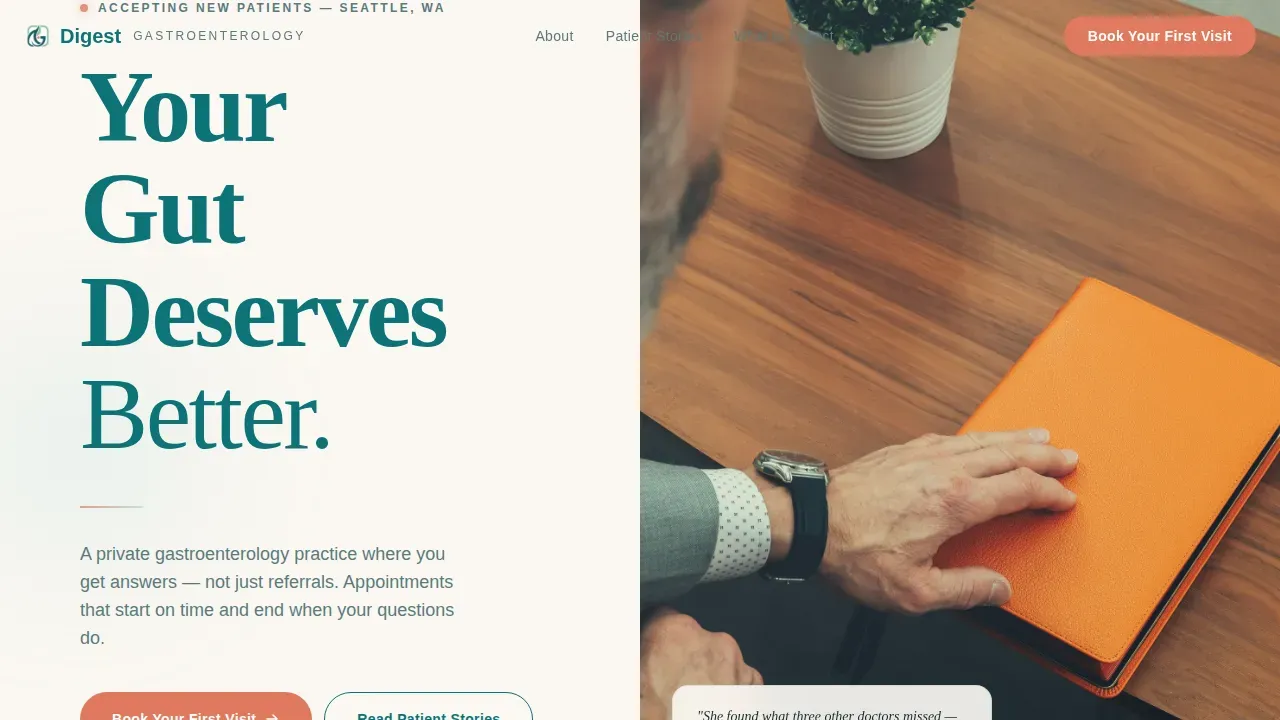
- A split-screen hero layout featuring a Stacked Type Tower on the left and a warm doctor presence photograph on the right, built to create immediate professional credibility.
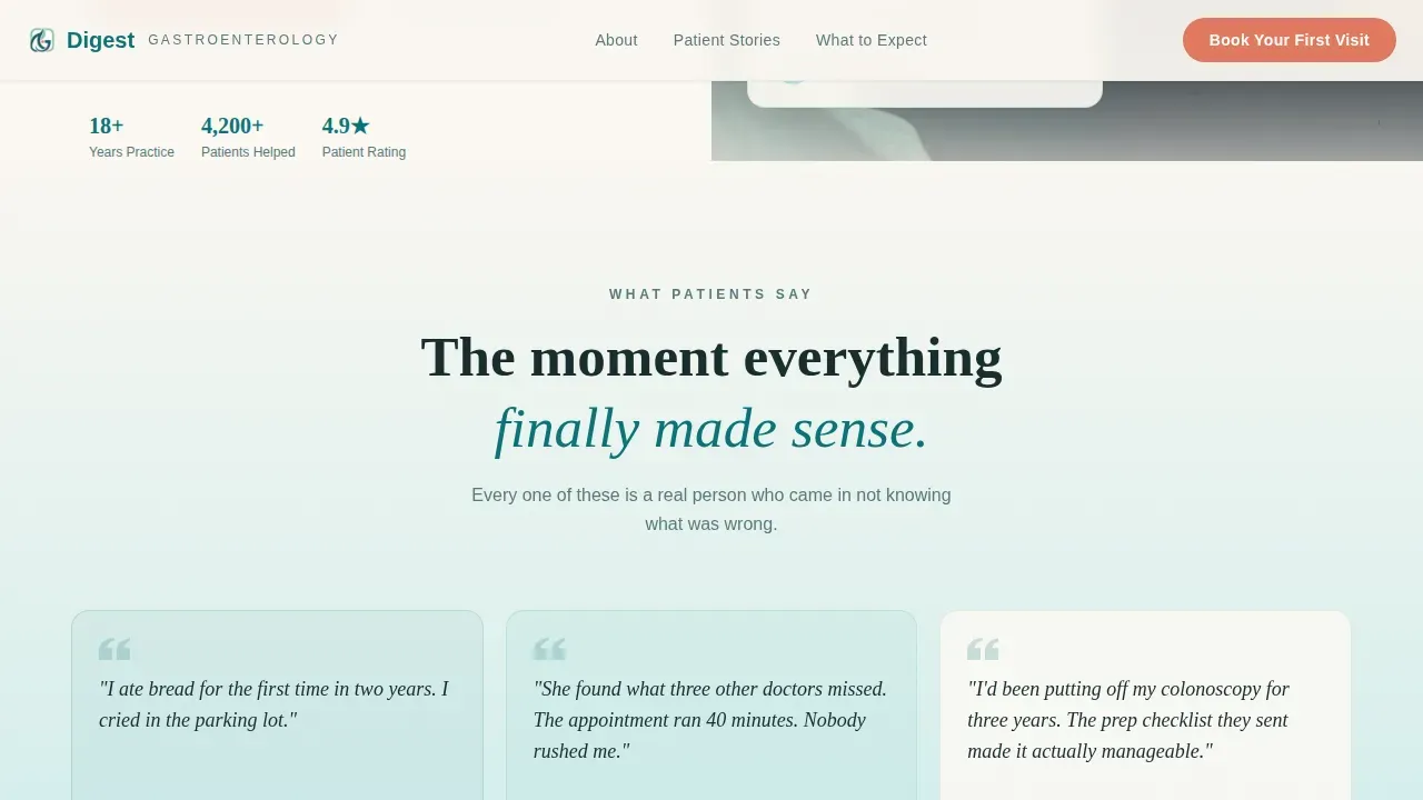
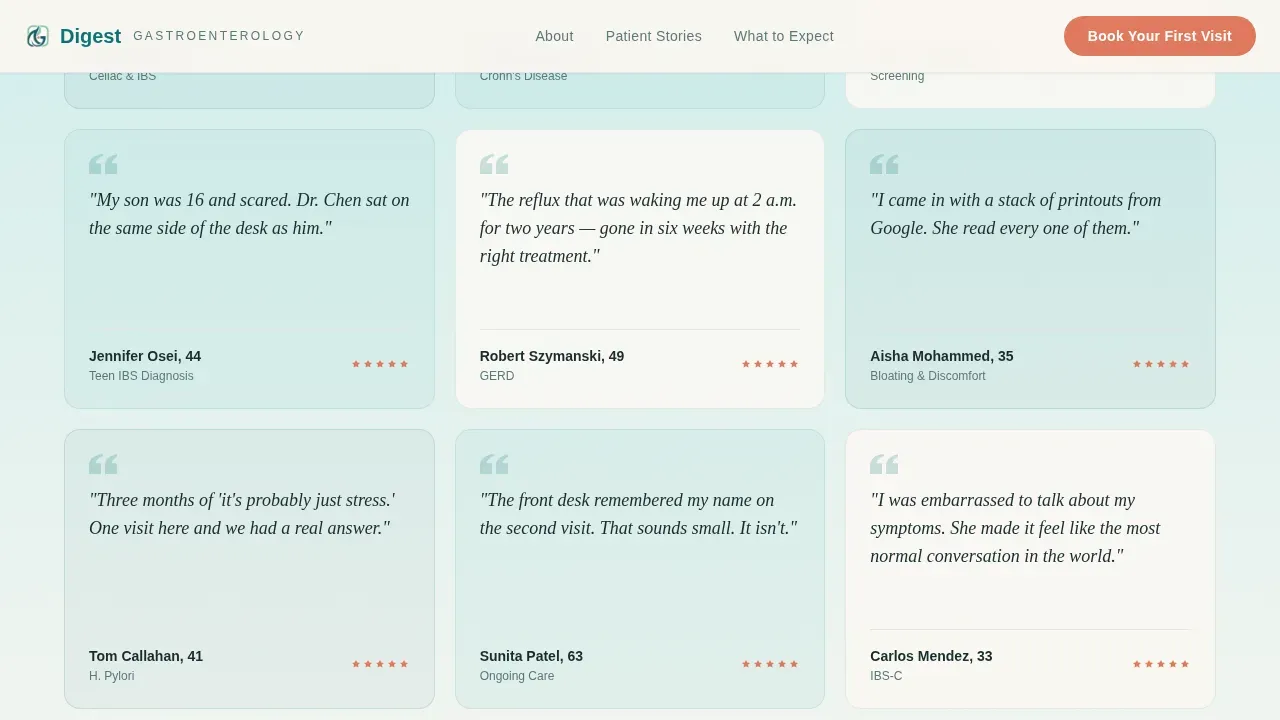
- A scroll-driven testimonial mosaic with staggered cards of varying heights, animated with scroll-triggered reveals that build social proof as patients read further down the page.
- An inline booking form with a plain-language reason-for-visit dropdown, preferred location field, insurance carrier input, and an open text field for personal details, plus a secondary email capture for patients not yet ready to book.
Feature list
This landing page template includes carefully considered features that serve both the practice and the patients it is trying to reach. Each feature is grounded in what gastroenterology landing pages need to work effectively in a competitive health and medical market. Below is a closer look at what the template delivers.
Split-Screen Hero with Stacked Type Tower
The hero section divides the screen into two equal halves. The left half displays massive, vertically stacked typography reading "Your / Gut / Deserves / Better" in deep teal against linen white, with each word descending in typographic weight. The right half holds a still photograph of a doctor's hands resting open on a wooden desk, morning light catching a glass of water beside a notebook. No lab coat. No stethoscope. Just presence and warmth. The design communicates professional expertise while immediately making patients feel at ease. This is the kind of landing page opening that replaces anxiety with quiet confidence.
Testimonial Mosaic with Scroll Animation
Below the hero, patient testimonials tile across both halves of the screen in staggered cards of varying heights. Each card carries a specific patient voice, the kind that names a real moment of relief rather than a generic rating. The mosaic is powered by scroll-triggered animation, so the cards reveal progressively as visitors scroll, building social proof like a chorus growing louder. Including authentic patient testimonials on medical landing pages is one of the most effective ways to establish credibility and trust. This feature does exactly that, at scale and with visual impact. A well-organized layout using short, scannable cards ensures that visitors absorb patient stories quickly, even during a brief page visit.
Credentials Band and Insurance Logos
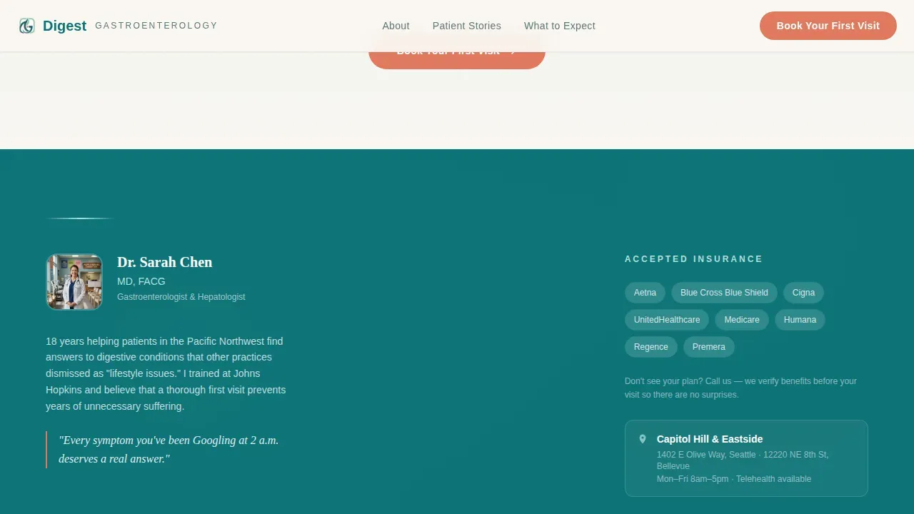
A slim horizontal strip between the testimonial mosaic and the booking section displays the doctor's credentials, certifications, and accepted insurance logos. This band serves as a trust anchor. It communicates board-level expertise and helps patients confirm their insurance will be accepted before they invest time in filling out a form. Clear trust signals, including board certifications and insurance details, are essential elements of any effective gastroenterology landing page. The credentials band delivers both in a clean, minimal format that does not interrupt page flow.
Prep-to-Visit Timeline
The prep-to-visit section uses a sticky-left, scrolling-right layout to walk new patients through everything that happens before their first appointment. It explains what to bring, including photo identification, insurance cards, and a medication list, and sets clear expectations for the visit itself. This kind of transparency is especially valuable for patients who feel nervous or uncertain about what to expect from a specialist consultation. A well-structured timeline helps reduce pre-appointment anxiety and makes the practice feel organized, empathetic, and professional. It also answers common questions before patients need to ask them, making the staff's job easier from the very first phone call.
Inline Booking Form with Dual Conversion Paths
The primary call to action, "Book Your First Visit," appears in coral at three scroll depths on desktop and as a floating button on mobile. Clicking it opens a lightweight inline form with a plain-language reason-for-visit dropdown, preferred location, insurance carrier, and a single open text field. A secondary path beneath the form reads "Not ready to book? Download our new patient checklist," capturing an email address for nurture. Short, simple forms that request only essential information are proven to minimize friction and improve appointment conversion rates. This template implements that principle with two distinct paths, one for patients ready to commit and one for patients still building confidence.
GSAP Entrance and Scroll-Triggered Animation
The template uses high-level animation throughout. The hero section launches with a GSAP entrance that gives the page energy from the very first second. Scroll-triggered reveals animate the testimonial mosaic, the credentials band, and the timeline as visitors move through the page. A marquee element adds motion to horizontal content bands. These animation details are handled through client-side components, while static sections use server components for efficient rendering. The result is a page that feels active, modern, and polished, without sacrificing the calm, healing-space atmosphere that makes patients feel comfortable.
Page sections overview
| Section | Purpose |
|---|---|
| Split-Screen Hero | Anchors first impression with stacked type and a warm doctor photograph |
| Testimonial Mosaic | Builds trust through specific patient relief stories across the full width |
| Credentials Band | Displays doctor certifications, credentials, and accepted insurance logos |
| Prep-to-Visit Timeline | Explains step-by-step what patients can expect before their first visit |
| Inline Booking Form | Captures appointment requests with minimal friction and plain-language fields |
| Secondary Email Capture | Nurtures visitors not yet ready to book via a downloadable new patient checklist |
| Footer Row | Delivers contact details, office hours, and location in a clean single-row layout |
Design & branding system
The Digest template is built on the Teal Catalyst color system, a palette designed to feel warm and clinical at the same time. Deep teal is used as the primary anchor throughout the page. Soft seafoam washes across alternating background panels, giving each section its own breathing room without visual noise. Linen white fills negative space generously, keeping the layout open and calm. Coral is reserved exclusively for call-to-action buttons and urgent callouts, making the booking action visually unmistakable at every scroll depth. The typographic system pairs DM Sans for body copy and interface elements with Fraunces, a serif display font that adds warmth and personality to headlines. Together, these choices create a landing page that feels like a waiting room redesigned by someone who actually hates waiting rooms.
- Color system: deep clinical teal (#0D7377) as primary, soft seafoam (#B2DFDB) for alternating panels, linen white (#FAF7F2) for open space, coral (#E07A5F) for calls to action only.
- Typography: DM Sans for body and interface copy, Fraunces serif for display headlines and emotional anchoring across hero and section headers.
Mobile & speed optimization
The Digest template is designed desktop-first with a fully responsive mobile layout. On smaller screens, the split-screen hero stacks vertically, with the typography tower above and the doctor photograph below, preserving visual hierarchy across every device. The floating coral "Book Your First Visit" button is pinned to the bottom of the mobile viewport, keeping the primary call to action visible at all times without interrupting content reading. Mobile responsiveness is essential for any medical landing page, since many patients search for health services on their smartphones, often late at night when symptoms feel most urgent.
- On mobile, the testimonial mosaic reflows into a single-column card stack, maintaining the scroll-triggered animation experience while fitting neatly on smaller screens.
- Static content sections use server components for efficient rendering, while interactive elements such as the booking form, accordion, and animation layers use client-side components, keeping the page load experience smooth across all device types.
How this template helps you convert
Conversion on a gastroenterology landing page is not just about a prominent button. It is about reducing the emotional distance between a patient's fear and their willingness to book an appointment. The Digest template is structured to earn that trust progressively, section by section, before it ever asks for a commitment.
- Patient testimonials appear before the booking form, allowing other patients to speak first. Real voices describing specific moments of relief lower the psychological barrier of admitting something is wrong and asking for help. This sequence is intentional: social proof at the beginning, then the call to action once trust is established.
- The prep-to-visit timeline removes uncertainty. Patients who understand exactly what to bring, what will happen during their consultation, and what the first visit looks like are far more likely to follow through with booking. Transparency is a conversion tool, and this template uses it at a dedicated scroll depth.
- The dual-path conversion system captures patients at two different levels of readiness. Those ready to book get a streamlined appointment form. Those still building confidence get a secondary email capture through the new patient checklist download. No visitor leaves the landing page without a clear next step.
Other information about this template
The Digest landing page template is part of a broader library of health and medical landing page templates designed to help practices launch faster and convert more effectively. Below are additional details that will help you understand how this template fits into the wider ecosystem of medical landing page design and promotion.
- This template is available as a free starting point for gastroenterology practices. Using free medical landing page templates saves time and resources for healthcare organizations that want a professional result without starting from zero.
- The template is fully customizable. Layouts in medical landing page templates can be adjusted to include your own doctor and staff photography, your specific services, patient testimonials, and brand colors. All design elements are editable to fit your practice identity.
- Promoting your gastroenterology landing page works best when paired with consistent digital promotion strategies. Pay-per-click advertising, social media promotion, and email marketing can each drive traffic to the page. Including location-specific details in your content helps the page perform better in local patient searches.
- Partnerships with other medical organizations can expand the reach of your landing page through cross-promotion. Influencer outreach within the medical community can also lend additional credibility and interest.
- Utilizing analytics to monitor how visitors interact with the landing page is important for ongoing improvement. Watching which sections hold attention, where visitors drop off, and which call-to-action performs best allows you to develop smarter iterations over time.
- The Digest template integrates the Testimonial Mosaic creative direction with the Stacked Type Tower header concept and a Booking/Scheduling landing page direction. These intersection choices are intentional and tested for the gastroenterology niche.
- The template is suited for the Digest Healing Space Gastroenterologist New Patient Welcome Landing Page Template use case, as detailed in the project brief. It covers all planned sections, including the hero, mosaic, credentials band, timeline, booking form, and footer.
- No-code platforms that support natural language prompts make it straightforward for non-technical users to launch this template and adapt it to their specific practice needs. AI-powered tools can further streamline the design process, reducing the time from template selection to live page.
- AI-powered platforms often provide customizable templates that are easily modified to fit specific branding needs. AI tools can also help optimize landing pages for better conversion rates by analyzing user behavior and suggesting targeted improvements.
- The science of effective landing page design in medicine is clear: short forms, clear calls to action, authentic patient stories, and visible trust signals consistently improve appointment conversion rates. This template applies all of these principles in a single, cohesive landing page layout.
- Physicians, nurses, and staff who are visible on the page through authentic photography and clear credentials help patients feel safer before they arrive. High-quality images of the doctor and team are among the most effective trust signals on any medical landing page.
- The page is designed to support efficient patient communication from the very first interaction. Effective communication and a genuine understanding of patient needs are central to how this template is structured, from the opening headline to the final booking confirmation step.
Theme
Healing Space
Creative direction
Testimonial Mosaic
Color system
Teal Catalyst
Style
Split Screen (50/50)
Direction
Booking/Scheduling
Page Sections
Split-screen Hero with Stacked Typography
Scroll-driven Testimonial Mosaic
Credentials Band and Insurance Display
Prep-to-visit Patient Timeline
Inline Booking Form with Dual Conversion Paths
GSAP Entrance and Scroll-triggered Animation
Related questions
What type of practice is this landing page template designed for?
Can I customize the colors, fonts, and photography in this template?
How does the booking form work for new patients?
Is this template suitable for mobile users?
Does this template include patient testimonial sections?



