Chiropractor Directory & Provider Finder Website Template
Align is a split-screen chiropractor provider directory landing page that guides visitors through a five-question assessment to match them with nearby practitioners. Built on a calming Soft Mist color system with animated line art and scroll-linked gradients, it turns pain awareness into a personalized result before asking for any contact information.
by Rocket studio
Quick summary
Align is a single-page chiropractor provider directory built around a guided five-step assessment. Visitors describe their pain, activity level, and insurance preference, then receive three matched local providers with ratings, specialties, and distance. The page uses animated spine line art, scroll-linked gradient shifts, and floating progress indicators to make the process feel personal and calm rather than clinical.
Who this template is for
This template is designed for teams and practitioners who want a chiropractic website that genuinely connects people in pain with the right local provider. It works equally well for directory operators, chiropractic marketing agencies, and individual clinic owners who want a smarter first touchpoint than a generic contact form.
- Desk workers, weekend athletes, and new parents looking for fast, specific pain relief referrals
- Chiropractic clinic groups and directory operators matching potential patients to local healthcare providers
- Designers and developers building a high converting chiropractic website for a niche health audience
What problem this template solves
Most people searching for a chiropractor land on a chiropractic website that looks the same as every other one. They see a phone number, a stock photo of a lab coat, and a booking form. Nothing earns their trust first. Nothing asks what they actually need.
Align solves that. Instead of using generic language that applies to everyone, the page opens a real conversation. It uses problem-focused headlines and a step-by-step assessment to guide visitors toward a result that feels made for them.
- Website visitors with neck pain, chronic back pain, or a sports injury don't know which provider fits their specific situation
- Standard landing pages skip the trust-building step and ask for contact information too early
- Slow loading pages and cluttered navigation distract from the single goal of matching a patient to the right chiropractic care
What you get with this template
You get a fully designed, single-page layout built for a chiropractic website that functions as both a patient acquisition tool and a trust-building experience. Every section is pre-structured to move visitors from awareness to a matched result without friction.
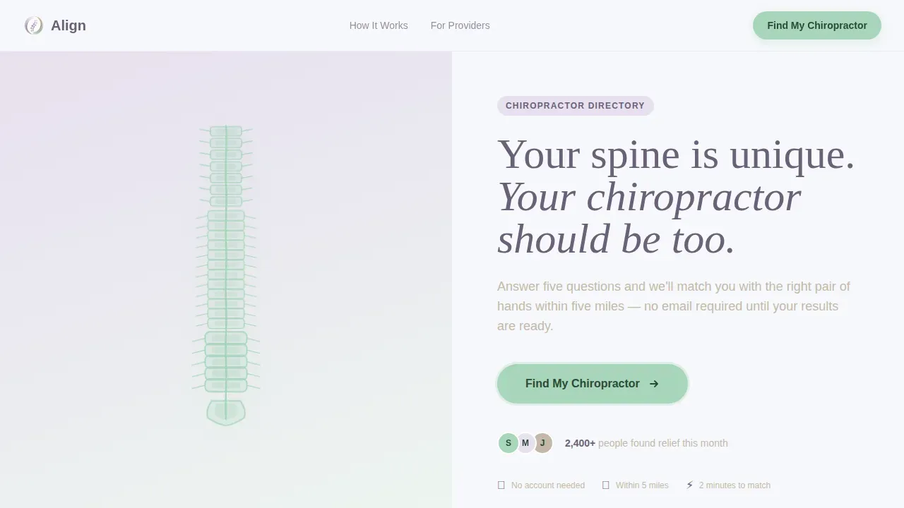
- A full-viewport split-screen hero with an animated spine SVG on the left and a headline plus call-to-action on the right
- A five-step scroll-based assessment covering pain location, duration, activity level, accepted insurance providers, and zip code
- A results screen showing three matched providers with ratings, specialties, and distance, followed by a soft email capture to save matches
Feature list
This template ships with a focused set of purposefully designed components. Each one serves the conversion goal of turning a first-time website visitor into a matched, engaged prospective patient.
Animated Spine Hero with Split-Screen Layout
The header fills the full viewport as a 50/50 split. The left panel renders a continuous-stroke line-art spine in eucalyptus green on a lavender-to-white gradient. The vertebrae animate into alignment from top to bottom as the page loads, creating an immediate visual metaphor for the relief the visitor is looking for. The right panel carries a single warm-stone headline and a softly pulsing primary call-to-action button.
Five-Step Scroll Assessment
The assessment is the core conversion engine. Each of the five questions occupies its own full scroll section, paired with a contextual line-art illustration on the left. The questions progress from pain location, selected via a clickable body map, through pain duration on a slider, activity level, insurance preference, and zip code. No email is required until results appear, which means the page earns trust before it asks for anything.
Scroll-Linked Gradient Warming
As visitors scroll deeper into the assessment, the background gradients shift gradually warmer and the eucalyptus accents grow bolder. This scroll-linked color transition is handled through GSAP-driven reveals and CSS animation, giving the page a sense of momentum and increasing personalization without any abrupt visual changes.
Floating Vertebrae Progress Indicators
Vertical progress dots float along the right edge of the viewport throughout the assessment. They are spaced and styled to echo the form of vertebrae, reinforcing the anatomical theme and giving visitors a clear sense of how far through the self-discovery process they have traveled.
Matched Provider Results Screen
After the final assessment question, the page surfaces three matched providers. Each card shows a rating, distance in miles, specialty tags, and a clear path to book appointments or learn more. The email capture on this screen asks visitors to save their matches, which frames the ask as a benefit rather than a gate.
Minimal Ultra-Clean Footer
The footer follows an ultra-minimal horizontal layout with no visual clutter. It anchors the page without competing with the primary conversion goal, keeping the structured layout clean through to the final pixel.
Page sections overview
| Section | Purpose |
|---|---|
| Split-Screen Hero | Animate spine, deliver headline, trigger first call to action click |
| Assessment Step 1 | Clickable body map for pain location selection |
| Assessment Step 2 | Duration slider plus activity level input |
| Assessment Step 3 | Insurance preference and zip code entry |
| Provider Results Screen | Display three matched providers, capture email to save |
| Minimal Footer | Close the page with contact links and legal basics |
Design & branding system
The Soft Mist color system keeps every surface calm and breathing. The palette deliberately avoids anything clinical or sharp. Fraunces handles headlines with warmth and character, while DM Sans keeps body text and patient information easy to read at any size.
- Cloud white (#F7F8FC) and pale lavender mist (#E8E0F0) flow between each other in seamless background gradients, cool eucalyptus (#A8D5BA) marks every interactive element and progress indicator, and warm stone (#C4B8A8) grounds body text and secondary buttons
- Line-art illustrations replace stock photography entirely: a seated desk figure, a runner mid-stride, and a parent lifting a child appear section by section to reflect the real people arriving on the page
- Typography pairing of Fraunces for display headlines and DM Sans for body copy creates a confident yet approachable tone that supports the chiropractic care message without feeling institutional
Mobile & speed optimization
Over 60 percent of healthcare searches happen on mobile devices, so this template is built to stack gracefully on smaller screens. The split-screen layout collapses to a single-column flow on mobile, keeping every assessment step readable and tappable without horizontal scrolling. Mobile optimization is treated as a first-class concern, not an afterthought.
- The spine SVG animation and GSAP scroll reveals are written to perform on mobile users' devices without blocking the main thread during the assessment interaction
- Contact pages, results cards, and the email capture all reflow cleanly for mobile devices, so new patients on smartphones experience the same guided flow as desktop visitors
- The assessment progress indicators rescale for touch navigation, keeping the experience intuitive for mobile users moving through each step with a thumb
How this template helps you convert
Landing page optimization is crucial for converting website visitors into patients, and this template is built around that single objective. Visitors form judgments about credibility within the first three seconds, so the animated hero and clear value proposition above the fold work immediately. High-converting landing pages minimize navigation options, and Align has no top navigation at all, keeping attention on the "Find My Chiropractor" primary call-to-action.
- The assessment structure delays the email ask until after value is delivered, which mirrors how high intent searches behave and dramatically reduces drop-off at the point of commitment
- Social proof appears at the right moment: provider ratings, distance, and specialty tags on the results screen give prospective patients the confidence to move forward without needing separate patient testimonials pages
- The step-by-step format and scroll-linked visual feedback guide visitors through the funnel naturally, making patient engagement feel earned rather than forced, and positioning the final email capture as a helpful save feature rather than a lead generation wall
Other information about this template
This section covers additional context useful for designers, developers, and chiropractic practice owners who want to understand how Align fits into a broader digital strategy.
The template is designed with chiropractic website design best practices in mind. A high converting chiropractic website should communicate credibility, treatment clarity, and ease of booking quickly. Align does this without relying on traditional page structures. There is no about page in the single-page flow, but the template can support linking to a separate about page, services page, or contact pages on a full chiropractic site.
Local search results matter enormously. Local SEO is crucial because 97 percent of consumers search online for local businesses. The zip code step in the assessment directly feeds local matching logic, making the template a natural fit for a local SEO strategy. Directory operators can layer schema markup, NAP (Name, Address, and Phone number) consistency, and Google Maps integration onto their chiropractic site to strengthen local search rankings further.
The page is also positioned to support broader digital marketing efforts. Whether a chiropractic clinic drives traffic from organic traffic sources, paid advertising campaigns, or digital marketing services outreach, the landing page's no-navigation structure keeps every visitor inside the conversion funnel.
Other practical considerations for operators:
- The results screen can surface a sports injury chiropractor, a sciatica treatment specialist, or a practitioner focused on sports injury rehabilitation, depending on how provider data is tagged in the directory
- Patient information collected at the email capture step should be handled in line with regulatory compliance requirements relevant to health data, including HIPAA guidance
- The template supports video content integration in section slots if a chiropractic practice wants to add video testimonials or patient success stories to future iterations
- Search engines benefit from well-structured landing pages with clear meta descriptions, internal linking to a services page and contact pages, and search engine optimization practices applied to the surrounding site
- The align find your perfect chiropractor provider directory landing page template is the formal product name for this asset in the marketplace
- Wellness tips, a blog or resource page, and a free consultation offer can be added as downstream destinations once visitors complete the assessment and save their matches
- Chiropractic marketing teams using this template alongside paid advertising and digital marketing services will find the single-goal layout reduces wasted spend on distracted clicks
- Content management systems can be connected to manage provider data and update the results screen without rebuilding the page design
- The page is built desktop-first with a responsive mobile stack, meaning website design integrity holds across screen sizes without requiring a separate mobile build


Theme
Soft Gradient
Creative direction
Step-by-Step Guide
Color system
Soft Mist
Style
Split Screen (50/50)
Direction
Quiz/Assessment
Page Sections
Animated Split-screen Spine Hero
Five-step Guided Assessment
Scroll-linked Gradient Warming
Floating Vertebrae Progress Dots
Matched Provider Results Screen
Ultra-minimal Horizontal Footer
Related questions
Does the assessment require visitors to enter their email upfront?
Can this template surface different chiropractic specialties in the results screen?
Is this template suitable for a single chiropractic practice or only for multi-provider directories?
How does this template support local patient acquisition?
What other pages should accompany this landing page on a full chiropractic website?



