Cat Specialist Professional Website Template
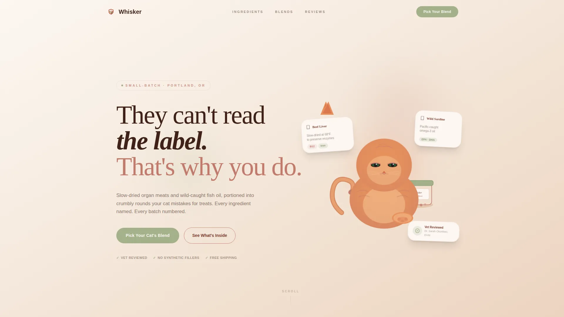
Whisker is a warm artisan landing page template built for small-batch cat health supplement brands. It uses a modular card grid layout, a hand-illustrated ginger cat mascot, and a Desert Rose color palette to create a neighborhood apothecary feel. Devoted indoor-cat parents can explore ingredients, read sourcing stories, and choose their cat's blend with a guided selector.
by Rocket studio
Quick summary
Whisker is a single-page, card grid landing page template designed for artisan cat health supplement brands. It blends warm hand-crafted visuals with a direct-sales conversion flow. The result is a page that feels personal and trustworthy before it ever asks for a purchase.
Who this template is for
This template is built for small-batch pet supplement makers who sell directly to devoted cat owners. It suits founders who want their page to reflect the care they put into their product, not just move units.
- Independent cat supplement brands selling organ meat or fish oil rounds directly to consumers
- Pet wellness makers who want a story-driven page that earns trust before the first call to action
- Artisan product sellers whose buyers read ingredient panels closely and expect full transparency
What problem this template solves
Most supplement landing pages feel clinical or generic. Cat owners who research ingredients deeply need more than a product photo and a price. This template bridges the gap between artisan quality and clear online selling.
- Ingredient-curious buyers leave pages that show no sourcing detail or product story
- Generic layouts fail to communicate the handmade, small-batch nature of niche cat health supplements
- Brands lose returning customers without a fast reorder path built into the page flow
What you get with this template
You get a fully designed, section-rich landing page that combines storytelling cards, a guided product selector, and a direct-sales conversion structure. Every visual and functional element is built for cat supplement brands selling to informed, loyal buyers.
- Modular card grid layout with varied heights and widths arranged in a bulletin-board style
- A hand-illustrated animated ginger cat mascot in the header with a subtle idle animation
- A guided blend selector, a sticky call-to-action bar, and a one-tap reorder path for returning buyers
Feature list
This template packs a focused set of purpose-built features. Each one serves the informed cat-owner buyer and the artisan brand behind the product.
Animated Mascot Header
The header features a hand-illustrated ginger cat drawn in a loose ink-and-watercolor style. A subtle idle animation makes the cat's ear flick and its tail curl. Behind the illustration, a warm linen texture and a hand-lettered headline set the brand tone immediately.
Modular Card Grid Layout
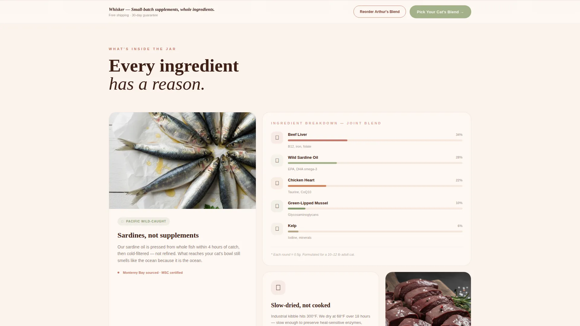
Cards vary in height and width, arranged with deliberate casual imperfection. Each card acts as a separate "shop window," from a sardine sourcing photo to a hand-drawn ingredient diagram. Every card rewards hover interaction with a gentle lift and warm shadow.
Guided Blend Selector
Clicking "Pick Your Cat's Blend" opens a simple three-step selector. The buyer chooses the cat's age range, primary concern (joints, coat, digestion, or immunity), and preferred quantity. This reduces decision fatigue and moves buyers toward the right product faster.
Sticky Call-to-Action Bar
The primary call-to-action button appears first beneath the mascot header. After the second scroll, a sticky bottom bar carries the same call to action throughout the rest of the page. Returning buyers also see a one-tap "Reorder" path alongside it.
Trust-First Sourcing Cards
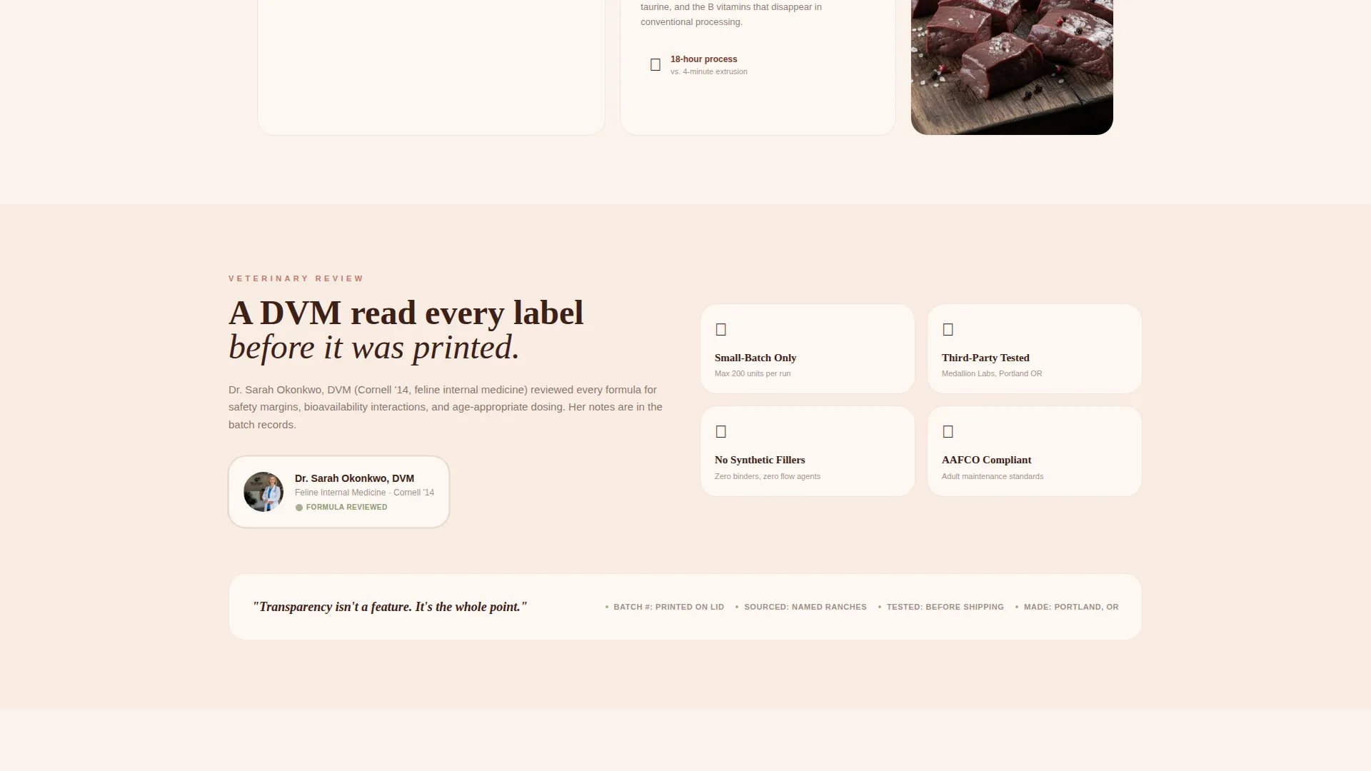
The ingredient sourcing card and a veterinary-reviewed badge appear above the first call to action. Buyers see what is inside the jar and who reviewed the formula before they are ever prompted to purchase. This sequencing is deliberate and built into the template structure.
Handwritten-Style Customer Notes
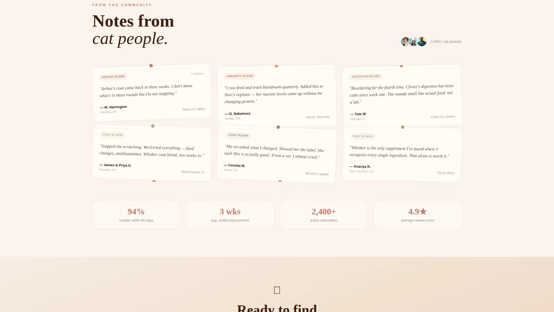
A rotating card displays handwritten-style customer testimonials, styled to look like notes passed between neighbors. The informal format reinforces the local, community-rooted feel of the brand and adds social proof without feeling like a standard review widget.
Page sections overview
| Section | Purpose |
|---|---|
| Mascot Header | Introduce brand personality and primary call to action |
| Sourcing Story Card | Show whole-ingredient origins with product photography |
| Ingredient Diagram Card | Break down each supplement round with a hand-drawn visual |
| Customer Notes Card | Display rotating handwritten-style testimonials |
| Veterinary Badge Block | Place trust signal above the first purchase prompt |
| Guided Blend Selector | Help buyers find the right blend in three steps |
| Sticky Bottom Bar | Keep the call to action visible throughout the page |
| Reorder Path Block | Give returning buyers a single-tap reorder option |
Design & branding system
The visual identity follows a Warm Artisan theme built around the Desert Rose color system. Every color choice references natural materials and late-afternoon kitchen light, creating an apothecary warmth that feels handmade rather than mass-produced.
- Color palette: sun-faded terracotta (#C27A6B), warm sand (#F2E0D0), deep clay (#7A3B2E), and dried sage (#A3B18A) used for call-to-action buttons and benefit highlights
- Illustration style: loose ink-and-watercolor hand-drawn art, linen textures, and handwritten headline lettering throughout
- Layout personality: cards at varied sizes arranged like a community bulletin board, with hover lift effects and warm drop shadows on interaction
Mobile & speed optimization
The card grid layout is designed to reflow cleanly across screen sizes. Modular blocks stack in a logical reading order on smaller screens so no sourcing detail or trust signal gets buried.
- Modular card structure allows natural vertical stacking on mobile without losing visual hierarchy
- The sticky call-to-action bar and guided selector remain accessible on touch screens throughout the scroll
- Illustration and texture assets are contained within a lightweight, single-page structure to support fast load behavior
How this template helps you convert
Every structural decision in this template is made to reduce hesitation and build confidence before the purchase moment. The sequence is intentional from the first scroll to the final tap.
- Trust is built before the ask: the sourcing card and veterinary-reviewed badge appear above the first call-to-action button, so buyers already understand the product before they see a price prompt.
- The guided blend selector removes decision fatigue by narrowing choices through age, concern, and quantity, making it easier for first-time buyers to commit.
- The sticky bar and one-tap reorder path keep the conversion route open for both new and returning buyers without adding friction or clutter.
Other information about this template
This template fits naturally within the growing niche of premium cat health supplement brands selling direct to consumer. It is especially well suited to founders who want their online presence to reflect the same intention they put into their product formulation.
- The Local & Neighborhood creative direction makes the page feel like a trusted community shop rather than an e-commerce storefront
- Card grid (modular) structure means sections can be reordered or swapped to match a brand's specific product range or story emphasis
- The Desert Rose color system and Warm Artisan theme were selected to resonate with the ingredient-conscious, lifestyle-driven cat owner demographic
- The header concept centers a Mascot/Character to give the brand an immediate, memorable face that returning visitors recognize
- The direct-sales landing page direction keeps the entire page focused on a single conversion goal without navigational distractions
Theme
Warm Artisan
Creative direction
Local & Neighborhood
Color system
Desert Rose
Style
Card Grid (Modular)
Direction
Direct Sales
Page Sections
Animated Ginger Cat Mascot
Modular Card Grid Layout
Guided Blend Selector
Sticky Call-to-action Bar
Trust-first Sourcing Cards
Rotating Customer Notes Card
Related questions
Can I change the blend selector options to match my actual product range?
Does the animated mascot slow down the page?
Can returning customers use the reorder path without going through the selector again?
Is the card grid layout flexible enough for a brand with fewer product stories?
Where does the veterinary-reviewed badge appear on the page?