Bold Asian Food Franchise Landing Page Template
Wok is a bold, overlap-style landing page template built for an Asian food franchise brand. It combines a Neo-Retro visual identity with a scroll-driven Comparison Journey that stacks franchise stats side by side. Every section moves the visitor toward one action: booking a franchise discovery call. No forms, no friction, just a clear click-through to qualified conversations.
by Rocket studio
Quick summary
Wok is a single-page franchise landing page template designed for an Asian food franchise concept entering strip malls and food courts. The layout uses overlapping cards, a photo-wall header, and a side-by-side comparison journey to move mid-career investors and multi-unit operators toward one goal: claiming a territory.
Who this template is for
This template is built for franchise brands that need to attract serious investors, not just curious browsers. It speaks directly to people who have capital ready and want a concept that stands apart from saturated fast-food categories.
- Mid-career professionals with Small Business Administration-ready capital exploring franchise ownership
- First-generation immigrants who want to build a business rooted in authentic culinary tradition
- Multi-unit operators looking for a differentiated concept that outperforms tired burger-and-sandwich fatigue
What problem this template solves
Most franchise landing pages bury the math, lead with jargon, and ask for a form fill before earning any trust. Serious investors scroll away before they ever reach the numbers that matter. This template solves that by making the financial case visually undeniable first, then asking for the click.
- Generic franchise pages fail to differentiate the concept against familiar fast-food alternatives
- Buried unit economics and vague lifestyle promises slow down qualified buyer decisions
- Early form gates push away investors who need to see the opportunity before they raise their hand
What you get with this template
You get a fully structured, single-page click-through layout built around the Wok franchise concept. Every visual and structural decision is made to earn the scroll and deliver the click.
- A dense UGC Photo Wall header with overlapping Polaroid-style franchise owner and customer snapshots
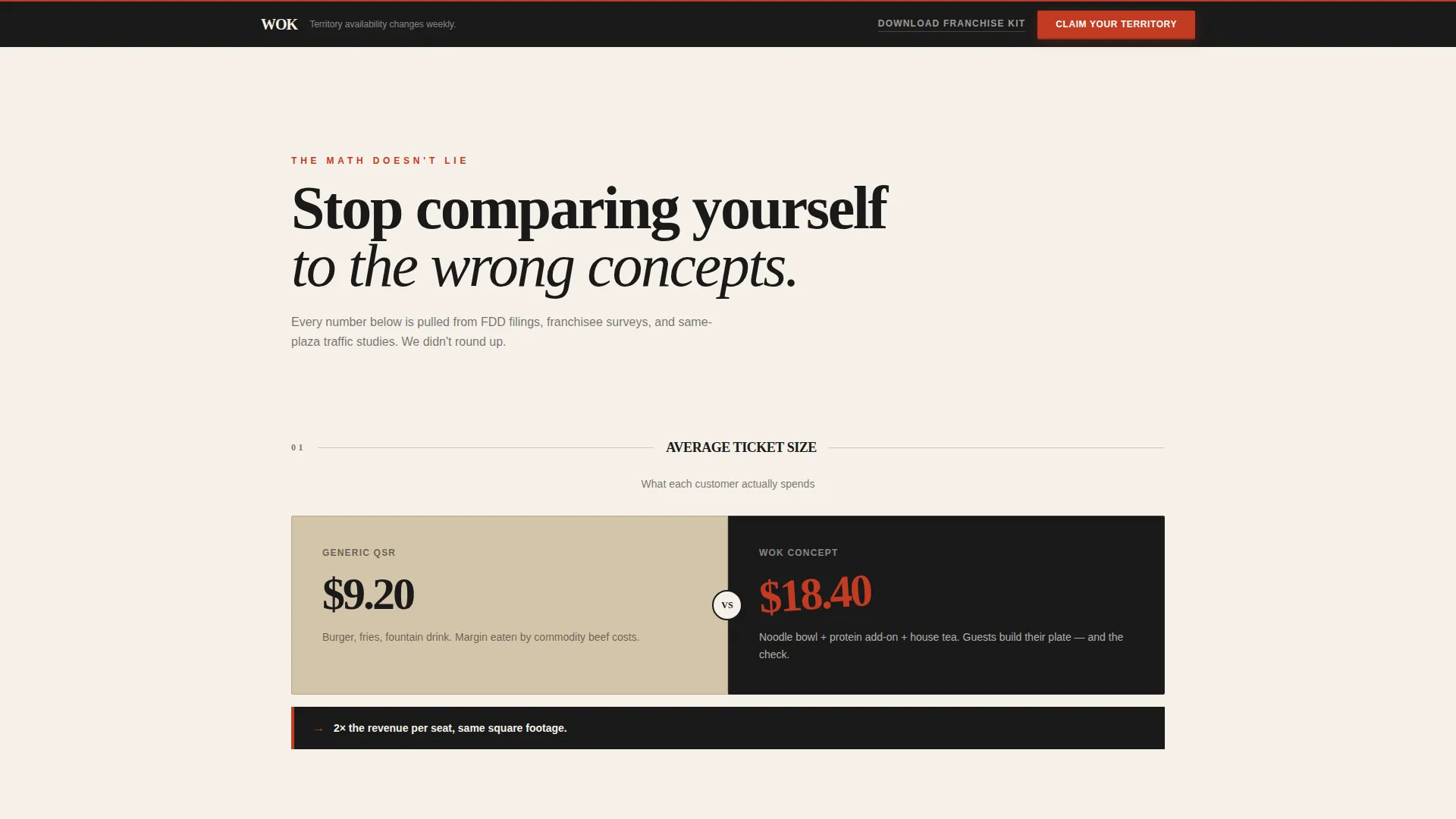
- A scroll-driven Comparison Journey with layered cards that contrast generic franchise metrics against wok-concept performance stats
- A persistent "Claim Your Territory" call-to-action bar and a secondary "Download the Franchise Kit" text link for earlier-stage prospects
Feature list
This template packs every conversion-oriented element into one cohesive, visually rich layout. Each feature is rooted in the brief and designed to serve a specific role in the buyer journey.
UGC Photo Wall Header
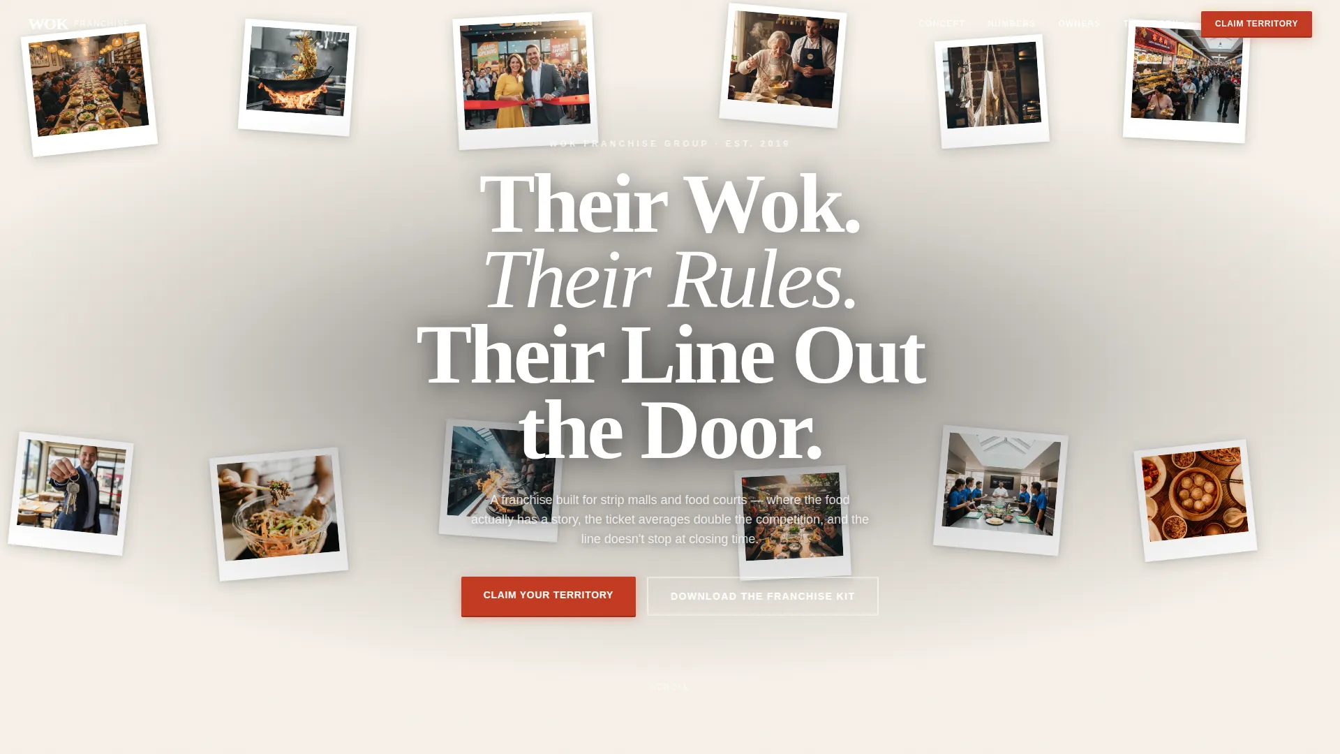
The header opens with a dense, overlapping mosaic of real-style franchise owner and customer photos arranged like Polaroids pinned to a corkboard. Images tilt at slight angles and cast subtle drop shadows onto the cream canvas, creating immediate warmth and credibility. A single heavy-ink headline punches through the center of the wall.
Scroll-Driven Comparison Journey
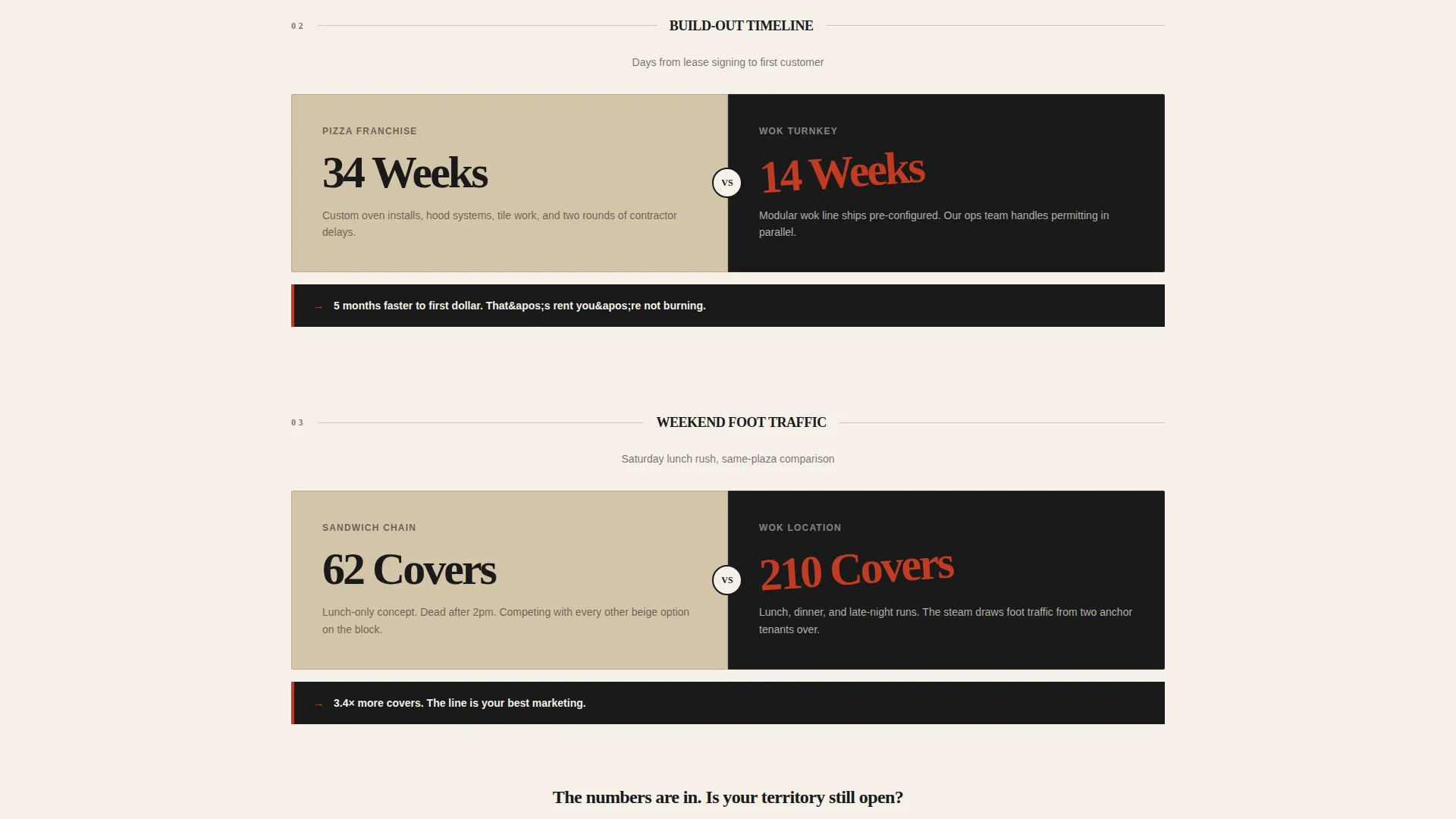
Each section of the page layers a "before" franchise reality against this concept's "after." Comparisons cover average ticket size, build-out timelines, and weekend foot traffic across three escalating categories: financials, operations, and lifestyle. Cards slide into frame as the visitor scrolls, and each stat lands tilted like a stamped chop mark in lacquer red.
Persistent Click-Through Call to Action
The primary call to action, "Claim Your Territory," appears first beneath the header and then locks into a floating bottom bar after the second comparison section. There is no form on this page. The click routes directly to a dedicated franchise qualification page, keeping the path clean and intentional.
Secondary Franchise Kit Link
A text-link call to action, "Download the Franchise Kit," captures earlier-stage prospects who are not yet ready to book a call. It gives them a low-commitment next step while keeping their interest warm for follow-up.
Neo-Retro Ink and Paper Visual System
The color palette uses rice-paper cream, woodblock ink, lacquer red, and faded tea-stain tan. Every typographic choice uses heavy ink-weight strokes. The overall effect reads like a vintage Hong Kong movie poster printed on handmade paper stock, bold and textured without feeling overdone.
Overlapping Card Layout
The template is built on an overlap and layered structure throughout. Cards, testimonial panels, and comparison blocks stack on top of one another with slight offsets. Tea-stain tan surfaces layer behind panels like aged newsprint, giving the page physical depth without relying on complex animation rigs.
Page sections overview
| Section | Purpose |
|---|---|
| UGC Photo Wall | Opens with franchise owner and customer photos; headline anchors brand personality |
| Primary call to action Block | Delivers first "Claim Your Territory" button directly below the header |
| Ticket Size Comparison | Contrasts generic QSR average ticket against wok-concept average ticket |
| Build-Out Timeline Comparison | Stacks pizza franchise build-out timeline against this turnkey kitchen timeline |
| Foot Traffic Comparison | Shows weekend foot traffic at a sandwich chain versus a noodle bar in the same plaza |
| Lifestyle Payoff Section | Shifts tone from numbers to ownership identity; accelerates emotional investment |
| Persistent call to action Bar | Floating bottom bar with "Claim Your Territory" locks in after second comparison |
| Franchise Kit Link | Secondary text-link capture for prospects who want unit economics before a call |
Design & branding system
The visual identity follows a Neo-Retro theme built on the Ink and Paper color system. The palette draws from historical print traditions, creating a tactile feel that stands apart from polished, generic franchise websites.
- Rice-paper cream (#F5F0E8) dominates the canvas; woodblock ink (#1A1A1A) handles all typography with unapologetic weight
- Lacquer red (#C23B22) is reserved for calls to action, price callouts, and tilted stat stamps; tea-stain tan (#D4C5A9) layers behind overlapping cards and testimonial panels
- Typography uses heavy, bold strokes that bleed into soft-grain textures, evoking a vintage Hong Kong movie poster printed on handmade paper stock
Mobile & speed optimization
The overlapping card structure and layered visual system are designed to translate across screen sizes without losing the tactile depth that makes the page feel distinct. The layout is built with mobile visitors in mind, particularly those browsing franchise opportunities on a phone during a commute or a lunch break.
- Overlapping cards and photo wall elements restack cleanly on smaller screens to preserve readability
- The persistent floating call to action bar is especially effective on mobile, keeping the primary action visible throughout the entire scroll
How this template helps you convert
The page is engineered around one principle: earn the click before you ask for anything. Every design and content decision builds toward that single moment when a visitor stops comparing and starts imagining their name on a lease.
- The Comparison Journey makes the financial and operational case visually before any call to action appears, so the visitor arrives at the call to action already convinced rather than skeptical.
- The dual call-to-action structure captures two types of qualified prospects at once: those ready to book a discovery call and those who need the unit economics in hand before they commit to a conversation.
Other information about this template
This template is categorized under Retail and E-Commerce, specifically within the Franchise Business subcategory, with a niche focus on the Asian food franchise market. It is built as a click-through landing page, meaning its only job is to deliver a warm, informed visitor to the next step in the sales funnel.
- The template style is Overlap and Layered, which creates visual depth through stacked components rather than relying on full-bleed imagery alone
- The header concept is a UGC Photo Wall, a format that builds immediate social proof through real-looking owner and customer photography rather than polished brand shots
- The creative direction is a Comparison Journey, a proven structure for franchise recruitment pages where the buyer needs to see a clear contrast before committing

Theme
Neo-Retro
Creative direction
Comparison Journey
Color system
Ink & Paper
Style
Overlap/Layered
Direction
Click-Through
Page Sections
UGC Photo Wall Header
Scroll-driven Comparison Journey
Persistent Click-through Call to Action Bar
Secondary Franchise Kit Link
Neo-retro Ink and Paper Visual System
Overlap and Layered Card Structure
Related questions
Does this template include a lead capture form?
Can I update the comparison stats and photo wall images?
What type of franchise business is this template built for?
Is there a contact form anywhere on the page?
What makes the Comparison Journey different from a standard features section?



