Copywriter Portfolio Careers Website Template
Wordsmith is a bold brutalist copywriter landing page template built for freelance writers who need their portfolio to do the selling. A masonry layout unspools your best work like a career reel, from raw brief to live result. A sticky lead-gen form invites prospects to send their brief directly, turning the page itself into your pitch.
by Rocket studio
Quick summary
Wordsmith is a single-page copywriter portfolio template with a bold brutalist design and a cinematic scroll experience. It opens with floating project fragments against a black void, compresses them into a masonry grid of case studies, and closes with a sticky "Send Me Your Brief" form. The page is the proof, and the proof sells.
Who this template is for
This template is built for freelance copywriters who work at a senior level and need a portfolio that matches the quality of their output. It speaks directly to the people hiring that talent.
- Freelance copywriters pitching creative directors, brand founders, and agency producers
- Senior writers who have measurable campaign results worth showing
- Copywriters ready to replace a static PDF portfolio with a living, scrollable proof of work
What problem this template solves
Most copywriter portfolios are passive. They list credits and link to PDFs. They ask visitors to do the work of connecting the dots. This template removes that friction entirely.
- Prospects rarely read a portfolio PDF from start to finish
- A flat grid of project thumbnails gives no sense of stakes, process, or results
- Generic contact forms ask questions that slow down a hiring decision
What you get with this template
You get a fully structured single-page layout that walks every visitor through your work in a deliberate sequence. Nothing is left to chance in how the story is told.
- A parallax floating-photo header that opens with a proof-of-results headline
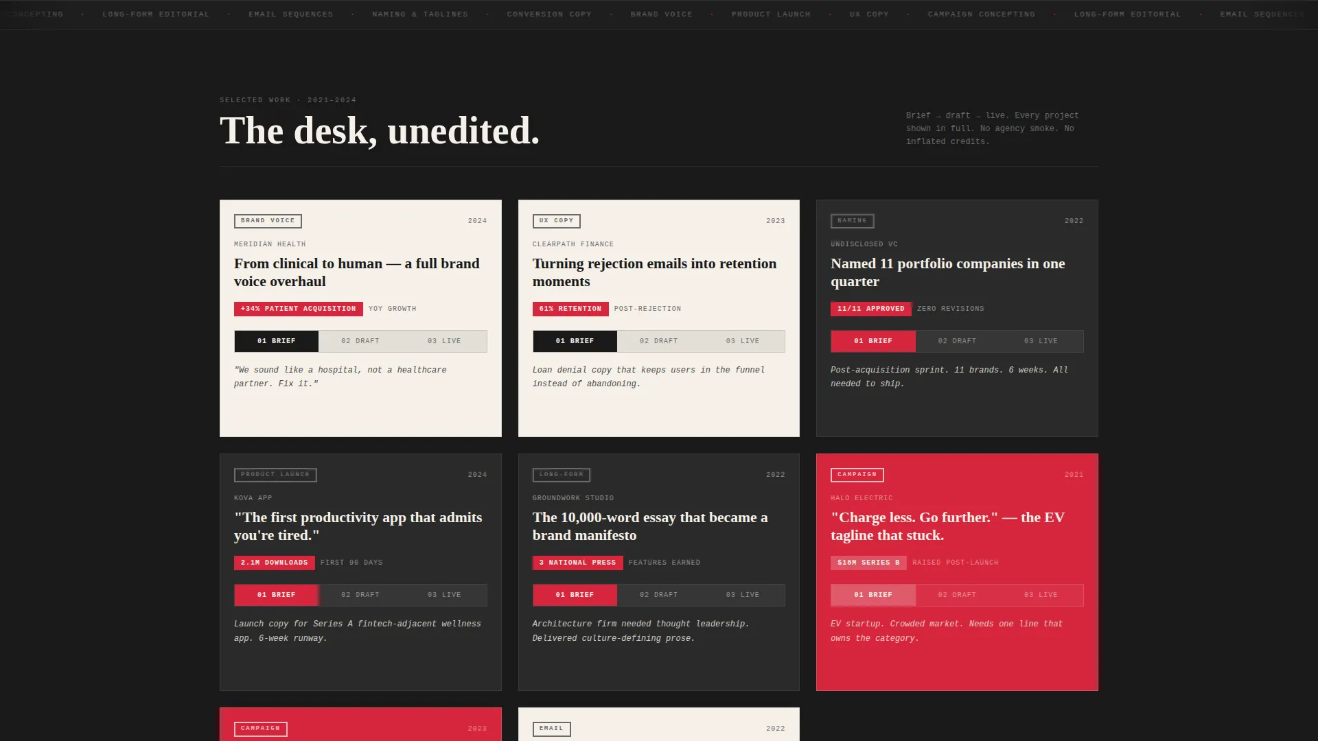
- A cinematic masonry scroll section that moves from raw brief through draft to live final copy
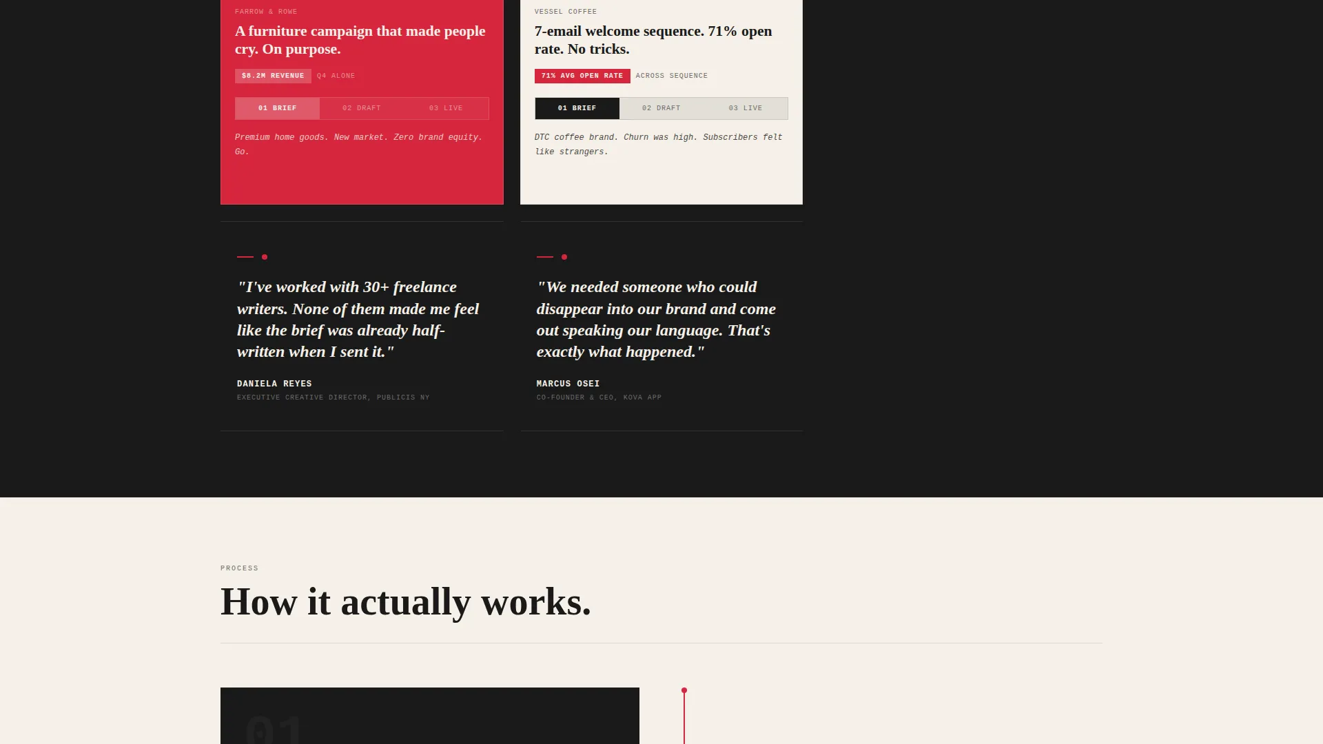
- Testimonial blocks set full-width in white on black that interrupt the scroll like director's commentary
- A sticky bottom bar with a three-field lead capture form that appears after the third project card
Feature list
This template is built around a small number of carefully considered components, each doing a specific job in the visitor's journey.
Parallax Floating Photo Header
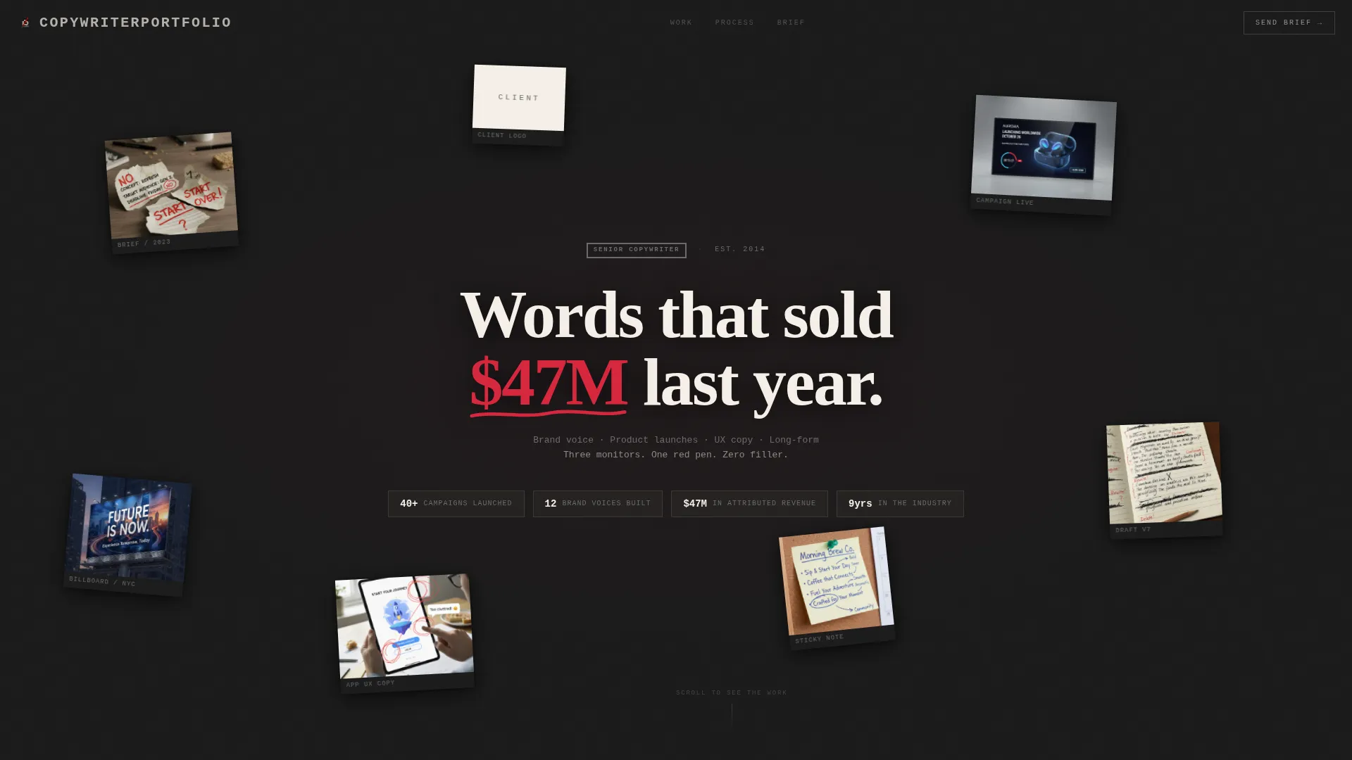
The header places torn briefs, handwritten notes, ad screenshots, and client logo fragments at different depths against a solid black background. Each piece is slightly rotated and casts a soft shadow. As the cursor moves, the fragments shift in parallax, creating the feel of a filing cabinet emptied into zero gravity. The central headline, set in typewriter serif, reads: "Words that sold $47M last year."
Cinematic Masonry Scroll
As the visitor scrolls, the floating chaos in the header compresses into an ordered masonry grid of project cards. Each project is presented in three beats: the original brief, the draft process complete with tracked changes and margin scribbles, and the final copy as it appeared in the real world. Projects scale in stakes and results as the visitor moves down the page.
Full-Width Testimonial Blocks
Testimonial blocks interrupt the project scroll at deliberate intervals. Each block is a single sentence from a creative director or brand founder, presented in white type on a full-width black background. They are impossible to skip and deliver social proof exactly where momentum peaks.
Sticky Lead Capture Bar
A sticky bottom bar appears after the visitor has passed the third project card. It contains three fields: name, project type selected from a short list, and a textarea labeled "Paste your brief or describe the fire." The form mirrors how a working writer actually receives a brief, reducing friction by meeting the client where they already are.
Bold Brutalist Typography System
Type is oversized and monospaced where it needs to command attention. Headings are set tight, almost confrontational. The red editor's mark color is reserved for calls to action, pull quotes, and revision markers only. Nothing decorative competes for attention with the work itself.
Ink and Paper Color Architecture
The color system uses four values: unbleached stock cream, fresh ballpoint black, red editor's mark, and faded pencil graphite for secondary text. Backgrounds alternate between raw cream and solid black across sections, giving the page the rhythm of a galley proof pulled fresh from the press.
Page sections overview
| Section | Purpose |
|---|---|
| Floating Photo Header | Opens with proof-of-results headline and parallax fragment animation |
| Masonry Project Grid | Shows each project across three cards: brief, draft, and live final copy |
| Testimonial Interrupts | Delivers single-sentence social proof at full width between project sets |
| Sticky Brief Form | Captures inbound leads after the third project card with a three-field form |
Design & branding system
The visual identity is built on contrast and intention. Nothing in this design is decorative for its own sake. Every element earns its place by directing attention toward the work or the call to action.
- Four-color palette: cream (#F5F0E8), black (#1A1A1A), red (#D7263D), and graphite (#6B6B6B), used with strict purpose
- Oversized monospaced type set tight, alternating black and cream section backgrounds, and red reserved only for the eye's next destination
- Soft shadows, slight rotation on header fragments, and parallax depth add tactile dimension without breaking the brutalist discipline
Mobile & speed optimization
The layout is designed to translate the desktop cinematic experience into a focused, fast-moving mobile scroll. The masonry grid and floating header adapt to narrower viewports without losing the raw energy of the design.
- Floating header fragments reposition for smaller screens, maintaining depth and rotation at a mobile-friendly scale
- The sticky brief form remains accessible at the bottom of the viewport on all screen sizes
- Masonry card flow reflows to a single or double column on mobile, keeping the project narrative intact
How this template helps you convert
This template is engineered to move a skeptical creative director from arrival to inquiry without a single moment of friction or confusion.
- The parallax header opens with a specific, credible result rather than a generic tagline, giving the visitor an immediate reason to keep scrolling
- The cinematic project sequence builds trust progressively by showing process, not just outcomes, so the visitor understands how the writer thinks
- The sticky brief form appears only after the visitor has seen enough proof to act, and it asks exactly the questions a copywriter needs to say yes or no to a project
Other information about this template
This template is purpose-built for the copywriter interactive portfolio niche. It assumes the writer has real work to show and real results to cite, because the layout puts both front and center.
- The masonry and Pinterest-style card layout is ideal for writers who work across formats: billboard, digital, long-form, brand voice, and user experience copy
- No calendar embed and no portfolio PDF download are included by design; the page itself functions as the proof and the pitch
- The template style follows a masonry layout logic, making it straightforward to add or remove project cards as the writer's body of work grows
- The lead generation direction is baked into the page structure from the header all the way to the sticky form, so every scroll event is also a soft conversion event
Theme
Bold Brutalist
Creative direction
Cinematic Sequence
Color system
Ink & Paper
Style
Masonry/Pinterest
Direction
Lead Generation
Page Sections
Parallax Floating Photo Header
Cinematic Masonry Scroll
Full-width Testimonial Blocks
Sticky Lead Capture Form
Bold Brutalist Type System
Ink and Paper Color System
Related questions
Can I use this template if I do not yet have seven-figure campaign results?
How many projects should I include in the masonry grid?
Is the sticky brief form connected to any email or messaging service?
Can I edit the project type options inside the brief form?
Does the page include a portfolio PDF download or a calendar booking tool?



