Luxury Gift Wrapping Subscription Box Landing Page
Wrap is a bento grid landing page built for a luxury gift wrapping subscription box. It guides visitors through curated product reveals, a tier comparison, and a focused upgrade flow. The Obsidian and Gold color system makes every cell feel like a premium unboxing moment. Countdown urgency and a one-step modal keep the path to conversion short and confident.
by Rocket studio
Quick summary
Wrap is a single-page bento grid template designed for a gift wrapping and packaging subscription box. It layers curated product reveals, a scarcity-driven scroll, and a clean tier comparison into one flowing page. The Obsidian and Gold palette gives every section the weight of a luxury stationery brand. The page moves visitors from curiosity to upgrade without a single unnecessary step.
Who this template is for
This template suits founders and marketers running a premium packaging or gift wrapping subscription. It is especially useful when you need to convert existing subscribers to a higher tier.
- Subscription box brands selling hand-curated wrapping and packaging supplies
- Etsy sellers and gifting enthusiasts who want to present and sell a premium unboxing experience
- Office managers, event planners, and gifting professionals looking to showcase a curated monthly box
What problem this template solves
Subscription box brands often struggle to communicate the value difference between tiers. A plain product page cannot carry the sensory weight of a luxury wrapping experience. This template solves that by making the page itself feel like the product.
- Visitors cannot see, feel, or smell the physical product, so the template uses visual storytelling across bento cells to close that gap
- Standard subscribers who land from an email need a clear, frictionless reason to upgrade without re-entering payment details
- Scarcity and exclusivity are hard to communicate in static layouts, so this template uses countdown timers and per-cell item reveals to reinforce urgency
What you get with this template
The template delivers a full single-page layout structured around the subscription upgrade journey. Every section is purposeful and ordered to build desire before presenting the call to action.
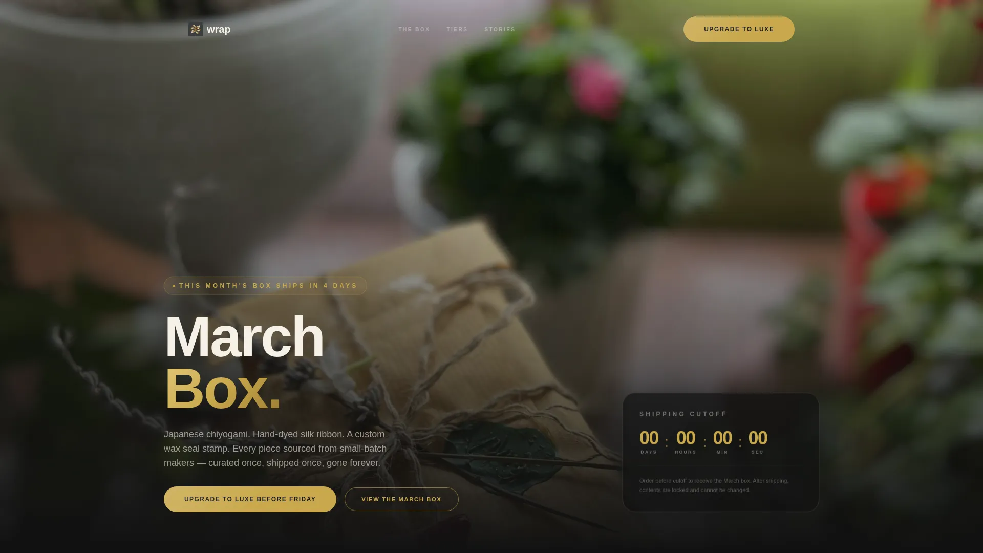
- A full-viewport lifestyle header with a warm flatlay image and a gold countdown line showing days until shipping
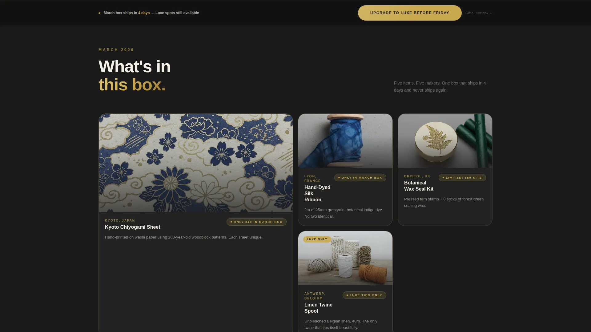
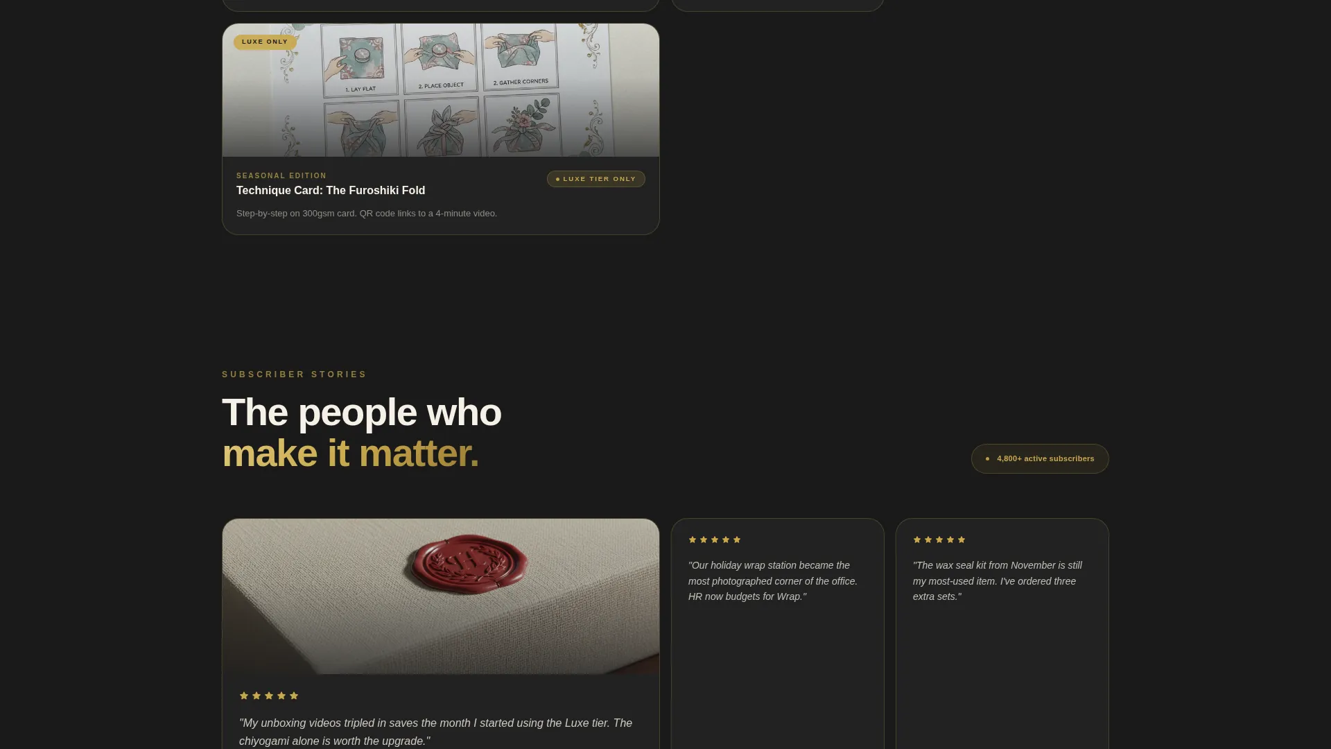
- A bento grid body that reveals monthly box items cell by cell, shifts into subscriber unboxing moments, and closes with a tier comparison grid
- A sticky bottom bar that appears after fifty percent scroll, a floating countdown timer, and a one-step confirmation modal pre-filled for upgrade
Feature list
This template packages several purpose-built components into one cohesive layout. Each one earns its place in the page flow.
Bird's-Eye Flatlay Header
The header fills the viewport edge to edge with a warm, slightly shallow depth-of-field lifestyle shot. A single line of gold type fades in over the dark margin to show the shipping countdown. The composition sets the sensory tone before the visitor reads a single word.
Bento Grid Item Reveal
Each bento cell surfaces one item from the current month's box. Cells carry a small "Only in the March box" tag to reinforce scarcity. The grid shifts rhythm as the visitor scrolls, moving from product reveals to subscriber unboxing moments.
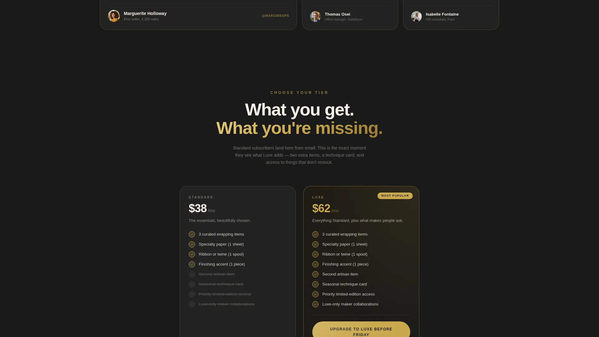
Tier Comparison Grid
A dedicated comparison section shows exactly what the Standard tier includes and what the Luxe tier adds. The two extras, a seasonal technique card, and priority access to limited-edition collaborations are clearly separated. Visitors see precisely what they miss by staying on their current plan.
Floating Countdown Timer
A persistent timer counts down to the shipping cutoff. It appears as the visitor scrolls and stays visible without blocking content. The countdown reinforces that the window to upgrade or order is closing.
One-Step Upgrade Modal
Clicking the primary call to action opens a modal pre-filled with the subscriber's current plan details. A single toggle switches from Standard to Luxe. No payment re-entry is needed, and a confirmation tap completes the action.
Sticky Upgrade Bar
After fifty percent scroll, a sticky bottom bar appears with the primary call to action in gold on black. It stays visible as the visitor continues reading. A secondary text link below it catches subscribers who want to gift a Luxe box rather than upgrade their own plan.
Page sections overview
| Section | Purpose |
|---|---|
| Viewport Header | Full-bleed lifestyle flatlay with gold countdown text |
| Shipping Countdown Line | Communicates days remaining before the box ships |
| Bento Product Reveals | Surfaces current month's curated items one cell at a time |
| Scarcity Item Tags | Reinforces limited availability per box cycle |
| Subscriber Unboxing Moments | Shifts tone from product to real-world experience |
| Tier Comparison Grid | Contrasts Standard and Luxe inclusions side by side |
| Primary Upgrade call to action | Gold on black button placed after the comparison grid |
| Sticky Bottom Bar | Persistent upgrade prompt triggered at fifty percent scroll |
| One-Step Modal | Pre-filled confirmation overlay for seamless tier switch |
| Gift a Luxe Box Link | Secondary path for subscribers buying up for someone else |
Design & branding system
The color system anchors everything in a luxury stationery mood. Deep matte black recedes to let product photography breathe. Warm champagne gold appears only on borders, hover states, and calls to action so it always feels earned rather than decorative.
- Primary background in deep matte black (#1A1A1A), card surfaces and typography beds in parchment cream (#F5F0E6), and body text in soft graphite (#3D3D3D)
- Accent borders and interactive hover states in warm champagne gold (#C9A84C), used sparingly so gold glints rather than shouts
- Bento grid layout with a Marketplace Grid theme, warm shallow depth-of-field photography direction, and a Gallery and Detail template style that balances product imagery with clear descriptive text
Mobile & speed optimization
The bento grid layout is structured to reflow cleanly across screen sizes. Cells stack in a logical reading order on smaller screens so the reveal rhythm and urgency cues remain intact.
- Full-viewport header image and bento cells are sized for both desktop and mobile viewports without cropping the focal point of the flatlay
- The sticky bottom bar and floating countdown timer are positioned to stay readable on mobile without overlapping critical content
- The one-step modal is compact and touch-friendly, keeping the upgrade action reachable with a single tap on any device
How this template helps you convert
The page is engineered around a single decision: upgrade now or miss this month's Luxe items. Every structural choice serves that moment.
- The cell-by-cell product reveal builds desire incrementally, so by the time the visitor reaches the tier comparison grid they already feel the loss of the Luxe items they have been seeing
- The floating countdown timer and sticky bottom bar maintain urgency and keep the call to action visible at every scroll depth, reducing the chance the visitor drifts away before acting
- The one-step modal removes the biggest friction point in subscription upgrades by pre-filling plan details, so the gap between intent and confirmation is one tap
Other information about this template
This template is built within the Retail and E-Commerce category, specifically aligned with the Gift Wrapping and Packaging Store subcategory. It is a strong fit for any brand selling curated packaging supplies, artisan wrapping goods, or seasonal gifting kits through a subscription model.
- The landing page structure supports both direct subscriber upgrade flows and cold-traffic gifting campaigns by including the secondary "Gift a Luxe box instead" text link
- The template style pairs a gallery-forward product presentation with clear detail copy, making it suitable for brands where visual identity and product quality are the primary sales arguments
- The Marketplace Grid theme and bento layout mean individual cells can be repurposed for seasonal campaigns, limited-edition drops, or collaboration announcements without rebuilding the page structure
Theme
Marketplace Grid
Creative direction
Limited Time
Color system
Lavender Dream
Style
Gallery + Detail
Direction
Direct Sales
Page Sections
Bird's-eye Flatlay Header
Bento Grid Item Reveal
Tier Comparison Grid
Floating Countdown Timer
One-step Upgrade Modal
Sticky Upgrade Bottom Bar
Related questions
Who is this landing page template designed for?
Can this template serve both new visitors and existing subscribers?
How does the urgency system work in this template?
What does the one-step upgrade modal do?
What color palette does this template use?



