Handyman Franchise Landing Page Template
Wrench is a masonry-grid landing page template built for handyman franchise businesses. It combines a bold Dopamine Pop color palette with a seasonal, feed-style card layout to turn browsing into booking. From the full-viewport hero shot to the inline three-step checkout flow, every section is designed to move a first-time homeowner or property manager from "I should fix that" to "booked."
by Rocket studio
Quick summary
Wrench is a single-page handyman franchise landing page template. It uses a masonry grid layout, a vibrant electric tangerine and sunshine yellow color system, and a direct-sales booking flow. The page is built to convert busy homeowners, property managers, and parents into paying customers with transparent pricing and a frictionless three-step checkout.
Who this template is for
This template is built for handyman franchise operators who need a polished, high-converting landing page fast. It works equally well for local franchise owners launching a new territory and regional operators running multiple service areas.
- First-time homeowners with a growing punch list of small repairs
- Property managers handling maintenance across multiple rental units
- Busy parents who need quick, safe home fixes without scheduling hassle
What problem this template solves
Most handyman service pages bury the price, bury the booking form, or both. Visitors leave before they ever commit. Wrench removes every friction point between "I need this fixed" and "I just booked it."
- No callback loops or estimate requests before a price is shown
- No confusing service menus that require a phone call to decode
- No checkout flow that asks for more than a service, a date, and a zip code
What you get with this template
You get a complete, ready-to-customize landing page that handles discovery, trust-building, and booking in one continuous scroll. The layout brings together seasonal content cards, transparent pricing badges, and an inline booking flow that never sends the visitor away from the page.
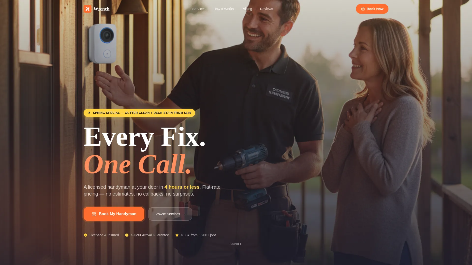
- A full-viewport lifestyle hero section with a headline and a pulsing tangerine call-to-action button
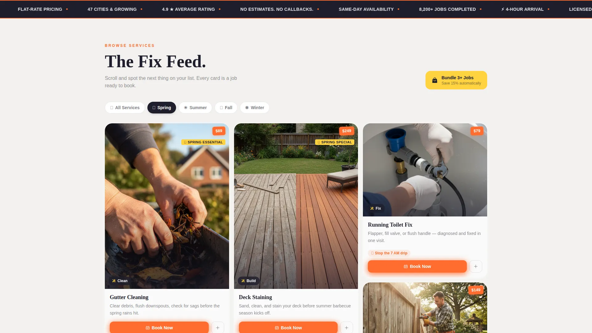
- A seasonal masonry grid with price-badged service cards that reorganize around the calendar
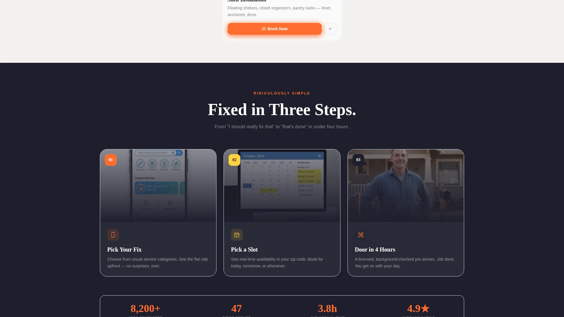
- A three-step inline booking flow covering service selection, date picking, and payment entry
Feature list
This template packages several purpose-built components into a single, cohesive landing page experience.
Masonry Grid Service Feed
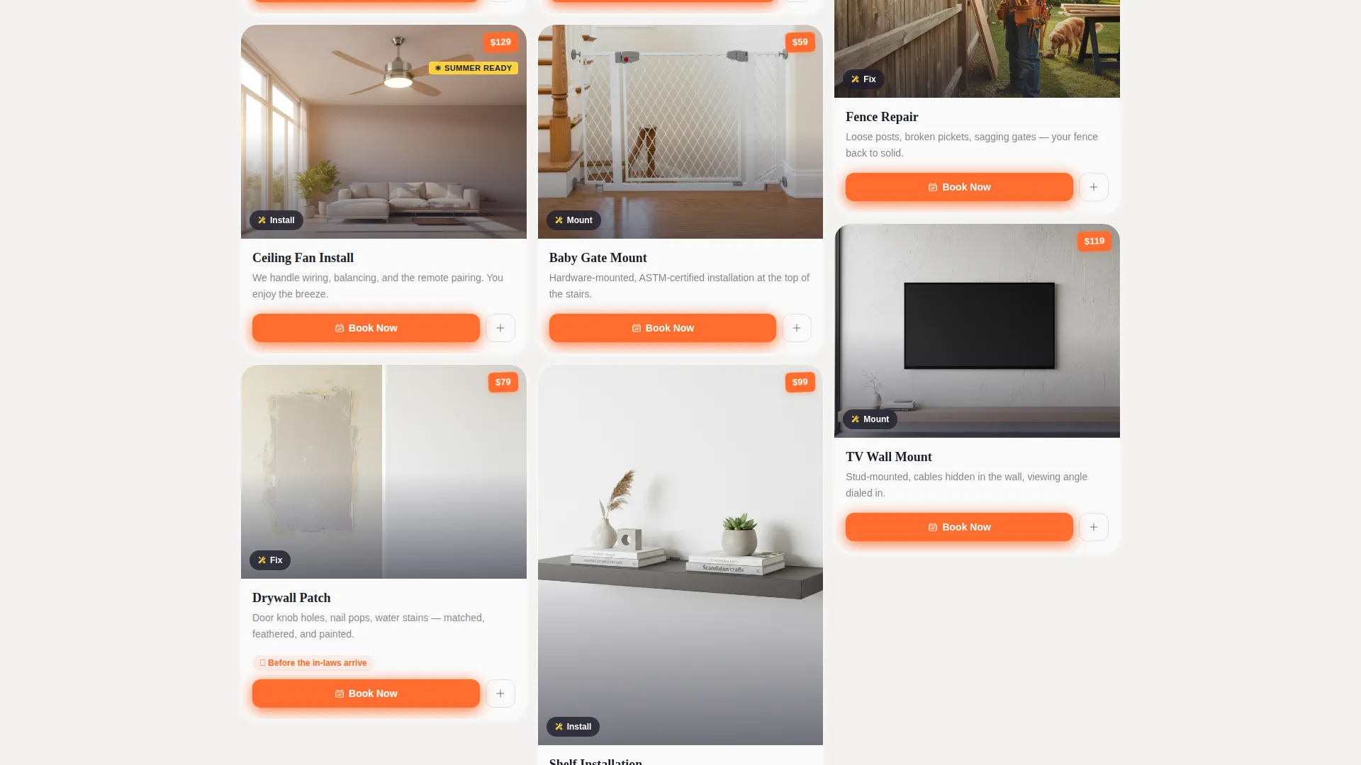
The core layout is a Pinterest-style masonry grid where each card shows a close-up service photo, a short label, and a price badge pinned to the corner. Cards refresh by season: spring surfaces gutter cleaning and deck staining; summer highlights fence repair and ceiling fan installs; fall brings weatherstripping and furnace prep; winter shows pipe insulation and holiday light hanging. Scrolling the grid feels like browsing a feed of satisfying repairs.
Inline Three-Step Booking Flow
Clicking the primary call-to-action opens a three-step flow without leaving the page. Step one lets visitors tap a service category from visual icons: mount, fix, install, or build. Step two shows a calendar with next-available slots highlighted in sunshine yellow. Step three collects zip code and payment. Price is visible before the visitor commits, so there are no surprises at checkout.
Bundle and Save Mini-Cart
A secondary conversion path lets visitors stack three or more jobs into a mini-cart sidebar and unlock a 15 percent discount automatically. The sidebar reinforces the marketplace mental model: services stack like items in a shopping basket, encouraging higher average order values without a hard sell.
Seasonal Urgency Banners
Sunshine yellow callout banners surface time-sensitive services at the top of the grid. These banners shift with the season and create a natural reason to book now rather than later, matching the real maintenance calendar of a homeowner.
Persistent Mobile Call-to-Action
On mobile viewports, the "Book My Handyman" button pins to the bottom of the screen throughout the entire scroll. Every third masonry card also repeats the call-to-action inline, so a booking prompt is always within one tap regardless of where the visitor is on the page.
Full-Viewport Lifestyle Hero
The header is a wide-angle, golden-hour photograph of a smiling handyman and a relieved homeowner on a front porch. The image fills the viewport edge to edge and anchors the page with an immediate emotional signal: someone else has it handled. The bold headline and tangerine button sit over the image without obscuring the scene.
Page sections overview
| Section | Purpose |
|---|---|
| Hero Header | Establish trust and present the primary call-to-action |
| Seasonal Urgency Banner | Surface time-sensitive services at the top of the grid |
| Masonry Service Grid | Let visitors browse and discover seasonal repair cards |
| Price Badge Cards | Show transparent per-job pricing on every service card |
| Inline Booking Flow | Guide visitors through a three-step service checkout |
| Bundle Mini-Cart | Allow stacking of multiple jobs for a bundled discount |
| Repeat call to action Cards | Reinforce booking prompt on every third grid card |
Design & branding system
The visual identity follows a Dopamine Pop color system built around four core values: energy, clarity, trust, and action. The palette evokes a hardware store aisle lit by morning sun, with the satisfying visual order of a perfectly organized tool drawer.
- Electric tangerine (#FF6D2E) dominates all call-to-action buttons and price badges, creating a consistent action signal across the page
- Sunshine yellow (#FFD23F) highlights seasonal callout banners and available booking slots, adding urgency without alarm
- Deep toolbox charcoal (#1E1E2C) grounds all body typography and headlines, keeping the page legible and grounded
- Fresh white (#FAFAFA) fills card backgrounds, giving each masonry card breathing room and a clean, pinned-project feel
Mobile & speed optimization
The template is designed with mobile-first behavior built into its core layout choices. The masonry grid reflows cleanly for narrower viewports, and the booking flow stays fully usable on a phone screen.
- The persistent bottom-pinned call-to-action button ensures a booking prompt is always visible on mobile without interrupting the scroll
- The three-step inline booking flow is designed for thumb-friendly tap targets, keeping the checkout contained on one screen
- Card images are cropped and composed for close-up impact at small sizes, so price badges and service labels remain legible on phone displays
How this template helps you convert
Every design decision in this template points toward one outcome: a confirmed booking before the visitor closes the tab.
- Transparent pricing shown on every card removes the most common reason a visitor abandons a service page, which is uncertainty about cost before speaking to someone.
- The three-step inline booking flow keeps the entire purchase journey on a single page, reducing drop-off caused by redirects or multi-page checkout forms.
- The bundle mini-cart creates a second conversion path that increases average order value by rewarding visitors who have more than one item on their to-do list.
Other information about this template
This template is built as a single landing page, not a multi-page site. It is ideal for franchise operators who want a focused, high-converting presence without the complexity of a full website build.
- The seasonal card logic makes the template reusable across the full year without a redesign, just a content swap per quarter
- The Marketplace Grid theme and masonry layout align the franchise service offering with the visual language of modern consumer shopping feeds, which makes the browsing experience feel immediately familiar
- The template suits any handyman or home services franchise that offers fixed-price, bookable jobs and wants to remove estimation friction from the sales process
- Franchise operators can customize the color tokens, photography, and service card copy to match their specific territory branding while keeping the conversion structure intact
Theme
Neo-Retro
Creative direction
Comparison Journey
Color system
Ink & Paper
Style
Overlap/Layered
Direction
Click-Through
Page Sections
Masonry Grid Service Feed
Inline Three-step Booking Flow
Bundle and Save Mini-cart
Seasonal Urgency Banners
Persistent Mobile Call to Action Button
Full-viewport Lifestyle Hero
Related questions
Can I update the service cards each season without rebuilding the layout?
Does the booking flow keep visitors on the landing page?
Can visitors book more than one job in a single order?
Is the full price shown before a visitor commits?
How does the mobile experience handle the booking call-to-action?



