Precision Bicycle Mechanic Landing Page Template
Wrench is a single-page landing page template built for precision bicycle mechanic businesses. It pairs a bold quote-driven header with mechanic profiles, side-by-side service comparison tables, and a gated seasonal maintenance checklist. The deep plum and amber color system signals authority and craft, turning a service page into a trust-building consultation that earns the visitor's email and their next booking.
by Rocket studio
Quick summary
Wrench is a comparison table landing page for a professional bicycle mechanic service. It opens with a manifesto-style header, introduces named mechanics beside their service tables, and closes with a content offer gated behind a single email field. The design feels authoritative and precise, built to earn trust from riders who already know the difference between a good mechanic and a great one.
Who this template is for
This template is built for bicycle mechanic businesses that want to move beyond a generic contact page. It works best for independent shops and skilled solo mechanics who serve a discerning, technically aware clientele.
- Weekend century riders and amateur racers who expect documented, itemized service work
- Bike commuters who need a mechanic they can rely on before Monday morning
- Workshop owners who want their craft, credentials, and people to speak before any sales pitch begins
What problem this template solves
Most bicycle mechanic service pages list prices without context and leave visitors guessing about what they actually get. That gap in trust is where bookings are lost. This template closes it by showing the work, the person doing it, and the exact differences between each service tier.
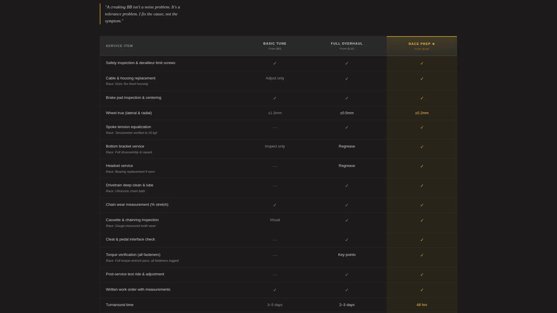
- Visitors can compare Basic Tune, Full Overhaul, and Race Prep side by side at a glance
- Named mechanics with credentials replace anonymous service descriptions
- A resource offer trades real value for an email, rather than asking for commitment before earning it
What you get with this template
The template delivers a full single-page layout with every section ready to populate with your shop's content. Nothing is vague or placeholder-heavy; each block has a clear job to do.
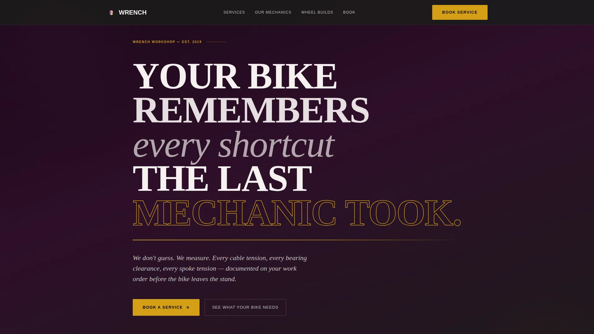
- A quote-and-manifesto header with a binding-promise subline in titanium gray type
- Mechanic profile sections paired directly with their respective comparison tables
- A gated checklist form with an email field and a bike-type selector covering road, gravel, mountain, and commuter categories
- An ungated secondary call-to-action linking to a diagnostic guide for visitors not ready to book
Feature list
This section walks through the core built-in components that make the Wrench template work as a trust-building and lead-capturing tool.
Manifesto Header Block
The header opens with white condensed type stamped across a deep plum background. A single titanium-gray subline reads like a binding contract. No hero image is needed; the words carry the weight and set a tone of craft and accountability from the first scroll position.
Mechanic Profile and Table Pairing
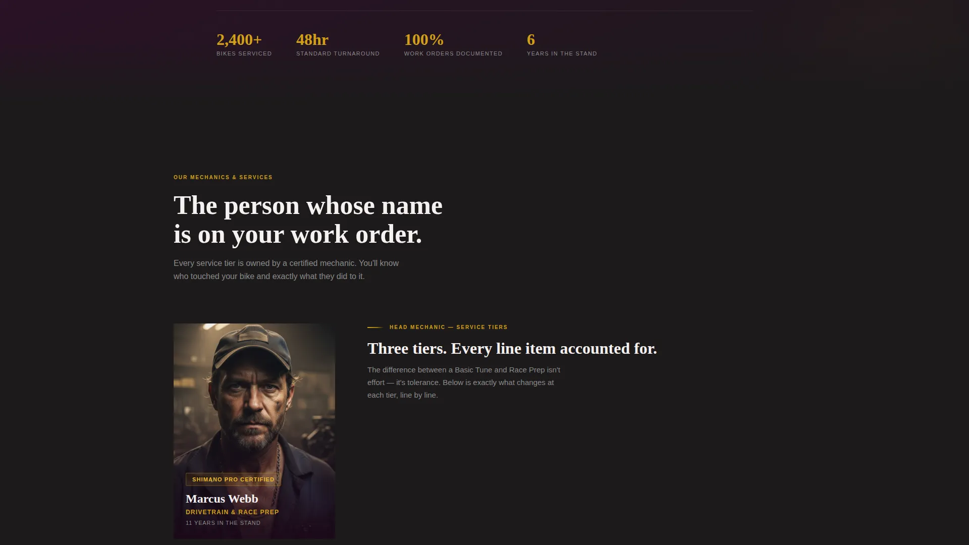
Each mechanic is introduced with a portrait, a named credential, and a stated specialty. Their profile sits directly beside the comparison table they own. This pairing makes authority personal rather than abstract, giving visitors a name they will recognize on the work order.
Three-Tier Service Comparison Table
A structured table breaks down Basic Tune, Full Overhaul, and Race Prep side by side. Rows cover components touched, tolerances held, and turnaround times. Visitors can see line-by-line differences rather than relying on vague tier labels.
Wheel-Build Comparison Table
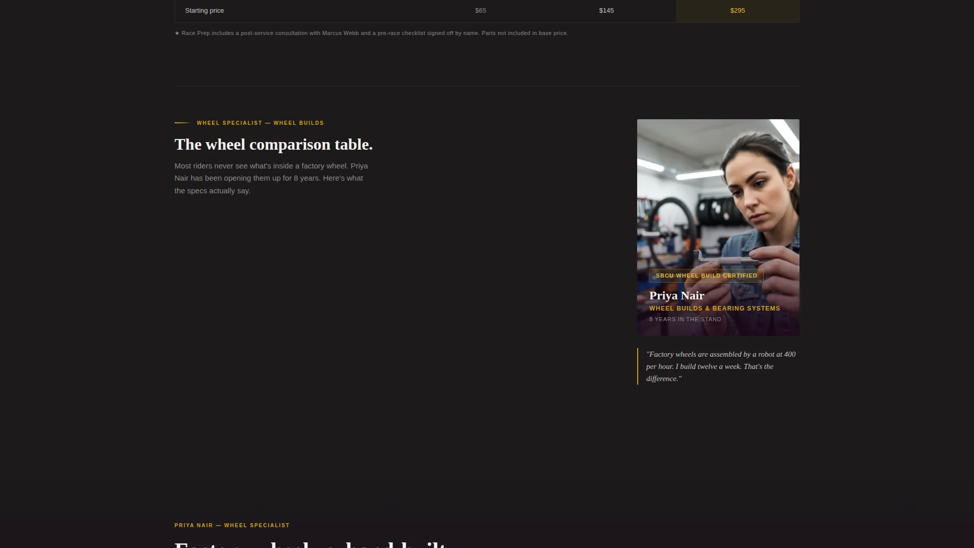
A second mechanic profile is paired with a wheel-build table comparing factory-built versus hand-built specifications. This adds a second layer of proof for riders whose decisions hinge on component precision.
Gated Checklist Lead Capture
The primary call-to-action offers a downloadable seasonal maintenance checklist. It is gated behind a single email field and a bike-type selector. The form earns the email by displaying enough table detail first that the checklist feels like the natural, valuable next step.
Ungated Diagnostic Guide Link
A secondary call-to-action offers an ungated path to a diagnostic guide titled "See What Your Bike Needs." This keeps lower-intent visitors engaged and moves them toward the service without requiring any commitment upfront.
Page sections overview
| Section | Purpose |
|---|---|
| Manifesto Header | Set tone and philosophy |
| Subline Promise | Reinforce shop accountability |
| Mechanic Profile One | Introduce first mechanic |
| Service Comparison Table | Compare three service tiers |
| Mechanic Profile Two | Introduce second mechanic |
| Wheel-Build Table | Compare build specifications |
| Checklist Lead Form | Capture email with value |
| Diagnostic Guide call to action | Offer ungated secondary path |
Design & branding system
The visual identity follows a Plum Executive color system built to feel authoritative and unexpectedly refined for a hands-on trade business. The palette evokes a velvet-lined tool case opened under shop lights.
- Deep plum (#4A1942) anchors backgrounds and headers; polished graphite (#2D2D2D) grounds body sections; brushed titanium (#C4C4C4) carries sublines and secondary text
- Decisive amber (#D4A017) is used exclusively for calls-to-action and highlighted comparison table cells, drawing the eye to the most important conversion points
- Typography feels engraved rather than printed, using condensed white type for the header and a weight contrast system that separates credential labels from body copy
Mobile & speed optimization
The layout is designed to remain readable and functional at every screen size. Comparison tables, which are the densest content blocks, are structured to stay scannable on smaller displays.
- Mechanic portrait and table pairings reflow cleanly so neither element loses context on a narrow screen
- The lead capture form collapses to a single-column stack, keeping the email field and bike-type selector accessible without horizontal scrolling
How this template helps you convert
The page is structured so each scroll position builds confidence before asking anything of the visitor. By the time a call-to-action appears, the visitor already understands the shop's philosophy, the people doing the work, and the specific value of the checklist being offered.
- The manifesto header filters for the right audience immediately, attracting riders who value precision and setting expectations before any service detail is shown
- The comparison tables make the shop's rigor visible and quantified, so the checklist offer feels like a logical extension of what the visitor just read rather than an interruption
Other information about this template
This template is part of the Professional Services category, specifically built for the bicycle mechanic business niche. It is structured as a single-page landing page and uses the Legal Shield theme as its design foundation.
- The Legal Shield theme applies a structured, document-like visual language to a trade service context, lending the page a sense of accountability that resonates with technically minded cyclists
- The Team and People creative direction means the template is designed around named individuals, not a faceless brand, making it suitable for solo mechanics and small teams alike
- The Content and Resource landing page direction means the primary conversion goal is lead capture through a high-value content offer, not a direct booking form or quote request
Theme
Legal Shield
Creative direction
Team & People
Color system
Plum Executive
Style
Comparison Table
Direction
Content/Resource
Page Sections
Manifesto Header with Promise Subline
Named Mechanic Profile Pairings
Three-tier Service Comparison Table
Wheel-build Specification Table
Gated Checklist Lead Capture Form
Ungated Diagnostic Guide Call-to-action
Related questions
Can a solo mechanic use this template without a full team?
Do I need to offer all three service tiers shown in the comparison table?
What does the bike-type selector in the lead form do?
Is the diagnostic guide content included in the template?
Why is amber used so sparingly in the color system?



