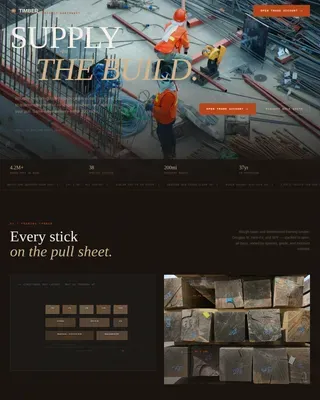
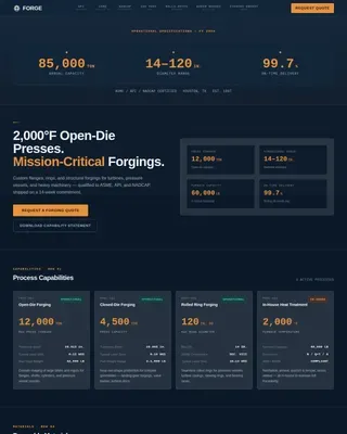
Agrochemical Landing Page Template | Data Grid
Yield is a dashboard-style landing page template built for agrochemical and pesticide manufacturers. It leads with a panoramic trial-field header, then walks visitors through sequential case study data cards covering pathogen identification, formulation mode of action, and field results. The result is a compelling, data-driven page that earns buyer trust before directing them to a product catalog or gated trial data download.
by Rocket studio
Quick summary
Yield is a single-page, click-through landing page template built for crop protection manufacturers. It opens with a drone-altitude field panorama, then unfolds a series of case study data cards that move from problem identification through formulation selection to quantified field results. The layout earns credibility through visible efficacy data before presenting any call to action.
Who this template is for
This template is designed for formulation houses and crop protection manufacturers that sell to technically literate buyers. It suits teams whose sales cycle depends on proving product performance with real data rather than product descriptions alone.
- Regional agrochemical distributors sourcing active ingredients across growing seasons
- Cooperative procurement managers who compare efficacy data before placing orders
- Contract farmers reviewing pre-harvest interval windows and maximum residue level compliance details
What problem this template solves
Agrochemical buyers arrive with hard questions and limited patience. They want to see efficacy numbers, mode-of-action logic, and cost-per-hectare comparisons before they consider clicking deeper into a catalog. A generic product page cannot do that work. This template structures the page so every scroll answers a technical question.
- Visitors leave pages that lead with features instead of results
- Procurement buyers need comparison data, not marketing language
- A disorganized layout buries the evidence that actually closes a distribution agreement
What you get with this template
You get a fully structured, data-forward landing page that sequences proof before promotion. Every section is purposefully ordered so the visitor builds confidence across multiple case studies before reaching any call to action.
- A panoramic trial-field header with embedded data overlays and a bold formulation-scale headline
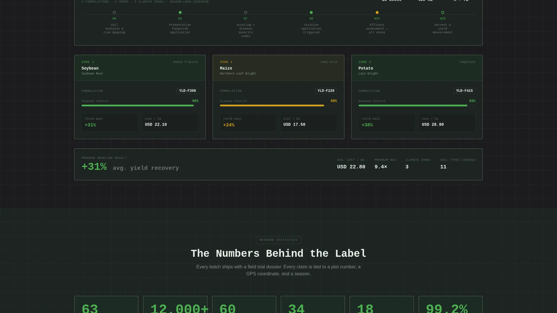
- A scrollable case study grid with cards for problem identification, formulation pathway diagrams, and quantified field results
- A persistent bottom-bar call to action and a full-width closing block, plus a gated email-capture path for trial data downloads
Feature list
A paragraph introducing this section: the features below reflect the specific layout decisions, visual components, and conversion mechanics built directly into the Yield template. Each one is grounded in the source brief.
Panoramic Trial-Field Header
The header uses a drone-altitude aerial image stretched across a wide viewport. Treatment blocks appear in distinct shades of green with data overlays pinned directly onto the landscape. Plot identifiers, application rates in liters per hectare, and days after treatment are typeset in a monospaced font over the image. A single headline fades in over the sky zone.
Sequential Case Study Data Cards
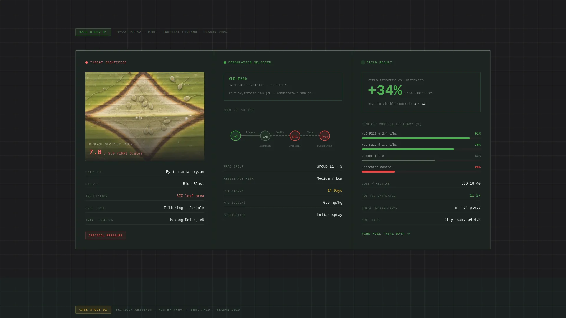
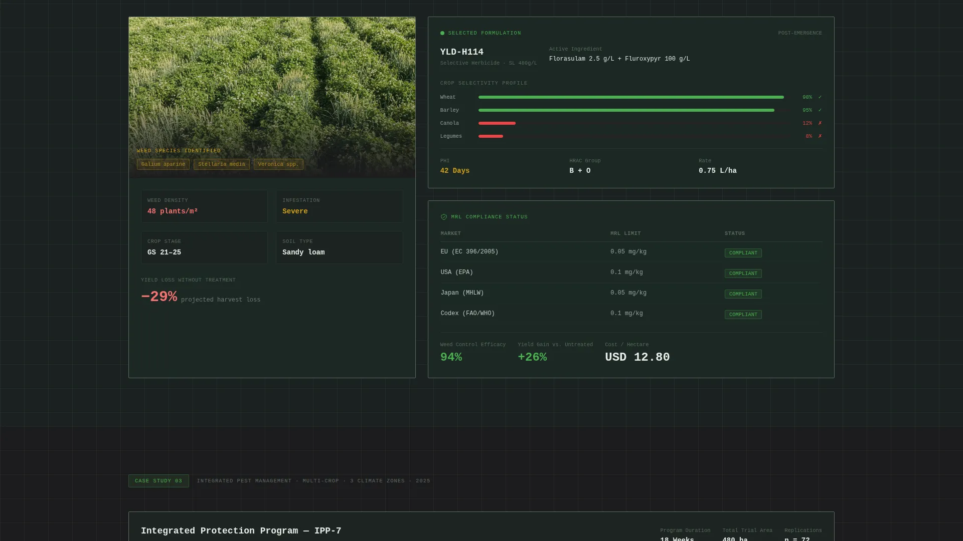
After the header, the page enters a scrollable grid of crop-problem case studies. Each case study occupies its own data card and follows a fixed three-part structure: pathogen or weed pressure identified with microscopy imagery and severity scores, formulation selected with a simple molecular pathway diagram, and field results displayed as dashboard metrics with comparison bars against untreated plots.
Dashboard Metrics Display
Field result cards present yield recovery percentage, cost per hectare, and days to visible control as prominent dashboard figures. Comparison bars sit alongside untreated plot baselines so the difference is immediate and legible without any supporting explanation.
Escalating Complexity Arc
The case study sequence is structured to increase in scope. It opens with a single rice paddy fungicide application and builds toward a multi-crop integrated pest management program spanning three climate zones. This arc keeps technically experienced buyers engaged as the page progresses.
Dual Call-to-Action Architecture
The primary call to action, "Browse the Portfolio," uses amber on canopy green and appears first as a persistent bottom bar after the second case study. It reappears as a full-width closing block after the final case. A secondary path, "Download Trial Data," gates a portable document format compilation behind a single-field email capture form.
Data Command Visual Grid
The layout uses a dark grid system with canopy green and loam black backgrounds. Grid lines and dividers use muted olive so structure is visible without competing with the data. Chlorophyll green highlights active data points and hover states. Cautious amber is reserved for warnings, dosage callouts, and call-to-action buttons.
Page sections overview
| Section | Purpose |
|---|---|
| Panoramic Field Header | Sets scale with a drone-altitude trial field image, embedded data overlays, and the primary brand headline |
| Problem Identification Card | Opens each case study with pathogen or weed pressure data, microscopy imagery, and infestation severity scores |
| Formulation Selection Card | Shows the chosen active ingredient, its mode of action, and a simplified molecular pathway diagram |
| Field Results Dashboard | Presents yield recovery, cost per hectare, and days to visible control with comparison bars |
| Persistent call to action Bar | Appears after the second case study as a fixed bottom bar linking to the full product catalog |
| Trial Data Gate | Captures a single email address in exchange for a gated portable document format of compiled trial data |
| Full-Width Closing call to action | Reinforces the primary call to action after the final case study with a full-width block |
Design & branding system
The template uses a Forest Trust color system that feels like a precision agriculture terminal. Every color choice carries a functional role: backgrounds anchor the data, green confirms activity, and amber flags what demands attention.
- Deep canopy green (#1B3A2D) and fertile loam black (#1C1C1E) form all backgrounds; off-white (#E8EDE9) carries body text
- Chlorophyll green (#4CAF50) marks active data points and hover states; cautious amber (#D4A017) is reserved for warnings, dosage callouts, and call-to-action buttons
- Grid lines and section dividers use muted olive (#5C6B5E) to provide structure without visual noise; monospaced typography appears on header overlays for a data-terminal feel
Mobile & speed optimization
The grid layout and card-based structure are designed to reflow cleanly across screen sizes. Data cards stack vertically on narrower viewports so the case study sequence remains readable without horizontal scrolling.
- Dashboard metric figures and comparison bars are sized to remain legible at mobile scale
- The persistent bottom-bar call to action is positioned to stay accessible on touch screens without obscuring card content
- The full-width closing call-to-action block adapts its padding and typography scale to smaller displays
How this template helps you convert
The page is built as a click-through landing page. Every layout decision is ordered to move a skeptical technical buyer toward the product catalog or the gated data download.
- The case study arc proves formulation competence across three levels of complexity before any call to action appears, so visitors arrive at the "Browse the Portfolio" button already holding evidence relevant to their own crops.
- The dual call-to-action architecture captures two buyer intents: catalog browsers looking for specific active ingredients and data-first evaluators who want portable document format trial results before committing to a conversation.
Other information about this template
This template belongs to the Dashboard and Data Grid style category within the Data Command theme. It is specifically suited to the agrochemical and pesticide niche under the broader Chemical and Pharmaceutical Manufacturing subcategory. The landing page direction is click-through, meaning the primary goal is to move visitors deeper into a product catalog or document library rather than to capture leads directly on the page.
- The header concept is Panoramic and Wide, designed for maximum visual authority at first scroll
- The creative direction follows a Case Study Narrative structure, which is particularly effective for buyers who need empirical evidence before purchase decisions
- The Forest Trust color system and Data Command theme make this template adaptable to other industrial science or precision agriculture contexts that require a data-dense, trustworthy visual identity

Theme
Data Command
Creative direction
Case Study Narrative
Color system
Forest Trust
Style
Dashboard/Data Grid
Direction
Click-Through
Page Sections
Panoramic Trial-field Header
Sequential Case Study Data Cards
Dashboard Metrics Display
Dual Call-to-action Architecture
Data Command Visual Grid
Related questions
Who is the ideal user for this landing page template?
Can I adapt the case study cards for different crop types or active ingredients?
How does the email capture work for the trial data download?
Is the persistent call-to-action bar always visible on the page?