Young Professional Insurance Pre-Launch Website Template
Shield is a single-column landing page template built for digital-first home insurance providers targeting young professionals. It pairs a premium fintech dark dashboard aesthetic with a Comparison Journey flow, award badge social proof, a live coverage calculator, and a countdown-driven call to action. The result is a page that earns trust fast and routes visitors into a quote engine with minimal friction.
by Rocket studio
Quick summary
Shield is a click-through landing page template designed for young professional home insurance platforms. It opens with credentialing badges, moves through a sequentially animated comparison table, and closes with a countdown call to action. Every section is built to push first-time homeowners and renters toward a 60-second quote flow on a deep plum fintech dashboard.
Who this template is for
This template is purpose-built for insurance providers and InsurTech startups targeting a mobile-first, digitally savvy audience. If your product speaks to people who expect their financial tools to be clean, fast, and visually credible, this template fits that positioning precisely.
- First-time homeowners, condo buyers, and co-op unit owners who want coverage without complexity
- Newly married couples consolidating renters and homeowners policies into one plan
- Remote workers and software engineers who need personal property coverage explained clearly and quickly
What problem this template solves
Traditional insurance landing pages feel dated and trust-eroding. They bury the value proposition under dense copy, use stock photography of suburban houses, and push long forms before earning a single click. Young professional buyers abandon those pages fast.
- Visitors arrive skeptical and need credentials up front, not paragraphs
- The comparison between legacy insurers and a modern alternative is never shown clearly on competitor pages
- First-time buyers do not know what they would pay, which creates hesitation before any quote form is reached
What you get with this template
You get a fully structured single-column landing page with five purpose-built sections and a linear footer. Every section escalates buyer confidence in a deliberate sequence, from credibility to comparison to cost transparency to conversion.
- An award badge header row, an animated comparison table, a live coverage calculator, a claim stories carousel, and a final anchored call-to-action block
- A Plum Executive color system with deep plum backgrounds, pearl card surfaces, and electric orchid interactive states
- DM Sans headlines and Manrope body typography paired with high-animation interactive components built as client-side islands
Feature list
This template is built around one goal: converting a skeptical first-time buyer into a confident quote requester. Every feature below serves that goal directly.
Award Badge Header Row
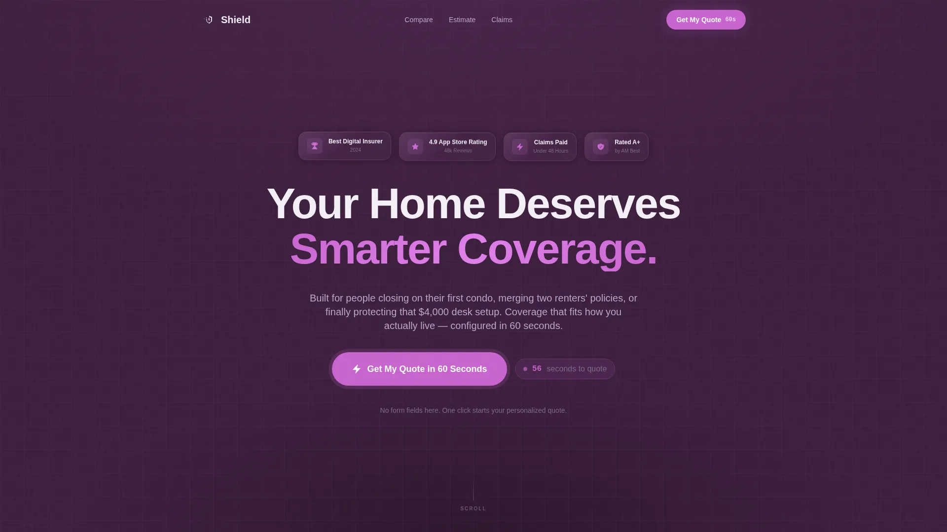
Four metallic-edged credential badges open the page before any headline copy. Each badge carries a specific claim and responds to hover with a subtle holographic shimmer. The badges cover digital insurer recognition, app store rating, claims resolution speed, and financial strength rating.
Animated Comparison Table
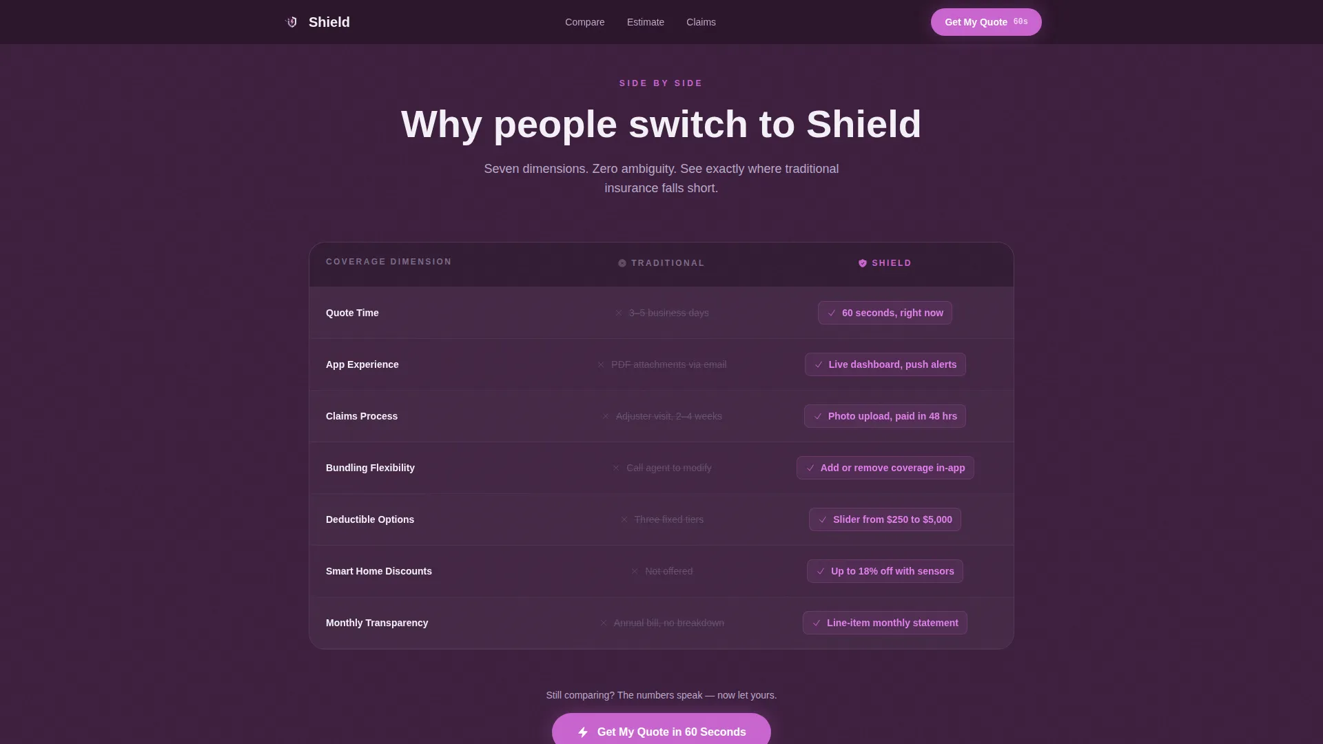
A seven-row side-by-side table compares traditional insurance against the product across quote time, app experience, claims process, bundling flexibility, deductible options, smart home discounts, and monthly cost transparency. Rows animate in sequentially. The competitor column renders in muted gray while the product column glows in electric orchid.
Live Coverage Calculator
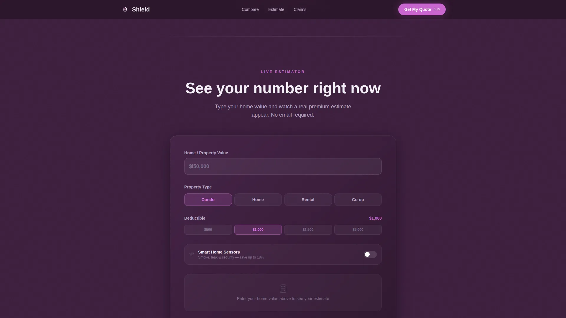
Visitors type their home value into an input field and receive a live premium estimate without leaving the page. This interactive component removes the biggest psychological barrier between a visitor and the quote engine by making the cost feel real and manageable.
Claim Stories Carousel
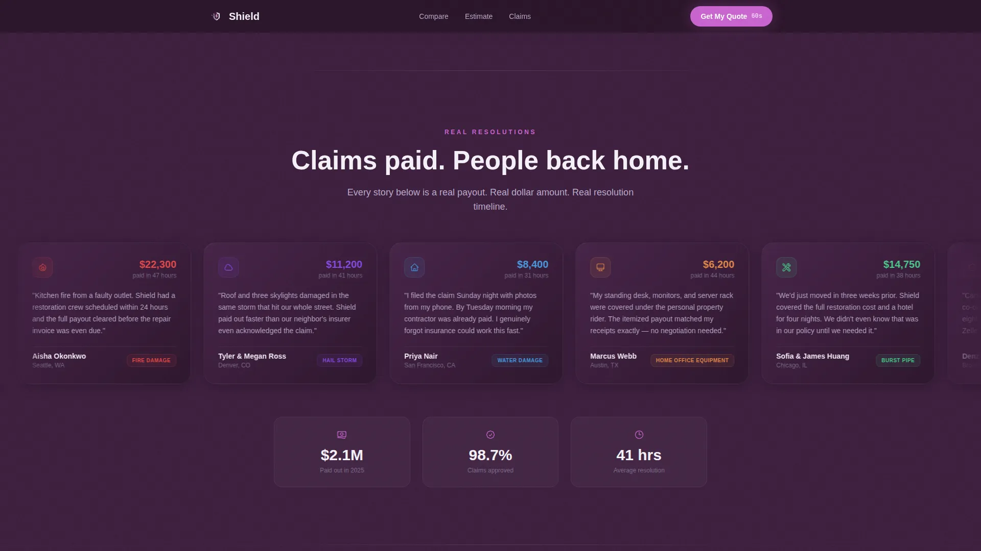
A scrolling carousel presents real resolution timelines and dollar amounts from past claims. Each story card reinforces that the product delivers on its promise. The carousel format keeps the section compact without sacrificing the depth of social proof.
Countdown Call to Action
The primary call to action reads "Get My Quote in 60 Seconds" and appears three times across the page. The final instance includes a micro-animation that counts down from 60, reducing the perceived time cost of clicking through to the quote flow.
Page sections overview
| Section | Purpose |
|---|---|
| Award Badges Header | Opens with credentialing proof before headline copy |
| Comparison Table | Shows seven-dimension product advantage over traditional insurance |
| Coverage Calculator | Delivers a live premium estimate from a home value input |
| Claim Stories Carousel | Reinforces delivery proof with real timelines and dollar amounts |
| Final call to action Block | Anchors the countdown quote push at the bottom of the scroll |
| Linear Single-Row Footer | Closes the page with minimal distraction |
Design & branding system
The visual identity follows a Data Command theme. The look is a premium fintech dark dashboard: serious, sophisticated, and completely free of stock photography or decorative noise. Every color in the palette has a single assigned role.
- Deep plum (#3D1F3E) as the primary background, muted lavender (#B8A9C9) for secondary text and divider lines, pearl (#F4F0F7) for card surfaces and content blocks
- Electric orchid (#C964CF) reserved exclusively for interactive elements, toggle states, and call-to-action pulses
- DM Sans for all headlines and Manrope for body copy and interface text, keeping the typographic tone modern and sans-serif throughout
Mobile & speed optimization
The template is built mobile-first because the target audience manages their financial tools on their phones. Desktop polish layers on top without compromising the core single-column scroll experience.
- Interactive islands handle the calculator, carousel, and countdown timer as client-side components, keeping static sections server-rendered for faster initial load
- The single-column flow means no layout shifts or hidden content between breakpoints, which keeps the conversion path clean on any screen size
How this template helps you convert
This template earns the click before it asks for it. The page is structured as a trust escalation sequence, moving visitors from credentialing to comparison to cost transparency in one continuous scroll.
- The award badge row establishes credibility in the first viewport, so visitors do not need to scroll to decide whether the brand is legitimate
- The animated comparison table makes the product advantage impossible to ignore, with sequential row reveals that hold attention and build conviction before the first call to action appears
- The coverage calculator reduces the single biggest hesitation for first-time buyers by showing a live estimate, making the final countdown call to action feel like a natural next step rather than a cold ask
Other information about this template
This template is part of the Young collection of premium professional landing page templates. It is designed specifically for the young professional home insurance niche within the broader Finance and Insurance category.
- The template uses a Single Column Flow layout, making it straightforward to customize section by section without restructuring the page grid
- Localization defaults are set for English, USD currency, and MM/DD/YYYY date formatting for the United States market
- Animation intensity is high across the page, including sequential row reveals, badge shimmer on hover, a live calculator, a scrolling carousel, and a countdown timer on the final call to action
- The footer follows Pattern 1, a linear single-row layout, keeping the exit experience clean and distraction-free
Theme
Data Command
Creative direction
Comparison Journey
Color system
Plum Executive
Style
Single Column Flow
Direction
Click-Through
Page Sections
Award Badge Credentialing Row
Seven-dimension Comparison Table
Live Premium Calculator
Claim Stories Carousel
Countdown Call to Action Animation
Plum Executive Dark Dashboard Design
Related questions
What kind of insurance business is this template built for?
Does the landing page include any form fields?
How many times does the call to action appear on the page?
Can the color system and typography be customized?
What sections are included in this template?



