Unique Stay & Accommodation Booking Website Template
Yurt is a full-width immersive landing page template built for a high-altitude nomad camp. It guides three distinct guest types toward booking through seasonal scroll storytelling, a Luxe Minimal visual identity, and three dedicated booking paths. The design feels elemental and unhurried, turning every scroll into a moment rather than a menu.
by Rocket studio
Quick summary
Yurt is a single-page immersive template designed for a high-altitude yurt and nomad camp. It blends felt-and-cedar atmosphere with three clear booking paths: solo retreat, couple escape, and group residency. The Alpine Fresh color palette and seasonal scroll storytelling make the experience feel like arriving at camp, not browsing a listing.
Who this template is for
This template is built for retreat operators, boutique camp hosts, and unique accommodation brands who want their booking page to feel as distinctive as the stay itself. It suits camps where the environment is the product.
- Yurt and nomad camp operators offering immersive, off-grid stays
- Boutique retreat hosts targeting creative professionals, couples, and leadership groups
- Unique accommodation businesses that need a single landing page to convert multiple guest types
What problem this template solves
Standard accommodation listing pages flatten the experience into a grid of photos and a rate table. That approach kills the sense of place before a guest ever arrives. This template solves the gap between a remarkable physical experience and a forgettable online presence.
- Visitors scroll through a generic page and feel nothing, so they book somewhere familiar instead
- Multiple guest types land on the same page but find no path tailored to their intent
- The mood and atmosphere of the stay never translate to the screen
What you get with this template
You get a complete, layout-ready landing page that immerses visitors in the camp experience before asking them to book. Every section is built around a specific moment, guest type, or conversion action.
- A viewport-filling lifestyle header with a slow-reveal headline and golden-hour visual tone
- Five seasonal full-bleed scroll sections, each pairing a single photograph with one line of text and a parallax drift effect
- Three booking path cards for solo, couple, and group stays, each showing season availability, a nightly rate, and an inline calendar picker
- A secondary email capture path at the page bottom for visitors not yet ready to book
Feature list
This template delivers a focused set of visual and functional components that work together to move a visitor from atmosphere to action.
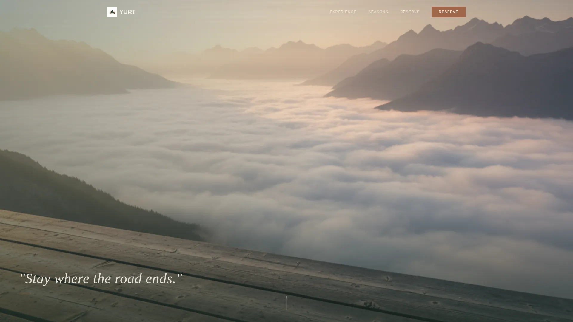
Viewport-Filling Lifestyle Header
The header fills the screen edge to edge with a single lifestyle photograph. A figure in an undyed linen robe stands on a wooden deck, holding a ceramic cup, looking out over a valley of morning cloud. The headline "Stay where the road ends." fades in at the bottom third after a full scroll-pause, giving the image room to land before any words appear.
Seasonal Scroll Storytelling
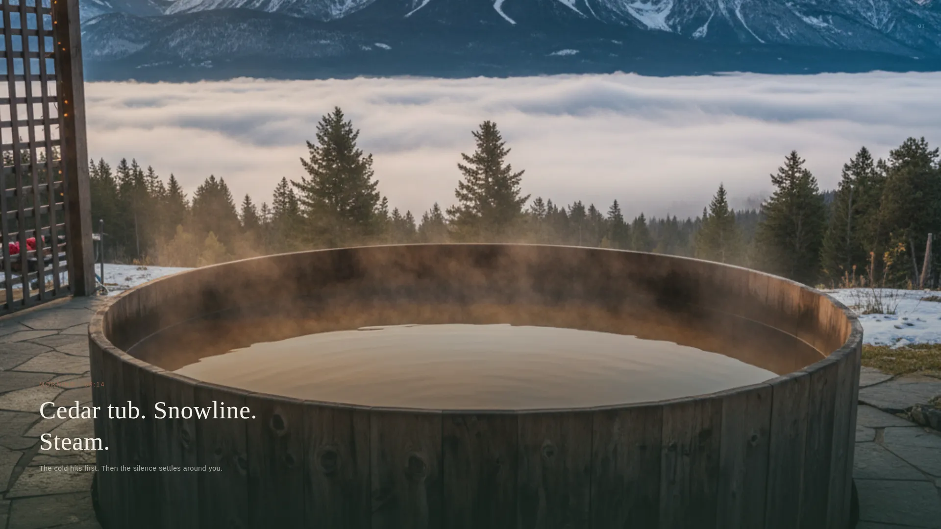
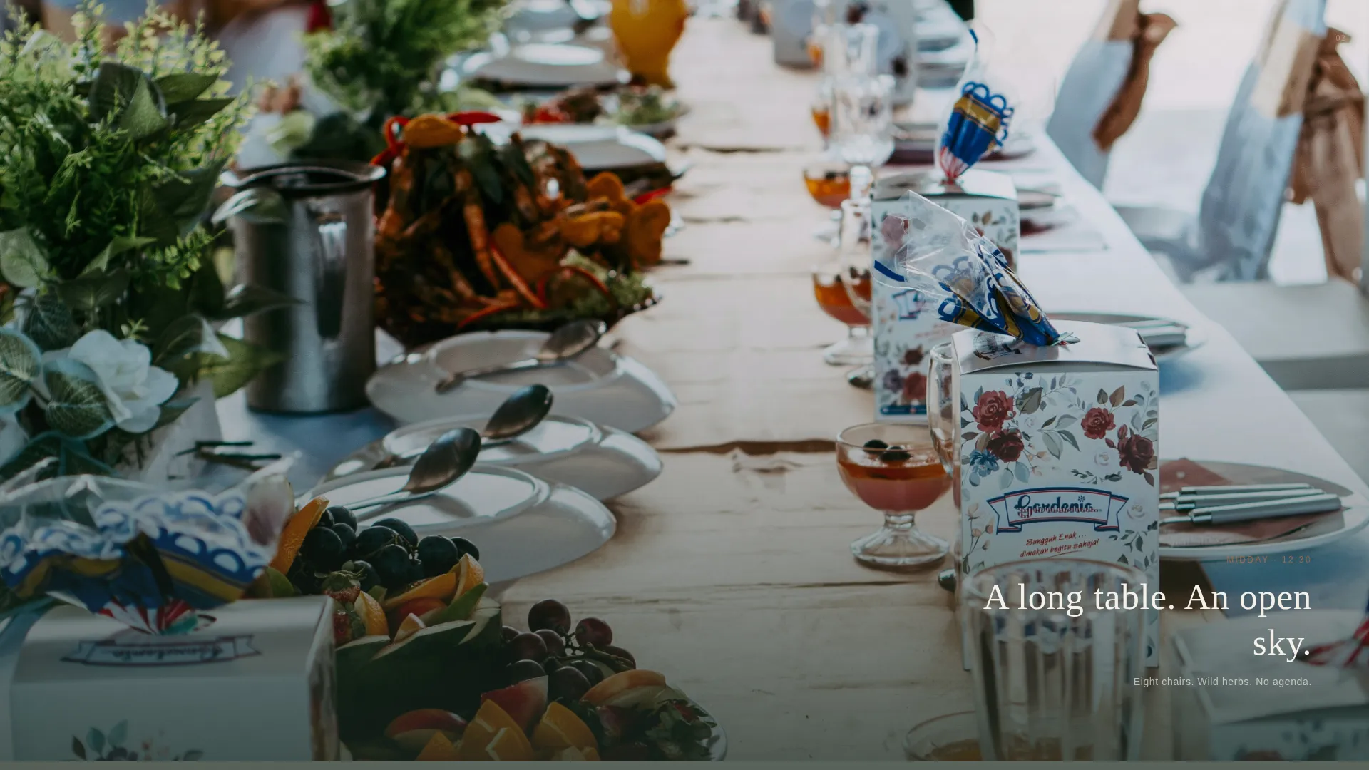
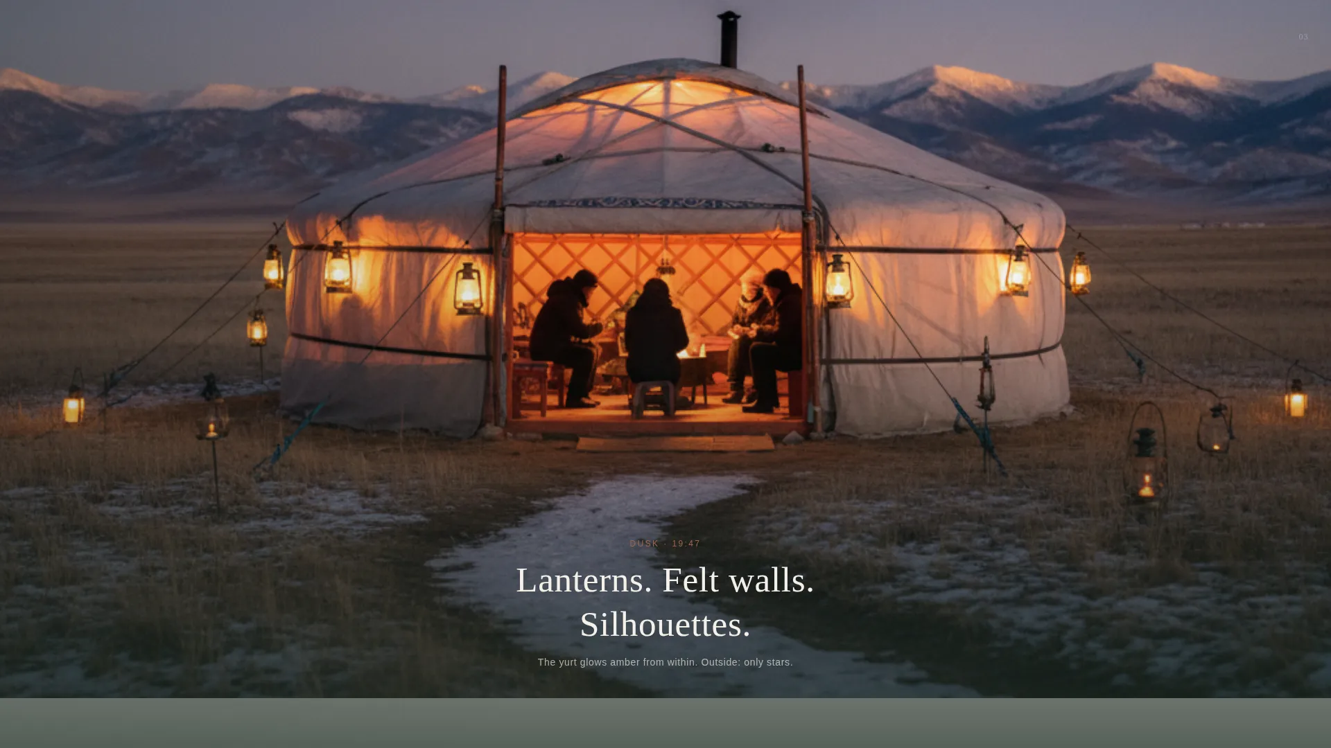
Five full-bleed sections each drop the visitor into a different hour or season at camp. Morning cedar tub, midday oak table, dusk lanterns, winter fire circle, and spring wildflower meadow each get one photograph, one line of text, and a subtle parallax drift. The scroll feels like time passing, not content loading.
Three-Path Booking System
Three booking cards surface as the visitor scrolls: solo retreat, couple escape, and group residency. Each card shows season availability and a nightly rate. A "Reserve Your Dates" button opens an inline calendar picker requesting arrival date, party size, and one optional note field.
Inline Calendar Picker
The calendar picker sits inside the page rather than redirecting to an external booking tool. It asks for arrival date, party size, and a single optional line: "Anything we should know?" The flow stays contained and unhurried, matching the overall tone.
Journal Signup Section
A secondary conversion path at the page bottom invites visitors to receive a quarterly journal. The call to action reads "Send Me the Seasons" and collects only an email address. This builds a list of potential future guests who are dreaming but not yet booking.
Alpine Fresh Color System
The palette uses four values: deep pine shadow, glacier melt, raw wool cream, and smoked copper. Backgrounds alternate between pine shadow and wool cream. Smoked copper appears only on buttons, price figures, and interactive cues, keeping the accent rare and meaningful.
Page sections overview
| Section | Purpose |
|---|---|
| Lifestyle Header | Opens the experience with a full-viewport photograph and a slow-reveal headline |
| Morning Cedar Scene | Shows the cedar soaking tub steaming against the snowline |
| Midday Table Scene | Places a long oak table set for eight under an open sky |
| Dusk Lantern Scene | Captures lit lanterns and silhouettes inside translucent felt walls |
| Winter Fire Scene | Leads the eye along snowshoe tracks toward a fire circle |
| Spring Meadow Scene | Reveals yurts barely visible at the edge of a wildflower meadow |
| Booking Path Cards | Presents solo, couple, and group options with rates and availability |
| Inline Calendar Picker | Collects arrival date, party size, and an optional note |
| Journal Signup | Captures email for the quarterly "Send Me the Seasons" newsletter |
Design & branding system
The visual identity follows a Luxe Minimal theme built on the Alpine Fresh color system. Every choice points back to the physical experience: muted tones, elemental textures, and warmth reserved for moments of contact.
- Four-color Alpine Fresh palette: deep pine shadow (#1B2A22), glacier melt (#E8F0EB), raw wool cream (#F5F1EA), and smoked copper (#A0674B) used only for buttons, prices, and interactive cues
- Backgrounds alternate between pine shadow and wool cream sections, with glacier melt providing breathing room between areas
- Typography and spacing follow a Luxe Minimal aesthetic: generous whitespace, restrained text, and off-center compositions that let the landscape dominate
Mobile & speed optimization
The full-width immersive layout is structured to translate cleanly across screen sizes. Large photographs and parallax sections are handled with layout patterns suited to mobile viewports.
- Full-bleed images and the parallax scroll sections are laid out to scale proportionally on smaller screens without losing their cinematic quality
- The inline calendar picker and three booking cards are structured to stack cleanly on mobile, keeping each conversion path accessible without scrolling horizontally
- Text overlays on seasonal sections remain legible across screen sizes by sitting in defined safe zones within each composition
How this template helps you convert
The template is designed around three conversion moments, each matched to a different stage of visitor intent.
- The seasonal scroll sections build emotional investment before any booking option appears, so visitors arrive at the booking cards already imagining their stay rather than comparing rates.
- The three distinct booking path cards let solo guests, couples, and groups each find a card that speaks directly to their situation, reducing the friction of a one-size-fits-all booking flow.
- The journal signup at the page bottom captures visitors who are not yet ready to commit, turning a lost bounce into a long-term relationship through a simple email exchange.
Other information about this template
This template is suited to any unique stay or accommodation business that leads with atmosphere and experience rather than amenity lists. It works equally well for seasonal camps, remote retreats, and off-grid hospitality concepts that want a premium digital presence without a complex multi-page build.
- The template is a single landing page, making it straightforward to publish, update, and maintain without a large content team
- The Marketplace/Multi conversion structure means multiple guest types and price points can coexist on one page without visual clutter
- The Seasonal/Moment creative direction can be adapted to reflect the actual seasons your camp operates in, keeping the content relevant across the year
- The journal signup path is intentionally low-commitment, designed to convert visitors who are in an early dreaming phase rather than an active booking phase
- This template fits naturally within the Travel and Hospitality category and is specifically shaped around the Yurt and Nomad Camp niche, where atmosphere and story drive booking decisions more than standard listing formats
Theme
Luxe Minimal
Creative direction
Seasonal/Moment
Color system
Alpine Fresh
Style
Full-Width Immersive
Direction
Marketplace/Multi
Page Sections
Viewport-filling Lifestyle Header
Seasonal Scroll Storytelling
Three-path Booking Cards
Inline Calendar Picker
Journal Signup Section
Alpine Fresh Color System
Related questions
Can this template support more than three booking options?
Does the template include the actual camp photographs?
Who is the ideal guest profile this template speaks to?
What does the inline calendar picker collect from visitors?
Can the journal signup section be removed from the build?


