Ask an AI builder to generate a mobile app. What you get is a website squeezed into a phone viewport.
Same card grids. Same navigation patterns. Same information density. The only difference is the screen width.
It looks like a mobile app in the same way that a desktop site "works" on mobile when you zoom in. Technically functional. Practically wrong.
The buttons are tappable, the screens scroll, the navigation exists — but it doesn't feel mobile. It feels like web content inside a phone frame. The interaction patterns are wrong. The density is wrong. The animations are absent or generic. The theming is an afterthought.
This is not a model limitation. This is an architecture problem.
Mobile generation is fundamentally different from web generation. Not because the syntax is different — Flutter and React look similar enough. But because mobile applications operate on different interaction primitives, different density constraints, different navigation hierarchies, and different user expectations.
We built Rocket's Flutter generation system to understand these primitives. Not to translate web patterns into mobile syntax, but to generate applications that think mobile-first.
Here's what that required.
Why Mobile Is Harder Than Web
The surface answer: smaller screen, touch interactions, platform conventions.
The real answer: mobile and web are different interaction models that happen to both involve pixels.
Interaction Depth vs. Horizontal Navigation
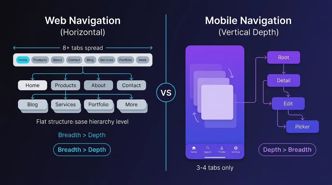
Web applications navigate horizontally. Every section is one click away via top navigation. Depth is avoided. Users expect to jump between concerns — settings, profile, content, search — without hierarchical traversal.
Mobile applications navigate vertically through depth. The home screen is the root. From there, you tap into a detail view. From detail, you tap into edit. From edit, you tap into field-specific pickers. Depth is the default. Horizontal navigation (tabs, bottom nav) exists but is reserved for switching between a small number of root concerns.
An AI builder trained on web patterns generates apps with 8 tabs at the bottom and shallow page hierarchies. A mobile-first generator understands that most apps have 3-5 root sections, and everything else is reached through tap depth.
We built a navigation constraint system into the generation pipeline. Before rendering UI, the model first constructs a navigation tree: root nodes, child views, modal overlays, drawer items. The UI is generated to fit this structure, not the other way around.
Information Density and Tap Targets
A web card component with 5 pieces of information (title, subtitle, metadata, tags, actions) is normal. On desktop, the mouse pointer is precise. Visual density is an asset.
The same card on mobile with the same 5 elements is cluttered. Tap targets compete. The eye scans inefficiently. The information hierarchy is lost in the density.
Mobile-native density is selective. A list item shows title and one contextual piece of metadata. The rest is revealed on tap. Actions are hidden in swipe gestures or context menus. Space is used for touch targets, not information display.
AI-generated mobile apps often fail this test. They port desktop information density directly: full-width cards with 6 buttons, metadata-heavy list items, dense forms with inline validation. It works in demo screenshots. It fails in actual use.
Rocket's generation system includes a density analyzer that runs before layout rendering. It counts interactive elements per screen region, calculates tap target sizes, and adjusts density to mobile ergonomics. If a card has 4 buttons, the generator either increases tap target size (reducing other content) or moves actions to a context menu.
Animations as Information, Not Decoration
Web animations are decorative. Hover effects, page transitions, loading states — they communicate state changes but are rarely load-bearing parts of the interaction model.
Mobile animations are informational. A card that expands to detail view with a hero animation tells the user where they are in the navigation hierarchy. A list that reveals items with a stagger tells the user that content is still loading and which item to focus on first. A swipe gesture that shows a delete button with a spring animation confirms the gesture was recognized before committing the action.
Remove these animations and the app still functions, but the user loses orientation cues. The interaction becomes ambiguous.
Most AI mobile generators either skip animations entirely or add generic fade-ins. The output is functional but disorienting. The user taps a list item and the screen changes instantly — no visual continuity, no spatial relationship between the list and the detail view.
We built animation as a first-class output of the generation system. Every navigation transition, every list render, every state change has a corresponding animation spec. The model doesn't just generate widgets — it generates animation controllers, stagger delays, curve parameters, and hero tags.
How We Built Mobile-Native Generation
The architecture has three layers:
1. Interaction Pattern Layer
Before generating UI, the model identifies the interaction pattern:
- List-to-detail: A scrollable list where each item expands into a detail view.
- Dashboard: A grid of actionable cards representing different app sections.
- Form flow: A multi-step process with validation and field dependencies.
- Media gallery: A grid of visual content with zoom and swipe interactions.
- Settings hierarchy: A nested list of configuration options.
Each pattern has a defined navigation structure, gesture set, and animation vocabulary. The UI generation is constrained by the pattern.
A web generator sees "list of items" and generates cards with inline actions. A mobile-first generator sees "list-to-detail pattern" and generates a list with tap-to-expand navigation, hero animations, and contextual actions in the detail view.
2. Theme Architecture Layer
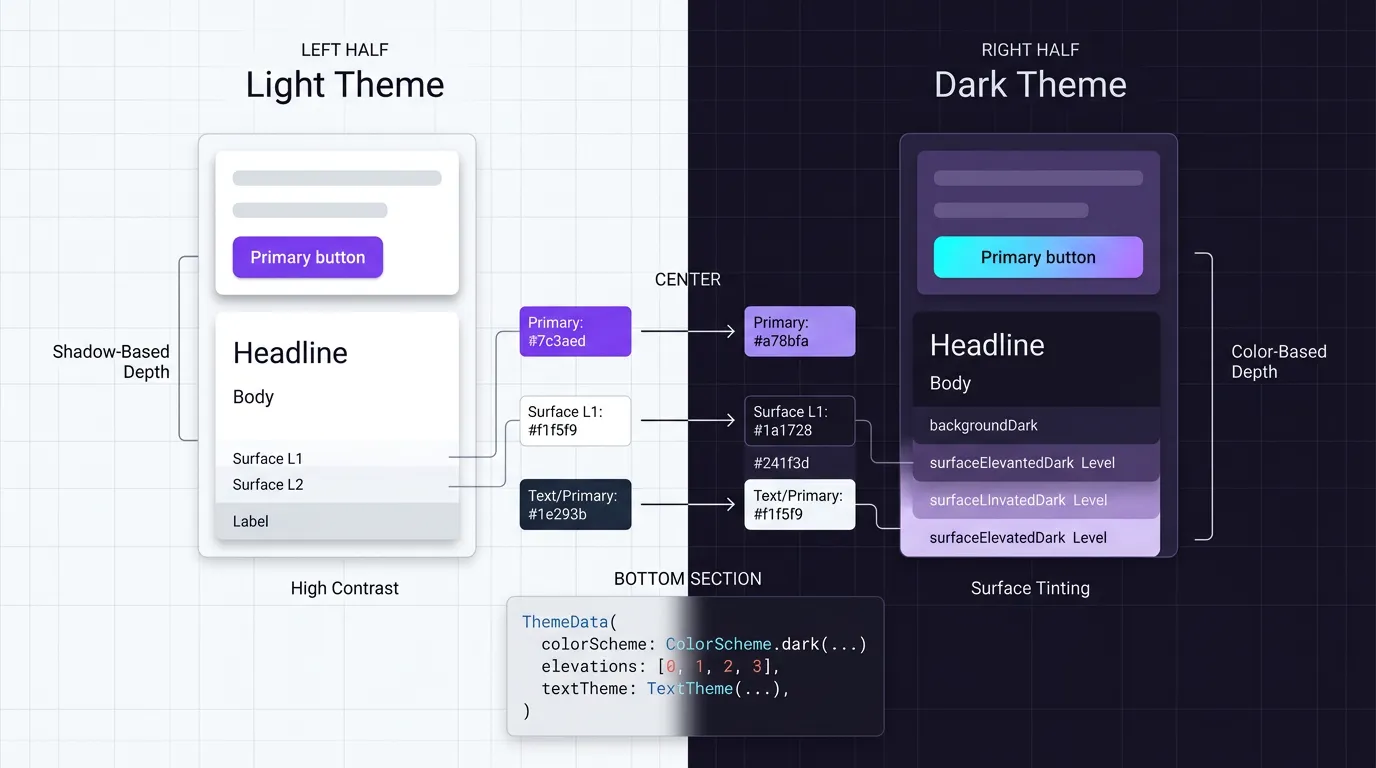
Theming in Flutter is not CSS variables. It's a type-safe system with component-level overrides, semantic color tokens, and platform-adaptive widgets.
Most AI generators treat themes as color swaps: here's your light mode (white background), here's your dark mode (dark background), done.
Real mobile theming is deeper:
| Aspect | What Gets Themed | Example |
|---|---|---|
| Colors | Not just background/foreground — semantic tokens for surfaces, primary actions, destructive actions, disabled states | primaryColor, surfaceVariant, errorContainer |
| Typography | Scale adjusted for readability at mobile sizes, different weights for hierarchy | headlineLarge, bodyMedium, labelSmall |
| Elevation | Shadow depth conveys hierarchy in light mode, surface color conveys hierarchy in dark mode | Card elevation, modal elevation, app bar elevation |
| Density | Compact mode for information-heavy screens, comfortable mode for primary actions | List tile density, button density |
| Platform Adaptation | Different visual language for iOS vs Android — Cupertino vs Material | CupertinoNavigationBar vs AppBar |
Rocket's theme generation creates a full ThemeData object at generation time. It doesn't just set colors — it defines the complete visual system. Text styles, button shapes, input decorations, icon sizes, spacing constants.
When the user switches from light to dark mode, the entire visual hierarchy adapts. Elevated cards in light mode become surface-variant tinted in dark mode. Shadow-based depth becomes color-based depth. Contrast ratios are recalculated for accessibility.
The model generates both themes simultaneously and ensures every component reference uses theme tokens, not hard-coded colors.
3. Animation Choreography Layer
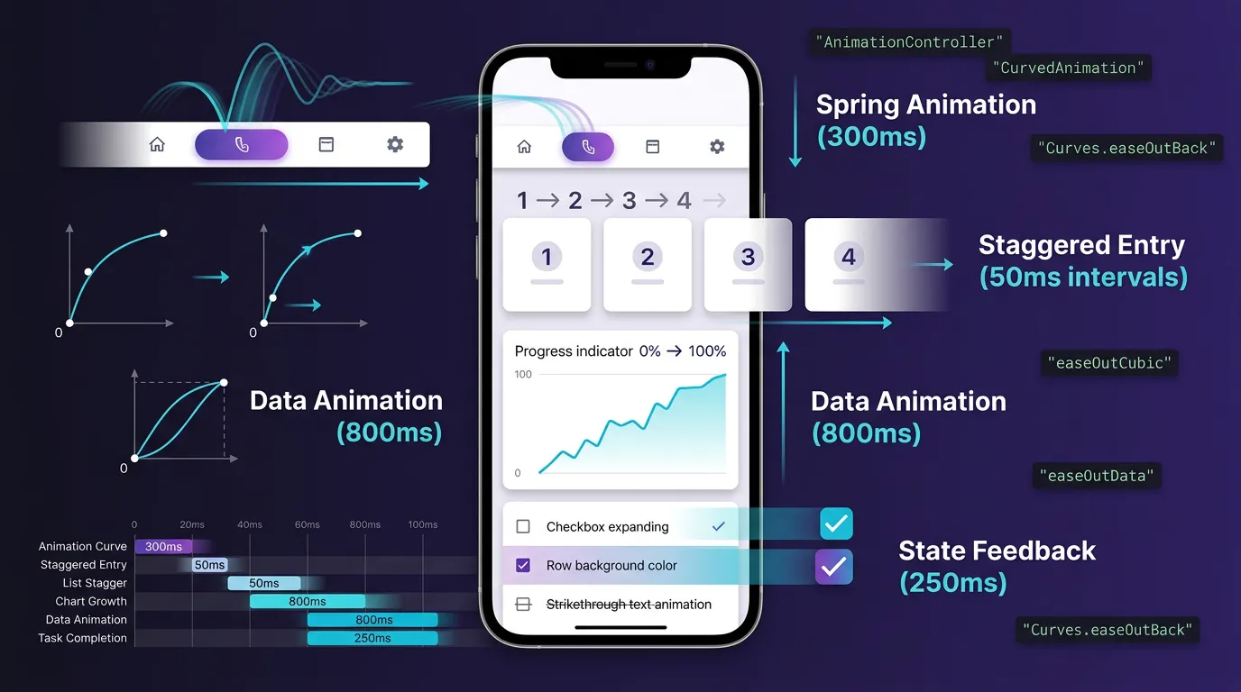
We built an animation system that generates coordinated motion:
1// From app_navigation.dart - Navigation tab switching
2class _AppNavigationState extends State<AppNavigation>
3 with SingleTickerProviderStateMixin {
4 late AnimationController _pillController;
5
6 @override
7 void initState() {
8 _pillController = AnimationController(
9 duration: const Duration(milliseconds: 300),
10 );
11 _pillAnimation = CurvedAnimation(
12 curve: Curves.easeOutBack, // Spring-like bounce
13 );
14 _pillController.forward();
15 }
16
17 @override
18 void didUpdateWidget(AppNavigation oldWidget) {
19 if (oldWidget.currentIndex != widget.currentIndex) {
20 _pillController.reset();
21 _pillController.forward(); // Re-animate on tab change
22 }
23 }
24}The generation system identifies which elements need coordinated motion:
- Navigation pills: Spring animations with easeOutBack curves for satisfying feedback
- List items: Staggered entry with controlled intervals
- Charts: Data-driven animations that scale from 0 to final value
- Interactive widgets: Immediate state feedback (checkbox fill, task strikethrough)
- Sheet transitions: Hero animations maintaining spatial continuity
Every animation controller is scoped to its widget lifecycle. Animations clean up on dispose, preventing memory leaks. The developer sees generated animation code that Just Works™.
The user sees an app that feels intentional, not mechanical.
What Most AI Builders Generate
A single screen with:
- Three horizontal cards showing stats in a row
- A scrollable list below
- A floating action button that opens forms
- Generic fade transition between screens
- No theming beyond background color
- Same layouts regardless of dark/light mode
It functions. It also looks like a web dashboard squeezed into a phone.
What Rocket Generates
1. Density-Aware Theme System:
The app automatically generates a 368-line theme file with 4-level surface elevation:
1// Key excerpt from generated app_theme.dart
2class AppTheme {
3 // 4-level elevation for dark mode depth
4 static const Color backgroundDark = Color(0xFF0F0D1A);
5 static const Color surfaceDark = Color(0xFF1A1728);
6 static const Color surfaceVariantDark = Color(0xFF252235);
7 static const Color surfaceElevatedDark = Color(0xFF2E2A42);
8
9 // Domain-specific gradients
10 static const LinearGradient physicsGradient = LinearGradient(
11 colors: [Color(0xFF3B82F6), Color(0xFF1D4ED8)],
12 );
13 // + Chemistry, Math, Biology gradients
14 // + Complete light theme variants
15 // + 13 text styles, button themes, card themes...
16}2. Micro-Interactions Within Widgets:
Every tap has weight. Task completion triggers immediate visual feedback:
1// From todays_plan_widget.dart
2AnimatedContainer(
3 duration: const Duration(milliseconds: 250),
4 decoration: BoxDecoration(
5 color: isCompleted ? AppTheme.success.withAlpha(10) : Colors.transparent,
6 ),
7 child: AnimatedContainer(
8 duration: const Duration(milliseconds: 200),
9 decoration: BoxDecoration(
10 gradient: isCompleted ? LinearGradient(...) : null,
11 ),
12 child: Icon(isCompleted ? Icons.check_rounded : null),
13 ),
14)3. Chart Animations with Physics:
Charts grow from zero with easing curves:
1// From performance_chart_widget.dart
2class _PerformanceChartWidgetState extends State<PerformanceChartWidget>
3 with SingleTickerProviderStateMixin {
4 late AnimationController _chartController;
5
6 @override
7 void initState() {
8 super.initState();
9 _chartController = AnimationController(
10 duration: const Duration(milliseconds: 800),
11 );
12 _chartAnimation = CurvedAnimation(
13 curve: Curves.easeOutCubic, // Natural deceleration
14 );
15 _chartController.forward();
16 }
17
18 // Chart data points animate: scores[i] * _chartAnimation.value
19}4. Responsive Layout Adaptation:
1// From home_screen.dart
2@override
3Widget build(BuildContext context) {
4 final isTablet = MediaQuery.of(context).size.width >= 600;
5 final isLargeTablet = MediaQuery.of(context).size.width >= 840;
6
7 return Scaffold(
8 body: isLargeTablet
9 ? _buildTabletLayout(context) // Two-column + rail nav
10 : _buildPhoneLayout(context), // Single-column + bottom nav
11 );
12}
13
14// Tablet: Row with NavigationRail + Expanded(flex: 3) + Expanded(flex: 2)
15// Phone: CustomScrollView with SliverToBoxAdapter widgetsThe app feels native because it uses native interaction patterns. The animations guide the user. The theming adapts to system preferences. The density is appropriate for touch. The navigation depth matches user expectations.
The Technical Constraints That Make It Work
Mobile-native generation requires constraints that web generation doesn't:
Constraint 1: Gesture-First Interaction Model
Every generated screen must answer:
- Primary tap target: What happens on the most obvious tap?
- Secondary actions: Where do less common actions live? (Swipe? Long press? Menu?)
- Navigation gestures: Can the user swipe back? Pull down to refresh? Scroll to load more?
The generator doesn't produce a screen and then figure out gestures. It defines the gesture model first, then generates UI that supports it.
Constraint 2: Navigation Depth Budget
Mobile apps have a depth budget: 3-4 levels before users feel lost. The generator enforces this:
- Level 0: Bottom nav (3-5 root sections)
- Level 1: Main content view
- Level 2: Detail view
- Level 3: Edit/form view
- Level 4: Field-specific picker (date, location, etc.)
Going deeper than 4 levels triggers a reorganization: modal overlays, tabbed interfaces within a view, or flattening the hierarchy by promoting deeply nested content to a top-level section.
Constraint 3: Animation Coherence
Every transition must have spatial continuity:
- Tap a list item → hero animation to detail
- Swipe to delete → slide-out animation
- Submit a form → success checkmark animation
- Navigate back → reverse of forward animation
The generator maintains an animation registry per screen that tracks which elements animate and how. This prevents animation conflicts (two elements trying to animate the same property) and ensures visual coherence.
Constraint 4: Platform Adaptation
Flutter can generate iOS or Android (or both). The generator must decide:
- Navigation:
CupertinoNavigationBaron iOS,AppBaron Android - Dialogs:
CupertinoAlertDialogvsAlertDialog - Switches:
CupertinoSwitchvsSwitch - Date pickers:
CupertinoDatePickervsshowDatePicker
Rocket's generator asks: "Which platform?" before generating widgets. The output adapts to platform conventions automatically.
What This Enables
The difference between a web-style mobile generator and a mobile-native generator is the difference between technically correct and actually usable.
Web-style generator output:
- Functions on mobile devices
- Looks like the designer had never used a phone
- Requires manual rework to feel native
- Animations added as afterthought
- Theming is color swaps
Mobile-native generator output:
- Functions and feels mobile
- Interaction patterns match platform conventions
- Ships as-is or with minor tweaks
- Animations are load-bearing parts of UX
- Theming is a complete design system
The first makes developers faster at generating non-production prototypes. The second makes developers faster at shipping production mobile apps.
Web-First vs. Mobile-First AI Generation
| Aspect | Web-First Generators | Rocket (Mobile-First) |
|---|---|---|
| Navigation | Horizontal tabs, unlimited breadth | Bottom nav (3-5 sections) + depth hierarchy |
| Information Density | Desktop-level: show all metadata | Mobile-appropriate: title + 1 contextual field |
| Tap Targets | Optimized for mouse precision | Minimum 44x44pt (iOS) / 48x48dp (Android) |
| Animations | Optional fade-ins | Generated controllers, curves, hero transitions |
| Theming | Color variables | Full ThemeData with semantic tokens, elevation system |
| Responsive Design | Media queries for layout | Separate phone/tablet builders with density adaptation |
| Platform Adaptation | One UI for all | Material vs Cupertino widgets based on platform |
| Interaction Model | Click-based | Gesture-first (tap, swipe, long-press) |
| Generated Code | Single screen with forms | Multi-screen navigation, animated widgets, theme system |
Example: Ask both to generate a "fitness app dashboard."
Web-First Output:
- Single page with stats cards in a row
- List of workouts below
- Floating action button
- No animations
- Hard-coded colors
Rocket Output:
- Bottom nav with 4 sections
- Animated stats cards with staggered entry
- Charts with easeOutCubic animation
- Task completion with gradient transitions
- 368-line theme file with light/dark modes
- Responsive tablet layout
The Problem We Actually Solved
AI-generated mobile apps have been bad not because models can't write Flutter code — they can. They've been bad because the generation architecture treated mobile as a smaller web.
The failure was architectural:
- Generating UI without first defining interaction patterns
- Treating animations as optional polish
- Implementing theming as color variables
- Ignoring platform conventions
- Optimizing for desktop information density
Rocket's Flutter generation system solves this by making mobile constraints first-class:
-
Interaction patterns precede UI generation — the model identifies the pattern (list-to-detail, dashboard, form flow) before rendering widgets.
-
Animations are generated, not added — every transition, every list render, every gesture has corresponding animation code.
-
Theming is a complete system — not color swaps but full
ThemeDataobjects with semantic tokens, component overrides, and platform adaptation. -
Density is mobile-appropriate — information density, tap targets, and visual hierarchy are optimized for touch, not mouse.
-
Navigation depth is constrained — the generator enforces mobile-appropriate hierarchy and prevents infinitely nested screens.
The result: AI-generated mobile apps that ship to production without feeling like "AI generated them."
That's the test. Not whether the code compiles. Whether the app feels like a human mobile designer built it.
Table of contents
- -Why Mobile Is Harder Than Web
- -Interaction Depth vs. Horizontal Navigation
- -Information Density and Tap Targets
- -Animations as Information, Not Decoration
- -How We Built Mobile-Native Generation
- -1. Interaction Pattern Layer
- -2. Theme Architecture Layer
- -3. Animation Choreography Layer
- -What Most AI Builders Generate
- -What Rocket Generates
- -The Technical Constraints That Make It Work
- -Constraint 1: Gesture-First Interaction Model
- -Constraint 2: Navigation Depth Budget
- -Constraint 3: Animation Coherence
- -Constraint 4: Platform Adaptation
- -What This Enables
- -Web-First vs. Mobile-First AI Generation
- -The Problem We Actually Solved