
How do landing pages drive conversions? Learn how focused design, layout, messaging, and psychology turn visitors into leads, outperform averages, and maximize hard-earned traffic through proven best practices consistently and effectively.
What makes a good landing page work so well?
It’s simple: a landing page must turn visitors into leads or customers.
A well-designed landing page helps you guide your target audience to take the action you want.
According to Unbounce’s Conversion Benchmark Report, the average landing page conversion rate is around 2–3%, while top-performing landing pages (top 25%) convert at 5% or higher.
That’s a big deal when website traffic is hard-earned.
Let's break down landing page best practices. You’ll see how design, layout, messaging, and psychology all play their part.
What is a Landing Page?
A landing page is a standalone web page designed for a single, clear purpose.
Visitors land on it after clicking a link from paid ads, emails, social posts, or search results. Unlike other pages on a website, a landing page does not try to do many things at once. It focuses on a single desired action. That action could be signing up, downloading a resource, booking a demo, or making a purchase.
There’s no top navigation. No sidebar distractions. No endless links pulling attention away. Everything on the landing page exists to guide visitors toward that single goal.
Landing pages typically work best because they remove choice overload. Instead of asking visitors to browse around, a good landing page gives a clear message and a clear next step. It doesn’t whisper “maybe later.” It confidently says, “This is what you came for.”
Great Landing Page Design Tips
Before anything else loads, the headline does the talking. It decides whether someone stays or leaves.
- People make decisions quickly, often in just a few seconds.
- If the headline doesn’t spark interest right away, visitors bounce.
- A clear and compelling headline should instantly show:
- Who the offer is for
- What the visitor gets out of it
- Keep the headline short and direct. Skip clever wordplay that needs explanation.
- Add a punchy subheading right below the headline.
- The subheading should:
- Add clarity, not extra noise
- Explain the benefit in one quick line
- Since most visitors skim before reading, this headline–subheading combo sets the tone for the entire landing page.
Get the headline right, and the rest of the landing page has a fighting chance. Get it wrong, and nothing below it really matters.
Make the Call to Action Impossible to Ignore
The call to action CTA is where interest turns into action. This is the moment visitors decide whether to click or walk away.
- Place the CTA above the fold so it’s visible right away.
- Use clear, action-focused text that explains what happens next.
- Examples: “Get the Free Guide,” “Start the Trial,” “Book a Demo”
- Make the CTA button stand out with strong contrast, spacing, and size.
- Repeat the CTA at natural points as visitors scroll.
- Keep the wording consistent across the page to avoid confusion.
- Limit the number of CTAs. Too many options slow people down.
A strong CTA doesn’t beg for clicks. It confidently shows the next step and makes it feel easy to take.
Content That Actually Works
This is the part where clarity beats cleverness, and visitors finally understand why they should stick around.
-
Value Proposition Comes First: Your value proposition is what makes your offer worth clicking. It’s not fancy words. It’s the real benefit your audience gets. Make it clear before anything else on the page.
Think: “Why should I care?” Answer that. Then repeat it in different parts of the page. This helps guide visitors, especially if they scroll.
-
Relevant Visuals and Media: A picture, demo video, or product mockup can make your message feel more real. High-quality images help convey meaning faster than text. They can show your product in action or demonstrate the outcome your visitor dreams about.
Just keep them clean and relevant. Random stock photos? Not helpful here.
When the message is clear and the visuals support it, the landing page feels easy to understand. And when things feel easy, people are far more likely to act.
Trust and Social Proof
This is where hesitation fades, and confidence starts to build
Show People You’re Real.
People don’t buy from strangers. They buy from brands they trust. That’s where social proof helps.
Add customer testimonials, successful case snippets, badges, or satisfaction stats. This tells visitors, “others have done this, and they were happy.”
Funny thing is, testimonials don’t need to be long. A short quote from a known customer can be far more convincing than half a page of text.
When visitors see proof that real people trust you, clicking the CTA feels far less risky and much more natural.
Page Layout and Flow
A landing page isn’t just about looking good. It’s about moving visitors naturally from one section to the next.
Every element should guide them toward the action you want, without making them pause or wonder what to do next.
Guide Visitors Step by Step:
This part controls how smoothly visitors move from interest to action.
- The page layout should feel like a clear path, not a maze.
- Start with the headline and value proposition at the top.
- Follow with proof, key benefits, and answers to common doubts.
- End with strong CTA sections that clearly show the next step.
- Keep the layout simple and predictable.
- Use white space to separate sections and reduce visual noise.
- White space helps visitors focus on what matters.
- Too much clutter pushes people to leave faster.
When the flow feels obvious and nothing fights for attention, visitors don’t hesitate. They simply keep moving forward.
Mobile Devices Rule:
Most visitors won’t see your landing page on a laptop, so the mobile experience sets the first impression.
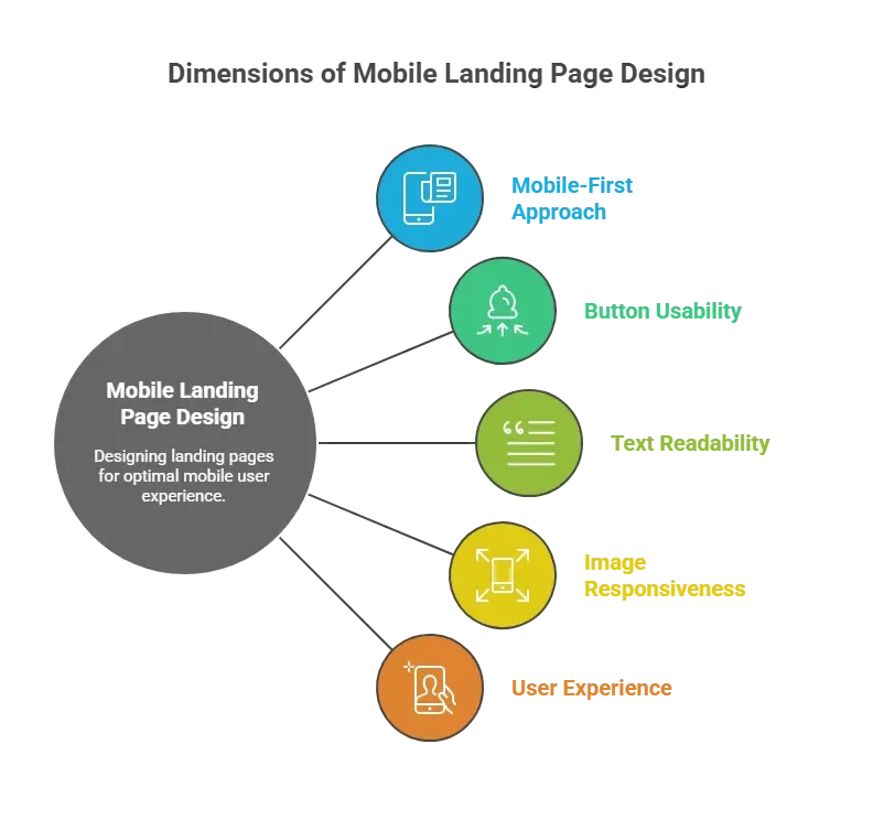
If the page feels smooth on a phone, visitors stay longer. If it doesn’t, they leave without a second thought.
When the layout feels clear and the flow feels natural, visitors move forward without friction. That’s exactly what a landing page should do.
Quick Comparison Of Landing Page Elements
Here’s a quick snapshot of the key elements that make a landing page actually work.
| Element | What It Does | Why It Matters |
|---|---|---|
| Headline | Grabs attention | First impression counts |
| Value Proposition | Explains benefit | Keeps interest high |
| CTA Buttons | Prompts action | Drives conversion |
| Visuals | Supports message | Makes idea concrete |
| Social Proof | Builds trust | Reduces hesitation |
| Mobile Layout | Makes usable on phones | Most traffic comes from phones |
Each element plays a role in guiding visitors, building trust, and nudging them toward action. Together, they make the page effective and highly converting.
Creating Landing Pages That Convert
Creating landing pages that convert isn’t just about design; it’s about guiding visitors toward one clear action. Every section, image, and line of text should work together to make the CTA feel obvious and easy to click.
A landing page template can give you a head start. Good templates follow layout rules and focus on flow. Many builders offer templates you can tweak. You still need to add your own voice and value, though.
Templates save time, but they should feel yours, not generic.
Rocket.new For Landing Page Ideas
Rocket.new isn’t your full landing page builder, but it’s great for shaping the strategy behind one. Think of it as the place where ideas become structured plans before you build the real thing.
Rocket.new shines when you need to quickly plan landing page content, organization, and flow. It suggests structures, drafts copy, and gives you a shared space to iterate on plans and layouts.
Top features
- Natural language to project generation: Describe what you want in plain English, and Rocket.new turns it into structured outlines or even starter pages. This makes planning feel almost conversational.
- Figma-to-code templates: If you already have a design idea, you can import Figma layouts and get a usable output that reflects your design intent.
- Built‑in template library: Choose from pre‑made landing page and website templates to sketch layouts fast.
- Live preview and editing: See ideas come to life and tweak them right away based on how they look or read.
- SEO‑optimized copy support: Rocket can generate copy that reads well and aligns with what search engines like, useful when planning clear headlines or value propositions.
- Deploy options with custom domains: Once your draft becomes a real page, you can publish it quickly with hosted previews.
Use cases
-
Plan your next landing page template before building it in a full builder
Draft structure, headlines, and CTAs in Rocket before exporting to a dedicated page builder.
-
Draft multiple headlines and copy ideas to share with your team
Use Rocket.new as a collaboration space to test different layouts and scripts before final design.
-
Create outline drafts for high-quality landing pages for client projects
Generate structured landing page drafts to show clients early, with clear sections defined and ready for design.
Rocket.new helps bridge the gap between idea and execution, giving you a space to sketch, refine, and prep before building real, high-converting landing pages.
👉Build Landing page with Rocket
Community Insight
Here’s what real users and creators are saying about landing pages out there.
One Reddit user shared a blunt take on why many pages fall short:
“Most landing pages look nice but don’t actually convert. If you want people to sign up, buy, or take action, you need to guide them clearly… If your landing page is missing any of these, you’re probably leaving money on the table."
This comment highlights a common problem: aesthetics alone won’t earn clicks or conversions if visitors don’t clearly understand what to do next.
What makes a good landing page
A good landing page blends thoughtful design, clear messaging, targeted visuals, and streamlined action prompts. Keep the focus on the one thing you want your visitors to do. Test, rinse, repeat. And always write for the human on the other side of that screen.
Even small tweaks can make a big difference. From adjusting a headline to rearranging a CTA button, paying attention to how visitors interact with your page can turn good landing pages into high-converting ones. It’s all about making the experience effortless and obvious.
Table of contents
- -What is a Landing Page?
- -Great Landing Page Design Tips
- -Make the Call to Action Impossible to Ignore
- -Content That Actually Works
- -Trust and Social Proof
- -Page Layout and Flow
- -Mobile Devices Rule:
- -Quick Comparison Of Landing Page Elements
- -Creating Landing Pages That Convert
- -Rocket.new For Landing Page Ideas
- -Top features
- -Use cases
- -Community Insight
- -What makes a good landing page