Transformative K-12 Education Landing Page Template
Syllabus is a K-12 education mobile app landing page template built for EdTech teams who need to convert school administrators and teachers into demo bookings. It combines a Feature Tab Switcher hero, animated stat counters, a head-to-head comparison table, district case study cards, and a dual-path lead capture section into one focused, glass-styled page.
by Rocket studio
Quick summary
Syllabus is a single-page landing page template purpose-built for K-12 classroom management apps. It opens with a three-tab device mockup hero, flows through data-driven stat blocks and a glowing comparison table, and closes with a demo scheduler call to action and a PDF lead gate, all wrapped in a luminous Tech Glass visual style.
Who this template is for
This template is designed for EdTech product and marketing teams launching or promoting a K-12 mobile app to school decision-makers. It speaks directly to the people who feel the daily friction of fragmented classroom tools.
- K-12 teachers, assistant principals, and curriculum coordinators who evaluate classroom management tools
- District technology and procurement leads building a business case for their school board
- EdTech founders and growth teams who need a high-converting demo request page fast
What problem this template solves
Most K-12 EdTech landing pages lead with features and lose administrators before the scroll. Schools have real, specific pain points, offline access during fire drills, sub-plan handoffs, multilingual parent alerts, and generic pages never address them directly.
- Decision-makers cannot quickly compare the app against the legacy tools and spreadsheet workflows they already use
- Teachers and principals need proof through data, not just promises, before they advocate for a new platform
- Marketing teams need one page that captures both demo-ready buyers and early-stage leads who are still building their case
What you get with this template
You get a fully structured, section-led landing page that guides school administrators from first impression to demo request in one smooth scroll. Every section has a defined job in the conversion flow.
- A Feature Tab Switcher hero with three floating device mockups and liquid tab transitions
- An animated stats block, a violet-glow comparison table, district case study cards, and a dual-path lead capture banner
- A Tech Glass design system using Electric Indigo colors, frosted surfaces, and two paired typefaces ready to customize
Feature list
This template comes with six purpose-built sections, each carrying real interactive and visual weight. Together they form an Industry Report-style narrative that earns trust before asking for a meeting.
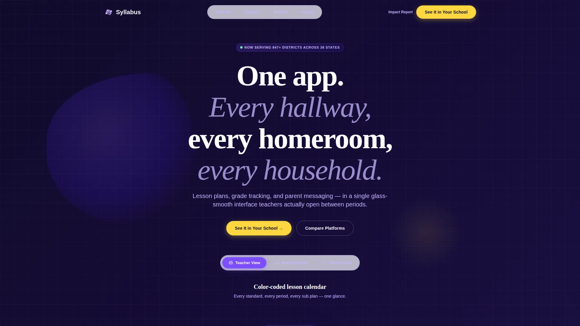
Feature Tab Switcher Hero
Three floating device mockups sit on a frosted-glass surface in the header. Each tab shows a different app screen: a color-coded teacher calendar, a real-time behavior dashboard, and a parent chat thread with a translated message bubble. Clicking a tab animates the selected phone forward while the others recede and blur, with a liquid screen transition between states.
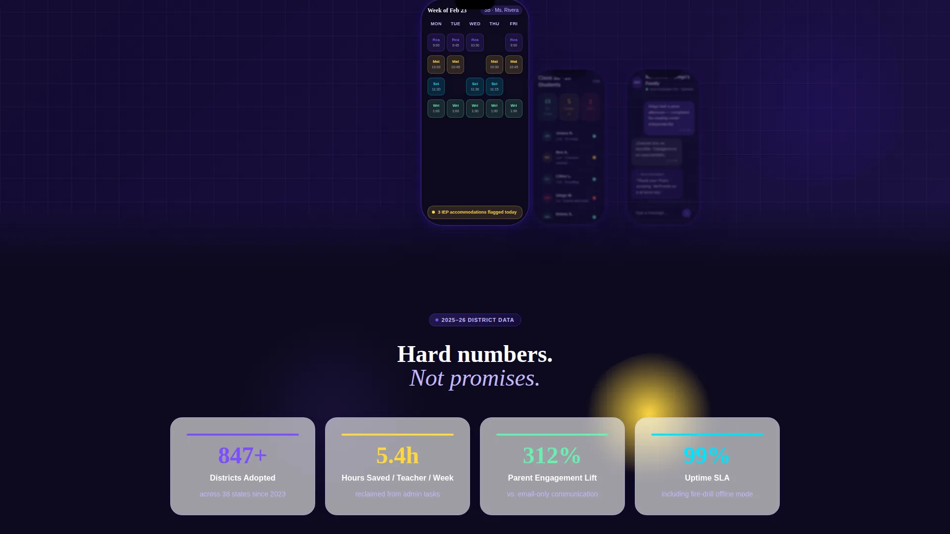
Animated Statistics Block
A bold stat block sits directly below the hero. District adoption rates, minutes saved per teacher per week, and parent engagement lift percentages each animate upward like a loading progress bar as the section enters the viewport. The counters make the value proposition feel immediate and evidence-backed rather than promotional.
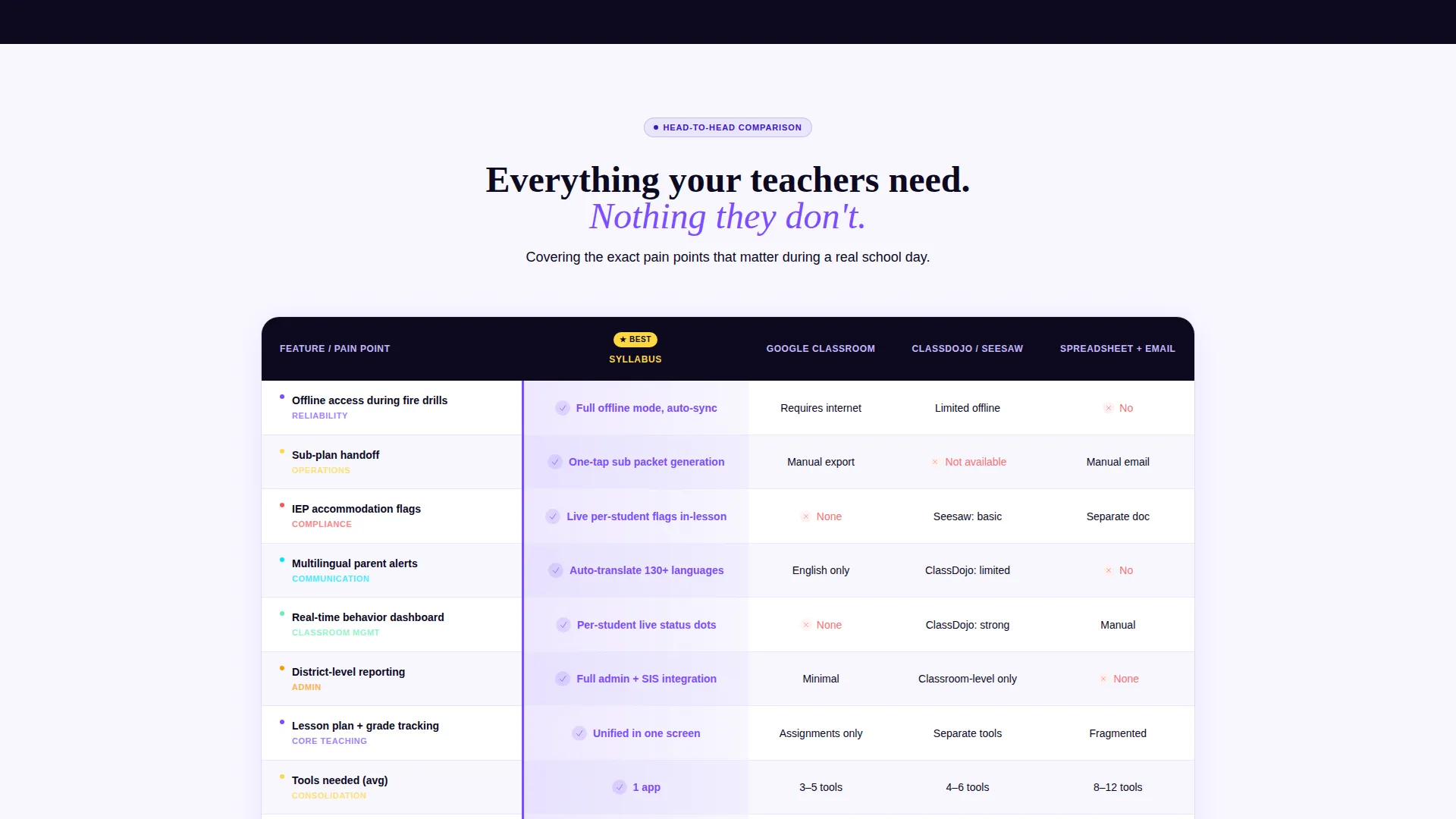
Glowing Comparison Table
The core of the page is a structured comparison table pitting the app against legacy learning management systems and spreadsheet-and-email workflows. Rows cover specific pain points: offline access during fire drills, sub-plan handoff, individualized education program accommodation flags, and multilingual parent alerts. Every row where the app wins highlights in an electric violet glow on reveal.
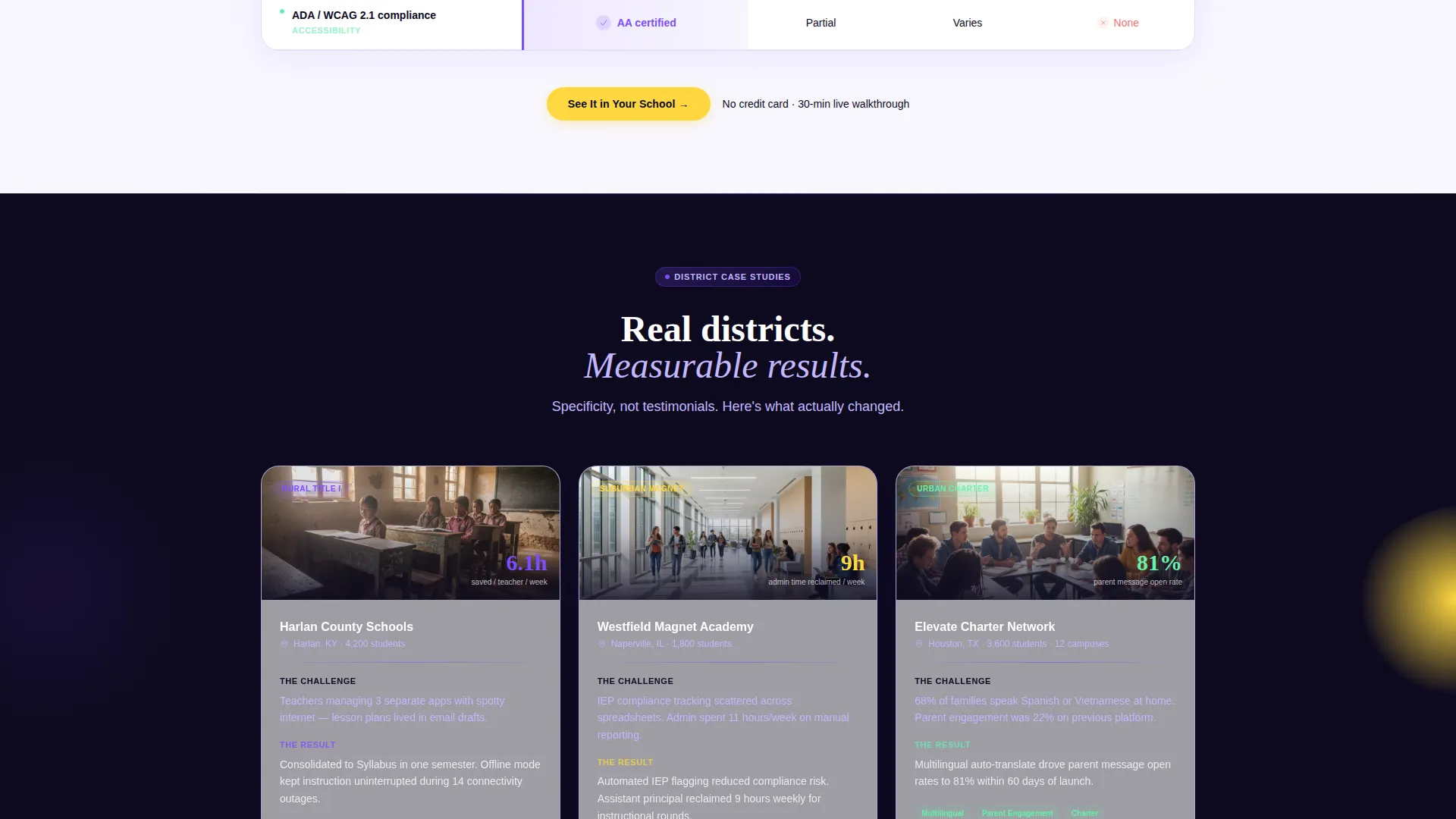
District Case Study Cards
Below the table, three short case study cards represent distinct district types: a rural Title I school, a suburban magnet school, and an urban charter school. The cards build credibility through specific context rather than anonymous testimonials, showing prospective buyers a scenario that mirrors their own situation.
Dual-Path Lead Capture
The closing section serves two audiences at once. A primary call-to-action button reading "See It in Your School" routes to a personalized demo scheduler. A secondary path offers a downloadable K-12 Impact Report behind a single work-email field, capturing leads who are still building a board presentation and are not yet ready to book a demo.
Sticky Call-to-Action Placement
The primary "See It in Your School" button appears three times: inside the hero header, pinned immediately after the comparison table, and again on the closing banner. The closing banner carries its own supporting copy line to reinforce urgency without being pushy.
Page sections overview
| Section | Purpose |
|---|---|
| Feature Tab Switcher Hero | Introduce app screens with interactive device mockups and a headline |
| Animated Stats Block | Build data-driven credibility with counter animations |
| Comparison Table | Show direct wins against legacy platforms row by row |
| District Case Study Cards | Ground claims in recognizable real-world district scenarios |
| Lead Capture Banner | Convert demo-ready leads and board-presentation researchers simultaneously |
| Single-Row Footer | Close the page cleanly with a minimal linear footer pattern |
Design & branding system
The visual identity follows a Tech Glass style that channels the energy of a smartboard glowing in a dimly lit classroom. Every surface, color choice, and type pairing reinforces authority and clarity.
- Color system: deep digital indigo (#3D17C6) as the primary brand anchor, glowing violet (#7C4DFF) for hover states and active table rows, chalk-dust white (#F8F7FF) for backgrounds, and highlighter yellow (#FFD740) on calls to action and data callouts
- Typography: Plus Jakarta Sans for interface and body text, Fraunces for display headlines, giving the page a pairing that feels both modern and warm
- Surface style: frosted-glass panels, luminous indigo glows, and scroll-linked stagger animations create depth without clutter
Mobile & speed optimization
This template is built mobile-first because teachers use their phones between class periods, not at a desktop. The layout decisions reflect how the actual end-users move through the page.
- Mobile-first structure ensures the hero, stats, and comparison table read cleanly on small screens before scaling up to desktop widths
- Static sections use server-rendered components while interactive pieces like the tab switcher and animated counters use client-side components, keeping the split intentional and load-conscious
- Scroll-linked stagger animations and row glow reveals are designed to trigger smoothly during a natural reading pace on any device
How this template helps you convert
The page is structured as a Click-Through funnel with a single primary destination: a personalized demo scheduler. Every section is arranged to move a skeptical administrator one step closer to booking.
- The Industry Report flow presents hard data and a direct comparison before any sales language appears, so readers arrive at the call to action already informed and less resistant.
- The three-placement call-to-action strategy ensures the "See It in Your School" button is always within reach, whether a visitor converts at the hero, after the table, or at the closing banner.
- The email-gated PDF impact report creates a second conversion path for leads who are not yet demo-ready, keeping them in the funnel while they build internal buy-in.
Other information about this template
This template is one of the more interaction-heavy options in the K-12 EdTech category. It is worth knowing a few additional details before you build with it.
- The high animation level, liquid tab transitions, counter animations, and row glow reveals, requires attention during content customization to keep motion purposeful and not distracting
- The comparison table is most effective when rows map to the specific pain points your buyers raise in sales conversations, so plan your row content carefully before launch
- The localization defaults are set for English (United States), using USD currency formatting and MM/DD/YYYY date format throughout
- The single-row linear footer pattern is intentionally minimal, keeping the page focused on the two conversion actions rather than scattering attention to navigation links
Theme
Tech Glass
Creative direction
Industry Report
Color system
Electric Indigo
Style
Comparison Table
Direction
Click-Through
Page Sections
Feature Tab Switcher Hero
Animated Statistics Block
Violet-glow Comparison Table
District Case Study Cards
Dual-path Lead Capture Banner
Three-placement Call-to-action Strategy
Related questions
Who is the primary audience this landing page template is built for?
Can I adapt the comparison table rows to match my product's specific features?
Does the template support two different conversion goals on the same page?
What makes the hero section different from a standard image-and-headline layout?
Is this template suitable for smaller or rural school districts, or only large systems?


