Strategic Follow Up Landing Page Template
Closer is a split-screen landing page template built for real estate professionals who need a sharper follow-up email strategy. It uses a high-contrast Carbon Fiber visual system, animated metric comparisons, and a side-by-side layout to show visitors exactly what better follow-up looks like, and move them to sign up.
by Rocket studio
Quick summary
Closer is a bold, single-page template designed for real estate follow-up email services. It runs a 50/50 split screen that puts the old way of following up on the left and the optimized way on the right. Animated metrics, comparison scroll sections, and a focused signup form make it fast to understand and easy to act on.
Who this template is for
This template speaks directly to the people who live in the 48 hours after a showing. It is built for those who know that a slow or generic follow-up email can cost them a deal.
- Solo agents who work open houses and handle their own client communication
- Boutique brokerages that need a sharper edge over larger, data-heavy competitors
- Transaction coordinators who manage post-showing outreach and client touchpoints
What problem this template solves
Most real estate follow-up emails arrive too late, sound too generic, and get ignored. The gap between a warm lead and a closed deal often comes down to how quickly and personally an agent responds after a showing.
- Agents lose momentum when follow-up is slow, manual, or copy-pasted from a template that feels impersonal
- Leads go cold because there is no clear next step offered in the message
- There is no easy way to show a prospect the difference between average follow-up and high-performing follow-up
What you get with this template
You get a fully structured, single-page layout that frames a real estate thank-you email service as an obvious choice. Every section is designed to build the case visually and emotionally.
- A 50/50 split-screen header with animated metrics comparing generic versus optimized follow-up performance
- Scroll-driven comparison blocks that move from open rates to reply rates to closed deals and commission impact
- A three-field signup form and a lightbox sample email so visitors can see the product before they commit
Feature list
This template is built around a single, powerful idea: show the visitor two futures and let the numbers do the talking.
Animated Stats Header
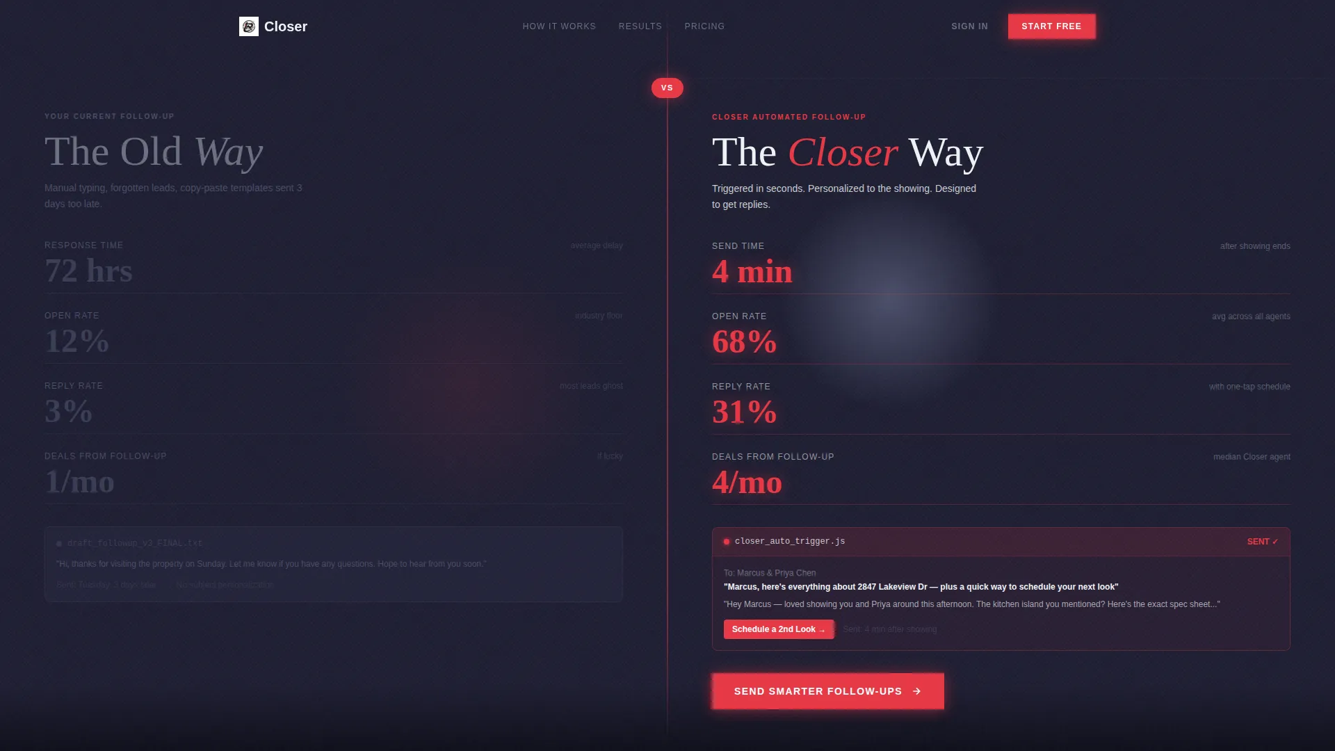
The header opens with a live metrics wall. The left panel displays a generic agent's numbers, a 72-hour response time and a 12% open rate. The right panel shows the optimized version: a 4-minute send time and a 68% open rate. Numbers animate upward on page load like a funding-round ticker, each figure snapping into place against a carbon-fiber texture.
Split-Screen Scroll Engine
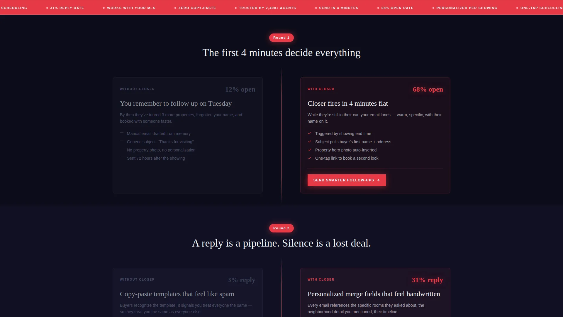
Each scroll section deepens the comparison. The left side shows the old way: manual typing, forgotten leads, and copy-paste templates. The right side reveals the new way: automated triggers, personalized merge fields, and embedded showing-feedback forms. The stakes rise with each block, moving from open rates to reply rates to annual commission differences.
Persistent Conversion call to action
The primary call-to-action button reads "Send Smarter Follow-Ups" in conversion-red. It is pinned to the right panel and repeated after every comparison block so the next step is always visible. A secondary option lets visitors open a lightbox with a real, populated thank-you email they can inspect before signing up.
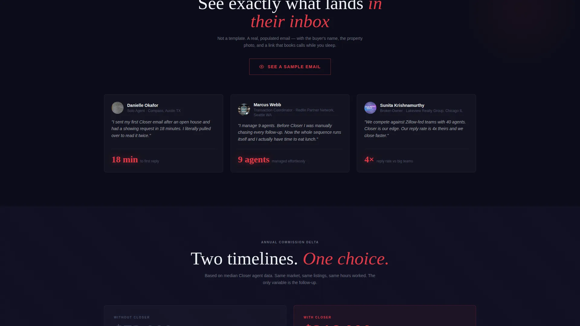
Sample Email Lightbox
Visitors can preview a fully populated thank-you email inside a lightbox overlay. The sample includes the recipient's name, a property photo, and a one-tap scheduling link. This gives prospects a concrete sense of the product without leaving the page.
Focused Signup Form
The final section collects just three fields: email address, brokerage name, and average monthly closings. The form is intentionally minimal to reduce friction. Its placement at the bottom of the split screen positions the signup as the moment the visitor chooses the right side of the comparison.
Page sections overview
| Section | Purpose |
|---|---|
| Animated Metrics Header | Compare generic versus. optimized follow-up stats side by side |
| Open Rate Block | Show the impact of faster, personalized email delivery |
| Reply Rate Block | Demonstrate how a clear next step drives responses |
| Closed Deals Block | Connect better follow-up directly to conversion outcomes |
| Commission Delta Block | Frame the annual income difference between two approaches |
| Sample Email Lightbox | Let visitors inspect a real, populated thank-you email |
| Signup Form Section | Collect three fields and convert the visitor |
Design & branding system
The visual identity follows a Startup Velocity theme with a Carbon Fiber color palette. Every color choice is deliberate, the palette feels like the dashboard of a matte-black performance car at night, with only the most important elements lit up.
- Deep carbon black (#1A1A2E) dominates backgrounds; titanium mid-gray (#4A4E69) carries body text and dividers; high-beam white (#EDF2F4) punches headlines
- Conversion-red (#E63946) appears exclusively on calls-to-action and live metric highlights, keeping the eye focused on what matters
- The carbon-fiber texture behind animated numbers reinforces the high-performance, data-driven tone throughout the page
Mobile & speed optimization
The split-screen layout is designed to translate cleanly from desktop to mobile without losing the comparison logic. On smaller screens, the two panels stack vertically so the contrast between old and new remains clear.
- Animated metric counters are lightweight and load quickly without heavy dependencies
- The lightbox overlay for the sample email is touch-friendly and dismisses cleanly on mobile
- The three-field signup form is compact by design, making it fast to complete on any device
How this template helps you convert
Closer is built around a single conversion principle: when visitors see two futures side by side, choosing the better one becomes obvious. Every design and copy decision supports that moment of clarity.
- The animated header creates an immediate, visceral contrast between the old approach and the new one, pulling visitors into the comparison before they have read a single word of body copy.
- Repeated calls-to-action after every comparison block keep the signup option in view at all times, so the visitor never has to scroll back up to act.
- The sample email lightbox and the minimal three-field form remove the two biggest barriers to signup: uncertainty about the product and friction at the point of commitment.
Other information about this template
Closer fits naturally into a broader real estate marketing toolkit. It is designed to be a standalone promotional page that does one job well: turning skeptical agents into confident signups.
- The template is categorized under Technology and Real Estate Email Templates, making it relevant for email service providers, real estate marketing platforms, and tools aimed at agents
- The Startup Velocity theme and Launch Energy creative direction make the page feel urgent and modern without relying on industry clichés
- The Comparison/Versus layout direction is well-suited for any service that benefits from a clear before-and-after narrative

Theme
Startup Velocity
Creative direction
Launch Energy
Color system
Carbon Fiber
Style
Split Screen (50/50)
Direction
Comparison/Versus
Page Sections
Animated Metrics Header
Split-screen Comparison Scroll
Persistent Conversion Call to Action
Sample Email Lightbox
Minimal Three-field Signup Form
Related questions
Who is this template designed for?
Can I update the colors and copy to match my brand?
What does the split-screen layout look like on a phone?
Does the template include actual email content in the lightbox?
Is this template a good fit for a real estate marketing agency?


