Accelerate — Live Patient Wellness Email Landing Page Template
The Recover template is a dark-console landing page built for healthcare SaaS teams that need to win back patients who abandoned appointments, insurance enrollments, or prescription refills. It pairs an interactive email sequence preview with a modular feature card grid and a three-field progressive lead capture form that delivers a personalized recovery projection within sixty seconds of submission.
by Rocket studio
Quick summary
Recover is a single-page landing page template designed for patient retention SaaS platforms in the healthcare industry. It intercepts abandoned bookings and fires personalized follow up email sequences before care gaps widen. The page combines an interactive email builder preview, a modular feature card grid, live telemetry social proof, and a frictionless lead gen form into one high-stakes conversion experience.
Who this template is for
This template is built for B2B healthcare technology teams who watch thousands of incomplete patient sessions evaporate every month. It speaks directly to the people responsible for turning abandoned intent into recovered revenue.
- Growth marketers and patient acquisition leads at telehealth platforms who need to re-engage patients at scale
- Operations directors at dental and vision chains tracking how many patients never complete their appointments
- Healthcare administrators at regional hospital networks who need to monitor drop-off rates and recover lost care opportunities
What problem this template solves
Every day, patients start booking appointments, enrolling in insurance plans, or requesting prescription refills and then stop. Healthcare providers lose revenue, patients lose continuity of care, and care teams absorb the operational cost of outreach that never quite reaches the right person at the right time. This template gives SaaS platforms a landing page that communicates the full urgency of that problem and shows exactly how automated follow up email sequences solve it.
- Patients abandon the booking flow before confirming their next visit, leaving treatment plans incomplete
- Follow up is inconsistent or too slow, allowing care gaps to grow before medical professionals can intervene
- Marketing teams lack a compelling landing page that converts website visitors into qualified demo leads
What you get with this template
This template delivers a fully structured, single-page experience with high interactivity and precise visual hierarchy. Every section has a defined purpose and a built-in conversion role. Healthcare professionals evaluating the platform can scan the page non-linearly, find the feature that solves their specific pain, and submit a lead form that rewards them instantly.
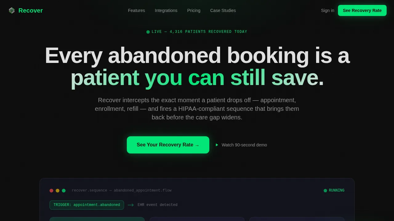
- An interactive hero section featuring an email sequence builder pre-loaded with an abandoned appointment flow, animated trigger lines, and hover-to-flip stat cards
- A modular card grid with per-card micro-animations covering six core platform capabilities, plus a full-width live ticker row showing recovered patient counts
- A three-field progressive lead capture form with instant personalized recovery projection delivered by email within sixty seconds
Feature list
This template is built around essential elements that work together across different sections to create a seamless patient journey from abandoned session to recovered appointment.
Interactive Email Sequence Builder
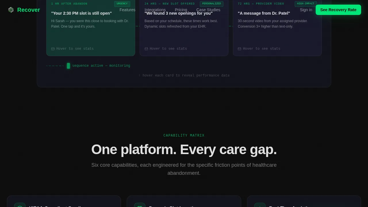
The hero section renders a live email sequence builder directly in the viewport. Three email cards sit on a dark canvas connected by animated trigger lines: one hour after abandon, twenty-four hours with a new time slot offered, and seventy-two hours with a provider video message. Users hover each card to flip it and review open-rate and recovery-rate stats. A blinking green cursor pulses at the sequence end, signaling the system is already running.
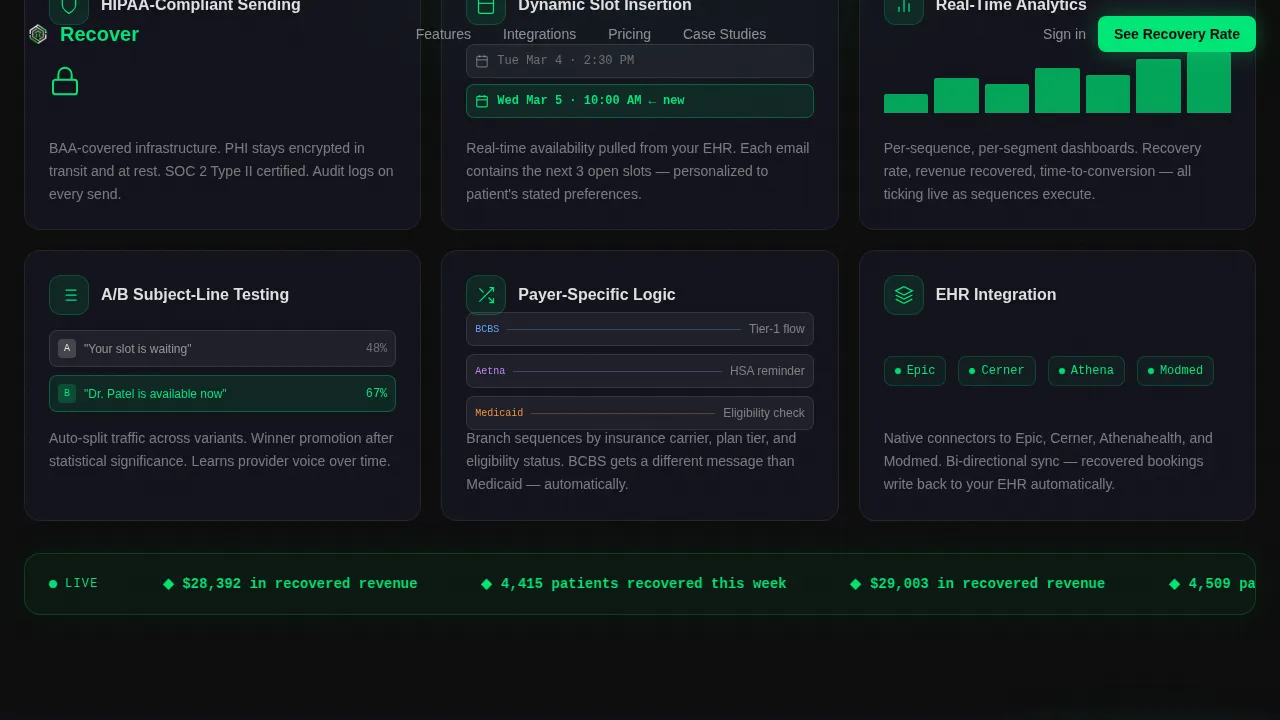
Modular Feature Card Grid
Scrolling past the hero drops users into a uniform card grid where each card isolates one platform capability. Cards animate on scroll using Intersection Observer triggers. Examples include a lock icon sealing shut for Health Insurance Portability and Accountability Act compliance, a calendar slot sliding into an email body for dynamic slot insertion, and a bar chart climbing to represent real-time analytics. This grid lets buyers focus on the one feature that matches their unique challenges without reading linearly.
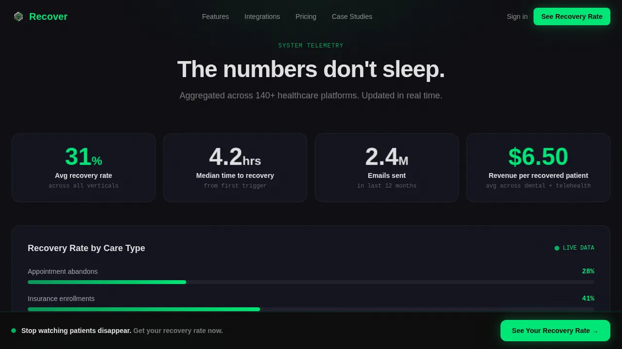
Live Telemetry Ticker
Midway through the page, a full-width row breaks the card grid with a live counter showing recovered patient counts for the current week. This transforms social proof into system telemetry, giving the page the feel of a real-time operations dashboard. It reinforces trust signals without relying on generic stock photos or static testimonial blocks.
Three-Field Progressive Lead Form
The lead capture form uses a deliberate progressive sequence. Users enter their work email first, then select their healthcare vertical from a dropdown, then set their monthly abandoned session volume using a slider. Form design follows a no-friction principle: no demo scheduling, no calendar friction. Submission triggers an instant personalized recovery projection by email, making the contact form itself the first proof of the product's value.
Sticky Call-to-Action Bar
A sticky bottom bar activates after forty percent scroll and holds the primary call-to-action button at all times. The primary call-to-action reads "See Your Recovery Rate" and appears both in the hero section and in the persistent bar below. This keeps the conversion path visible whether the user is reviewing the feature grid, reading recovery data, or reaching the contact area at the bottom of the page.
HIPAA-Aligned Messaging Layer
The template surfaces Health Insurance Portability and Accountability Act compliance as a prominent feature card rather than fine print. The lock-seal animation on that card makes compliance visible and trustworthy. HIPAA compliance seals and messaging are designed to appear prominently on the page so that healthcare professionals and healthcare administrators can immediately build trust with cautious enterprise buyers.
Page sections overview
| Section | Purpose |
|---|---|
| Hero interactive preview | Renders email sequence builder with animated trigger lines and flip cards |
| Feature card grid | Showcases six platform capabilities with per-card micro-animations |
| Live telemetry ticker | Displays real-time recovered patient count as social proof |
| Stats and proof | Shows recovery rates, conversion metrics, and return on investment data |
| Integrations showcase | Highlights electronic health record and platform compatibility |
| Lead gen form | Captures work email, vertical, and volume for instant recovery projection |
| Footer single-row | Provides navigation, legal links, and brand anchor in a linear layout |
Design & branding system
The visual identity channels Startup Velocity through a Carbon Fiber color system. Every background defaults to deep cockpit black, which forces signal green and titanium white to carry full visual weight. The palette feels engineered rather than decorative, designed to surface only what matters to a fast-reading healthcare professional.
- Color system: cockpit black (#0D0D0D) as base, woven graphite (#1A1A2E) for card surfaces, clinical signal green (#00E676) reserved exclusively for live data states and call-to-action elements, titanium white (#E0E0E0) for body text
- Typography: Manrope handles all primary copy for a clean, modern feel; JetBrains Mono renders all data readouts, code-style labels, and telemetry figures for a console aesthetic
- Animation system: GPU-accelerated card flips, animated trigger lines, blinking cursor, bar chart climbs, lock-seal sequences, and ticker scroll all run on high-performance transforms without layout shifts
Mobile & speed optimization
Over sixty percent of healthcare traffic arrives from mobile devices, so the template is built desktop-first for the console dashboard aesthetic while remaining fully responsive. Mobile optimization is addressed at the layout and interaction level across the page.
- The sticky call-to-action bar, contact forms, and card grid reflow cleanly for smaller viewports, with large tap targets for mobile users
- Intersection Observer handles all scroll-triggered animations so that motion fires only when elements enter the viewport, keeping the experience smooth on mobile devices
- Mobile optimization ensures the hero section, feature grid, and lead form remain readable and actionable without horizontal scrolling or oversized elements
How this template helps you convert
This template is purpose-built to turn website visitors into qualified leads. Every design and layout decision serves the conversion goal without creating friction for the person reviewing the page.
- The compelling headline in the hero section addresses the buyer's immediate pain: patients abandoning care without completing appointments. The interactive preview then shows the solution running in real time, moving the buyer from awareness to belief before they scroll.
- The live ticker and card flip stats act as trust signals that build confidence. Buyers can review recovery rates and open rates directly within the page, reducing anxiety about product claims and removing the need to seek real world examples elsewhere.
- The three-field progressive form design lowers commitment at each step. By delivering an instant personalized recovery projection by email within sixty seconds of submission, the form itself demonstrates that the platform works, turning lead capture into proof of value.
Other information about this template
This template supports use cases across the broader healthcare industry, including telehealth platforms, dental chains, vision services, pharmacy networks, and regional hospital systems. It is designed to help medical practices and healthcare providers communicate the value of patient retention automation to growth-focused buyers.
- The page can support patient journey mapping discussions, showing how automated follow up sequences fit into a larger care strategy that covers medication adherence, treatment plans, and wellness programs
- Teams evaluating practice management software alongside patient retention tools will find the integrations section useful for understanding how the platform connects with existing electronic health record systems
- The drag and drop email card sequence in the hero preview acts as a hands-on demonstration of the platform's user friendly builder, letting users interact with care plans and sequence logic before signing up
- For further analysis, the stats and proof section provides a real-time telemetry dashboard where teams can analyze data on recovered patients, conversion rates, and return on investment across medical practices
- The template avoids generic stock photos and instead uses live data visualizations, micro-animations, and interactive components to create a patient experience that feels clinical, credible, and precise
- Care teams evaluating the platform can review how the follow up appointment automation handles physical therapy referrals, chronic conditions, and other high-drop-off care scenarios within the feature grid
- The form can be adapted so that healthcare professionals and doctors on the team are identified by name and photo in the personalized recovery projection email, adding a provider-level personal touch that helps patients feel ownership over their own health
- The patient portal integration pathway is highlighted in the integrations section, making it clear that the platform can surface patient recovery progress data through existing portal access points
- Social media sharing links can be added to the footer to extend reach beyond direct landing page traffic
Theme
Startup Velocity
Creative direction
Feature Matrix
Color system
Carbon Fiber
Style
Card Grid (Modular)
Direction
Lead Generation
Page Sections
Interactive Email Sequence Hero Preview
Modular Feature Card Grid with Micro-animations
Live Telemetry Ticker Row
Three-field Progressive Lead Capture Form
Sticky High-contrast Call-to-action Bar
Hipaa-prominent Compliance Card
Related questions
Does this template include the actual email automation backend?
Can the lead capture form connect to an existing CRM or marketing stack?
How does the interactive email sequence preview work for visitors?
Is this template suitable for dental, vision, and pharmacy verticals beyond telehealth?
How does the sticky call-to-action bar behave as users scroll the page?