Expert Language Instruction Landing Page Template
Fluent is a modular card-grid landing page template built for professional language training platforms. It guides corporate visitors through a concierge-style multi-step form, then earns trust through narrative case study cards. The Corporate Precision design uses a Botanical color palette to project calm authority while pushing qualified leads toward a team language audit.
by Rocket studio
Quick summary
Fluent is a single-page lead generation template for online language learning platforms targeting corporate teams. It opens with a multi-step form that qualifies visitors by language need and business context, then walks them through modular case study cards. The design balances structured precision with a warm, growth-oriented palette to convert L&D directors, HR managers, and operations leads.
Who this template is for
This template is designed for professional language training businesses that sell to corporate buyers rather than individual learners. If your platform runs live, scenario-based sessions for workplace teams, this layout fits your audience and your sales motion naturally.
- Learning and development directors at multinationals onboarding teams into new regional markets
- HR managers at consulting firms whose analysts rotate through offices in cities like São Paulo and Frankfurt
- Operations leads at logistics companies losing margin to miscommunication in procurement and supplier negotiations
What problem this template solves
Corporate language training is a serious purchase decision. Generic landing pages feel too casual for buyers who need to justify spend to leadership. This template addresses the gap between a polished product and a page that earns genuine institutional trust.
- Visitors arrive skeptical and leave without converting because generic pages lack proof of measurable business impact
- Procurement-minded buyers need to see scale and specificity before they will request a demo or share a work email
- L&D teams building an internal business case need a supporting resource, not just a pitch
What you get with this template
The template delivers a fully structured, modular landing page ready for a corporate language platform. Every section serves a specific role in moving the visitor from curiosity to a qualified inquiry.
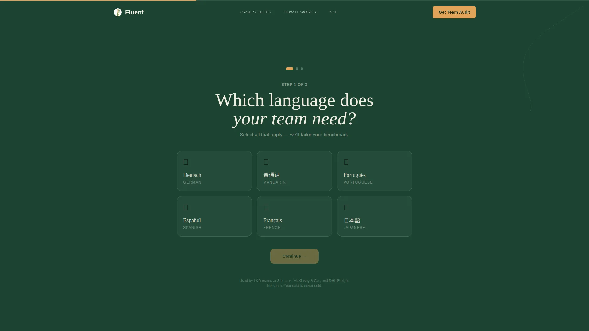
- A three-step header form that qualifies visitors by language, business context, and team size before asking for contact details
- A scrolling case study card grid that presents real-scenario proof in a problem, intervention, and result format
- A sticky bottom call-to-action bar and a secondary gated ROI calculator to capture leads at two different readiness levels
Feature list
This template is built around four core capabilities derived directly from its design brief and structural direction.
Three-Step Concierge Form
The header form runs visitors through three sequential steps: language selection, business context, and company details. Each step animates like turning a page. The evergreen background deepens slightly with each progression, rewarding commitment and delivering a personalized benchmark report on completion.
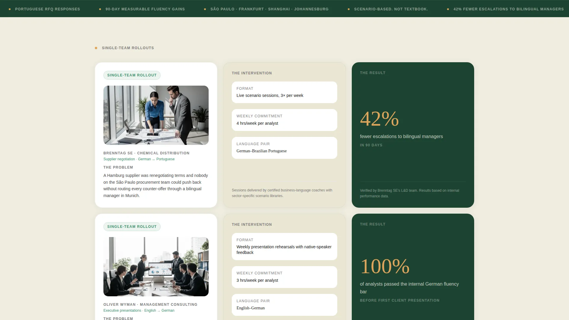
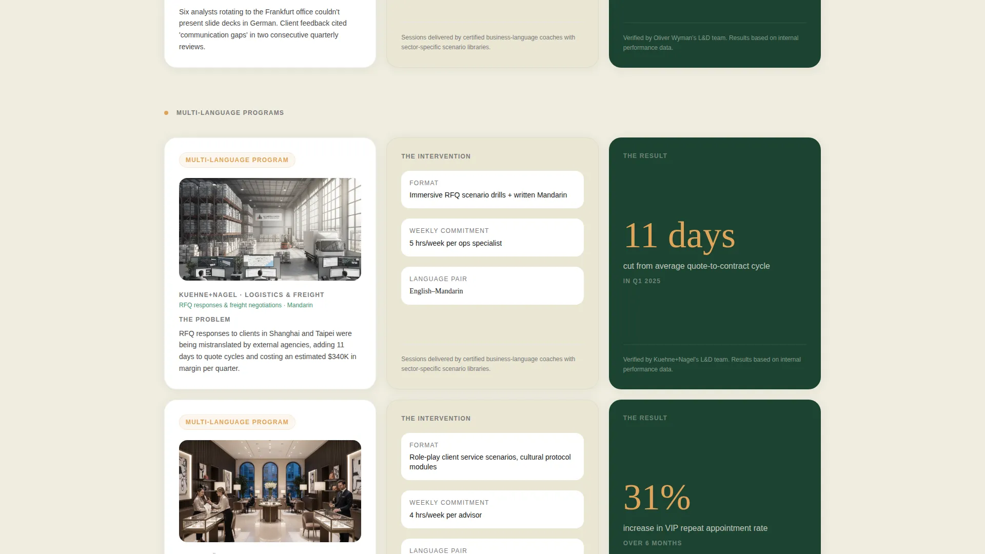
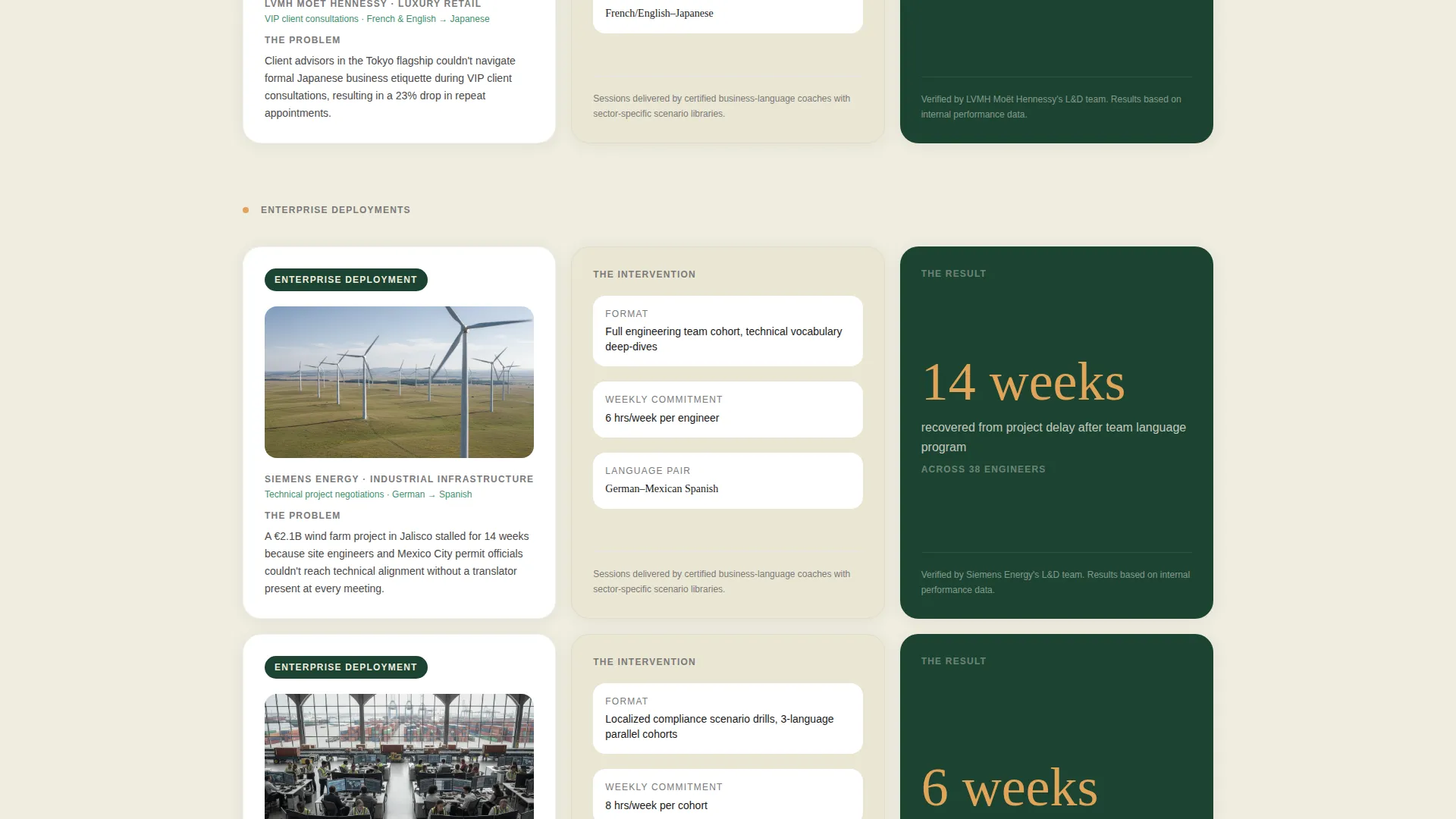
Modular Case Study Card Grid
Each row of cards tells one company's story across three panels: a problem card, an intervention card, and a result card. The result metric appears in large sap-gold type for immediate visual impact. Rows escalate in scope from single-team rollouts to full enterprise deployments.
Dual Lead Capture Paths
The primary call to action, "Get Your Team's Language Audit," anchors the header form and repeats in a sticky bottom bar after the third case study row. A secondary path offers a downloadable ROI calculator gated behind just an email address, catching visitors who are still building a business case internally.
Language Selection Card Display
Step one of the form presents six language option cards. Each card shows the language name in its native script alongside a small botanical illustration. This detail signals fluency and cultural specificity to buyers who know the difference between cosmetic and substantive language training.
Botanical Corporate Visual System
The color system pairs deep evergreen section backgrounds with warm parchment breathing room between cards. Sap-gold is reserved strictly for calls to action, progress indicators, and hover states. Pressed-fern mid-tone marks completed milestones and active states throughout the form flow.
Page sections overview
| Section | Purpose |
|---|---|
| Multi-Step Header Form | Qualifies visitors by language need, business context, and team size |
| Language Selection Cards | Presents six language options with native script and botanical illustration |
| Business Context Tiles | Lets visitors self-select Negotiations, Presentations, Client Service, or Relocation |
| Company Details Step | Captures company size and corporate email to complete the qualification sequence |
| Case Study Row One | Introduces single-team rollout proof with problem, intervention, and result cards |
| Case Study Row Two | Escalates to multi-language program proof at a broader organizational scope |
| Case Study Row Three | Demonstrates full enterprise deployment scale with headline metric in sap-gold |
| Sticky call to action Bar | Repeats the primary audit call to action after the third case study row |
| ROI Calculator Gate | Secondary email capture for visitors building an internal business case |
Design & branding system
The visual identity follows a Corporate Precision theme expressed through a Botanical color palette. The result feels like a greenhouse built inside a corporate headquarters: structured and disciplined, but alive and growing. Every color has a specific functional role and is not used interchangeably.
- Deep evergreen (#1B4332) anchors section backgrounds and the navigation bar; pressed-fern (#40916C) marks completed form steps and active card states
- Warm parchment (#F0EDDF) opens visual breathing room between card rows, preventing the layout from feeling dense or overwhelming
- Sap-gold (#E0A458) appears only on calls to action, progress indicators, and hover states, so visitor attention is always directed to the next action
Mobile & speed optimization
The card grid layout is modular by design, which means individual sections reflow cleanly at smaller viewport widths without breaking the narrative sequence. The multi-step form collapses into a single-column flow on mobile, keeping the qualification process intact.
- Card rows stack vertically on smaller screens so problem, intervention, and result panels remain readable in sequence
- The sticky bottom call-to-action bar is sized and positioned for thumb-friendly interaction on mobile devices
- Form steps animate at a pace that feels intentional rather than sluggish, even on a standard mobile connection
How this template helps you convert
The page is structured around a lead generation objective, with every section contributing to either direct conversion or nurture capture.
- The multi-step header form earns contact information by delivering value first: visitors complete three lightweight steps and receive a personalized benchmark report, making the exchange feel worthwhile before they ever see a sales conversation.
- The escalating case study card rows build credibility progressively, so by the time the sticky call-to-action bar appears after the third row, the visitor has already seen proof at the scale that matches their own organization.
- The secondary ROI calculator path captures in-market buyers who are not yet ready to talk but are actively justifying budget internally, turning a soft bounce into a qualified future lead.
Other information about this template
This template is purpose-built for the online language learning platform category, specifically where the buyer is a corporate decision-maker rather than an individual learner. It fits naturally within the Education and Training space, particularly language school businesses moving upmarket into enterprise accounts.
- The template style is Card Grid (Modular), making it straightforward to add, remove, or reorder case study rows as your proof library grows
- The creative direction is Case Study Narrative, which means the layout is optimized for story-driven proof rather than feature lists or promotional claims
- The header concept is a Multi-Step Form designed to feel like a concierge intake, not a barrier, qualifying the lead while the visitor feels guided and respected
- The page is oriented toward Lead Generation, with two distinct capture mechanisms built into the structure from the start
Theme
Corporate Precision
Creative direction
Case Study Narrative
Color system
Botanical
Style
Card Grid (Modular)
Direction
Lead Generation
Page Sections
Three-step Concierge Header Form
Modular Case Study Card Grid
Dual-path Lead Capture System
Native Script Language Selection Cards
Botanical Corporate Color System
Related questions
Who is this landing page template built for?
What makes the header form different from a standard sign-up form?
Can I use this template if I offer more than one language?
How does the secondary ROI calculator capture leads?
Is the color system easy to adapt to a different brand?


