Accounting Digital Presence Comparison Website Template
Ledger is a comparison-focused landing page template built for accounting community forums. It showcases a live interactive forum preview, an animated side-by-side comparison table, and a low-friction two-field signup flow. Designed for CPAs, bookkeepers, and tax strategists, it turns visitor skepticism into community belonging before the scroll ends.
by Rocket studio
Quick summary
Ledger is a single-page landing page template built to recruit members into an accounting community forum. The page opens with a live interactive forum preview, drops into an animated comparison table, and closes with a two-field signup form. Every scroll reinforces one idea: this is where accounting professionals actually talk to each other.
Who this template is for
This template is built for people launching or growing an accounting-focused online community. It speaks directly to the professional who knows their forum is better than the alternatives but needs a page that proves it fast.
- Solo practitioners and firm owners building a peer community for CPAs, bookkeepers, and tax strategists
- Community managers who need a conversion-focused landing page that handles its own persuasion
- Accounting educators or certification coaches who want a forum sign-up page with real urgency
What problem this template solves
Generic community sign-up pages rarely answer the one question every skeptical professional asks: "Why here instead of everywhere else I already scroll?" Ledger solves that directly with a structured comparison layout that puts the answer on screen before a visitor has to think.
- Professionals comparing forums lack a clear side-by-side view of what makes one worth their time
- Sign-up pages with long forms and vague promises push high-intent visitors away before they convert
- Static pages cannot show that a community is alive right now, killing trust for first-time visitors
What you get with this template
You get a fully designed, animation-ready landing page built around the comparison conversion model. Every section is purpose-built to move an accounting professional from curious visitor to signed-up member.
- An interactive header that renders a live forum snippet with animated threads, reply counts, and avatar clusters
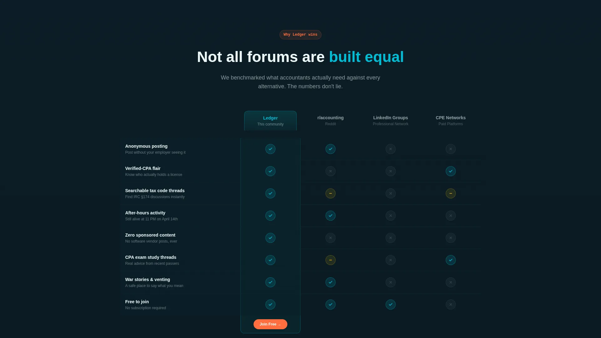
- An animated comparison table with kinetic row reveals, teal checkmarks, and grayed-out competitor markers
- A floating "Join the Discussion Free" call-to-action bar, a two-field signup form, and a guest browse path with an email gate
Feature list
This section breaks down the core components included in the Ledger landing page template.
Interactive Forum Header Preview
The header renders a functioning snippet of the forum directly in the viewport. Visitors see three active thread titles with live reply counts, upvote animations, and avatar clusters using micro-motion pulses. A cursor ghost clicks into a thread, reveals two replies, then a frosted-glass overlay invites the visitor to continue inside the forum.
Animated Comparison Table
The comparison table stacks this forum against three common alternatives across five dimensions that accounting professionals actually care about. Each table row animates in with a kinetic slide. Teal checkmarks land with a subtle bounce, and competitor markers appear in muted gray for an immediate visual contrast.
Floating Call-to-Action Bar
A sticky "Join the Discussion Free" bar activates after the visitor scrolls past the comparison table. It appears at the exact moment persuasion is complete and stays pinned without interrupting earlier sections. The timing is intentional: the bar reinforces the decision the visitor just made.
Two-Field Signup Form
The signup flow asks only for an email address and a professional role selection: Certified Public Accountant (CPA), bookkeeper, student, or other. Two fields, one click. The minimal form design reduces commitment friction while still capturing the data needed to personalize the member experience.
Live Member Activity Elements
A live member-count ticker pulses in the corner of the page. A horizontally scrolling "Posted in the last hour" thread strip proves the community is active in real time. Testimonial chat bubbles animate in as the visitor scrolls, styled to look like messages landing in a thread.
Guest Browse Path
A secondary conversion path lets visitors browse top threads as a guest before committing. After three thread views, a lightweight email gate appears. This path reduces the pressure on first-time visitors while still moving them toward membership at a natural pace.
Page sections overview
| Section | Purpose |
|---|---|
| Interactive Forum Header | Shows a live forum preview to build immediate trust |
| Comparison Table Block | Positions the forum against alternatives across key dimensions |
| Testimonial Chat Bubbles | Delivers social proof styled as live member messages |
| Live Activity Strip | Proves community activity with a scrolling thread ticker |
| Member Count Ticker | Reinforces community size with a pulsing live counter |
| Primary Signup Form | Converts visitors with a two-field email and role form |
| Guest Browse Path | Reduces friction with a three-view guest access option |
| Floating call to action Bar | Pins a persistent join prompt after the comparison table |
Design & branding system
The Teal Catalyst color system gives this landing page the visual weight of a trusted financial brand combined with the live energy of an active chat thread. The Dynamic Motion theme makes every scroll feel like something is happening.
- Core palette: deep ledger teal (#0D7377) for primary surfaces, kinetic cyan (#00BCD4) for accents, midnight balance sheet (#0B1D26) for backgrounds, and spark white (#F0FAFA) for readable content areas
- Motion system: kinetic row slides, micro-motion avatar pulses, bouncing checkmark animations, and a cursor ghost interaction in the header all follow the Dynamic Motion theme
- Reactor orange (#FF6D3F) appears exclusively on call-to-action buttons and notification indicators, keeping it visually distinct from every other element on the page
Mobile & speed optimization
The Ledger template is designed with a mobile-first layout so that the comparison table, floating bar, and animated sections adapt cleanly across screen sizes. The interactive header and motion elements are built to degrade gracefully on smaller viewports.
- The comparison table reflows into a vertically scannable format on mobile without losing its visual contrast between checkmarks and competitor markers
- The floating call to action bar stays accessible on touch screens and activates at the same scroll-depth trigger as on desktop
- Micro-motion and animation elements are scoped to avoid layout shift, keeping the page stable as content loads in
How this template helps you convert
The Ledger landing page is engineered around the comparison conversion model. Every element builds on the previous one to move a skeptical professional toward a frictionless sign-up.
- The interactive forum header creates immediate proof of life. A visitor sees real thread titles, real reply counts, and real activity before reading a single marketing claim.
- The comparison table does the persuasion work in a format accounting professionals respect. Side-by-side data across five meaningful dimensions is more convincing than any headline copy.
- The two-path conversion system captures visitors at different commitment levels. High-intent visitors click the floating call to action bar. Lower-commitment visitors browse as guests and hit the email gate naturally after three views.
Other information about this template
Ledger is part of a broader Premium Community Landing Page template collection designed for professional niche forums. It is built specifically for the accounting digital presence space, where trust and community proof matter more than flashy design alone.
- The template style is a Comparison Table layout, which suits any professional community that needs to justify itself against well-known alternatives
- The creative direction is Launch Energy, meaning the scroll experience is paced to build momentum and close with urgency rather than fading into a generic form
- The header concept is an Interactive Preview, which is particularly effective for forum and community products where showing beats telling
- This template fits within the Technology category and the Accounting Digital Presence subcategory, making it a strong match for tools, platforms, and communities serving accounting and finance professionals



Theme
Dynamic Motion
Creative direction
Launch Energy
Color system
Teal Catalyst
Style
Comparison Table
Direction
Comparison/Versus
Page Sections
Interactive Forum Header Preview
Animated Comparison Table
Floating Call-to-action Bar
Two-field Signup Form
Live Activity and Social Proof Elements
Guest Browse Path with Email Gate
Related questions
Can I change the comparison table rows to match my own community features?
What does the guest browse path actually show visitors?
Do I need design experience to use this template?
Is the floating call to action bar always visible on the page?
Can this template work for a community that is not strictly for CPAs?



