App Marketing Platform Landing Page Template
Acquire is a scroll-reveal landing page template built for app marketing platforms. It combines a glassmorphic Tech Glass visual system with a progressive feature matrix layout and a sticky comparison bar. The result is a high-clarity page that walks mobile growth professionals from a live SDK code snippet straight through to a confident first campaign signup.
by Rocket studio
Quick summary
Acquire is a single-page, scroll-reveal landing page template designed for app marketing platforms. It opens with a live-typed SDK code block, unfolds a side-by-side feature matrix as visitors scroll, and closes with a direct campaign signup call to action. Every section is built around the glassmorphic Tech Glass aesthetic: frosted panels, glowing cyan accents, and data that feels live.
Who this template is for
This template is built for teams and individuals who need to communicate a complex app marketing platform clearly and persuasively to a technically literate audience.
- Mobile growth leads who manage attribution across multiple ad networks and need a page that speaks their language
- Indie app studios launching on a tight budget who want to show their platform's edge without writing an essay
- Performance marketing agencies handling many apps at once who need one focused, credible landing page
What problem this template solves
Most app marketing platform pages drown visitors in feature lists and vague promises. Acquire is designed to fix that by presenting capability comparisons in a way that feels like switching from a cluttered terminal to a clean, formatted output.
- Visitors immediately see what the platform does differently, panel by panel, rather than scrolling past walls of text
- The sticky comparison bar keeps context visible at all times, so the advantage never gets lost mid-scroll
- The diagnostic secondary call to action gives hesitant visitors a low-commitment path forward without forcing a signup
What you get with this template
You get a complete, production-ready landing page layout with every structural section pre-built and styled. The page is organized as a progressive reveal sequence that builds cumulative momentum toward conversion.
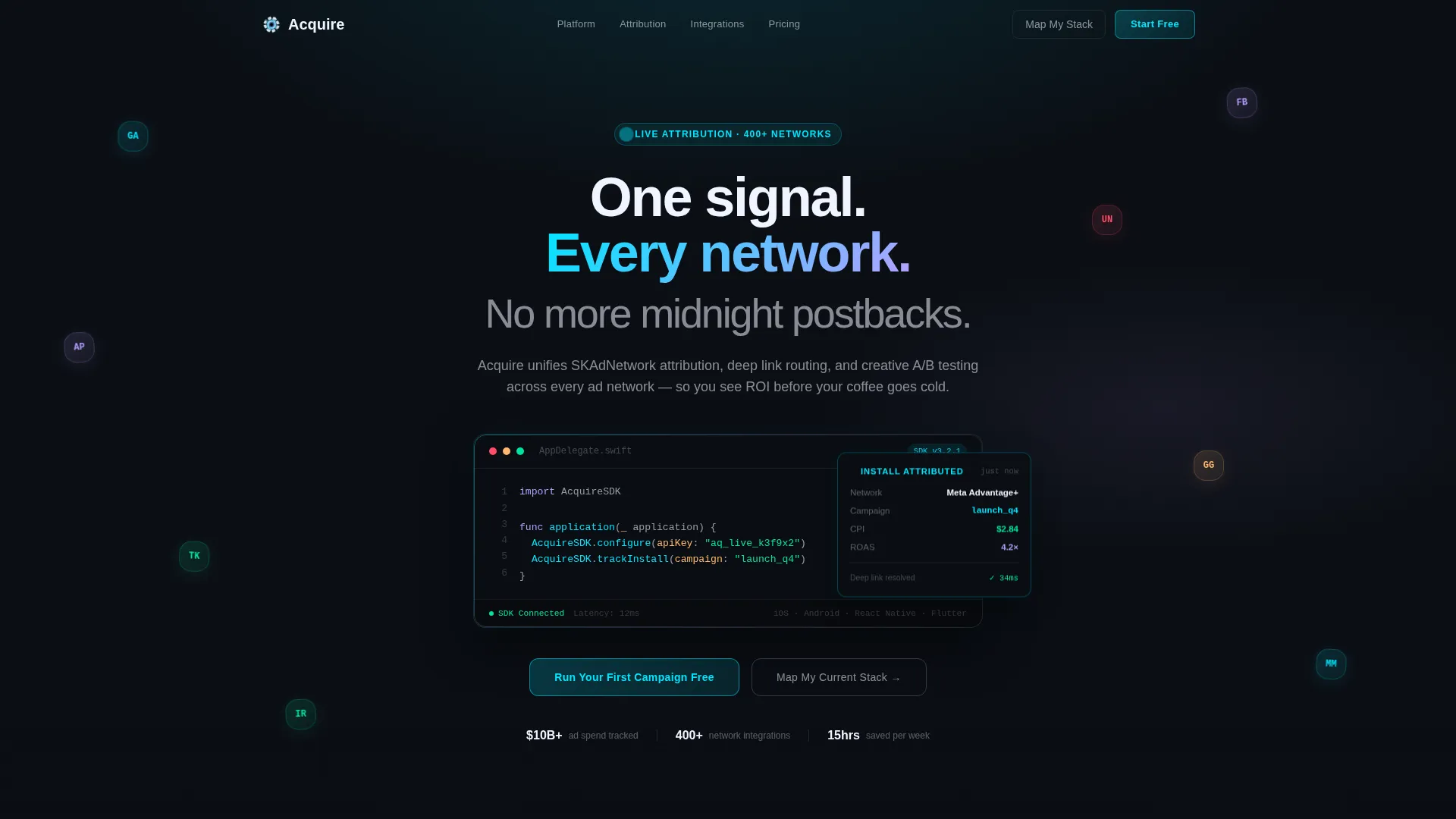
- A syntax-highlighted SDK initialization header with an auto-typing second line and a live attribution event card
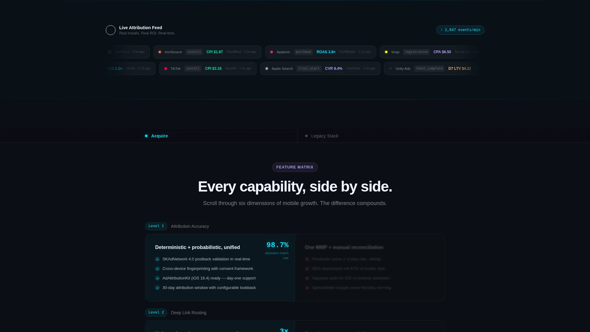
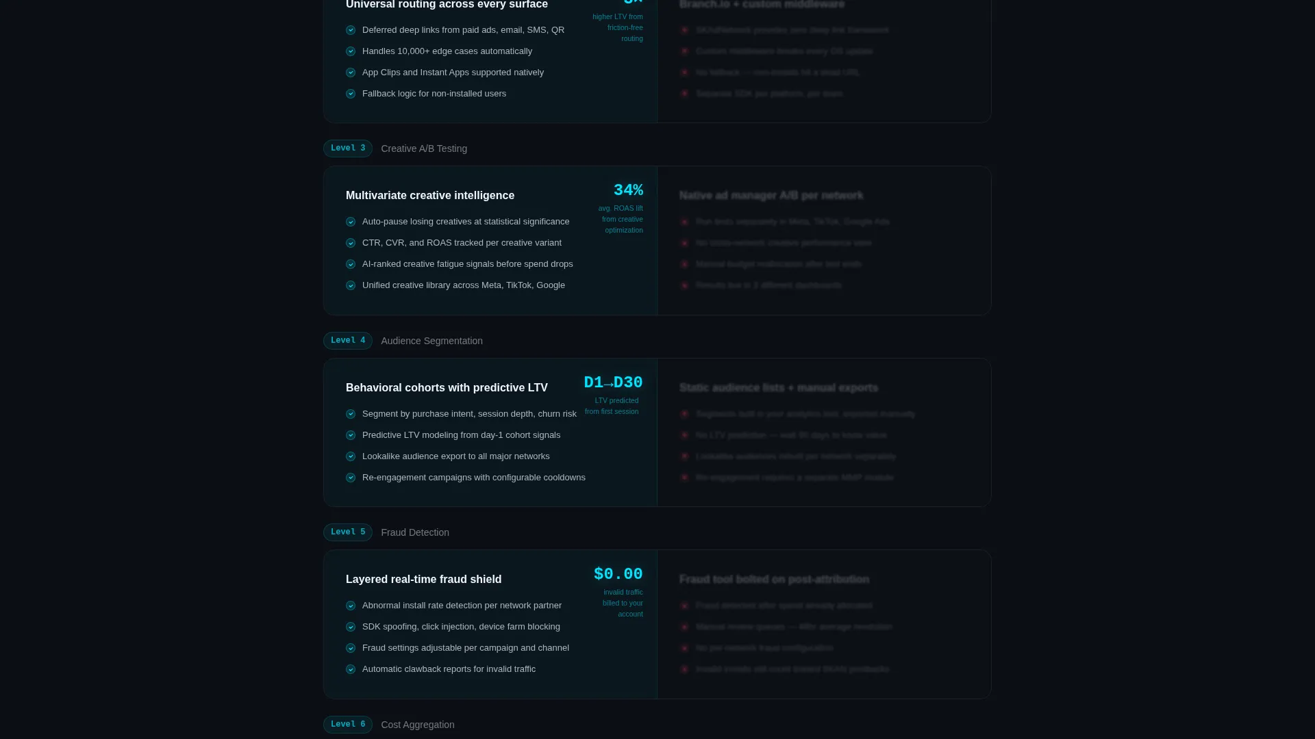
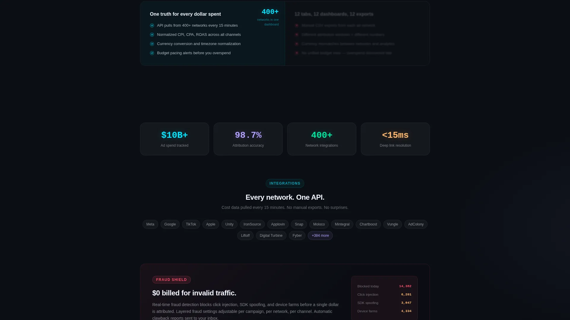
- Six frosted glass comparison panels covering attribution accuracy, deep linking, creative testing, audience segmentation, fraud detection, and cost aggregation
- A sticky comparison bar, a primary campaign signup call to action, and a three-field secondary diagnostic form
Feature list
This section describes the core capabilities built into the Acquire template layout.
Live-Typed SDK Code Header
The header opens with a fully syntax-highlighted AcquireSDK.configure(apiKey:) block rendered in a monospaced font on a frosted glass card. A cursor blinks at the end of the last line, then a second line auto-types in real time. A live attribution event card slides in from the right showing network, cost, and return on ad spend, giving visitors immediate proof the platform works before they read a single marketing claim.
Progressive Scroll Reveal Layout
Each section of the page enters from depth as the visitor scrolls, creating a sense of leveling up with each new panel. The sequence moves from basic install tracking through to predictive lifetime value modeling. This scroll-driven pacing holds attention and builds stakes progressively rather than dumping everything above the fold.
Side-by-Side Feature Matrix
Six frosted glass panels compare the platform's approach against a legacy stack. The platform side sits in sharp focus on the left. The legacy alternative appears on the right behind an additional blur layer, making it literally harder to read. Capabilities covered include attribution accuracy, deep link routing flexibility, creative A/B testing, audience segmentation, fraud detection, and cost aggregation across ad networks.
Sticky Comparison Bar
A persistent sticky bar stays locked at the top of the viewport as the visitor scrolls the feature matrix. It labels the two columns clearly so the comparison context is never lost. This structural anchor makes the cumulative advantage of the platform feel undeniable by the time the primary call to action appears.
Dual Conversion Path Design
The primary call to action, "Run Your First Campaign Free," appears after the sixth comparison panel at the moment of maximum persuasive momentum. A secondary path, "See Your Current Stack Mapped," opens a lightweight diagnostic form. The form asks only three fields: current mobile measurement partner, monthly ad spend range, and primary app store, with no signup required to receive a personalized migration brief.
Glassmorphic Visual System
The entire template uses a cohesive Tech Glass design language. Frosted panels float over a deep void black background. Electric cyan highlights live data accents and hover states. Soft lavender marks tags and badges. Every visual element is designed to feel like a heads-up display projected onto tinted glass, where data appears to glow from underneath a translucent frost layer.
Page sections overview
| Section | Purpose |
|---|---|
| SDK Code Header | Opens with live-typed code and a real-time attribution event card |
| Sticky Comparison Bar | Keeps platform versus. legacy column labels visible throughout scroll |
| Attribution Accuracy Panel | Compares attribution precision against legacy measurement approaches |
| Deep Link Routing Panel | Shows flexible deep linking capability against fragmented alternatives |
| Creative A/B Testing Panel | Contrasts structured creative optimization with manual ad testing |
| Audience Segmentation Panel | Highlights targeting capability versus broad, undifferentiated spending |
| Fraud Detection Panel | Positions built-in fraud detection against add-on legacy tools |
| Cost Aggregation Panel | Demonstrates unified spend visibility across every ad network |
| Primary call to action Block | Presents "Run Your First Campaign Free" after peak persuasion |
| Diagnostic Form Path | Three-field form for personalized migration brief, no signup needed |
Design & branding system
The Acquire template uses a glassmorphic color system built around four core values that work together as a coherent visual language. The overall effect is a heads-up display aesthetic: everything floats, layers of frost separate depth, and accents glow as if the data underneath is live.
- Deep void black (#0B0E14) as the base background, frosted panel white at 12% opacity (#FFFFFF1F) for floating cards, electric cyan (#00E5FF) for live-data accents and hover states, and soft lavender (#B4A0FF) for tags and badges
- Monospaced typography in the code header gives the SDK snippet authentic developer credibility
- A slow-drifting parallax constellation of app icons behind the header adds depth without competing with the primary message
Mobile & speed optimization
The scroll-reveal animation system and glassmorphic panel layers are structured to remain performant on modern devices. The progressive reveal approach means content loads contextually as visitors scroll rather than all at once.
- Frosted glass effects use CSS-based styling designed to render smoothly across screen sizes without heavy asset loading
- The three-field diagnostic form is intentionally lightweight, reducing friction for mobile visitors who want a quick result
- The sticky comparison bar adapts to viewport height so it remains useful on smaller screens without obscuring panel content
How this template helps you convert
The Acquire template is built around a clear conversion architecture. Every structural decision, from the opening code snippet to the final call to action, is designed to move a technically skeptical visitor toward action.
- The live-typed SDK header establishes immediate platform credibility before any marketing copy appears, earning trust from developers and growth leads in the first six lines of code
- The progressive feature matrix builds cumulative persuasion across six panels, so by the time the primary call to action appears, the visitor has already seen the full capability comparison
- The secondary diagnostic path removes the signup barrier for hesitant visitors, offering tangible value through a personalized migration brief in exchange for three lightweight answers
Other information about this template
The Acquire template is designed specifically for the app marketing platform category, where buyers are technical, skeptical, and quick to close a tab if the page feels generic. The layout reflects that audience's mental model: structured data, clear comparisons, and no noise.
- The template is built on a scroll-reveal progressive structure, meaning sections animate into view as the visitor scrolls rather than loading all at once above the fold
- The feature matrix creative direction is a deliberate choice for the mobile app marketing niche, where platform comparisons drive purchase decisions more than lifestyle imagery
- The Tech Glass theme and glassmorphic color system are matched to the intersection of mobile technology aesthetics and the data-forward expectations of performance marketing professionals
Theme
Tech Glass
Creative direction
Feature Matrix
Color system
Glassmorphic
Style
Scroll Reveal (Progressive)
Direction
Comparison/Versus
Page Sections
Live-typed SDK Code Header
Progressive Scroll Reveal Layout
Six-panel Feature Matrix
Persistent Sticky Comparison Bar
Dual Conversion Path Design
Glassmorphic Tech Glass Visual System
Related questions
Who is this landing page template designed for?
Can I customize the comparison panels for my own platform features?
What is the secondary diagnostic form and how does it work?
Does the SDK code snippet work as a live integration?
Is this template suitable for a performance agency managing multiple apps?



