Smart Energy Operations Landing Page Template
Dispatch is a dark-mode field service management landing page template built for experiential marketing agencies. It opens with a live savings calculator, flows through four modular feature cards representing stages of field operations, and drives visitors toward a sandbox demo. The Teal Catalyst color system and Launch Energy creative direction make every scroll feel like ignition.
by Rocket studio
Quick summary
Dispatch is a single-page, card-grid landing page template designed for marketing agency field service management software. It combines an interactive cost calculator, animated modular cards, stat callouts, and a sticky call-to-action bar to move operations directors from awareness to a live demo click. The template is built on a dark-mode dashboard aesthetic with high interactivity and launch-energy motion.
Who this template is for
This template is built for B2B software teams that sell field service solutions to experiential marketing organizations. It speaks directly to the people running large-scale, multi-city activations and the vendors who support them.
- Operations directors at experiential agencies who need real-time data visibility across dozens of simultaneous jobs
- Field marketing managers coordinating field teams across forty or more cities who need faster decision making tools
- Regional leads and service contractors currently dispatching crews from spreadsheets and group chats
What problem this template solves
Running field operations across multiple markets without a proper system is expensive and chaotic. Ops directors lose hours every week to unnecessary delays, missed calls, and error-prone manual scheduling. This template gives software companies a landing page that makes the cost of that chaos visible and personal.
- The interactive calculator quantifies wasted drive time in real dollars, turning an abstract pain point into a specific number the visitor calculated themselves
- The modular card layout communicates how field service management software moves a team from reactive chaos to coordinated control, stage by stage
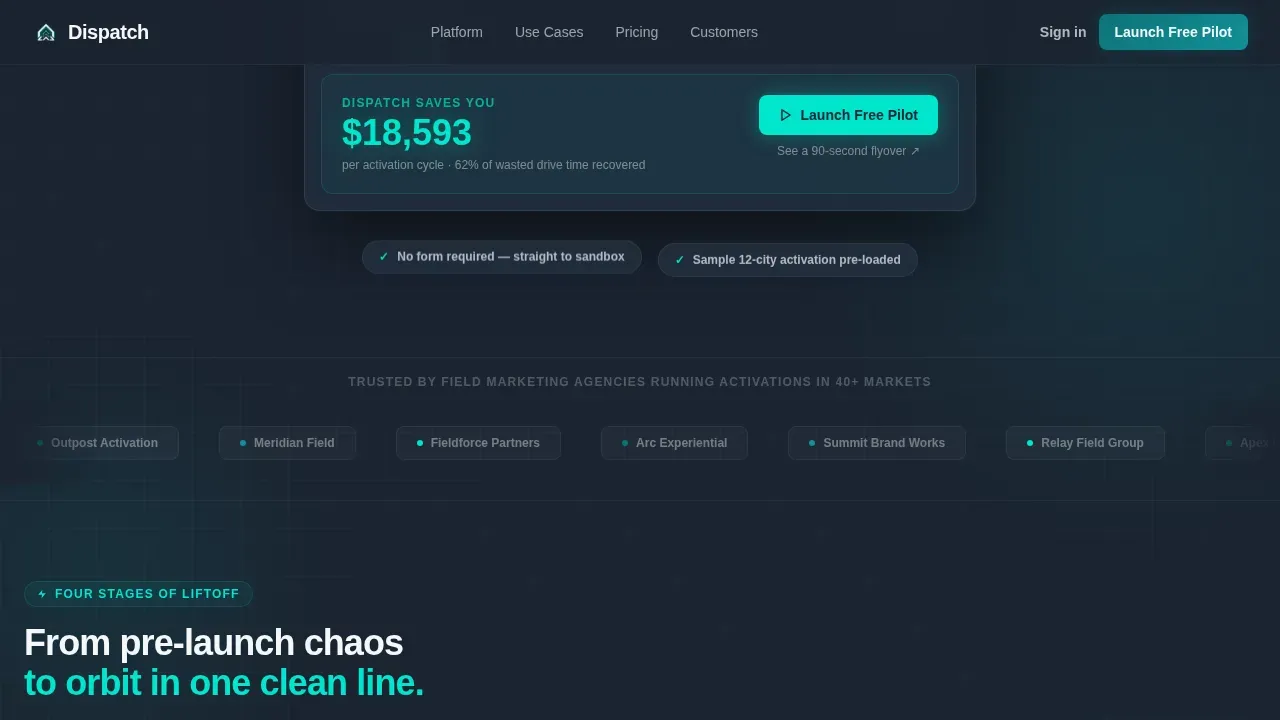
- The click-through structure removes friction, sending qualified visitors directly into a live sandbox rather than forcing them through a form
What you get with this template
The template delivers a fully structured, single-page layout with every section pre-built and ready to customize. Design tokens, animation logic, and copy placeholders are included so teams can adapt the page quickly.
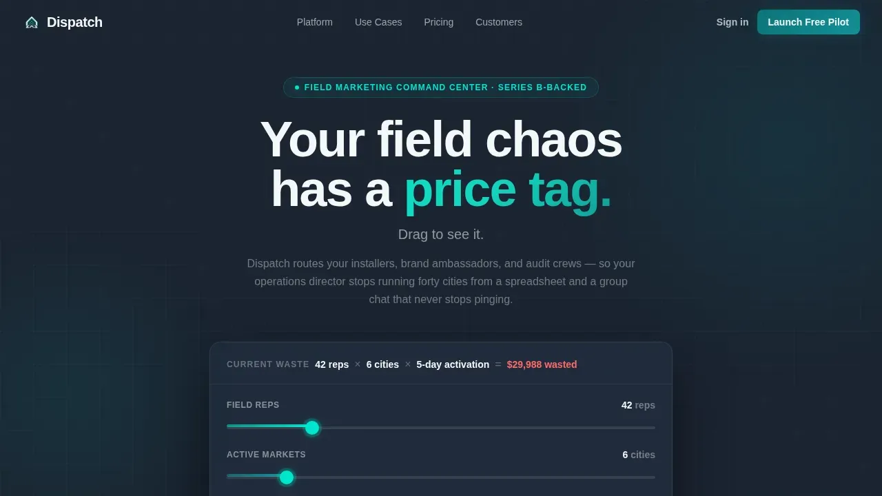
- A hero section built around a three-slider cost calculator that recalculates live savings in reactor-core cyan as visitors adjust team size, market count, and activation length
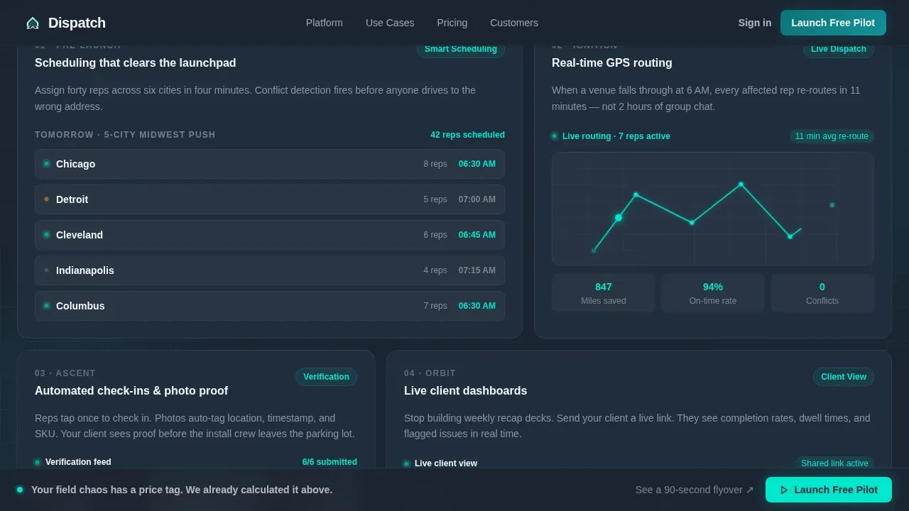
- Four animated feature cards representing scheduling, GPS routing, automated check-ins, and live client dashboards, each with micro-interaction placeholders including pulsing status dots and route-line animations
- A sticky call-to-action bar, stat callout rows, a testimonial section, and a linear single-row footer, all styled to the Teal Catalyst color system
Feature list
This template includes a focused set of components that support field service software marketing. Each section is built to address a specific stage of the buyer journey.
Live Cost Calculator Hero
The hero section leads with an interactive estimator that arrives pre-loaded with sample activation data. Three sliders let visitors adjust field team size, city count, and activation length. The savings figure recalculates live, displayed in reactor-core cyan against the charcoal background. This tool is the primary conversion driver: it makes the cost of inaction a number the visitor owns.
Modular Launch-Stage Card Grid
Four feature cards are arranged in a bento-style grid, each representing a stage of field service operations: pre-launch scheduling, real-time GPS routing, automated check-ins with photo verification, and live client dashboards. Cards animate in with an upward drift sequence that accelerates with each card, building kinetic momentum. Micro-interactions such as pulsing status dots and self-drawing route lines keep the grid feeling operational rather than static.
Cyan Stat Callout Rows
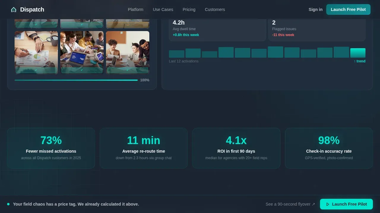
Between card rows, single-stat callouts punch through in reactor-core cyan. These short, bold data points, such as reduction in missed activations and average re-route time, give decision makers concrete proof points without requiring them to read a paragraph. The callouts reinforce situational awareness of the product's impact at a glance.
Sticky Call-to-Action Bar
After the second card row, a sticky bar appears at the bottom of the viewport and persists through the remaining scroll. It carries the primary call to action alongside a secondary text link that opens an inline video. The bar keeps the conversion path visible without interrupting the content flow, maintaining pressure without being disruptive.
Testimonial Section with Outcome Metrics
The testimonials section features quotes from operations directors and field managers, each paired with company logos and specific outcome data. Real job completion rates, re-route times, and activation metrics give service contractors and agency clients the social proof they need to trust the product before clicking through.
Linear Single-Row Footer
The footer follows a Pattern 1 linear layout: one row, no excess navigation, focused entirely on brand and legal essentials. This minimalist approach keeps users focused on the goal rather than offering exit paths that reduce conversion.
Page sections overview
| Section | Purpose |
|---|---|
| Hero Calculator | Quantify field ops cost with live sliders |
| Feature Card Grid | Show four field service management stages |
| Stat Callout Row | Deliver single-metric proof in cyan |
| Testimonials Block | Build trust with outcome-backed quotes |
| Sticky call to action Bar | Maintain visible conversion path throughout scroll |
| Inline Video Link | Support undecided visitors with a quick product overview |
| Linear Footer | Close the page with minimal distraction |
Design & branding system
The visual identity follows the Teal Catalyst color system inside a Startup Velocity theme. Every design decision is calibrated to feel like a mission-control dashboard: fast, legible, and electric without tipping into chaos.
- Color palette: deep mission-control teal (#0D7377) for interactive elements and progress indicators; launch-smoke charcoal (#1B2431) for backgrounds and card surfaces; reactor-core cyan (#00E5CC) for data highlights, hover states, and live metrics; clean-room white (#F4F7F9) for all body copy and labels
- Typography: Manrope at bold weights throughout, chosen for legibility on dark surfaces and fast visual scanning across both desktop and mobile contexts
- Motion language: upward-drift card animations that accelerate with each successive card, pulsing status dots on feature cards, self-drawing route lines, and a counter-tick effect on the calculator output
Mobile & speed optimization
The template is built desktop-first, reflecting the reality that operations directors and field managers primarily work from large screens during active campaign management. A mobile fallback is included so the page remains functional for managers who check field service status on the go.
- Card grid reflows from a multi-column bento layout to a single-column stack on smaller screens, preserving the upward-drift animation sequence and keeping all calls to action tappable
- Mobile access to the calculator is maintained with touch-friendly sliders, large tap targets on both call to action buttons, and readable white type on charcoal backgrounds at all viewport sizes
- Static sections use server-rendered components for fast initial load; the calculator and animation layers are client-rendered to balance interactivity with performance
How this template helps you convert
This template is engineered as a click-through page. Every element is ordered to reduce hesitation and push qualified visitors toward the live demo environment.
- The calculator creates a personalized dollar figure before any feature is introduced, making the value of better field service management feel immediate and specific rather than abstract
- The modular card grid and stat callouts maintain momentum through the scroll, giving decision makers layered evidence of job completion improvements, faster re-routing, and reduced delays without requiring long-form reading
- The sticky call-to-action bar and secondary inline video link ensure every visitor has a clear next step available at every point in the scroll, whether they are ready to enter the sandbox or still want a 90-second product overview
Other information about this template
This template is designed to support field service software businesses across various industries and business sizes. It addresses a wide range of buyer needs, from service contractors running regional field teams to enterprise operations teams managing high-volume, multi-market activations.
- The dispatch launch energy field operations landing page template is well-suited for software teams that need to communicate the value of centralized data, real-time updates, and automated scheduling to non-technical decision makers
- Compliance and safety features can be highlighted within the testimonial or callout sections, reinforcing trust with clients who operate in regulated environments where safety documentation and reporting are critical
- The template structure supports coverage of key features such as technician performance tracking, job completion rates, first time fix rates, and availability management through the stat callout and dashboard card sections
- Mobile responsiveness is essential for field managers who monitor operations away from the office; the mobile fallback ensures the page remains credible and usable across all devices
- Trust signals including client logos and specific outcome metrics are baked into the testimonial section, addressing the need for social proof among decision makers evaluating field service management software
- The page structure is intentionally minimal, with no main navigation bar, to keep users focused on the single conversion goal: entering the live sandbox environment
- For software teams considering A/B testing, the calculator headline, primary call-to-action label, and stat callout figures are the highest-leverage elements to test for conversion lift
- The template can support service contractor teams, franchise operations, and enterprise field management groups that need a fast-loading, credible entry point into a demo environment
Theme
Startup Velocity
Creative direction
Launch Energy
Color system
Teal Catalyst
Style
Card Grid (Modular)
Direction
Click-Through
Page Sections
Live Cost Calculator Hero
Animated Launch-stage Card Grid
Cyan Stat Callout Rows
Sticky Call-to-action Bar
Testimonials with Outcome Metrics
Minimalist Linear Footer
Related questions
Who is the Dispatch template designed for?
Can I customize the calculator values and slider ranges?
Does this template include form fields for lead capture?
What sections can I adapt for different field service industries?
How does the sticky call-to-action bar behave during scroll?



