Proven Eye Health Landing Page Template
Optic is a bold brutalist bento grid landing page built for optometry booking and scheduling practices. It leads with hard-hitting stats, a live-looking dashboard preview, and a head-to-head comparison layout that makes the case before asking for anything. Designed for independent optometrists and multi-location practices ready to cut no-shows and streamline appointments.
by Rocket studio
Quick summary
Optic is a single-page bento grid landing page for optometry booking and scheduling. It opens with a pixel-accurate dashboard preview, delivers three headline stats before any body copy, then walks visitors through a direct system comparison. The design uses a bold brutalist aesthetic with a teal-on-charcoal palette that feels clinical, confident, and impossible to ignore.
Who this template is for
This template is built for eye care practices that need a high-converting landing page, not a brochure. It speaks directly to the people managing appointment chaos every day.
- Independent optometrists handling scheduling manually and losing patients to no-shows
- Multi-location practices juggling multiple calendars and front-desk bottlenecks
- Practice managers and front-desk staff who want a page that sells the booking system for them
What problem this template solves
Most optometry scheduling pages bury the value. They lead with taglines instead of proof, and ask for commitment before earning trust. Optic flips that sequence entirely.
- No-show rates, booking speed, and return on investment are presented before any form appears
- The comparison layout directly names the pain points: manual reminders, triple-booking, and paper intake
- Visitors arrive skeptical and leave convinced, because the data does the persuading
What you get with this template
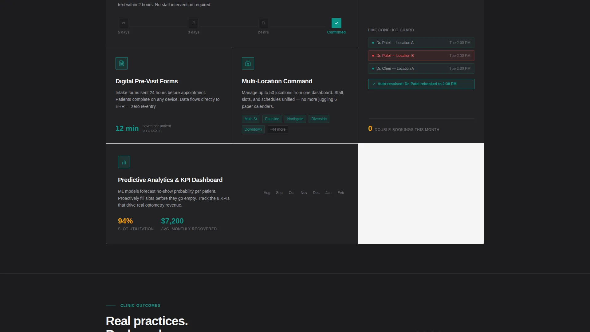
You get a fully structured bento grid landing page with a clear visual hierarchy and a conversion-first content flow. Every section is purposeful and positioned.
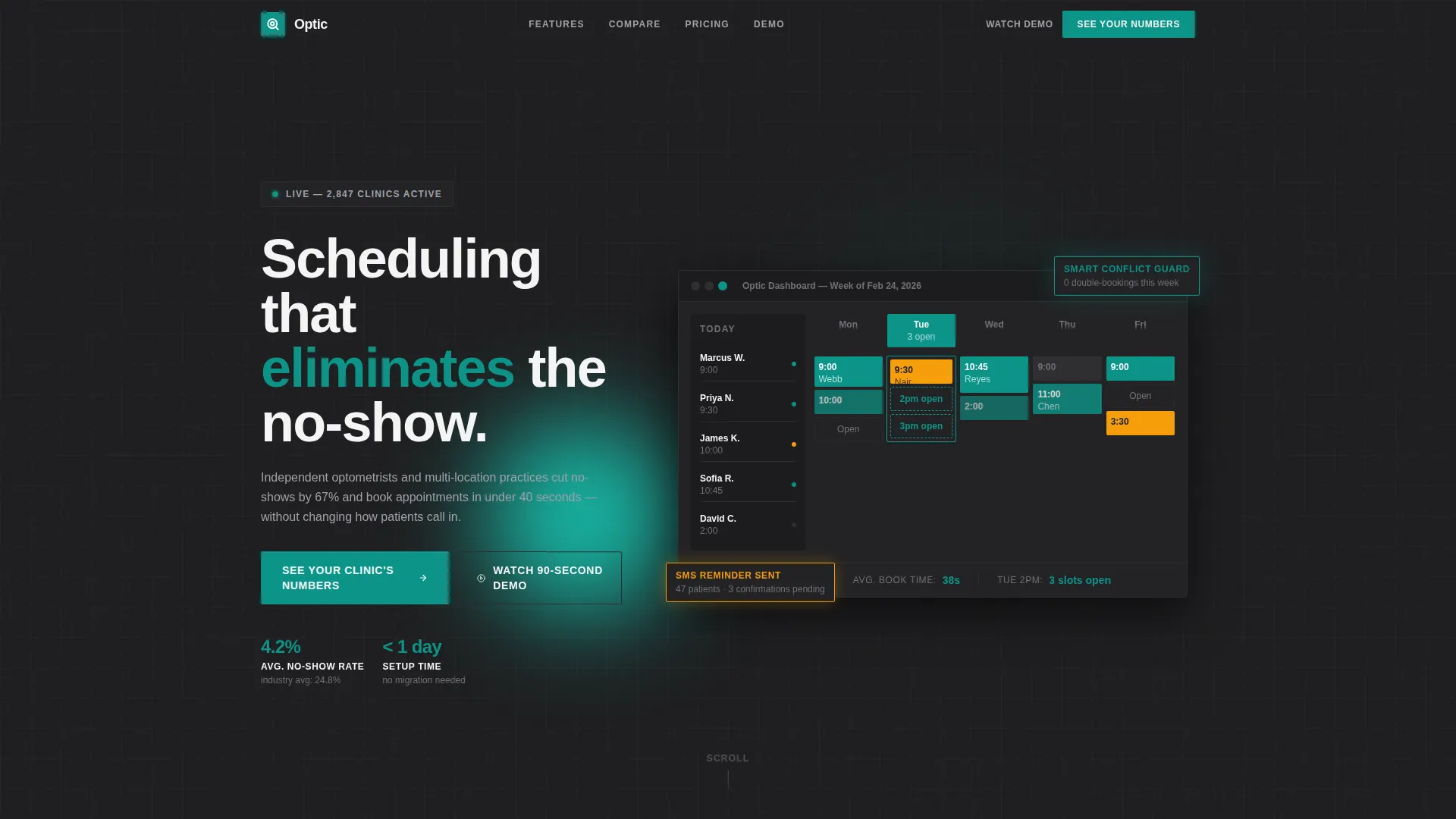
- A hero section featuring an isometric dashboard screenshot with legible live-data callouts
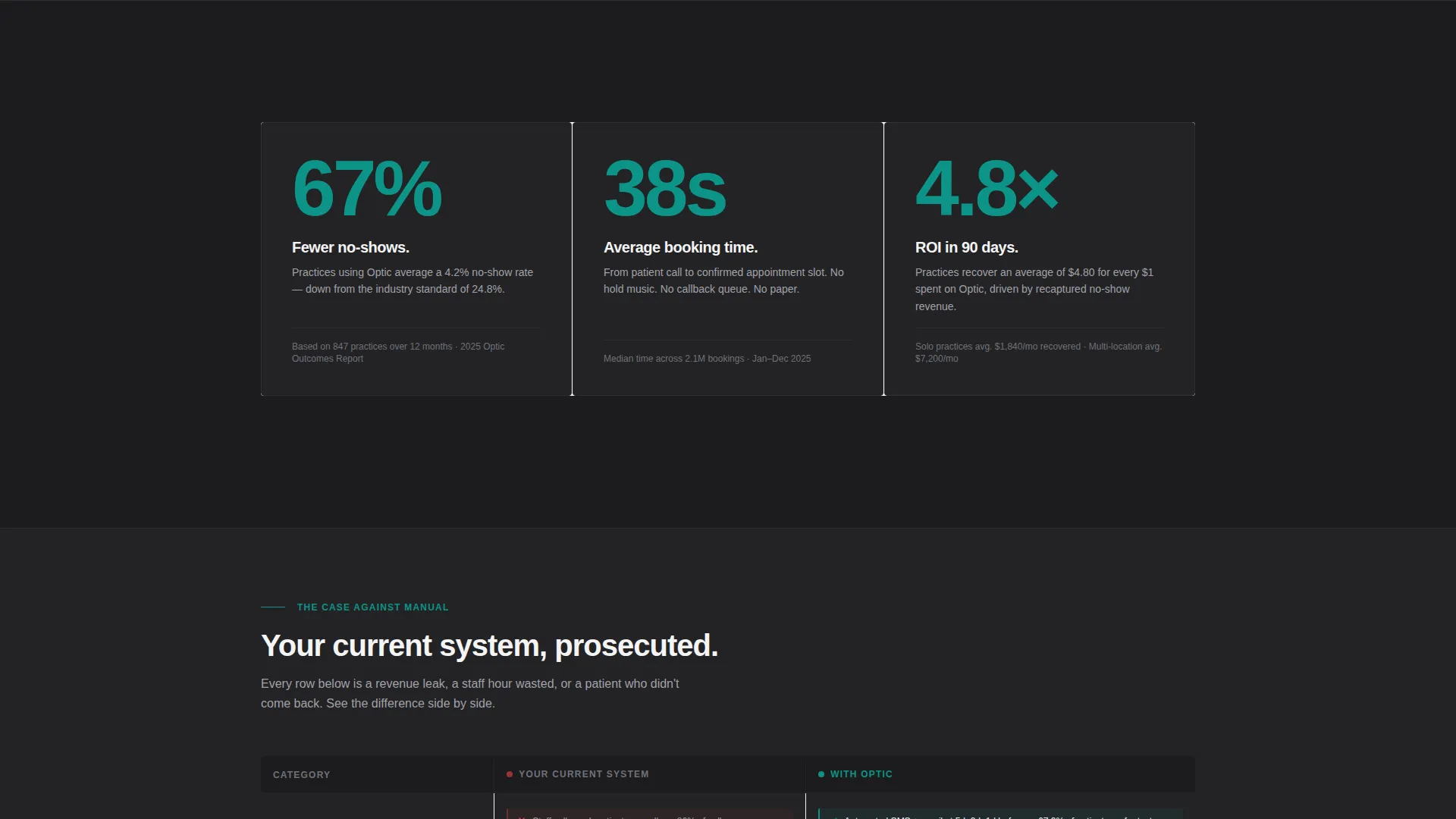
- Three brutalist stat cards leading the scroll, followed by a side-by-side comparison grid
- A diagnostic form call to action and a secondary demo path to capture visitors at different commitment levels
Feature list
This template packages several purpose-built components into one cohesive landing page layout.
Isometric Dashboard Hero
The header renders a pixel-accurate scheduling interface in isometric view, slightly rotated on a charcoal slab with a hard shadow. Key data points are deliberately legible on screen: no-show rate, average booking time, and open appointment slots.
Stats-First Bento Row
Three oversized typographic numbers land at the top of the scroll before any paragraph copy. Each stat sits in its own brutalist card with a teal numeral on a charcoal background, creating immediate impact for any visitor.
Head-to-Head Comparison Grid
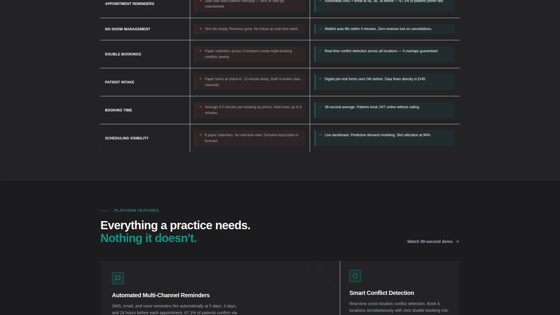
A two-column layout places the visitor's current workflow against the Optic-powered alternative, row by row. Specific pain points such as manual reminders versus automated messaging and paper intake versus digital pre-visit forms are called out directly.
Diagnostic Form call to action
The primary call to action triggers a short three-question form covering practice size, current scheduling method, and monthly patient volume. This lets the visitor self-qualify and see relevant outcomes before committing.
Secondary Demo Path
A "Watch the 90-Second Demo" option gives hesitant visitors a lower-commitment entry point. Both conversion paths are visible on the same page, accommodating different buyer readiness levels.
Teal Catalyst Color System
Surgical teal is reserved for primary action elements and key numerals. Reactive amber appears only on data callouts and alert states. This strict color hierarchy keeps the visual language functional and intentional.
Page sections overview
| Section | Purpose |
|---|---|
| Dashboard Hero | Showcases the scheduling interface with live-data callouts in isometric view |
| Stats Impact Row | Delivers three headline metrics before any narrative copy |
| Comparison Grid | Contrasts current workflows against the Optic system row by row |
| Diagnostic Form call to action | Captures practice details through a short three-question qualifier |
| Secondary Demo Path | Offers a 90-second demo link for visitors not ready to fill the form |
Design & branding system
The visual identity follows a bold brutalist theme with a tightly controlled four-color palette. Every color choice has a defined role and is never used outside it.
- Surgical teal (#0D9488) drives primary actions, key numerals, and active interface indicators
- Slab charcoal (#1C1C1E) anchors card backgrounds and all primary typography
- Clinical white (#F4F4F5) provides grid gaps and breathing room between bento cells
- Reactive amber (#F59E0B) is reserved exclusively for data callouts and alert-state highlights
Mobile & speed optimization
The bento grid layout is structured to reflow cleanly across screen sizes without breaking the visual hierarchy. Stat cards and the comparison grid remain legible at smaller viewports.
- Brutalist card blocks stack vertically on mobile, preserving the stats-first reading order
- The isometric dashboard hero scales proportionally so key data callouts remain readable
- Both call to action paths stay visible and tappable on small screens without layout overlap
How this template helps you convert
The page earns the click before it ever asks for one. The content sequence is designed to remove doubt progressively.
- The dashboard hero and three stat cards establish credibility instantly, so the visitor trusts the numbers before reading a single sentence of copy.
- The comparison grid names specific frustrations that the visitor already feels, making the value gap concrete and personal rather than abstract.
- The diagnostic form and demo path give two distinct next steps, so every visitor finds a commitment level they are comfortable with.
Other information about this template
This template is part of a focused set of technology landing pages built around bold visual frameworks and niche-specific conversion flows.
- The bento grid format makes it straightforward to rearrange or resize cells to match a specific practice's priorities
- Amber callout styling can be applied to any stat or alert element to draw attention without disrupting the palette
- The template suits both solo practice launches and larger multi-location rollout campaigns
- It was designed with optometry booking and scheduling as the primary use case, so the copy structure and section order reflect that niche directly
Theme
Bold Brutalist
Creative direction
Stats-First Impact
Color system
Teal Catalyst
Style
Bento Grid
Direction
Comparison/Versus
Page Sections
Isometric Dashboard Hero
Stats-first Bento Row
Head-to-head Comparison Grid
Diagnostic Form Call to Action
Secondary Demo Path
Teal Catalyst Color System
Related questions
Can I change the stats shown in the hero and stat cards?
Does this template support two different calls to action at once?
Is the comparison grid section editable?
Who is the ideal user of this landing page template?
Does the bento grid layout work on mobile devices?



